Reverse-Engineering the iPhone X Home Indicator Color
I noticed an unusual behavior of the iPhone X home indicator while working on my most recent app. The app’s background near the home indicator is purple. When the app launches, the home indicator is very light gray.
But
something odd happened when I pressed the app’s “share” button, which
opened a default iOS activity view (aka “share sheet”). When I hit the
“cancel” button to close the activity view, the home indicator animated
to a dark gray color.
Even
though the background color was exactly the same, the light-colored
activity view passing underneath caused the home indicator to change
color. The only way to get the home indicator back to its original color
was to leave the app and come back.
I had never seen this before, and it prompted my curiosity.
What
determines the color of the home indicator and why it does it behave
like this? The answer is surprisingly complex. Let’s take a deep dive
and see what we can learn!
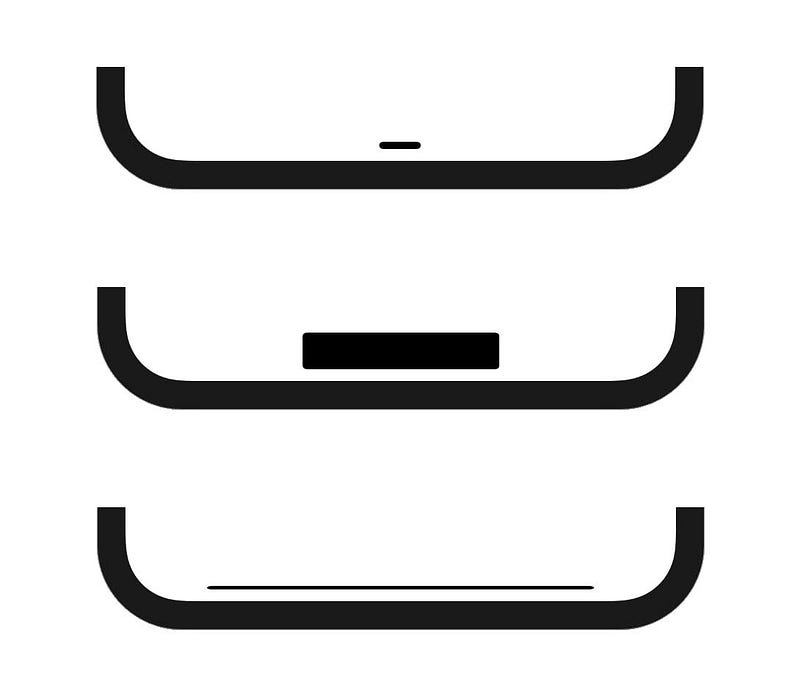
Home Indicator Basics
In
September 2017, Apple introduced its newest iteration of mobile phone:
iPhone X. The new design replaced the iconic home button with on-screen
gestures. To go home, the user simply swipes up from the bottom of the
screen.

The Home Indicator’s Purpose
To
create the affordance of being able to swipe up from the bottom of the
screen, Apple added a small horizontal bar known as the home indicator.
The home indicator is always present except for the home screen and in
any apps that request it to be temporarily hidden (full-screen video,
games, etc.).
The
home indicator serves another purpose: protecting the bottom edge of
the screen from conflicting user interface elements and gestures.
Because the user needs to be able to swipe up from the bottom of the
screen at any time, best practices now dictate that developers should
avoid place conflicting gestures or buttons in the bottom edge of the
display.
By placing a bar at the bottom, user interface elements in the same location look wrong—there’s
a visual conflict between the bar and other elements. In this sense,
the home indicator “protects” this region of the screen from designers
or engineers that are unaware of the functionality of the iPhone X.

Now that we’re all on the same page, let’s get back to our original question: “What color is the home indicator?”
Part 1 — The Beginning
On September 13, 2017, I answered a Stack Overflow question asking how to change the color of the home indicator.
At
the time, the iPhone X hadn’t been publicly released, but the latest
version of Xcode included an iPhone X simulator. Running a simple test
app in the simulator revealed that the home indicator’s color was based
on the color of the content below it.
The
new APIs for the iPhone X were released alongside this same version of
Xcode, and there was no public API available to modify the color of the
home indicator (which is still the case at the time of writing this
post, and probably will always be the case).
This
made my Stack Overflow answer simple and straightforward: it is not
possible to modify the color, and you shouldn’t worry about it, since
it’s out of your control and guaranteed to be visible.
Because
I anticipated this to be a common question, I included some screenshots
of the home indicator on top of various background colors.
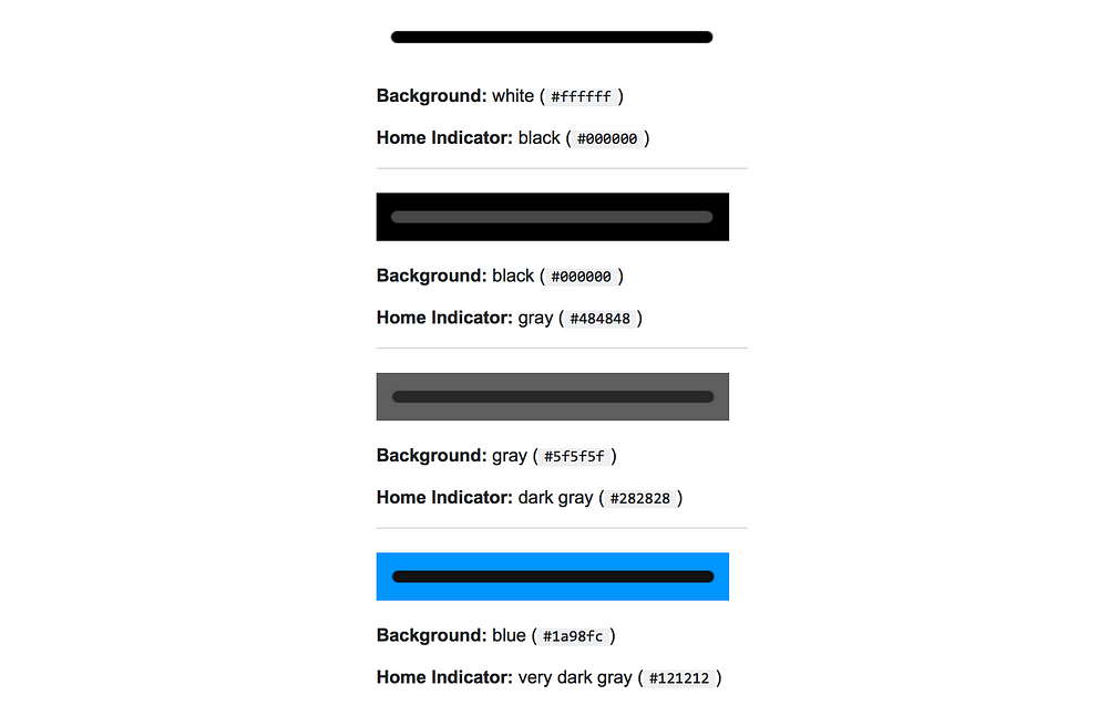
This
was good enough for me. The home indicator maintains its visibility by
sampling the color of the view below it, and picking a gray color that
provides sufficient contrast.
Part 2 — The Plot Thickens
It
turns out the home indicator’s color is not that simple. Some further
observations poked holes into my “solid-color function” theory.
Observation #1: Multiple Colors
The
first observation is that the home indicator can have multiple colors,
similar to a gradient. In the following example, the left side of the
screen is black, and the right is white. The home indicator adjusts for
this by adopting a lighter color over the dark background, and a darker
color over the light background.

The
home indicator can be multiple colors at the same time, and smoothly
transitions between them. This smooth transition is updated in real time
if any of the views behind the home indicator change.

In
the example above, a small white view is moving back and forth behind
the home indicator. The section of the home indicator that covers the
white view becomes pure black and smoothly transitions to gray.
This behavior is similar to a
UIVisualEffectView,
which applies a blur over existing content. The home indicator is most
likely taking a sample of the nearby colors in order to get the blend
effect seen in the image above.
(Besides looking good, this functionality might help prevent burn-in on the OLED display.)
Observation #2: Same Background, Different Home Indicator Color
As
I mentioned at the beginning of this post, I noticed an unusual
behavior when a share sheet passed beneath the home indicator.
This
was the most surprising observation — there is not a simple 1-to-1
mapping between background colors and home indicator colors. At this
point I was determined to learn more via experimentation.
Part 3 — The Investigation Begins
My
first order of business was to determine the formula for the home
indicator color on the iOS simulator. From my previous observations, the
iOS simulator’s behavior was more predictable than a real device.
I
created a new iOS app as a laboratory for my future experiements. The
app was simple—all I needed was an easy way to change the background
color behind the home indicator. A slider and stepper control the
background color’s gray value, which is displayed as a large number in
the center of the screen.
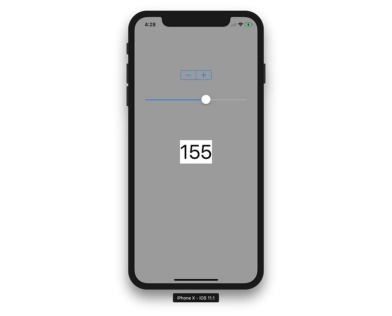
My
goal was to determine the home indicator color for every possible gray
background color. I could graph this data and see if a formula applied
to it. Since there were only 256 possibilities, I took the manual
approach, using macOS’s built-in “Digital Color Meter” app to get the
home indicator color for each value.
I
graphed the results. It was not a linear function, an exponential
function, or any kind of “nice” function you might see in math class.
The graph was … odd.
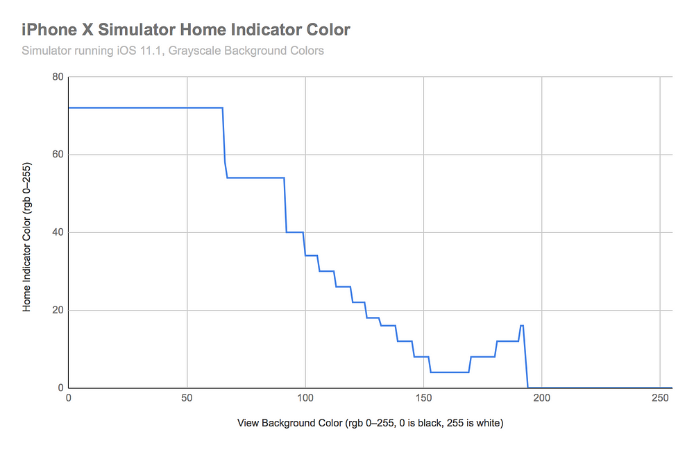
This was not what I was expecting.
It
was a step function but with uneven steps. It had a few distinct
sections: a period of (relatively) light gray, two big steps, a series
of small steps, steps in the reverse direction, and a period of pure
black.
The
most unusual part was that the home indicator color was not always
decreasing. There was a period (around rgb 170–190) where it became
lighter as the background became lighter.
Why did the graph look like this? What would the same experiment have similar results on a real device? I needed to know.
Part 4 — The Investigation Continues
My
next task was to perform the same experiment on a real device. It was
immediately obvious that the results were going to be dramatically
different.
To
collect data on a real device, I used the same app from before. I
streamed a live preview of the iPhone screen to my computer via
QuickTime. This removed any discoloration from the True Tone display, as
well as allowed me to use the Digital Color Meter app to easily inspect
the colors.
Another
factor added to the complexity on a real device—the red, green, and
blue values were not always the same. On the simulator, the RGB values
were identical, resulting in colors like RGB(54, 54, 54). On a real
device, they were almost never the same, but were very close, resulting
in colors like RGB(211, 209, 212). When recording the results, I took
the average of the individual RGB values.
Here are the results, compared with the previous simulator data.
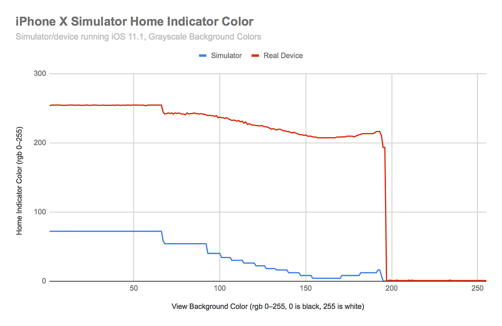
The
colors on a real device (red line) follow a similar trend to those on
the simulator (blue line), except offset by a significant margin. The
simulator home indicator is always very dark, while the device home
indicator is either very light or very dark.
The
graph for the real device is noisy. Overall it follows a smooth trend,
but jumps up and down and looks rough. This is more than just a
side-effect of my averaging, and the noise is consistent. If the
experiment is repeated, the noise follows the exact same pattern.
However, the graph above doesn’t tell the whole story.
The
values presented above were gathered by starting the background
completely black and incrementing the RGB values one at a time (going
from 0 to 255). When the values are gathered in the opposite direction, the results are different.
At
a certain point, the home indicator color “falls off the cliff” in its
transition from light to dark or dark to light, and animates for a brief
period of time, as shown in the previous gif with the purple background
color. Depending on whether the background starts light or dark, the
cliff occurs in a different place.
Let’s take a look at a new graph comparing the results from “going up” (black to white) and “going down” (white to black).
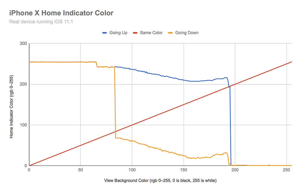
The
blue line above is the same as the previous graph’s red line. Its data
points were collected left to right (0 to 255, “going up”). The orange
line is the same data, but collected in the opposite direction (255 to
0, “going down”). The red line represents the points where the home
indicator and the view background are the same color.
The
“going up” and “going down” lines follow a similar path, but have a
different noise pattern. Interestingly, they have the exact same noise
pattern in the darkest range (0–80).
From
this graph we can tell that the “cliffs” occur when the color of the
home indicator is coming too close to the color of the background. It
even appears as if the “going up” and “going down” lines are being
pushed away by the red line, actively trying to resist becoming exactly
the same color as the background. At a certain point, the home indicator
flips to being very dark or very light.
This
explains the shift in color in the app with the purple background. The
purple color must be in a region between the two cliffs. Based on the
previous color of the home indicator, it could either be light or dark.
When the white activity view animates behind the home indicator as it is
dismissed, the home indicator transitions from its light state to its
dark state, and re-settles at the dark-equivelevnt value for the purple
background color.
Part 5 — The Investigation Becomes Colorful
All
the tests up to this point have used grayscale backgrounds. How would
the results differ if we used colored backgrounds instead?
I
repeated the same experiment, but instead of modifying the gray color, I
modified the hue on an HSB color scale. I kept the saturation (S) and
brightness (B) at their maximum values to get the most vibrant and
distinct colors. I only tested these colors “going up”, which in this
case means from hue 0 (red) to hue 255 (red) in rainbow order.
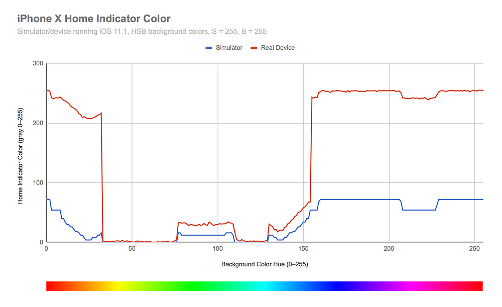
The
first observation is that there are two cliffs — once when the color
becomes yellow, and again when the color becomes dark blue. This occurs
because of the relative “brightness” of the colors.
The
next observation is the difference between the simulator and a real
device. The colors follow the same general trends, but the real device’s
home indicator color is noisier and can reach brighter values.
These
are fascinating findings so far. Aside from testing every possible
background color, there’s not much else we can discover from observation
alone. Now I was curious exactly how the home indicator is
implemented—is it a
UIView? CALayer? UIVisualEffectView? Something else? What is making it behave in this way?
Let’s find out.
Part 6 — We Need to Go Deeper!
At this point I turned to my friend and iOS expert Ian McDowell.
He was able to point me in the right direction—using the iPhone X
Simulator and Xcode’s debugging tools to find the home indicator.
The
iOS “home screen” is actually an app called SpringBoard. We can attach a
debugger to the Springboard app running in the iPhone X simulator and
use the “Debug View Hierarchy” option in order to inspect the views that
make up the home screen, including the home indicator.
If you want to follow along at home, here is the process:
- Launch an iPhone X simulator.
- In Xcode, select Debug > Attach to Process… > SpringBoard.
- When SpringBoard is running, select the Debug View Heirarchy button.
Deep in the view hierarchy we find an
MTLumaDodgePillView which is a subview of an SBHomeGrabberView. Sounds like we found the home indicator!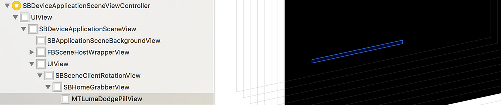
The name
MTLumaDodgePillView
makes sense. It confirms our observed behavior of the home indicator,
that its color contrasts the background based on its current brightness.
Can we go deeper yet?
SpringBoard
has another cool feature: a hidden debug menu. It turns out there’s an
entire section for modifying properties of the home indicator. In this
debug menu, the home indicator is called a “grabber”.
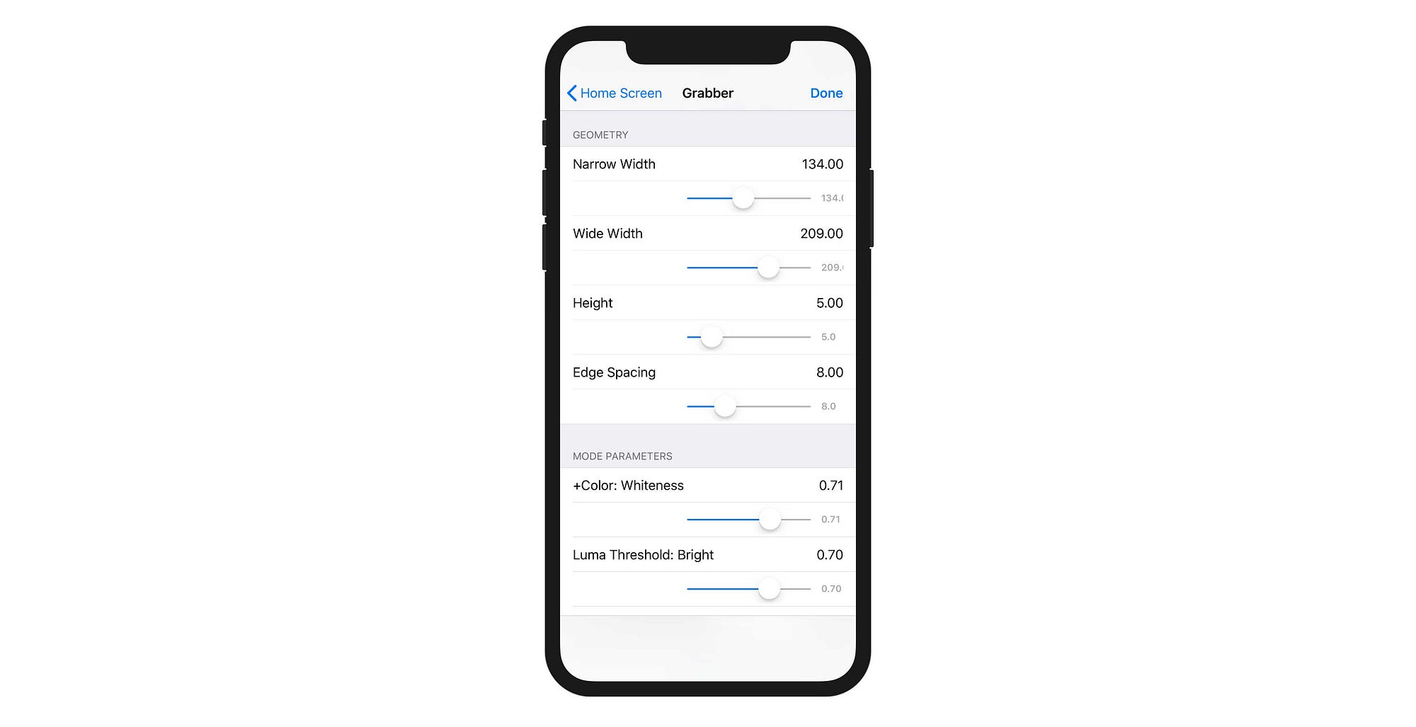
This
debug menu mainly contains visual and animation settings. It is most
likely used to collaborate between design and engineering within Apple.
Engineering builds the home indicator, provides hooks to all the
internal parameters, lets designers fiddle with them until they are
content, and then engineers use the settings for the final product.
Luckily for us, we can access this menu and see the results in the simulator.
I
first played around with the visual appearance of the home indicator.
There are sliders for the width and height in various states.
The
other settings are more difficult to test, as they don’t seem to apply
to the simulator. There are settings for a “luma threshold” for light
and dark, as well as parameters for the animation between states. This
confirms the “cliffs” where the color would dramatically animate between
light and dark—there are pre-defined thresholds based on the luminosity
of the background.
I
was unable to determine why the simulator behaves so differently from a
real device. My guess is that the simulator is using a different
combination of settings, or that certain settings only take effect on
real hardware.
Want to learn more about reverse engineering on iOS? Sash Zats posted an amazing in-depth article about the home indicator. Check it out if you want to dive into more code!
This marks the end of the adventure of home indicator discovery. I hope it was as educational for you as it was for me!
High-level Takeaways
- The home indicator’s color is determined by the system and cannot be modified directly.
- The home indicator’s color is determined by the content underneath, and it is not always a solid color.
- The home indicator on the simulator is not an accurate representation of the home indicator on a real device.
- The home indicator animates to its new color(s) when the content underneath changes.
- The home indicator is either in a “light” or “dark” state.
But… Why?
Why bother investigating the home indicator if its appearance is out of our control?
There
is a practical application for these learnings: If a screen in your app
has a background color in the middle range where the home indicator
could be either light or dark, you may prefer one style over the other.
If the status bar is white, for example, it may look more visually
balanced if the home indicator is white as well. Being aware of the home
indicator’s nuanced behavior can help ensure that it doesn’t
accidentally animate between light and dark when it could be distracting
to the user.
In
a previous example, the white share sheet animating behind the home
indicator was enough to change the home indicator’s style.
If
I wanted to prevent this, I could pin a view behind the home indicator
between the safe area and the bottom edge of the display. When the share
sheet is dismissed, I could give it a darker background color (maybe
black with 40% alpha) and add a fade animation so it’s less noticeable.
This
same tactic could be used to set the color of the home
indicator—forcing it over one of the “cliffs”. In the vast majority of
cases, the home indicator should be left alone to do what it wants. Most
iPhone X users have probably already forgotten it’s even there.
The Real Lesson
Hopefully
this brief investigation into the color of the home indicator helps us
appreciate the complexity of simple design. “It’s just a black/white
bar!” is far from the truth. The amount of care and attention to detail
that went into the home indicator is worth appreciating.
Taking
something simple, investigating its internal complexities, and
pondering its design helps us learn about the creative process. By
combining design and engineering, we can make better products that are
simple and delightful to use.