Programming & IT Tricks . Theme images by MichaelJay. Powered by Blogger.

Copyright

Facebook

Post Top Ad

Search This Blog

Post Top Ad

Responsive Ads Here

Archive

Post Top Ad

Contact


Editors Picks

Follow us

Post Top Ad

Fashion

Music

News

Sports

Food

Technology

Featured

Videos

Fashion

Technology

Fashion

Label

Translate

About

Translate

Sponsor

test

Weekly

Comments

Recent

Connect With us

Over 600,000+ Readers Get fresh content from FastBlog

About

Showing posts with label Android. Show all posts

Wednesday, February 21, 2018

Knowing India's position in the 4G speed compared to the countries of the whole world will not be trusting


Technology Generation Every generation is going strong, but India is going back to the 4G LTE issue. This disclosure has been disclosed by the UK-based open signal, and a new list has been announced for the availability and speed of the Forge LTE network in other international markets including India. India's situation has worsened this time compared to the November 2017 report in December last year. The report says that 4G availability in the country has been slow and India has fallen behind from Sweden and Taiwan.
According to the report, according to the availability of 4G signal, India is at 14th position 14th, last year India was in the eleventh position in this matter. The last year's incremental increase was the impact of geo chronology. With the 4G speed, compared to the 4G speed list, India came down. India stood at the bottom of the list of 77 countries with 6.13 Mbps in 4G LTE Speed. Singapore is at number one with 46.66 Mbps speed in this category.
According to the report many countries with a large population have missed out on the list. Both India and Indonesia's 4G download speeds have been recorded below 10 mbps. Looking at Singles, tariff plans in Singapore and South Korea have been expensive this time. When the US and Russia Federation also appeared behind the 4G speed issue.
Last year, the download speed of Reliance Jio Network was lower than Vodafone and Idea Cellular.

Monday, February 19, 2018

With the Jio, the company is offering just 4G smartphones in Rs.699


Smartphone and feature phone maker company, Mobiels has launched the world's fastest growing mobile network and the largest data network company Reliance Geo together with 4G Volte smartphones in just Rs 699.

According to the statement given by the company, Reliance Jio is offering cash back of 2200 rupees under the Geo Football offer on all 4G smartphones of Govi ​​Mobiles. There is also a Brand Revolution TNT 3 from the five brands under this cashback offer, which will be the world's first touch and type smartphone hybrid model for users moving from feature phones to smartphones.


Pankaj Anand, CEO of Jivi Mobiles, said that as a company in Jivi, we believe in the principle of providing opportunities for giving new technology to the asteroids. He said that considering the 4G technology in rural areas and the growing demand for smartphones, we need to understand the changing needs of our customers and produce the product accordingly.


Anand said that RIL is a suitable step towards achieving our goal of delivering communication equipment to Deva till partnership with Geo. With the cashback given by Reliance Geo, we will be able to make our customers available at 4G Volte smartphones at an effective price of Rs 699.  

Thursday, February 15, 2018

Zen Experience on Your Android Phone

Take back control of your phone (and your attention)


Photo by Kim S. Ly on Unsplash

The vast majority of consumers use their phone exactly as it was originally configured. The problem is that this default setup, with built-in apps, non-stop notifications, and constant cries for your attention has nothing to do with productivity or happiness.
I’ve seen this firsthand.
Several years ago, I had a job where I reviewed mobile phone apps and gadgets. In the course of this job, I realized how much our phones were taking over our lives each day. The entire industry is built around begging for your attention.
But you’re the boss of your phone, and you should be the one in charge of when and how you give your attention.
There’s a better way. Let’s take a look at the ways you can set up your Android phone for a more zen experience.
This guide will give you step-by-step instructions that will work for the majority of Android phones. The menus may look slightly different on your particular device, but the thought process will be the same.


Clear Your Lock Screen


A supposed selling point for Android is how customizable the lock screen is. Some people like to add widgets, notifications, and all sorts of information to the lock screen. But these extra bells and whistles just tend to distract you; they take you away from the task that prompted you to pick up your phone in the first place.
Remember what the purpose of a lock screen is. It’s really just there as a security measure. You shouldn’t be reading notifications there — you should be confirming your identity and then moving on to more important tasks.
If you want the security of a lock screen that doesn’t display your notifications, here’s an easy way to do it.
  1. Tap “Settings”


2. Tap “Security & location”


3. Tap “Lock screen preferences”


4. Tap “On the lock screen” and choose “Don’t show notifications at all”


Once you have this set up you’ll still have the security of a lock screen, without being bombarded by a stream of notifications as soon as you look at your phone.


Clear Your Home Screen


Most Android phones come with a home screen pre-configured. Often there are shortcuts to the apps the manufacturer assumes you’ll use the most. Worse, there are often some sponsored apps that companies have paid to get in front of you. You’re paying to be advertised to. That’s not cool.
In almost all cases, there are a lot of things that you just don’t need to be staring at.
The home screen certainly is a personal space that will vary from user to user. But here I will give you my rationale for why a clean, uncluttered home screen works the best.
My home screen has no app shortcuts. It does not has excessive widgets. It has nothing but a Google search icon, the date and weather, and navigation buttons.
Whenever I look at my home screen, I see nothing but the relaxing live wallpaper that I’ve installed. All of my apps are still easily accessible with a swipe up from the bottom, but there are no shortcuts with badges of unread messages or widgets displaying news headlines that I didn’t ask for.
A clear home screen equates to a clear mind, and it makes me far more productive.
App badges, in particular, are a case of the app manufacturing trying to control your behavior. If there’s one principle of this article, it’s that you should always be in control of your phone. I’m glad not to see those badges any more.
Here’s how to remove the clutter from your home screen:
  1. Long press on any app shortcut on your home screen


2. You’ll see some options appear at the top of the page (Remove, App info, Uninstall)
3. Drag the icon into the option that says “Remove”


4. Repeat the process for any widget or app shortcut that you no longer want to see on the home screen
Don’t worry, removing an app shortcut from your home screen doesn’t entirely remove the app from your phone — it just takes away that visual distraction. You’ll still be able to open the app from your app drawer, but only when you need to complete a task!


Hide (Almost) All Notifications

The smartphone notification has become a scourge of modern society. People are always checking for new notifications and searching for the shot of dopamine they receive when they obtain new information.
Linda Stone has the best phrase for the multitasking world we live in: continuous partial attention.
It may sound jarring, but I recommend turning off all notifications. You won’t miss them. In fact, there are many reasons why the biggest lovers of productivity, like the editor of this publication, are turning off their notifications.
I know it can be an uncomfortable thought, but it will be worth the head space you’re freeing up. Remember that all of the notifications are still on your phone; you don’t need them to pop up and take control of your time.
Turning off the notifications allows you to regain that control.
Social media apps should be the first ones to go. You can still check your favorite social media apps if you need to, but don’t let them distract you throughout the day! Shutting off these notifications puts you back in control. You’d be surprised at how unimportant most of these notifications are.
Are there any other apps that are needlessly notifying you? Maybe a photo sharing app telling you to remember the photo you took on this day 4 years ago? Perhaps you downloaded a game that keep reminding you of the latest high scores? We all have downloaded an app at some point that just starts notifying us when we least expect it. At the very least you need to disable these notifications. You may also want to reassess if you need the app on your phone at all.
E-mail should be the next notification that you tackle. Yes, we all need to check e-mail throughout the day, but you don’t need to be told when each and every new message has arrived in your inbox. Your postal mail carrier delivers all of your mail at one time, right? You don’t receive each piece of mail individually, and your e-mail should be received the same way. Disable these email notifications, and just check your inbox a few times throughout the day.
Texting and SMS are typically the most urgent messages that are received on a smart phone. This is the one area where I think it’s okay to allow notifications. If your friends and family know that you’re not checking the other notifications frequently, they can rely on the fact that you’ll check your text messages. This doesn’t mean that you need to drop everything and reply to each message on the spot, but if it’s something urgent you’ll know about it.
Here’s how you can turn off your notifications:
  1. Go to “Settings”


2. “Apps & Notifications”


3. “Notifications”


4. “App notifications”


5. You’ll see a list of all the apps on your phone
6. Tap any app
7. Here you can toggle notifications on or off for any given app


The beauty of this method is that it allows you to take control of your notifications. There may be some apps where you still want to allow notifications, but you can turn off the ones that you know are distracting you the most.


Set Quiet Hours or “Do Not Disturb”

We all need time to rest and recharge away from our smartphones.
Fortunately, there are easy ways to disconnect during certain hours. All Android phones now allow you to set quiet or “do not disturb” hours, during which your phone will be silent. Depending on your sleep schedule, I’d recommend setting these for an hour before bedtime and an hour after you wake up.
This allows you to have a wind down period when you’re preparing for sleep when you’re not checking your phone. It’s also important to allow yourself some time to wake up in the morning and plan your day before you jump straight into checking your phone.
Here’s how you setup “Do Not Disturb” on your phone:
  1. Go to “Settings”


2. Click “Sound”


3. “Do Not Disturb Preferences”


4. This screen gives you options to set up different rules based on days of the week or special events. (Maybe you don’t want to be disturbed after 8pm during the week, but you’re okay with pushing it to 10pm on the weekends.)


5. Configure each rule as you see fit (Give it a name, days of the week, start & end time, and allow overrides if you’d like)
Everyone has a different schedule, and you’ll obviously have different “Do Not Disturb” hours that make sense for you. For me, not being disturbed between 9pm and 6am works really well any day of the week.
Experiment for yourself until you find what works!

Night Light & Blue Light Filters

Much has been written on how the blue light from our phones is keeping us awake at night. It’s just not natural for human eyes to stare at such bright lights at all hours of the day. Sure, not looking at a phone at all is the best option. But the next best option is to calibrate your screen to block the blue light wavelength and go easy on your eyes.
Some of the latest Android phones (from Samsung and LG specifically) come equipped with night time modes that dim the screen and reconfigure the wavelengths of the light being emitted. If your phone doesn’t have this capability straight out of the box, I highly recommend downloading an app to help. My personal favorite is CF.lumen, but I’ve also used Twilight in the past and it has worked well.
Whichever app you choose, just set some initial parameters and then let it do its thing. Yes, there may be a few instances where the dimmed light is hard to see, so you can temporarily disable it as needed. But your eyes will surely thank you compared to the typical brightness of a phone screen.
Here’s how to setup a basic sleep filter that comes standard in the Android OS:
  1. Go to “Settings”


2. “Display”


3. “Night Light”


4. From here, you can customize exactly how you want your night light to work
5. Choose a custom on/off time
6. Set your desired intensity for the screen brightness
For most people, this will be plenty. But if you’re looking for some more advanced features, here is a quick guide on getting CF.lumen setup:
  1. Download CF.lumen from the Google Play Store
  2. If your phone is rooted, you’ll have greater control over some of the settings. If you have no idea what rooting is, no worries! You can still use the app just fine.
  3. Yes, CF.lumen can look super intimidating, but stick with me!


4. Tap on the “Location” section to set your location. (don’t be scared off by the longitude and latitude, the GPS on your phone will detect it automatically. This is used to calibrate the sunset and sunrise times for your location)


5. You’ll want to set the “Sleep: Start time” and “Sleep: End time” to know the specific times to start the blue light filtering


6. Those are really the only required settings, the rest of the options are for power users to customize things. (For instance, you can make CF.lumen start automatically when you boot up your phone, or manually set up the color filter if you want to try something more extreme)


Concluding Thoughts

Taking these steps will certainly improve your experience. But it’s important to realize that every Android user needs to find their own personal balance of function and aesthetics. What works for me may not work for you.
The beauty of the Android eco-system is that it’s built on choice and customization. You may find that a clean home screen brings you joy but a blue light filter just frustrates you. That’s okay! Only make changes that you think will genuinely improve your experience.
We’re staring at our phones for nearly 5 hours per day. You owe it to yourself to maximize the visual experience and efficiency of that time.


Source

Wednesday, January 31, 2018

An introduction to Progressive Web Apps


Progressive Web Apps (PWA) are the latest trend in mobile application development using web technologies. At the time of writing (early 2018), they’re only applicable to Android devices.
PWAs are coming to iOS 11.3 and macOS 10.13.4, very soon.
WebKit, the tech underlying Safari and Mobile Safari, has recently (Aug 2017) declared that they’ve started working on introducing Service Workers into the browser. This means that soon they will land in iOS devices as well. So the Progressive Web Apps concept will likely be applicable to iPhones and iPads, if Apple decides to encourage this approach.
It’s not a groundbreaking new technology, but rather a new term that identifies a bundle of techniques that have the goal of creating a better experience for web-based apps.

What is a Progressive Web App

A Progressive Web App is an app that can provide additional features based on what the device supports, providing offline capability, push notifications, an almost native app look and speed, and local caching of resources.
This technique was originally introduced by Google in 2015, and proves to bring many advantages to both the developer and the users.
Developers have access to building almost-first-class applications using a web stack. This is always considerably easier and cheaper than building native applications, especially when considering the implications of building and maintaining cross-platform apps.
Devs can benefit from a reduced installation friction, and at a time when having an app in the store does not actually bring anything in terms of discoverability for 99,99% of the apps, Google search can provide the same benefits if not more.
A Progressive Web App is a website which is developed with certain technologies that make the mobile experience much more pleasant than a normal mobile-optimized website. It almost feels like working on a native app, as it offers the following features:
  • Offline support
  • Loads fast
  • Is secure
  • Is capable of emitting push notifications
  • Has an immersive, full-screen user experience without the URL bar
Mobile platforms (Android at the time of writing, but it’s not technically limited to that) offer increasing support for Progressive Web Apps. They even ask the user to add the app to the home screen when that user visits such a site.
But first, a little clarification on the name. Progressive Web App can be a confusing term, and a good definition is: web apps that take advantage of modern browsers features (like web workers and the web app manifest) to let their mobile devices “upgrade” the app to the role of a first-class citizen app.

Progressive Web Apps alternatives

How does a PWA stand compared to the alternatives when it comes to building a mobile experience?
Let’s focus on the pros and cons of each, and let’s see where PWAs are a good fit.

Native Mobile Apps

Native mobile apps are the most obvious way to build a mobile app. Objective-C or Swift on iOS, Java /Kotlin on Android and C# on Windows Phone.
Each platform has its own UI and UX conventions, and the native widgets provide the experience that the user expects. They can be deployed and distributed through the platform App Store.
The main pain point with native apps is that cross-platform development requires learning, mastering and keeping up to date with many different methodologies and best practices. If, for example, you have a small team or you’re a solo developer building an app on 3 platforms, you need to spend a lot of time learning the technology and environment. You’ll also spend a lot of time managing different libraries and using different workflows (for example, iCloud only works on iOS devices — there’s no Android version).

Hybrid Apps

Hybrid applications are built using Web Technologies, but are deployed to the App Store. In the middle sits a framework or some way to package the application so it’s possible to send it for review to the traditional App Store.
Some of the most common platforms are Phonegap and Ionic Framework, among many others, and usually what you see on the page is a WebView that essentially loads a local website.
I initially included Xamarin in the list, but Carlos Eduardo Pérez correctly pointed out that Xamaring generates native code.
The key aspect of Hybrid Apps is the write once, run anywhere concept. The different platform code is generated at build time, and you’re building apps using JavaScript, HTML and CSS, which is amazing. The device capabilities (microphone, camera, network, gps…) are exposed through JavaScript APIs.
The bad part of building hybrid apps is that, unless you do a great job, you might settle on providing a common denominator. This effectively creates an app that’s sub-optimal on all platforms because the app is ignoring the platform-specific human-computer interaction guidelines.
Also, performance for complex views might suffer.

Apps built with React Native

React Native exposes the native controls of the mobile device through a JavaScript API, but you’re effectively creating a native application, not embedding a website inside a WebView.
Their motto, to distinguish this approach from hybrid apps, is learn once, write anywhere. This means that the approach is the same across platforms, but you’re going to create completely separate apps in order to provide a great experience on each platform.
Performance is comparable to native apps, since what you build is essentially a native app which is distributed through the App Store.

Progressive Web Apps features

In the last section, you saw the main competitors of Progressive Web Apps. So how do PWAs stand compared to them, and what are their main features?
Remember — currently, Progressive Web Apps are for Android devices only.

Features

Progressive Web Apps have one thing that separates them completely from the above approaches: they are not deployed to the app store.
This is a key advantage. The app store is beneficial if you have the reach and luck to be featured, which can make your app go viral. But unless you’re in the top 0.001% you’re not going to get much benefit from having your little place on the App Store.
Progressive Web Apps are discoverable using Search Engines, and when a user gets to your site that has PWAs capabilities, the browser in combination with the device asks the user if they want to install the app to the home screen. This is huge, because regular SEO can apply to your PWA, leading to much less reliance on paid acquisition.
Not being in the App Store means you don’t need Apple’s or Google’s approval to be in the users pockets. You can release updates when you want, without having to go through the standard approval process which is typical of iOS apps.
PWAs are basically HTML5 applications/responsive websites on steroids, with some key technologies that were recently introduced to make some of the key features possible. If you remember, the original iPhone came without the option to develop native apps. Developers were told to develop HTML5 mobile apps that could be installed to the home screen, but the tech back then was not ready for this.
Progressive Web Apps run offline.
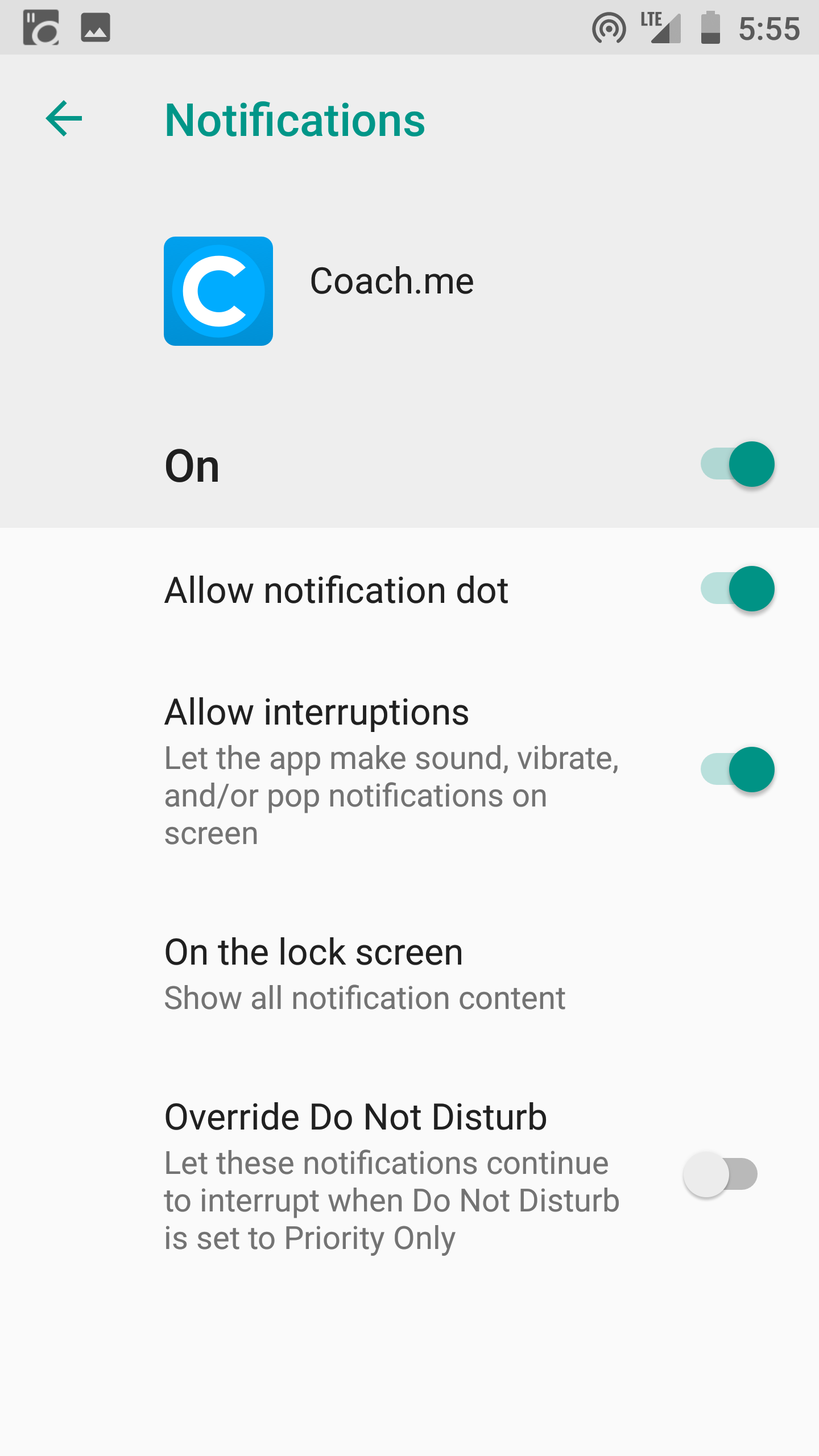
The use of service workers allow the app to always have fresh content, which can be downloaded in the background, and to provide support for push notifications, which offer greater re-engagement opportunities.
Also, sharability makes for a much nicer experience for users that want to share your app, as they just need a URL.

Benefits

So why should users and developers care about Progressive Web Apps?
  1. PWA are lighter. Native Apps can weigh 200MB or more, while a PWA could be in the range of the KBs.
  2. There’s no native platform code
  3. The cost of acquisition is lower (it’s much more difficult to convince a user to install an app than to visit a website to get the first-time experience)
  4. Significantly less effort is needed to build and release updates
  5. They have much more support for deep links than regular app-store apps

Core concepts

  • Responsive: the UI adapts to the device screen size
  • App-like feel: it doesn’t feel like a website but rather like an app (as much as possible)
  • Offline support: it will use the device storage to provide an offline experience
  • Installable: the device browser prompts the user to install your app
  • Re-engaging: push notifications help users re-discover your app once installed
  • Discoverable: search engines and SEO optimization can provide a lot more users than the app store
  • Fresh: the app updates itself and the content once it’s online
  • Safe: it uses HTTPS
  • Progressive: it will work on any device, even older one, even if it has fewer features (e.g. just as a website, not installable)
  • Linkable: it’s easy to point to it using URLs

Service Workers

Part of the Progressive Web App definition is that it must work offline.
Since the thing that allows the web app to work offline is the Service Worker, this implies that Service Workers are a mandatory part of a Progressive Web App.
WARNING: Service Workers are currently only supported by Chrome (Desktop and Android), Firefox, and Opera. See http://caniuse.com/#feat=serviceworkers for updated data on the support.
TIP: Don’t confuse Service Workers with Web Workers. They are a completely different thing.
A Service Worker is a JavaScript file that acts as a middleman between the web app and the network. Because of this it can provide cache services, speed the app rendering, and improve the user experience.
For security reasons, only HTTPS sites can make use of Service Workers, and this is part of the reason why a Progressive Web App must be served through HTTPS.
Service Workers are not available on the device the first time the user visits the app. On the first visit the web worker is installed, and then on subsequent visits to separate pages of the site, this Service Worker will be called.
Check out the complete guide to Service Workers at https://www.writesoftware.org/topic/service-workers

The App Manifest

The App Manifest is a JSON file that you can use to provide the device information about your Progressive Web App.
You add a link to the manifest in every header on each page of your web site:
<link rel="manifest" href="/manifest.json">
This file will tell the device how to set:
  • The name and short name of the app
  • The icons’ locations, in various sizes
  • The starting URL, relative to the domain
  • The default orientation
  • The splash screen

Example

{ 
  "name": "The Weather App", 
  "short_name": "Weather", 
  "description": "Progressive Web App Example", 
  "icons": [{
    "src": "images/icons/icon-128x128.png",
    "sizes": "128x128",
    "type": "image/png" 
  }, { 
    "src": "images/icons/icon-144x144.png",
    "sizes": "144x144", 
    "type": "image/png" 
  }, { 
    "src": "images/icons/icon-152x152.png",
    "sizes": "152x152", 
    "type": "image/png" 
  }, { 
    "src": "images/icons/icon-192x192.png",
    "sizes": "192x192", 
    "type": "image/png" 
  }, { 
    "src": "images/icons/icon-256x256.png", 
    "sizes": "256x256", 
    "type": "image/png" 
  }], 
  "start_url": "/index.html?utm_source=app_manifest", 
  "orientation": "portrait", 
  "display": "standalone", 
  "background_color": "#3E4EB8",
  "theme_color": "#2F3BA2" 
}
The App Manifest is a W3C Working Draft, reachable at https://www.w3.org/TR/appmanifest/

The App Shell

The App Shell is not a technology but rather a design concept. It’s aimed at loading and rendering the web app container first, and the actual content shortly after, to give the user a nice app-like impression.
Take, for example, Apple’s Human Interface Guidelines’ suggestion to use a splash screen that resembles the user interface. This provides a psychological hint that was found to lower the perception that the app was taking a long time to load.

Caching

The App Shell is cached separately from the contents, and it’s setup so that retrieving the shell building blocks from the cache takes very little time.

Thanks for reading through this tutorial. There’s a lot to learn about this topic and the new browser APIs. I publish a lot of related content on my blog about frontend development, don’t miss it! 😀

Friday, January 26, 2018

Switching from iPhone 7 to Google’s Pixel 2 XL


The Google product lineup
I recently spoke to a friend who said he “didn’t care about what a phone looks like anymore — they’re all the same”. It’s true; pretty much every phone looks like the same cold, lifeless slab of glass and aluminium. Even Apple’s iPhones, once lauded for bringing hardware design to a higher level, have started to feel boring. It seems like the looks of a phone played a way larger role a few years ago. Now, we want a phone that works well and takes great photos.
Google’s announcement of the Pixel 2 phones, Google Homes, the creepy camera, the VR headset, their Pixel buds, speaker and laptop/tablet hybrid made me think of Dieter Rams’ work for Braun—although the great Teenage Engineering also popped up.
Rams has created or overseen the creation of numerous products for Braun. Most, if not all these products, have a certain elegance and timelessness, mostly due to their materials, the sparse use of colour and typography, and their ease of use.
Without lingering on it too much, I think this line of Google products is close to achieving the same thing. Their speakers and Home products look like furniture that will seamlessly blend into their surroundings. Their phones feel like—bear with me—a useful utility made for a human being, rather than a brick of computing power. From a product design point-of-view, the look of these products is an exciting development.
If you’re interested in reading more about Google’s hardware design, have a look at this article on Design Milk.

The Google Pixel 2 XL

On size and battery life

I’m not going back to 4.7”

One of my fears was that the phone would be too big. I’ve been an iPhone user since the iPhone 4 and have never chosen the larger model. After six weeks with the Pixel 2 XL, I don’t see myself going back to a small phone anytime soon.
While comparing the Pixel 2 XL to the smaller version, I noticed the difference in size between the two is minor. I’d say the Pixel 2 is more awkwardly sized than the XL version, and the XL gives you a lot more screen. It runs all the way to the edges, while the screen of the smaller version reveals larger bezels. Even if you have small hands, it might be worth holding both before deciding that a big phone is not for you. I worried it might slip out of my hands, but the Pixel 2 XL has an aluminium body and the matte coating provides more grip.
I’ve enjoyed the larger screen a lot so far. Reading articles on Instapaper’s black background is very immersive. The edges of the screen seem to disappear completely. With this phone I’ve done more reading in the Kindle app than I used to, and watching YouTube or Netflix in fullscreen is great.
Instapaper in fullscreen

One charge every two days

My iPhone 7 running iOS 11 was a shitshow when it comes to battery life. I had to charge it around 8pm every evening if I wanted to keep it on until bedtime.
The Google phone’s battery lasts me so long I can afford to forget charging it. On a full charge I can use it for at least a full day. That’s snapping photos and Instagram stories, sending messages on Telegram or Whatsapp, listening to podcasts for about an hour, a Headspace session, and reading an article or chapter of a book here and there. I’ll go to bed without having thought of charging the battery. When I wake up, it’s usually at 55%, lasting me another day before charging it the following evening.

From iOS to Android

Many friends mentioned being “locked into the Apple ecosystem”. For me, switching was as easy as or easier than switching from one iPhone to the other. The phone comes with a dongle you can plug into your iPhone. Within half an hour it has copied your contacts and whatever apps you’ve decided to keep, provided they are available for Android.
After switching I realised I’m more locked in to Google’s ecosystem than I am into Apple’s. I use Google Maps, Google Mail, and Google Photos, as Apple’s offering has sucked on those fronts for as long as I can remember. I only used iCloud to sync iA Writer documents between my phone and computer, but using Dropbox instead was a piece of cake.

Nifty details and customisation

I had a ton of duplicate contacts on my iPhone for whatever reason. Deleting them on iOS is a pain, so I never got around to it and accepted a contact list three times the size it should be. After importing all my contacts, the Google phone first asked if I wanted to merge all my duplicates in one tap. Aces! ✨
It’s details like those that make the Android OS a delight to work with. The control centre is customisable — I know, Apple also introduced that recently — and if the keyboard is not to your liking, you can choose a theme (light, dark, with or without button shapes) that better suits you. It listens to music playing around you and provides you with the song on your lock screen, which is scary and more convenient than I’d imagined. You can choose to set several widgets on your home screen; my calendar widget shows me my next upcoming appointment, if available.
If you feel like going all-in with customisation, you can tap the phone’s build number 10 times to enable developer mode. “You are now a developer!”, it’ll say, after which you can customise even more things, like the speed of animations. I won’t encourage messing too much with those, but the fact that the OS has numerous ways of customising it to your personal preference is a big plus.

Squeeze for help

The Google Assistant — which you can bring up by long pressing the home button or squeezing the phone — is a gazillion times better than Siri. I actually use it now and, occasional screw ups aside, it’s very accurate. Also, you can squeeze the phone to bring up the Assistant!
😏
At home I use a Chromecast Audio to stream music to my speakers. Pairing it with an iPhone was pretty OK, although it did force me to turn Spotify or wifi on/off on a regular basis. With the Google phone, connecting is instant and I haven’t had any problems. I wouldn’t expect otherwise from one Google product talking to the other, but it’s nice nonetheless.

Swiping and squeezing

Fingerprint sensor and NFC payments

The fingerprint sensor is on the back, conveniently placed for your index finger. Swiping down on the scanner brings down the notification/control centre. When the phone is on its back, you don’t have to pick it up to see your notifications. Double tap the screen to light up the lock screen and see if you have any. The way notifications are displayed on the lock screen minimises my urge to open apps, which is a plus.
Photo: Mark Wilson (Fast Co Design)
The phone has a built in NFC chip, so I can now use it to pay at PIN terminals. I had to install an app from my bank to enable it. After that I could hold it near a terminal once the cashier had entered the amount. It has proven to be quicker than pulling a card out of your wallet, and it has worked without fault almost every time.

Photos of my food have never looked better

The camera is great. I’ve taken some photos in low light and they come out very well. It has a Portrait Mode, which blurs the background and leaves you with a nice portrait. Much has been said about the difference between Google and Apple’s portrait mode (one being software-based while the other is created by hardware), but I don’t see or care much about the difference. I’m not going to use this phone for professional photography. I just want to take a nice picture of my girlfriend or a plate of food now and then, and it more than does the job for that.
A photo in low light and Portrait Mode used on a bowl of ramen

Google Lens

The camera has Google Lens integrated. Snap a photo, hit the Lens button and it will try to find whatever it sees in the photo. Again, this works very well and has been convenient for looking stuff up now and then. It’s also built into the Google Assistant, allowing you to open the camera and tap anything you’d like to find more information about. See below.
Google Lens integrated into Google Assistant ✨

A note on apps

The only apps I’ve missed so far are Darkroom, for editing photos, and Things, for my to-dos. Luckily, Things recently added a feature that allows you to email tasks to your to-do list, so that helps. It’s a bit of a bummer that I can’t look at my to-dos on my phone — and judging by Cultured Code’s development speed, an Android app might be scheduled for 2022 — but it’s not that big of a deal. For editing photos I’ve simply switched back to VSCO.
I used iMessage with my girlfriend and 6 other friends, and have switched to Telegram or Messenger with them. This might be a hassle if you’re all-in on iMessage, but it was hardly an issue for me.
Google’s apps are high quality and I enjoy using them. Some apps from third-party developers have proven to be a little less great than they are on iOS. Instagram’s compression on videos taken with an Android phone is lousy, for whatever reason. Instapaper crashes more often than I’m used to, and it expresses the time it takes to read an article in a range of dots instead of minutes. I have no idea why an Android user would prefer that. Goodreads is an absolute mess on Android, but that’s no surprise.
Watching videos on YouTube in fullscreen is glorious 👌
I’ve found a worthy replacement for the iOS Podcasts app in Pocket Casts. For email and my calendar I use Outlook — which is basically Sunrise, rest in peace—and I’ve been keeping my notes in the great Dropbox Paper more often. The Twitter app on Android is fine (as it is on iOS). Google’s Inbox is great for email too.
Overall, the Material Design language does make well-designed apps more fun and immersive to use. As Owen Williams put it:
Apps are full of color, playful animation and fun design flourishes. Where iOS has become flat, grey and uniform, Google went the opposite direction: bright colors, full-on fluid animations and much, much more.
Aside from this, apps are able to integrate more closely with the OS. A good example of this is that Spotify, Sonos or Pocket Casts can show on your lock screen persistently, allowing you to skip or pause playback. Overall, I’m finding the Google ecosystem to be much more pleasant to work with than Apple’s, and agree (again) with Owen that Google is eating Apple’s ecosystem for lunch.

TL;DR — I am very happy with this phone

The Google phone is here to stay. I’m not tempted to go back to iOS, as I haven’t missed it since I switched. If you’re considering making the switch, I’d fully recommend the Pixel 2 XL 🔁
I’m currently tempted to purchase a Google Home Mini and might even replace my Apple TV (which has mostly been an expensive disappointment) with a Chromecast. Slippery slope.
I look forward to see what Google will do on their next iteration!

Interested for our works and services?
Get more of our update !