Programming & IT Tricks . Theme images by MichaelJay. Powered by Blogger.

Copyright

Facebook

Post Top Ad

Search This Blog

Post Top Ad

Responsive Ads Here

Archive

Post Top Ad

Contact


Editors Picks

Follow us

Post Top Ad

Fashion

Music

News

Sports

Food

Technology

Featured

Videos

Fashion

Technology

Fashion

Label

Translate

About

Translate

Sponsor

test

Weekly

Comments

Recent

Connect With us

Over 600,000+ Readers Get fresh content from FastBlog

About

Showing posts with label Ui Ux Design. Show all posts

Friday, February 2, 2018

The Future of Light


The body clock is influenced by changes in light throughout the day. Photo by Den Heslop.
Edison’s commercialization of the electric light bulb quite literally changed the world. His technology helped enable the power grid, modern transportation, and ultimately the lifestyles we enjoy today. Lighting improved gradually over the last century until the recent mass adoption of LEDs.
As LED lighting goes mainstream, we face new challenges. You can no longer 
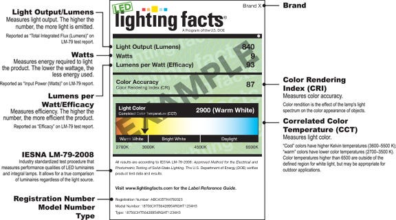
buy a 60 Watt bulb. Instead, you have to dive deep on CCT, CRI, lumens, and other jargon. There is an increased awareness of the risks of blue light coupled with unwarranted demonization of the new technology. The lighting industry as a whole faces stagnation.
How do we get out of this mess, and where do we go from here?

The LED Revolution

Red and green LEDs have been around for about 50 years, mostly confined to use as indicator lights in electronics. In the early 90s, three Japanese researchers at Nagoya University and Nichia Chemical created the first blue light emitting diode (LED) from gallium nitride (GaN).
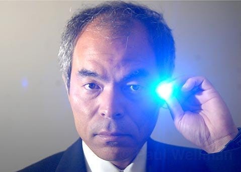
One of the blue LED inventors, Shuji Nakamura. Photo by Ladislav Markuš.

The discovery by Nobel recipients Isamu Akasaki, Hiroshi Amano, and Shuji Nakamura was significant because blue light can be converted to white light by means of a phosphor material. The phosphor material, for example yttrium aluminium garnet (YAG), is generally yellow in color and sits atop the LED die material.
In the mid-2000s, companies started packaging blue LEDs and phosphors into bulbs and other light sources. These early products were expensive ($20-$50 for a bulb) and largely had problems with color consistency, heat, and lifetime.
Today, you can buy an LED bulb for about $1.50.
The cost of components dropped, along with increases in performance. According to Haitz’s law, the cost per lumen (an amount of emitted light) decreases by a factor of 10 each decade.
Today, you can buy an LED bulb for about $1.50. That bulb has better color performance than its swirly compact fluorescent equivalent, and lasts 10,000–20,000 hours. Other LED sources can last significantly longer (50,000–100,000 hours). By contrast, an incandescent bulb may last 1,000–2,000 hours.
LED lamps are not far off in price from incandescent lamps at the point of sale. But their long lifetimes and low power usage mean you can save significantly more. Over the life of a cheap LED bulb, you will pay about $12, including the purchase price and energy. Five 60 Watt incandescent bulbs would cost about $78 over the same period of time. And don’t forget that you have to change the bulb five times instead of just once.


You probably wouldn’t know it, but this trendy Edison-style bulb is LED. Photo by IKEA.

Efforts have been made to phase out the sale of incandescent bulbs in numerous countries. Even though legislation has not passed in some places, the lighting industry has largely moved on to LED anyway. IKEA became the first large retailer to sell only LED lighting in 2015, and others are making similar moves.
The efforts are working. According to the U.S. Department of Energy, LED market penetration was 12.6% in 2016. That’s up from just 3% in 2014.

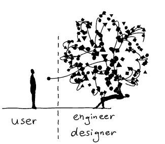
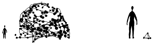
Massive Choice, Massive Confusion

All is not well. LED had its moment of differentiation, but now it’s largely a race to the bottom in price. That $1.50 bulb purchase will happen one-fifth as often, breaking old business models. The old stalwarts struggle to compete with new discount-oriented brands.
General Electric, the company Thomas Edison founded, plans to sell its bulb business due to low profit margins.
People just want their 60 Watt bulb back, energy savings be damned.
It’s not even all that great for consumers. That LED bulb is cheap, but you probably don’t really know what you’re getting. The Home Depot and other retail outlets don’t do a good job of explaining color temperature (CCT), lumens, and color rendering index (CRI). Manufacturers fuel the confusion with misleading terms like “soft white” and “bright white.”
Early LED products were plagued with reliability issues and ugly color, further contributing to the stigma.
Oh, you want to use that bulb with your existing dimmer? Forget about it.
All of this leads to mass dissatisfaction. And dissatisfaction results in returns, which does not help the already low-margin consumer lighting business. People just want their 60 Watt bulb back, energy savings be damned.
Things are a bit brighter in the commercial sector. LED fixtures are available in a million shapes, sizes, and colors. Energy and maintenance costs are drastically reduced, improving a building’s bottom line.
Most commercial LED fixtures have no lamps to replace. They are intended to last until the next renovation. Barring any electronics failures, LEDs don’t “burn out.” They just get dimmer over time.


The Lighting Facts label is now found on most lamps. But it is still not clear enough for the everyday user. Image by DOE.

But the B2B sector also has its issues. Lighting controls are increasingly requested, and in some cases even required by law. Very few manufacturers make all the components of a lighting system, leading to incompatibilities. Even when the stars align, it can be extremely costly and time-consuming to commission the system as intended.
The DLC standard focuses so much on energy efficiency that it may ultimately impair quality of light. California, historically the most progressive state in energy regulations, has fought back, putting a higher emphasis on color performance than energy. LEDs are efficient enough, they say. But the state is now under scrutiny for overriding federal energy efficiency regulations.

Blue Light Blues

At the same time, we have become aware of the effects of light on the human circadian rhythm. There’s debate about the nuances, but in general, you can sleep better and perform better when there is significant blue light during the day and very little at night.
In addition to the rods and cones, there is a third type of photoreceptor in our eyes that is only sensitive to blue light. Instead of contributing to vision, these cells tell the body clock when it is daytime and when it is not.
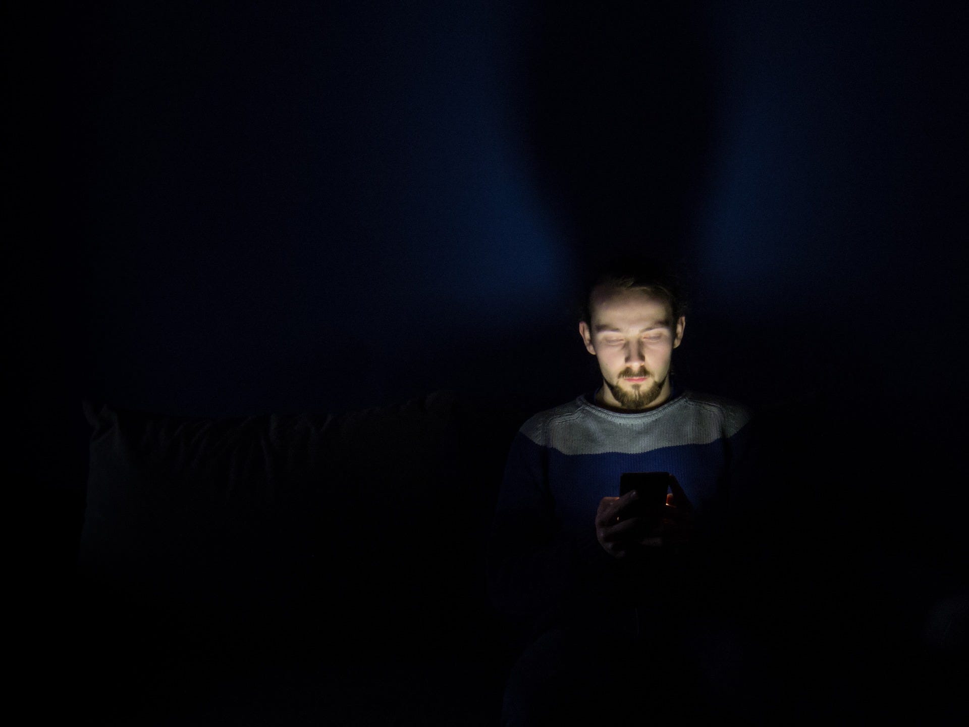
This mechanism worked well up until the last 150 years or so, before electric lighting became ubiquitous. The same lighting found in our homes and electronic devices can trick the body clock into thinking it’s daytime when it is really not.
It’s not like the issue is limited to academics. People are aware of the effects of blue light, and want solutions.
Circadian rhythm disruption may seem like a first world problem, less important than public health issues related to malnutrition and poverty. But it has been linked to breast cancer, Alzheimer’s disease, and other conditions. Additionally, shift work and frequent time zone hopping can contribute to accidents on and off the job, as well as inconsistent menstrual cycles in females.
Apple is the only household name to have taken a significant stance on this problem, with the introduction of Night Shift on iOS in early 2016 and on MacOS in 2017. Night Shift changes phone and computer screens to an orange hue at night, reducing the blue light content. Even then, the feature is not enabled by default and not widely advertised by the company.
Anecdotally, I was in an Apple Store recently. A little old lady came up to one of the employees and asked how to get the orange light back on her phone. It’s not like the issue is limited to academics. People are aware of the effects of blue light, and want solutions.


Usage of blue-light emitting displays at night can disturb the body clock. Photo by KristopherK.
The lighting industry, in general, has made little progress in providing straightforward products that address circadian disruption. The specification community, which includes lighting designers and architects, is begging for systems that support their latest human-centric designs. But their pleas mostly fall on deaf ears.
The industry’s arguments du jour against human-centric lighting circle around: not enough research, disagreements on the spectrum of light, and complexity of integrated systems. In my opinion, these are excuses to avoid pioneering in an unverified market.
The lighting giants are blind to the potential of human-centric lighting to differentiate their businesses. There is room for someone to come in and make a big splash.

Circadian Lighting

Several upstarts have created a category that I call circadian lighting. Broadly speaking, circadian lighting shifts in color and brightness automatically throughout the day. The morning begins with a warm, dim glow, giving way to cool, bright light during working hours. In the evening, the lighting shifts back to a warm glow. It’s a lot like f.lux and Night Shift, but for your environment.
One of the most notable startups in this category is Ketra, which makes a circadian lighting system that can be installed in the home and commercial environments. It’s not particularly affordable, but the Ketra system is the most complete and ready-to-go out of the box circadian lighting solution at the moment.


Not only does circadian lighting match the science, but it also just feels right. Cool, relatively bright lighting during the day makes the indoor environment seem more like outside. In the evening, dimmer, warmer light promotes relaxation. Waking up in the middle of the night, only very dim light is needed to guide the way. Otherwise, the light would startle.


Honeybrains, a health-focused fast casual restaurant in New York City, featuring circadian lighting by Ketra.
Ketra’s offering is by far the most impressive, but there are signs of light from other manufacturers. Philips offers an LED bulb for about $6 that can change between three color settings (dim and warm at night, normal bright incandescent, and cool, bright white for the day) simply 
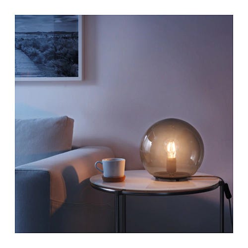
by flicking a switch. IKEA has something similar but with wireless remote controls and dimming for $27.
These products can only be controlled manually, and thus are not true circadian lighting. But they are something you can buy today for not a lot of money to get a glimpse into the future.

Light Tuned to You

Circadian lighting sounds great, but what about all the other factors that can influence the circadian rhythm? What about food, social events, caffeine, alcohol, stress, and travel?
A lighting system is unlikely to counteract circadian disruption completely. However, if it knows about your circadian state, the lighting could help normalize the body’s cycle of sleep and wake.
The lighting in your environment would always be the right light for you.
Let’s say you’re traveling to Tokyo in a week. Your destination is 13 hours ahead of Eastern Daylight Time. Instead of throwing your circadian rhythm into a complete 180 upon arrival, circadian lighting could help you shift to the new time zone in the days leading up.
Or you’re a shift worker on the night shift. But you also have weekend activities planned with your family, most of which take place during the day. Circadian lighting could help reduce the grogginess associated with rapidly changing sleep patterns.


Circadian lighting could reduce the symptoms of jet lag. Photo by Jon Tyson.
What if the lighting in your home, car, office, and gym was tuned to your circadian rhythm? What if the light at your desk was different from the light at your neighbor’s desk? What about the lighting in your airplane seat and the hotel room or Airbnb thousands of miles away?
What if the lighting system knows not only that someone is present in a room, but also who that happens to be? The lighting in your environment would always be the right light for you. You never would have to do much more than dim the lights, and maybe not even that.

Building the Killer App

LED lighting quickly moved from an expensive toy for early adopters to a cheap commodity. Now there is room for a killer app, and I believe advanced, connected circadian lighting is the answer.
A great product is simple, understandable, and affordable.
The pieces of the puzzle already exist to make all of this happen. A combination of GPS and an indoor positioning system can pinpoint your precise location anywhere in the world. Info about your sleep hygiene could come from a Fitbit or smartwatch. A phase response curve would be applied to shift your circadian rhythm by the amount appropriate at any given time.


Estimote sells an indoor positioning system solution that could be integrated with lighting.
Whoever builds a circadian lighting solution will recognize that it is no easy feat. It takes an understanding that a great product is simple, understandable, and affordable. It takes the right people working toward a uniform, opinionated vision.
We’ve seen the potential of circadian lighting to positively impact people’s lives. The awareness is there, and will continue to grow.
Now we’re just waiting for the right solution.

Source :Hacker Noon

Tuesday, January 30, 2018

Designing beautiful mobile apps from scratch


I started learning graphic design when I was 13. I learned to design websites from online courses and used to play around with Photoshop and Affinity Designer all day. That experience taught me how to think like a designer.
I’ve been designing and developing apps for almost a year now. I attended a program at MIT where I worked with a team to develop Universeaty. Two months ago, I started working on a new app, Crypto Price Tracker, which I launched recently on 28th January.
In this post, I’ll share the step-by-step design process I follow along with examples of the app I worked on. This should help anyone who wants to learn or improve upon their digital design skills. Design is not all about knowing how to use design software, and this post won’t teach you how to use it. There’s hundreds of good quality tutorials online to learn. Design is also about understanding your product inside out, its features and functionality, and designing while keeping the end-user in mind. That’s what this post is meant to teach.
Design Process:
  1. Create a user-flow diagram for each screen.
  2. Create/draw wireframes.
  3. Choose design patterns and colour palettes.
  4. Create mock-ups.
  5. Create an animated app prototype and ask people to test it and provide feedback.
  6. Give final touch ups to the mock-ups to have the final screens all ready to begin coding.
Let’s start!

User-Flow Diagram

The first step is to figure out the features you want in your app. Once you’ve got your ideas, design a user-flow diagram. A user-flow diagram is a very high level representation of a user’s journey through your app/website.
Usually, a user flow diagram is made up of 3 types of shapes.
  • Rectangles are used to represent screens.
  • Diamonds are used to represent decisions (For example, tapping the login button, swiping to the left, zooming in).
  • Arrows link up screens and decisions together.
User-flow diagrams are super helpful because they give a good logical idea of how the app would function.
Here’s a user-flow diagram I drew when I started out working on the design of my app.
User-flow diagram for the Main Interface.

Wireframes

Once you’ve completed the user-flow diagrams for each screen and designed user journeys, you’ll begin working on wireframing all the screens. Wireframes are essentially low-fidelity representations of how your app will look. Essentially a sketch or an outline of where images, labels, buttons, and stuff will go, with their layout and positioning. A rough sketch of how your app will work.
I use printed templates from UI Stencils for drawing the wireframes. It saves time and gives a nice canvas to draw on and make notes.
Here’s an example wireframe.
Wireframe for the Main Interface.
After sketching the wireframes, you can use an app called Pop and take a pic of all your drawings using the app and have a prototype by linking up all the screens through buttons.

Design Patterns and Colour Palettes

This is my favourite part. It’s like window-shopping. Lots of design patterns and colour palettes to choose from. I go about picking the ones I like and experimenting with them.
The best platforms to find design patterns are Mobile Patterns and Pttrns. And to find good colour palettes, go to Color Hunt.

Mock-ups

This is when you finally move on to using design software. A mock-up in the design sense is a high-fidelity representation of your design. It’s almost like you went into this app in the future and you took some screenshots from it. It should look realistic and pretty much like the real thing.
There are design software and tools for creating mock-ups. I use Affinity designer. The most commonly used tool for iOS design is Sketch.
Here’s an example of some of the early designs of my app.
Bringing the pencil drawing to pixels!
I experimented more with various colour palettes.
I shared the initial mockups with my friends for their feedback. A lot of people seemed to like the gold gradient and black scheme.
Be willing to take feedback and experiment with new suggestions! You’ll find amazing ideas come from your users when you talk to them, not when you frantically scroll through Dribbble or Behance.
So I redesigned the mock-up and removed the background graphs because generating them was a technically time-consuming process and they reduced readability. This is what the redesigned mock-up looked like.
Gold gradient with black surprisingly looks good!
I was pretty satisfied with the colour scheme, icons on the tab bar, and overall layout. I went ahead and designed the rest of the screens following the same design guidelines. It was a long, but surely fun process!
Once all of my screens were ready, I put together a prototype in Adobe XD and asked a few friends to experiment and give feedback.
After final touches and such, this is what my final design looks like.
The Main Interface!
After all the screens were completed, I imported them into Xcode and began coding the app.
That’s it! I hope this post will help you get started with app design or help you become a better designer. And if you like my app, you can download it here.
I’m ending the post with one of my favourite quotes about design.
“Design is not just what it looks like and feels like. Design is how it works”
-Steve Jobs

Make me think!


the design of complexity

Until recently everyday objects were shaped by their technology. The design of a telephone was basically a hull around a machine. The task of the designers was to make technology look pretty.
It was up to the engineers to define the interfaces of those objects. Their main concern was the function of the machine, not its ease of use. We — the “users” — had to figure out how they worked.
With every technological innovation our everyday objects became richer and increasingly complex. Designers and engineers simply burdened the users with this increase in complexity. I am still having nightmares trying to get a train ticket from the old BART vending machines in San Francisco.

From complicated to simple

Fortunately, UX (User eXperience) designers have found ways to design beautiful interfaces that are easy to use. Their process can resemble a philosophical enquiry, where they constantly asks questions such as: What is this really about? How do we perceive this? What is our mental model?
Today, as a result of their efforts, we interact with wonderfully designed interfaces. Designers have been taming complexity for us. They make extremely sophisticated technology appear simple and easy to use.

From simple to too simple

And easy sells well. Thus more and more products are based on the promise to make our lives easier by using increasingly complex technologies with ever simpler interfaces.
Just tell your phone what you want and things will appear magically — whether it is the information on a screen or a package delivered to your doorstep. A gigantic amount of technologies and infrastructure is domesticated by brave designers and engineers who make all this work.
But we don’t see — let alone understand — what is going on behind the scenes, behind the simple appearance. We are kept in the dark.
You should see me whining like a spoiled brat when a video call is not working as smoothly as expected — all those interruptions and the bad sound quality! An experience which would have appeared nothing short of a miracle to people just 50 years ago and which requires the operation of a colossal infrastructure has become an expected normality for me.
We fail to appreciate and to empathise because we don’t understand what is going on.
So does technology makes us dumb? This question isn’t really new. Famously Plato warned us about the detrimental effects of writing — which we know of because he wrote them down.

The problem with “user centered” design

In his excellent book “Living with complexity” Donald Norman offers numerous strategies for how designers can harness the design of complexity to improve the user experience.
And there lies a problem.
I am increasingly wary of the term “user centered design”. The word “user” has a second meaning — “consumer of drugs”— which implies dependance, short-sighted gratification and a reliable source of income for the “dealer”. The word “centered” excludes pretty much everyone and everything else.

A holistic approach to complexity

As an alternative we should widen our perspective and ask questions such as:
Empowerment: Who’s having the fun?
Maybe being able to speak a foreign language is more fun than using a translation software.
Whenever we are about to substitute a laborious activity such as learning a language, cooking a meal, or tending to plants with a — deceptively — simple solution, we might always ask ourselves: Should the technology grow — or the person using it?
Resilience: Does it make us more vulnerable?
Highly sophisticated systems work flawlessly, as long as things go as expected.
When a problem occurs which hasn’t been anticipated by the designers, those systems are prone to fail. The more complex the systems are, the higher are the chances that things go wrong. They are less resilient.
A chronic dependance on a combination of electronics, artificial intelligence and a high speed internet connection for the simplest tasks is a recipe for disaster. It makes our lives more complicated, especially when we don’t understand what is going on behind the deceptively simple interface.
Empathy: What is the impact of simplification on others?
Our decisions have consequences for ourselves and others. A simplified appearance can make us blind to those consequences.
Our decision what smart phone to buy or what to have for dinner has a huge impact on other living beings. Knowing about the complexity behind such a decision can be of tremendous value. We need to know things better if we want to be better.
Embracing complexity
Simplification is a powerful design strategy. Naturally the button to make an emergency call should be as simple as possible. And yet, we also need further design strategies that help us accept, understand, and interact with complex situations in our lives.

Sunday, January 28, 2018

The User Experience of Lootboxes


I hope you like GIF’s. I brought GIF’s.

Disclaimer: In real life, when I’m not pretending I know how to write, I work for a gambling company here in Australia. This means that lootboxes — gambling — in video games is a unique point of interest for me. I’m not a gambler in any sense, but I deal with the industry on a daily basis. I think this gives me a unique perspective on the topic, and I want to be up front about where I’m coming from when I talk about it.
I believe gambling is much like drinking or smoking — it’s harmful to millions of people, and requires a significant effort by both gambling corporations and governments to regulate the medium effectively. I also, however, believe that just like drinking and smoking, it is an adults choice to participate in any form of gambling.
In gaming, gambling takes a different tone. There are very, very few barriers in most games for minors to participate in lootboxes, which absolutely are gambling. I believe there is an inherent ethical responsibility on any developer or publisher to put safeguards in place to protect kids. I also believe that it is the governments responsibility to enforce strict regulations on developers on how, and when, they institute gambling systems in games.
The views expressed in this article do not reflect the views of Tabcorp in any way. These are my own personal opinions.

I hope you like GIF’s. This article has a few.
Lootboxes were the number one gaming story of 2017. More specifically, games like Star Wars Battlefront 2 — a relatively good game in it’s own right that was significantly hampered by it’s extremely heavy-handed micro-transaction system.
I don’t want to dwell on the ethics or merits of these systems (I’ve done that enough in the disclaimer), but what I do want to talk about is how — from a UX perspective — these systems work and affect players.
I will say, however, that I unequivocally do not support games that put gameplay upgrades (especially those that grant power in a competitive setting) behind a paywall — commonly referred to as pay-to-win. I’m talking about games like FIFA Ultimate Team, Star Wars Battlefront 2, and to a lesser extent, Fortnite. Players shouldn’t have to pay money to have a better experience than other players.
There’s some key techniques successful lootboxes use to create an exciting opening experience — let’s see what they are:

Artificial Scarcity

Rarity is a massive driver in games. As soon as something is rare, it becomes intrinsically valuable to a player. This makes sense in the real world — there’s not much gold, so that which exists has value. In the digital world, everything is only as rare as a developer makes it.
Lootboxes often use thematic visual changes to represent time gates on certain boxes. Card packs or crates that are only available for certain periods have a unique style, so you feel as though you need to get it now, or you’ll miss out. This combines a sense of urgency and rarity — something that can powerfully influence a players’ decision to purchase.
Hearthstone’s extra touch — mousing over an unrevealed card gives you a glimpse of it’s rarity.
‘The Old Gods’ expansion features Lovecraftian-style packs.
Hearthstone is a good example of this. Each new expansion has it’s own card-pack style. It makes them feel special, and also gives that message that they’re new, or limited.
‘Knights of the Frozen Throne’ took a frostier route.
Hearthstone doesn’t remove these card packs for purchase, so there is technically no urgency (other than the need to have the best cards to stay competitive, of course), but the visual styling still motivates purchases.
EA Sports FIFA series actually does this a bit better. Their Ultimate Team mode has card packs that players can purchase (more on that later) that award football players for your teams.
This is an extreme example, but many players will genuinely have 6–8 versions in the game, most of which are time-sensitive rewards.
EA releases new, upgraded versions of players every week, alongside with regular events throughout the season. If you don’t buy packs that week/event, you can’t get that version of the player.
It’s very, very effective when your favourite player has a special edition card that you want. I may or may not have been brainwashed by this trick. More than once. Like, a lot, actually.

The Drumroll

Early lootboxes were simple — purchase me and get some loot. A few years ago, though, things got a little complex. Lootboxes started opening with some fancy graphics and cool effects. A big shift was what I call the drumroll. It’s that moment between clicking ‘Open’ and finding out what you’ve got, where often the box will reveal something about your rewards.
I’ve opened hundreds of these, but only just noticed that the box has disappeared when the camera comes back down…
This Overwatch box is a great example. There’s a moment where the rewards are spinning through the air and you catch a glimpse of the rarity of what you’re getting. When you see the orange glow of a legendary skin, it’s exciting and builds anticipation. Likewise, if you open 20 boxes and don’t get to see that orange hue, there’s tangible disappointment.
FIFA does this well, also. When you open a pack, the animation changes depending on the best player you recieve. Take a look at the three animations below:
A pack with a gold-ranked, non-rare player.
A pack with a gold-ranked, rare player.
A pack with a gold-ranked, rare, high-rated player.
The first two are relatively subtle, but even from the first moment of opening there’s some additional gold effects and a slightly different split effect for the rare opening.
The third opening is referred to as a ‘Walkout’ in the community — it’s reserved for highly rated players, and the player animation is personalised to one that player is known for in real life. When the billboards pop out of the pack, you immediately know you’re up for a good player. If that player jumps on screen, you’ve got one of the best in the game.
The excitement in these effects don’t start at the reveal, however. The excitement builds from the moment the pack starts to split and you recognise the unique effect that tells the player they’re in for something good.

The Big Reveal

As you might expect, the grand reveal is the most important part of any lootbox. This is where the player experiences limitless euphoria or bitter disappointment.
Ironically, there’s not too much to say about this. The boxes we’ve looked at so far are great examples of fun reveal moments; Hearthstone’s slow card-turn, FIFA’s staggered reveal of country, then position, then team, and finally the player’s name and portrait.
So, to change things up, let’s look at a few that I think are bad at this:
The infamous lootbox of Star Wars Battlefront 2
Star Wars Battlefront 2 drew so much ire in 2017 for offering powerful player upgrades in their lootboxes. They got slammed for this choice and, in turn, made some changes. It didn’t mean much though. What’s staggering is that despite this huge focus on a microtransaction model, the animation sucks. The holographic reveal has no impact, the color codes aren’t vibrant or exciting, and most packs came with intangible junk anyway. Boring.
I don’t remember this scene from Saving Private Ryan.
Call of Duty WWII had you call in ‘Supply Drops’ in a player populated hubspace between matches. This was a pretty transparent mechanism to show players who weren’t buying boxes just how much fun everyone else was having with their loot. The card flip lacks impact for me, and there’s no real drumroll beyond waiting for the cards to turn. Not great.
No Llamas were harmed in the making of Fortnite. Or so I’m told.
Aesthetically, I actually really like Fortnite’s loot-llamas. It’s also a relatively generous loot model, although it loses any possible browny points by having tangible upgrades locked behind purchasable lootboxes. Overall, it’s a creative execution that lacks any punch. The loot slows down the rarer it is, which actually feels more tedious than it does exciting.
That’s a big box for a little gun, Sergeant.
Battlefield 1’s crates are a prerendered animation followed by a static image of the weapon skin you get. It’s kind of cool the first two or three times, but once that delight wears off it feels more like an afterthought. Snore.

The Power of Choice

Something that’s come up relatively recently is giving players choices in their loot. There isn’t too many examples of this, but I did want to showcase a few games that use this technique. I think it’s a fun, pro-player way to create additional engagement in these sort of random drop systems.
Using the card backs to display rarity and type is a nice twist on a drumroll mechanic.
When you get a ‘Keg’ in Gwent, the fifth card in the pack is one you choose from a set of three. This is a great way to solve an ongoing problem with TCG games, where players rarely have the ability to purchase specific cards ad-hoc.
In Fortnite, at a certain tier of loot, the rarest item in a lootbox will be given to the player as a choice of two equally rare items. This is often between two weapon types, or two new heroes. It’s a nice way to make the loot more meaningful to the player, as they can choose something relevant to them.

In closing, I’d just like to say that lootboxes, for the most part, are completely evil.
I actually really like microtransactions as a concept. I think it’s a good way for developers to generate ongoing revenue and can be done in a way that doesn’t negatively impact the game, or the playerbase.
I also acknowledge that this concept has existed pretty much since Magic: The Gathering got big. Trading Card Games are almost exclusively built around a random-pack model (although the ability to trade cards mitigates this by creating a secondary market).
Furthermore, I admit that lootboxes when done right can be really fun. I quite like Overwatch’s interpretation — you earn them through standard gameplay, they only contain cosmetics, and you are rarely encouraged to make a purchase. There’s even a recovery mechanic in place so that you can outright purchase items you haven’t been lucky enough to recieve (Although this could be better).
But lootboxes, like booster packs, are gambling. They just are. And it’s a shame that such a large part of the industry (Including our two biggest publishers, EA and Activision Blizzard) are not so deeply entrenched in these systems as a way to sustain their games.
If you’re going to do lootboxes, please, fill them only with cosmetics. Having upgrades that affect gameplay in a randomised system compromises the integrity of your game, and forces players to choose between investing or being at a disadvantage.
There’s a right way and a wrong way to make systems like these work. There’s also a fun way. I don’t think lootboxes are going anywhere, but hopefully they’re going to get better.

Saturday, January 27, 2018

Designing Atlis, the future of local search


How Rainfall approaches all clients as an extension of their team.
Atlis is the next generation of local search, a platform where its community can get real, personalized recommendations for almost any type of business simply by asking. In essence, Atlis has brought word of mouth recommendations to the digital space by rewarding quality interactions from its users with cash, status, and most importantly a trustworthiness score.
When Rainfall was first approached by Atlis in the Spring of 2015, that product vision had not yet been created, or in better words, discovered. The story of our partnership is a journey that includes the creation of a product, a brand, and a new behavior from scratch through constant iteration, testing, and deployment.
Our approach to the next generation of branding
At Rainfall, we call projects like Atlis “full brand expressions” because we have the ability to affect every visual element and touchpoint, not only defining the rules for how the brand is presented, but literally designing each and every component in company’s suite whether it’s printed, on the web, or in the product itself.
When developing any large system we design multiple pieces simultaneously in order to test ideas on a broad scale. Sometimes a particular approach will work well in one situation but not adequately characterize the overall language of the brand. Working holistically allows us to spot those situations and find effective solutions earlier in the creative process.
Creating a full expression involves understanding how the visual language works as part of the narrative fabric without interrupting the audience’s ability to engage. This is especially true in the digital space, as each platform serves a higher purpose than simply communicating the brand’s visual identity. Atlis’s interaction model and methods for information hierarchy are themselves components of the identity, so on the web and in the product those elements are of highest importance.
Here’s a look at what we created together with Atlis.

The Atlis Visual Identity

Atlis helps users make decisions

At the start of our engagement Atlis existed as a big idea and a product MVP. The working idea was that they could be the ultimate platform for users to get trusted recommendations for businesses through a network of their peers. At the time the mechanism for bringing that idea to live was not yet complete, but there was a strong enough narrative structure in place that we could strategically build a brand, a “favorite” between two options.
The Atlis logo, a heart between two dots, symbolizes the platform’s aim to help it’s users make informed decisions when given multiple options. It is quite simply the love that one shows for one business over another. This mark fits with the company’s aim to strike friendly relationships with both consumers and businesses in order to create a platform that is mutually beneficial.

The Badges

At this point Atlis had a visual presence but lacked the personality required to excite its audience and encourage them to engage. As part of a larger strategic exercise in gamification we developed a series of badges to reward users for their participation and become the face of the brand.
We considered all of the individuals that compose the fabric of an urban neighborhood to conceptually link each badge to a stage in one’s knowledge of the businesses nearby. Each badge memorializes the journey of discovery while also putting a face on Atlis.

The Atlis Product

Central to Atlis is its mobile product, the main platform on which community members ask for advice finding businesses or respond to others with their own recommendations. As a concept the experience design is simple. There is a flow to ask for advice, a flow to view and respond to other users’ asks, as well as the necessary user and business profiles.
What started as a simple task of designing each of these flows developed into an approach of constantly iterating to optimize interaction and effectively display large amounts of supporting information.
The Ask Flow
#AskAtlis was a term coined early in the project that embodied the ease by which users would seek information. Our job was to deliver on that promise of ease by making the Ask flow as effortless as possible.
In early versions an Ask was just one step. The user would define what type of business they were looking for, write a brief supporting question, and confirm the preferred location all at once. While this seemed easiest we found that breaking that process into three focused steps resulted in a greater number of Asks and better insight into specifically what users were looking for.
The Response Flow
With over 20,000 users, recommendations begin to roll in almost immediately. Asking is only half of Atlis’s equation, and our main concern when testing the concept was that no one would respond as those Asks came in. Our approach was to make responding just as easy as asking, but with the added support of contextual information. When users opt to provide a recommendation Atlis suggests businesses that they have previously recommended or visited aided with additional context clues such as time of day, current location, and how long ago their last visit was.
Enticement
We knew that making it easy for users to respond wasn’t going to be enough, so we wove gamification into the core of the product experience. Each interaction with Atlis is an opportunity to earn points, increasing one’s standing within the community and represented with the badges developed as part of the identity. For additional appeal, users are rewarded in cash when someone acts on their recommendation and visits a business.

Trust

With a platform for recommendations involving status and cash we soon found it necessary to develop a means by which users could evaluate the advice from others. Were users thoughtfully suggesting businesses or were they recommending a place that they figured the asker would visit for other reasons? We wanted to create a democratized system in which users held each other accountable for good advice and where trust is earned through positive engagement with the community.
A simple thumbs up and down system encourages users to give their opinion as to whether advice is relevant to the asker’s intent. Users who give thoughtful advice increase their trust score, those who try to game the system will see it decrease, simple as that.
Available anywhere
We need to cater to everybody, from longtime Atlis community members, to newcomers, to businesses owners claiming their profiles. This means that Atlis takes on many formats and exists in various contexts throughout the course of a single day or a single user’s journey.
A full application suite serves this purpose, including a responsive web product, mobile apps, marketing landing pages, and soon more. For the web, every element is fully responsive with content and interaction models that adapt to contextual information including location and time.
The result — a positive experience for businesses
Atlis is extraordinarily beneficial for its users because they can finally get real recommendations from locals and friends who know their neighborhoods. With the addition of more ubiquitous touchpoints and machine learning currently in development, the quality of information will continue to increase.
The value that Atlis is creating is just the first step in ensuring a more positive ecosystem for businesses. Businesses can make themselves discoverable to new clientele without average ratings and negativity, while leveraging satisfied customers to promote their businesses.
Rainfall’s close partnership with Atlis resulted in a consumer brand and product suite with wild initial success. It is a demonstration that our approach of honesty and mutual respect with clients leads to work that engages users and encapsulates the brand’s ideals.


Interested for our works and services?
Get more of our update !