As
a designer starting out in the beginning of your career, you may not
know what to expect during your first job. You could be given lots of
work and because you are the new designer on team, you do things without
question. You might think you are expected to know everything because
nobody said you should seek out the things you need to help you.
Having
worked in the design industry almost every summer in college, I’ve
learned a thing or two about how a new designer, such as myself, can
navigate through challenges and learn in environments based on implied
messages of what we should or shouldn’t do. Knowing the basic tools and
techniques of good design is essential, but it’s the small details
surrounding how we work which can help us progress and open doors. Here
are a few tips that growing designers should take into consideration
during their first year on the job to accelerate career growth.
Asking for Help Doesn't Make You Stupid
It’s
okay to ask for help, but the issue that some designers may allude to
when they say asking for help is a big no-no is the phrasing. Instead of
directly asking for help, ask for feedback and advice.
If you need help with doing research, join a research session. If you
need help with moving forward in a project, ask designers to join you in
prioritizing ideas. This will provide you with direction. Instead of
receiving a hard-cut answer, you receive validation and perspective,
things that will help you develop your own point of view. Designers don’t receive answers, they problem solve to get there.
Saying “No” is better than saying “Yes” all the time*
Note
the asterisk. You are in control of what you want to do. You can decide
when you reply to that e-mail or if you want to go that meeting. We are
often given so many things to do that we can’t do all of them, yet we
think we have to. Many designers, especially in the beginning of their
career, do everything they are told to do, and this distracts them from
the work they need to do the most. Decide on what is most important to
help get your work done and prioritize.
Don’t say yes for the things that get in the way of producing quality work.
Delegating
tasks and prioritizing is hard, but if you can do that, you will get so
much done (and more). It’s okay to say no for valid reasons because it
tells people that you know what’s important.
Speak up
During
a critique, we are excepted to provide feedback for our peers, but not
everyone does it because they might be self concious of their thoughts,
or they don’t make the effort to help. Don’t be selfish with ideas.
Ideas are meant to be expressed and help our fellow designers design for
the people. Feedback is a gift. Feedback is what results in more iterations and better experiences.
Take Breaks
I
used to work hard constantly, whether it was at home, with friends and
family…You name it. But then I realized, without fault, I will be
working for the rest of my life and work isn’t ever really “done”. I was
taking the time to work on something fleeting, when I could have been
spending time with the people I loved and the things I loved to do
outside of work. Also, too much work can increase stress which can
increase burnout. It makes sense to do as much work as you can to get to
a certain job or rank, but that takes time. Just do what you can and
relax when you feel overworked or exausted. In the end, health is more important than work because without health, we can’t work.
Be Present
As
tempting as it is to work from home, especially for people who have the
privilege of doing so all the time, it is crucial to be present. Even
if the quality of work has not been affected, as designers,
collaboration is such an important aspect of the way we do things. Being
present in the office can make all the difference, especially when
working with the people on your team. It’s not a team if everyone isn’t present.
If you have any questions about design, message me on LinkedIn and I’ll write about it!
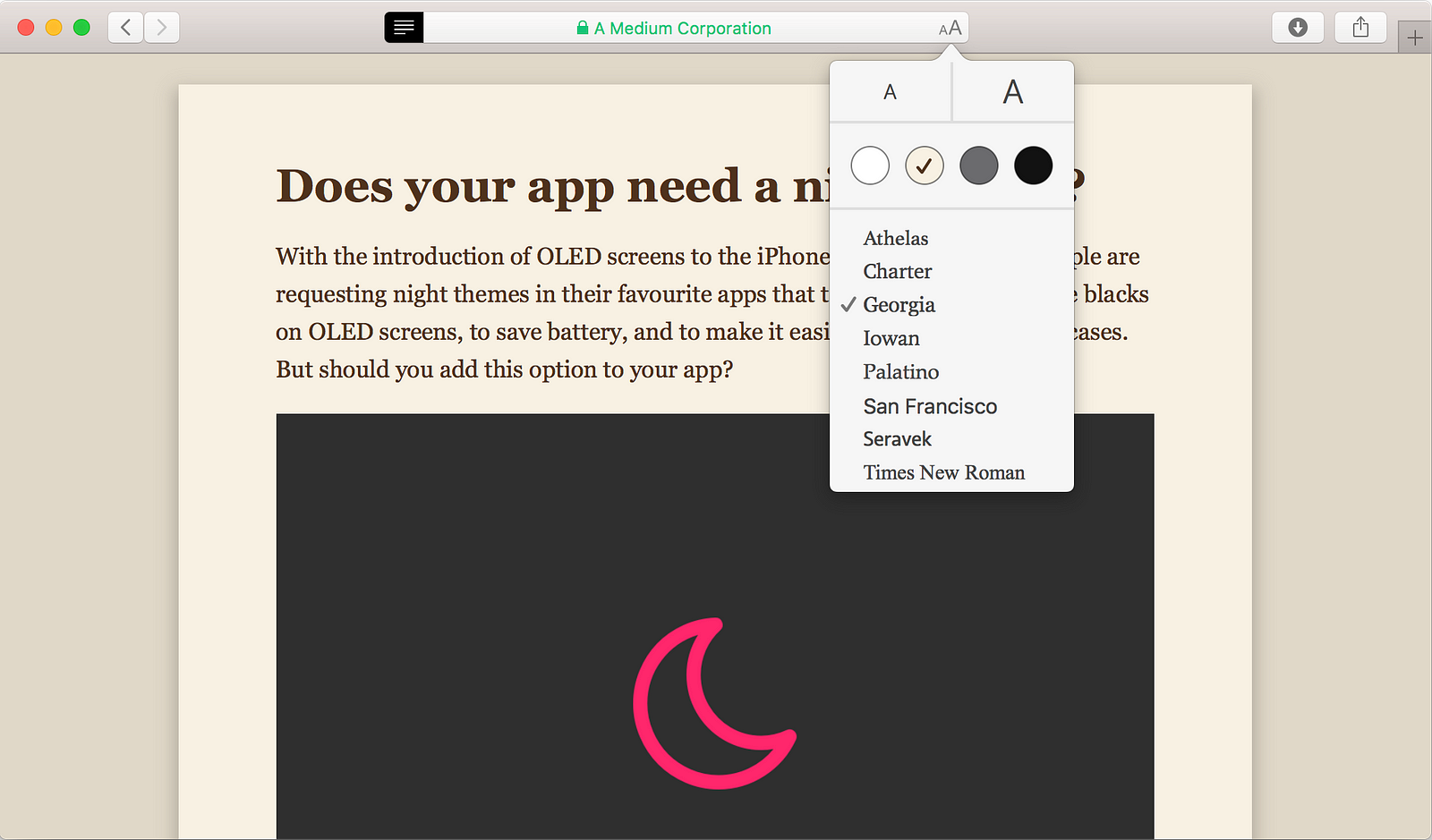
With
the introduction of OLED screens to the iPhone X, more and more people
are requesting night themes in their favourite apps to take advatage of
the true blacks on OLED screens, to save battery, and to make it easier
on the eyes in some cases. But should you add this option to your app?
Don’t confuse choice with convenience.
If
you ask any user if they’d want the option of night mode in your app,
they would say yes. As consumers we think we need more choices. It
sounds very logical. The more choices I have, the more likely I am to
choose something that suits me and makes me happy. But does more choice actually make users happier? In the TED Talk, The Art of Choosing, Sheena Iyengar explains how that might not actually be true.
Just
because users are asking for options, doesn’t mean they’re going to
start using them or that it’s the right choice for them. Depending on
the type of content that you provide to your users, a night mode might
actually hurt their engagement.
You have to ask yourself why you’re thinking about a night mode. If
you’re doing it solely to give your users options, then please, do
yourself and your users a favour and stop. There are many downsides to
having a night mode that you have to consider and be OK with before
adding it to your app.
A
night mode creates inconsistency within your app. It’s already hard
enough to keep your apps consistent with iOS and Android, and if you
have a website having that be consistent with everything too. Why would
you go out of your way to make it even more difficult for yourself?
A
night mode might reduce your users’ engagement with your app. Your
users are the reason that you have created your app. They have been
using your app and are used to it. If you have good information
architecture and user experience, they might be even using your app with
muscle memory. These users are your friends. They have already
memorized your app’s hierarchy and are using affordances and clues in
your app to navigate it fluently. Introducing a dark mode would change
all of that. Now they have to re-learn your app. Even though everything
is in the same place, they have to re-learn the affordances and clues
and repeat the process of getting used to it all over again, and this
risks alienating your users. They might see the dark mode and think
that’s a good choice for them and turn it on, but the next time they
open your app they won’t know how to navigate it and it will feel
strange. Remember when Instagram switched their UI design to the new
flat one with the new logo and everyone was running around setting
things on fire and protesting on the streets? Ok no one protested on the
streets but some users were pissed. Do you want your users to be
pissed? Looking back the re-design of Instagram was a success because it
simplified the interface to make room for new features like stories and
bookmarking photos and such. But a night mode is not a re-design.
Instead of moving your design forward, you would give it a split
personality.
Designing
a night mode for an app is no easy task either. You might think that
it’s just as easy as flipping the background and text colours, but
there’s actually a lot to consider. If there are photos in your app, are
they going to look their best in dark mode? On each given page, is the
right content being highlighted when the colours are switched? Do users’
attention still flow the same way they did in the regular mode? How
does the setting page look? Should the setting page also be switched to
dark mode? It would look very weird, wouldn’t it? what about all the
sub-pages of the settings page? how about the keyboard? Do we change it
to the dark keyboard in iOS when in night mode? If you have a black
tab-bar, should it now suddenly be white? because if it stays black then
there would be no contrast, but if you turn it white, there’s a big
bright object at the bottom getting all the attention from the rest of
the screen, and that’s not really what you want.
What
if my users have sensitive eyes and can’t handle bright lights? Or it’s
very hard for them to read balck on white due to dyslexia? Both iOS and
Android have very thorough accessibility features to accomodate the
whole experience for them. Having those settings on an app-by-app basis
would be confusing and inconsistent. There are options to reduce white
points, invert colours without inverting the photos, greyscale, adding a
tint, and options for different kinds of colour blindness built into
the system. So these don’t become an excuse for you to add a night mode
to your app.
OK. So there are many reasons why someone shouldn’t add a night mode to their app. But is there a good time to add a night mode? Yes.
It
all depends on the context — the type of content or service you are
providing your users and the context in which the users use your app.
The main complaint around the lack of night mode is prolonged reading at
night in a dark environment, mostly in bed or while in a car.
If your app is a game, then don’t bother.
If
it’s a productivity app, it’s still a very hard no as changing the
colour of the tools and the layout in an app that users depend heavily
on might confuse them. Unless you know for a fact that your users are
for some reason only using your app in bed with the lights off, then for
their sake do not add a night mode.
If
your app is related to messaging, then it’s be best to optimize for the
Smart Invert feature and let the user control the dark mode from the
accessibility section in settings if they wish.
If
your app focuses on reading, *cough* Medium *cough*, then it’s a good
idea to provide options for your users to adjust the reading environment
to their comfort. A great example of this is the Reader mode in Safari.
Reader mode in Safari allows you to change a few settings to find the most comfortable one for you.
If
your app is related to driving, like Google Maps or Podcasts, and might
stay open while a user is behind the wheel, it’s a good idea to add
automatic night mode so that it won’t distract the users while they’re
behind the wheel (can’t wait for self-driving cars).
I’ve
seen a lot of confusion and frustration from users and designers
surrounding night mode and if it should be a system-wide feature or not.
I hope this article made it a bit clearer if you should or shouldn’t
add a night mode to your app. Happy designing! ❤️
Rumu
is a very unique game, and of all the games on this list, I think it’s
the one that has the most unique UI. This is most likely due to the fact
that Rumu has pioneered the ‘Sentient Vaccuum Cleaner’ genre, and
there’s simply no game similar enough to pull inspiration from. Because
of this, I’ll briefly summarise the elements I liked the most, so you
have an idea of what I’m talking about.
It’s
fitting, then, that Rumu’s UI pulls from a number of different genres
and also remains quite unique. Rumu (The titular vacuum cleaner himself)
has a radial menu to manage it’s quest log and inventory. That’s about
where the traditional UI ends, and you start to see some bespoke
elements.
Tutorial
tips for controls appear outside the environments. This is a nice
detail, as it serves not only to communicate the key bind but also as a
hint of what you’re supposed to do in any given space.
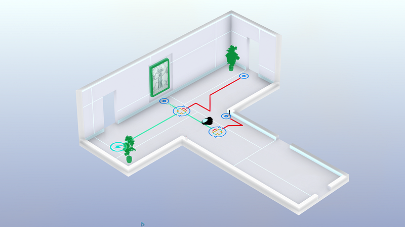
A
similar method is used for doorways or vent spaces — each is earmarked
with text or iconography to indicate whether the player can pass
through. The difference is actually really important, because it serves
to split how the player treats information throughout the game — if the
information is inside the room, it’s something to be learned. If it
exists outside of the game space, it’s something that little Rumu
already knows.
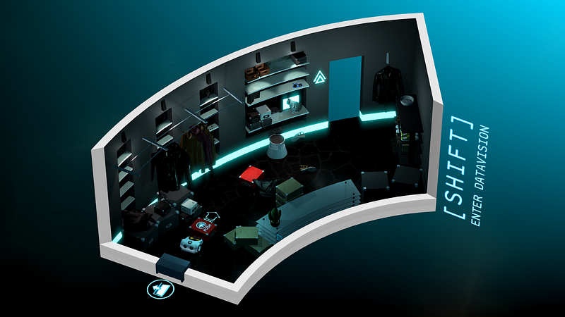
There’s
a ‘Datavision’ function that allows Rumu to see how the various smart
devices and intractable objects connect. It’s a great way to declutter
the environments when the player is being task oriented, and it also
often hides hidden easter eggs or gadgets.
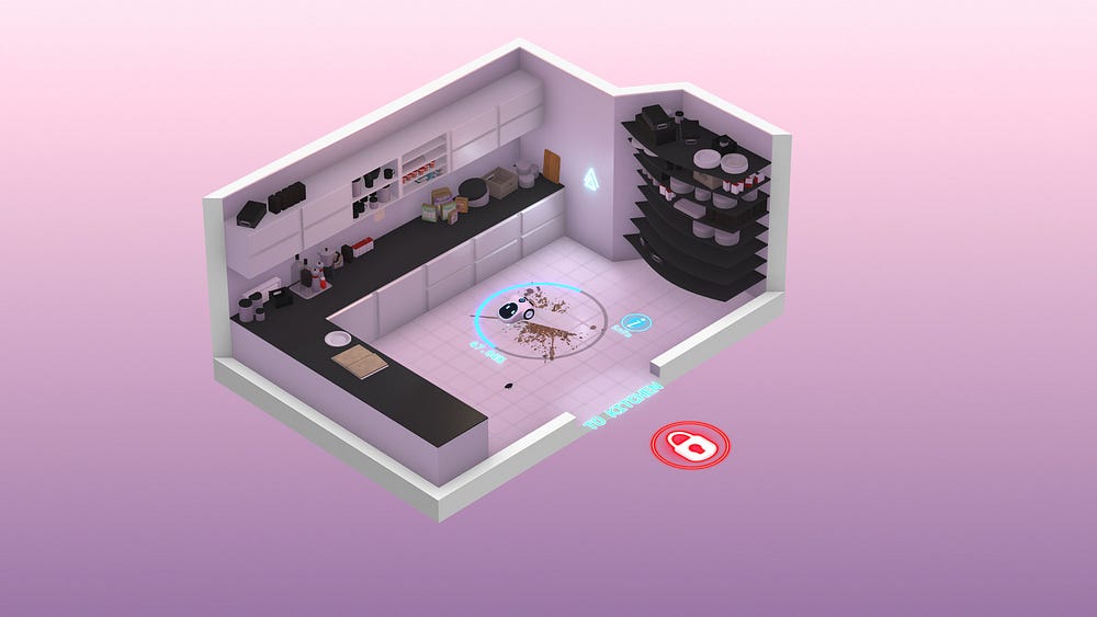
One
of the smartest UX features of Rumu is how it uses it’s palette and art
style to generate emotion. A clean, white kitchen feels calm and
simple, while crawling through vents on a sinister dark background gives
the game a sense of urgency and danger.
Rumu
is beautiful, functional, unique, and incredibly evocative. It’s UX
blends perfectly with the narrative of the game, and aids in the
storytelling.
Conclusion: Independent
developers are constantly coming up with new, interesting ways to
interact with their games. There’s even a few on this list: Hand of Fate
2 and Tooth of Tail both innovate in a well-trodden genre.
Rumu’s
a little different, because the robot vacuum cleaner genre isn’t quite
as mature as, say, first person shooters. Despite this, the interactions
in Rumu feel natural; the spacial and diagetic elements are what I’d
expect a robo-vacuum to see in the world, and the meta UI tips help move
the player along without breaking the (sometimes literal) fourth wall.
I look forward to seeing the robot vacuum cleaner genre evolve.
Worst: Stationeers
Picking
this game sparked an internal debate in my mind over having a ‘Worst’
section at all, but in the end I decided it’s always better to get your
feelings out than internalise them.
I
really enjoyed Stationeers; I played almost six hours straight in my
first run through. It’s an incredibly complex space space station
construction game. Most of it’s UI is inoffensive: a simple HUD with
your vitals and atmosphere stats, and a slot-based inventory system.
It
all falls apart for me in the item management. Rather than go into
specifics, I’ll give you an example: I need to take the empty battery
out of my welding torch, and replace it with a full one.
I
have to press 5 to open my tool belt, use the scroll wheel to highlight
the torch, press F to put it in my hand, press R to open the torch’s
inventory, press E to change hands, press F to move the batter into my
free hand.
Now
I press 2 to open my suit inventory, scroll wheel to an empty slot,
press F to place the flat batter in there. Scroll wheel to the full
battery, press F to place it in my off hand. Press E to change hands.
Press R to open the torch inventory. Press E to change hands. Press F to
place the battery in.
That’s…15 key presses. I can see what they were going for with this system, but there’s got to be a better way.
Virtual Reality
Best: Lone Echo
If
UX as a practice is still in it’s infancy, UX for VR is a single-celled
organism attempting mitosis for the first time. Nobody really has any
idea what’s going to work and what’s not going to work, and so many
games have great executions with a poor UX.
Lone
Echo feels like someone looking at what VR will be doing five years
from now, and dragged it screaming back into 2017. I don’t think it’s
hyperbole to say that Lone Echo’s UX will help define the future of
virtual and augmented reality interfaces.
There’s
no HUD in Lone Echo, instead opting to have your UI displayed from
various arm-mounted gadgetry. Jack, the player character, has a number
of controls and panels along his suit, each of which the player can
interact with to reveal various elements interfaces.
This
actually annoyed me at first — I wasn’t sure why a robot need any sort
of interface at all. However, the interactions available are just so
neat and genuinely enjoyable, it becomes a very small nitpick. You will
also witness other characters in the game use the same interface, which
gives some internal consistency to the game.
Talking
to someone, for example, is a matter of simply looking at them and
tapping a button the controller. This spawns a list of dialogue options
that you select with your finger. It’s a simple thing, but being able to
quickly interact with the object your looking at feels great.
Any
panels you summon are intractable with your hand. You can scroll and
tap like you would on an iPad. It feels completely natural to work with,
and there were very few times after the opening minutes where I had
trouble with this interaction style.
Similarly,
Jack’s wrist holds a number of functions and features that are
activated using your opposite hand. Slide across your forearm to open
your objectives. Tap the top of your wrist for your scanner, or the side
of your wrist for your welder. The interactions are so second-nature
after having used them a few times that I found myself not even looking
at my hands as I did these simple tasks.
Most
of what you see in Lone Echo comes from somewhere. The locomotion, the
dialogues, the tool interactions, are all borrowed from games that have
come before it. Lone Echo proves that these interactions are
unequivocally the right way to
do them, and if done right, can be so immersive and intuitive that the
player doesn’t have to remember them, they just become the way things are done.
Just like the brilliant writing and slick graphics, Lone Echo’s UX is the reason it’s
such a successful game. It keeps the player completely immersed in
everything they’re doing, no matter how complex the task. At it’s best,
the interactions in Lone Echo are actually fun to use. Menus that are fun! If that’s not a revolution, I don’t know what is.
Conclusion: The
most immersive experience I’ve ever had in a video game. Lone Echo
bends over backwards to put you in the moment with objects that behave
like the user expects they should, and an environment that is
consistently interactive.
Lone Echo isn’t held back by trying to
fit it’s UI into it’s narrative — it’s built it’s entire user
experience around the narrative, instead. Lone Echo sets the standard
for VR UX to come.
Worst: None
It’s
a cop out, I know. Truth be told, I haven’t played a VR game that
released in 2017 that had any truly awful UX. There’s plenty of games
that make some missteps, or the occasional obvious error, but this is
going to happen with a still-growing genre like virtual reality. For
now, VR gets a pass.
If
you got this far, thanks for reading! Hopefully you found something
interesting in my choices. Please feel free to comment with your
opinions, especially if there’s something great that I missed.
This
week, the Federal Communications Commission will vote on the future of
net neutrality. Whether you’ve been following the political back and forth,
skimming the headlines, or struggling to decode acronyms, the decision
will have an impact on what we can do online (and who can afford to do
it). Because the internet has effectively been free and open since the
day it was born, it’s easy to lose sight of the impact this vote will
have.
The reality is, the internet is a fragile thing. Open, crazy, weird spaces where people swap stories and secrets, create rad digital art projects,
type furiously and freely with people seven time zones away — these
spaces are rare. People build them, people sustain them, and now, people
are trying to restrict them. If this week’s vote passes — which is
looking increasingly likely — the internet’s gatekeepers will have more
control over their gates than ever before.
Because
we live and breathe the internet, laugh and cry on the internet,
connect with people who’ve tangibly changed our lives on the internet,
we decided to gather some perspectives on this moment in time. Why it
matters, how we got here, and what the future may hold. Here are some of
the most insightful essays we’ve found on Medium to help us make sense
of the fight to keep the net wild and free.
In 1989, Tim Berners-Lee
invented the World Wide Web. Now, he’s defending it. “I want an
internet where consumers decide what succeeds online, and where ISPs
focus on providing the best connectivity,” Berners-Lee emphasizes.
Content and connectivity are two distinct markets, and they must remain
separate. Conflating them risks blocking innovation, free expression, and the kind of creativity that can only thrive online.
What’s happening now is not just about net neutrality, law professor Lawrence Lessig
argues, but about the foundations of our democracy. Tracing the history
of the concept from its origins in the aughts (one of his students, Tim Wu,
coined the term “net neutrality”), Lessig sees the rollback of
Obama-era regulations as a symptom of a larger issue: a democracy that
doesn’t serve its people.
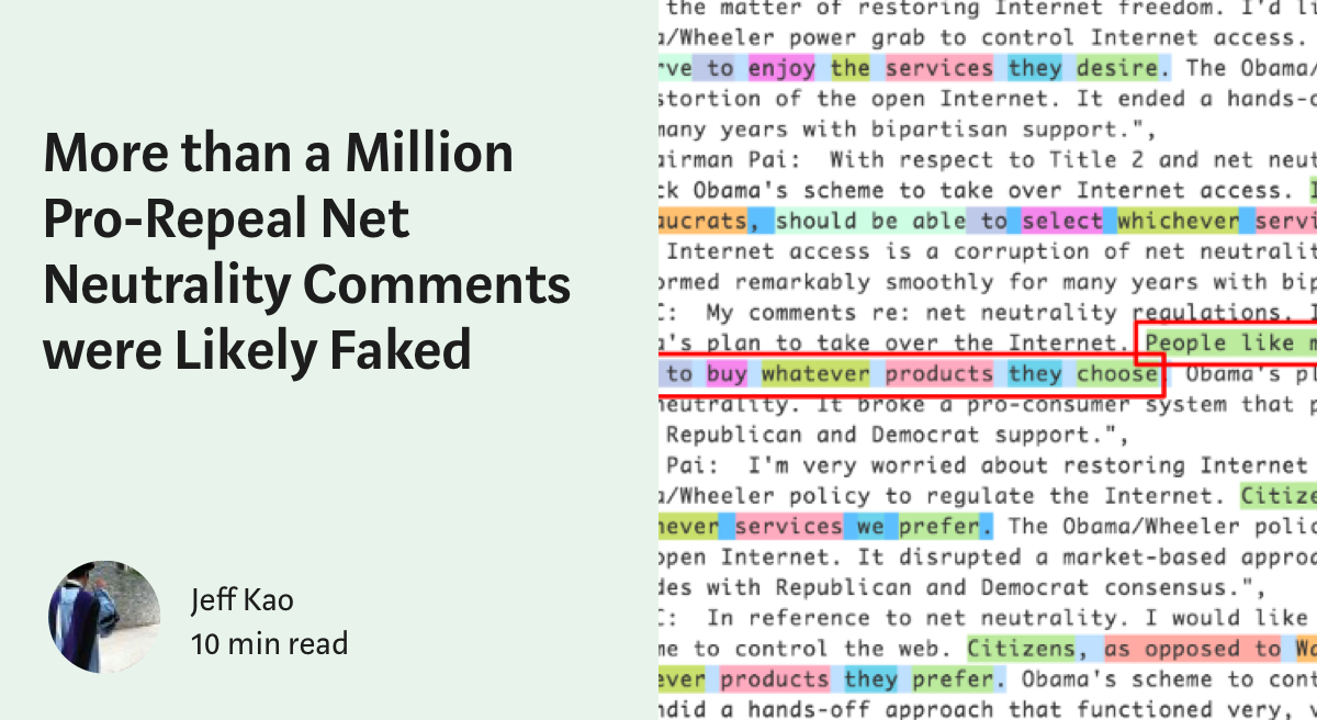
Through statistical analysis and natural language processing, data scientist Jeff Kao
shows that millions of pro-repeal comments submitted to the FCC were
faked. Organic public comments, according to Kao’s analysis,
overwhelmingly supported preserving existing regulations. The report
calls into question the legitimacy of the FCC’s comment process, and the
basis of chairman Pai’s intention to roll back regulations.
In part one of a five-part series on net neutrality, computer scientist Tyler Elliot Bettilyon
takes us back to FDR’s New Deal. Piecing together the history of
“common carrier” laws — those that govern everything from shipping to
telephone lines — Bettilyon contextualizes today’s fight for a free and
open internet.
Social psychologist E Price
interrogates the idea that the internet we’ve grown to love is really
as “free and open” as we’d like to think. “Internet activity is already
deeply centralized,” Erika writes, and major social media sites are
today’s answer to the Big Three TV networks of a few decades ago. The
internet is closer to cable than we think, and it’s (probably) about to
get even closer.
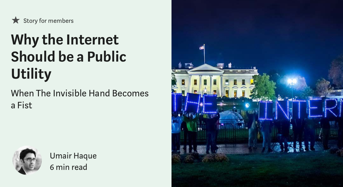
Why should the internet be a public utility? Economist umair haque
debunks the “competition will lower prices” argument against internet
regulation, and makes a compelling case for why going online, “just like
water, energy, and sanitation,” should be a basic right: “It
dramatically elevates our quality of life, best and truest when we all
have free and equal access to it.”
Visit battleforthenet to write or call your congressperson in advance of the vote. You can also text a few words of your choice to Resistbot.
My colleagues and I wanted to create something that would make people go “wow” at our latest hackathon.
Because
imitation is the sincerest form of flattery and IoT is incredibly fun
to work with, we decided to create our own version of Amazon Go.
Before I explain what it took to make this, here’s the 3 minute demo of what we built!
There were four of us. Ruslan,
a great full-stack developer who had experience working with Python.
John, an amazing iOS developer. Soheil, another great full-stack
developer who had experience with Raspberry Pi. And finally, there was
me, on the tail end of an Android developer internship.
I
quickly realized that there were a lot of moving parts to this project.
Amazon Go works on the basis of real-time proximity sensors in
conjunction with a real-time database of customers and their carts.
We
also wanted to take things a step further and make the entry/exit
experience seamless. We wanted to let people enter and exit the store
without needing to tap their phones.
In
order to engage users as a consumer-facing product, our app would need a
well-crafted user interface, like the real Amazon Go.
On
the day before the hackathon, I put together a pseudo-design doc
outlining what we needed to do within the 36 hour deadline. I
incorporated the strengths of our team and the equipment at hand. The
full hastily assembled design doc can be seen below.
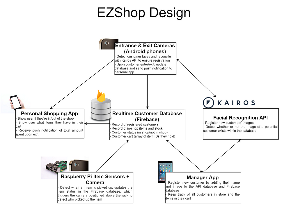
There were six main components to EZShop, our version of Amazon Go.
A quick diagram I whipped up visualizing the components of this project
The Kairos Facial Recognition API
The Kairos facial recognition API
was a fundamental component for us. It abstracted the ability to
identify and store unique faces. It had two APIs that we used: /enroll and /verify.
/enroll is described as:
Takes a photo, finds the faces within it, and stores the faces into a gallery you create.
We enrolled all new customers into a single “EZShop” gallery. A unique face_id attribute would be returned and stored with the customer’s registered name in our real-time database.
When we wanted to verify a potential customer’s image, we would POST it to the /verify endpoint. This would return the face_id with the highest probability of a match.
In
a real-world implementation, it probably would have been a better idea
to use a natively implemented facial recognition pipeline with
TensorFlow instead of a network API. But given our time constraints, the
API served us very well.
The Realtime Firebase Database
The
Firebase database was another fundamental piece to our puzzle. Every
other component interacted with it in real time. Firebase allows
customized change listeners to be created upon any data within the
database. That feature, coupled with the easy set-up process, made it a
no brainer to use.
The
schema was incredibly simple. The database stored an array of items and
an array of users. The following is an example JSON skeleton of our
database:
New users would be added to the array of users in our database after registering with the Kairos API. Upon entry or exit, the customer’s boolean in_store attribute would be updated, which would be reflected in the manager and personal app UIs.
Customers picking up an item would result in an updated item stock. Upon recognizing which customer picked up what item, the item’s ID would be added to the customer’s items_picked_up array.
I had planned for a cloud-hosted Node/Flask server that would route all activity from one device to another, but the team decided that it was much more efficient (although more hacky) for everybody to work directly upon the Firebase database.
The Manager and Personal Customer Apps
John, being the iOS wizard that he is, finished these applications in the first 12 hours of the hackathon! He really excelled at designing user-friendly and accessible apps.
The Manager App
This iPad application registered new customers into our Kairos API and Firebase database. It also displayed all customers in the store and the inventory of store items. The ability to interact directly with the Firebase database and observe changes made to it (e.g. when a customer’s in_store attribute changes from true to false) made this a relatively painless process. The app was a great customer-facing addition to our demo.
The Personal Shopping App
Once the customer was registered, we would hand a phone with this app installed to the customer. They would log in with their face (Kairos would recognize and authenticate). Any updates to their cart would be shown on the phone instantly. Upon exiting the store, the customer would also receive a push notification on this phone stating the total amount they spent.
The Item Rack, Sensors, and Camera
Soheil and Ruslan worked tirelessly for hours to perfect the design of the item shelf apparatus and the underlying Pi Python scripts.
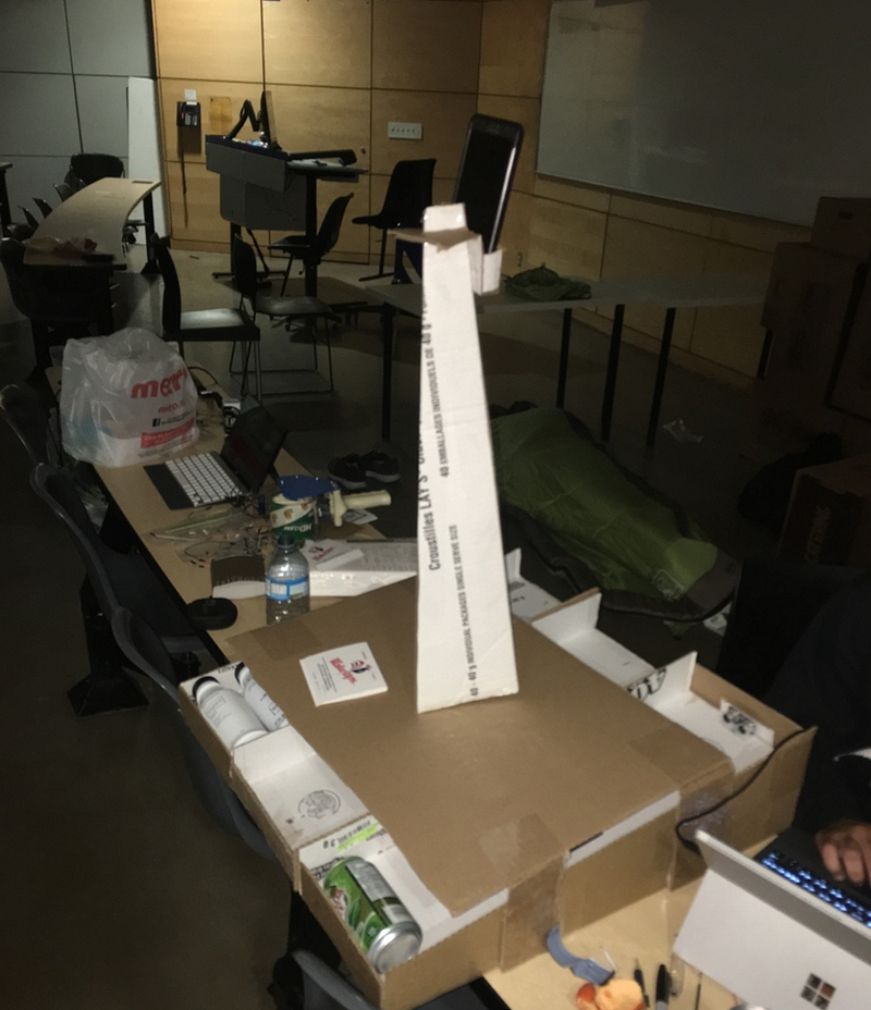
The item rack apparatus. Three items positioned in rows, a tower for the security camera, and ultrasonic sensors positioned at the rear
There were three items positioned in rows. At the end of two rows, an ultrasonic proximity sensor was attached. We only had two ultrasonic sensors, so the third row had a light sensor under the items, which did not work as seamlessly. The ultrasonic sensors were connected to the Raspberry Pi that processed the readings of the distance from the next closest object via simple Python scripts (either the closest item or the end of the rack). The light sensor detected a “dark” or “light” state (dark if the item was on top of it, light otherwise).
When an item was lifted, the sensor’s reading would change and trigger an update to the item’s stock in the database. The camera (Android phone) positioned at the top of the tower would detect this change and attempt to recognize the customer picking up the item. The item would then instantly be added to that customer’s cart.
Entrance and Exit Cameras
I opted to use Android phones as our facial recognition cameras, due to my relative expertise with Android and the easy coupling phones provide when taking images and processing them.
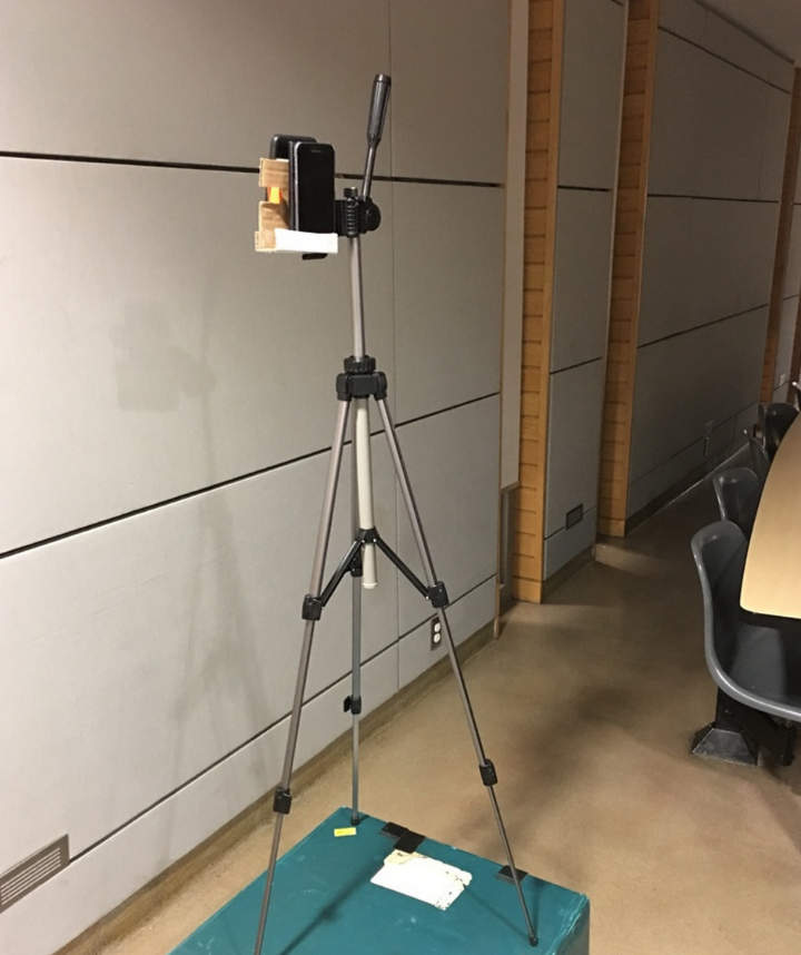
The phones were rigged on both sides of a camera tripod, one side at the store’s entrance, and the other at the store exit.
A camera tripod, two phones, and lots of tape
Google has an incredibly useful Face API that implements a native pipeline for detecting human faces and other related useful attributes. I used this API to handle the heavy lifting for facial recognition.
In particular, the API provided an approximate distance of a detected face from the camera. Once a customer’s face was within a close distance, I would take a snapshot of the customer, verify it against the Kairos API to ensure the customer existed in our database, and then update the Firebase database with the customer’s in-store status.
I also added a personalized text-to-speech greeting upon recognizing the customer. That really ended up wowing everybody who used it.
The result of this implementation can be seen here:
Once the customer left the store, the exit-detection state of the Android application was responsible for retrieving the items the customer picked up from the database, calculating the total amount the customer spent, and then sending a push notification to the customer’s personal app via Firebase Cloud Messaging.
Of the 36 hours, we slept for about 6. We spent our entire time confined to a classroom in the middle of downtown Toronto. There were countless frustrating bugs and implementation roadblocks we had to overcome. There were some bugs in our demo that you probably noticed, such as the cameras failing to recognize several people in the same shot.
We would have also liked to implement additional features, such as detecting customers putting items back on the rack and adding a wider variety of items.
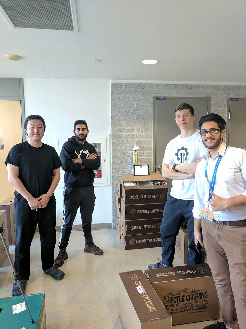
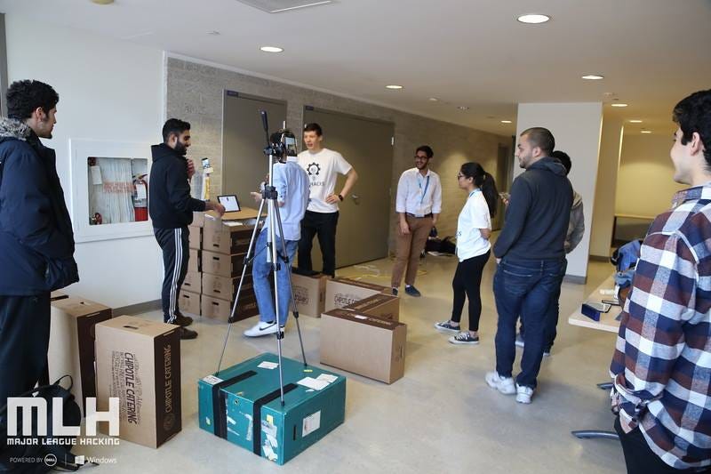
Our project ended up winning first place at the hackathon. We set up an interactive booth for an hour (the Chipotle box castle that can be seen in the title picture) and had over a hundred people walk through our shop. People would sign up with a picture, log into the shopping app, walk into the store, pick up an item, walk out, and get notified of their bill instantly. No cashiers, no lines, no receipts, and a very enjoyable user experience.
Walking a customer through our shop
I was proud of the way our team played to each individual’s strengths and created a well put-together full-stack IoT project in the span of a few hours. It was an incredibly rewarding feeling for everybody, and it’s something I hope to replicate in my career in the future.
I hope this gave you some insight into what goes on behind the scenes of a large, rapidly prototyped, and hacky hackathon project such as EZShop.
Want
to start 2018 off as a developer? Well check out DevFreeBooks! Here you
will find over 150 books, the best part about it is, the books are
FREE! You can check them out here.
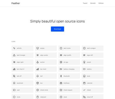
Feather
is a large collection of open source icons that look stunning! Each
icon is designed on a 24x24 grid with an emphasis on simplicity,
consistency and readability. Great if you need some icons in one of your
projects!
Are
you designing an iOS, Android, or React Native app? If so, check out
Lottie!Lottie is an iOS, Android, and React Native library that renders
After Effects animations in real time, allowing apps to use animations
as easily as they use static images.
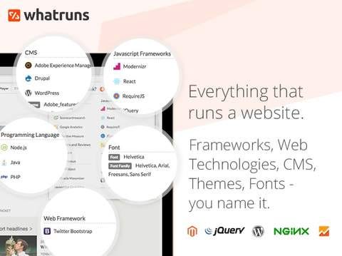
Were
you ever currious and wanted to know what powers a website? Well
WhatRuns will be useful for you! WhatRuns is a free research and
competitive intelligence tool for developers, designers and salespeople
to know the technologies used on any website.
Kite
is a heads up display (HUD) for programmers that surfaces proven
engineering knowledge in a live internet connected environment helping
developers write better code, faster. Kite is the first tool to offer a
connected way to program; it is integrated with text editors and it uses
type inference to reveal examples as programmers type without having to
leave the screen for a web browser.
Perfect
for developers starting out, Code to go helps developers learning
JavaScript find up to date, accurate and ready to use snippets of
JavaScript code for common use cases.
Over
170 responsive design blocks ready to be used in your web or mobile
apps. All blocks are based on the Bootstrap 4 Library, and they are the
building blocks for beautiful websites.
Happy New Year from the Dvlpr Stash Team ❤
We, at Dvlpr Stash
hope that you find these resources useful, and as a thank you for
everything, we’d like you give you 20% off of everything in our store.
Just use the coupon code ‘DEVELOPER2018’ during checkout. We wish you
guys a very Happy New Year and may 2018 be your best year to date!
Uber
has transformed the world. Indeed, its inconceivable to think of a
world without the convenience of the innovative ride sharing service.
Tracing its origins in a market which is constantly being deregulated,
Uber has emerged triumphant. Operating in over 58 countries and valued
roughly at US$ 66 billion, Uber has rapidly expanded to established
branches in over 581 cities in over 82 countries with the United States,
Brazil, China, Mexico and India being Uber’s most active countries.
If that wasn’t impressive enough, in 2016 the company completed a total of 2 billion rides
in one week. When you consider the fact that the first billion rides
took Uber 6 years, and the second billion was garnered in a mere 6
months, it’s not surprising to see Uber emerge as a global business
leader. This worldwide phenomenon is built on a simple idea, seductive
in its premise - the ability to hail a car with nothing but your
smartphone.
It
took the problem of hailing a taxi and gave everyone an equitable
solution while further capitalizing on the emerging market. And smart
people are asking the right question: How do I build an app like Uber for my business needs?
Humble Beginnings
It
all started in 2008, with the founders of Uber discussing the future of
tech at a conference. By 2010, Uber officially launched in San
Francisco. In 6 months, they had 6,000 users and provided roughly 20,000
rides. What was the key to their success? For one, Uber’s founders
focused on attracting both drivers and riders simultaneously.
San Francisco was the heart of the tech community in the US and was
thus the perfect sounding board for this form of technological
innovation to thrive.
In
the beginning, Uber spread their App through word of mouth, hosting and
sponsoring tech events, and giving participants of their events free
rides with their app. This form of go-to-marketing persists today -
giving 50% discounts to new riders for their first Uber ride. This
initial discount incentivized users to become long term riders, and the
rest was history. As more and more people took to social media to tell
the world about this innovative new App - the sheer brilliance of their
marketing strategy paid off.
Product Technology Cohesion: How Uber Works
What
makes Uber, Uber? For one, it’s the ubiquitous appeal, or the way in
which they streamlined their product, software and technology. It was,
at the start, fresh, innovative, and had never been seen before. So if
one were to replicate the model, they’d need to look at Uber’s branding
strategy.
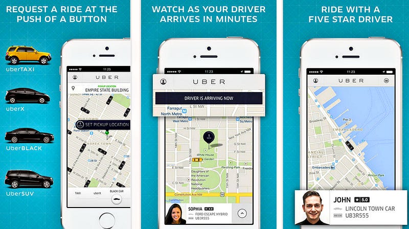
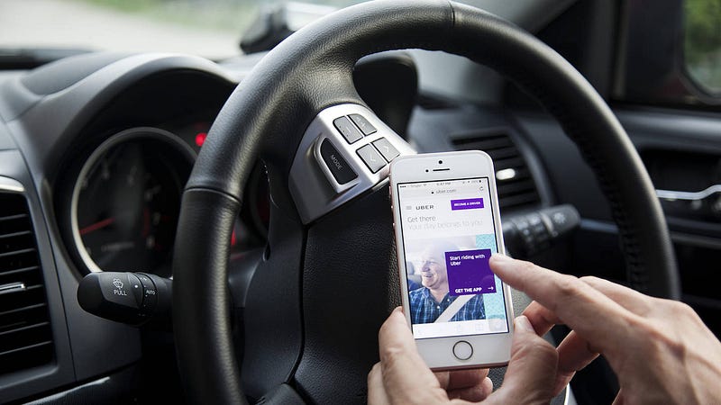
To use Uber, you have to download the app, which launched first on iPhone, then extended to Android and Blackberry.
Uber’s
co-founders, Garret Camp and Travis Kalanick, relied heavily on 6 key
technologies based on iOS and Android geolocation. What really sold it
though, was its clear core value - the ability to map and track all
available taxis in your given area. All other interactions are based on
this core value - and its what sets Uber (and will set your app) apart from the crowd. To build an App like Uber, you’ll need to have:
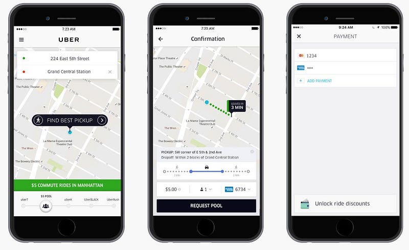
1. Registering/Log-in features:
Uber allows you to register with your first name, last name, phone
number and preferred language. Once you’ve signed up, they’ll send you
an SMS to verify your number, which will then allow you to set your
payment preferences. Trip fares are charged after every ride through
this cashless system.
2. Booking features:
This allows drivers the option to accept or deny incoming ride requests
and get information on the current location and destination of the
customer.
3. The ability to Identify a Device’s location: Uber, via CoreLocation framework
(for iOS platforms) obtains the geographic location and orientation of a
device to schedule location and delivery. Understanding iOS and Android
geolocation features is crucial for this step, because that’s what your
App is running on.
4. Point to Point Directions: The Uber App provides directions to both the driver and the user. Developers of the Uber App use MapKit for iOS and Google Maps Android API
for Android to calculate the route and make directions available. They
further implemented Google Maps for iPhone and Android, but cleverly
adapted technology from other mapping companies to solve any logistical
issues that might come up.
5. Push Notifications and SMS: You get up to 3 notifications instantly from Uber when you book a ride.
A notification telling you when the driver accepts your request
One when the driver is close to your location
One in the off chance your ride has been cancelled
You
further get the full update on your driver’s status, down to the
vehicle make and license number, and an ETA on the taxi’s time of
arrival.
6. Price Calculator: Uber
offers a cashless payment system, paying drivers automatically after
every ride, processed through the user’s credit card. Uber takes 25% of
the driver’s fare, making for easy profit. They paired with Braintree, a
world leader in the mobile payment industry, but other good options
avaible are Stripe, or Paypal, via Card.io.
Here are few more much sought after features for the user’s side of the App:
The ability to see the driver’s profile and status:
Your customers will feel safer being able to see your driver’s
verification, and it’s makes good security sense to ensure you know
who’s using your App for profit.
The ability to receive alerts: Receive immediate notifications about the status of your ride and any cancellations.
The ability to see the route from Their Phones (An In built Navigation system): This
is intrinsically linked to your geolocation features, you want to be
able to direct your taxis to the quickest, most available routes.
Price calculation: Calculating a price on demand and implementing a cashless payment system.
A “spilt fare” option: Uber introduced this option wit great success. It allows friends to spilt the price of the ride.
Requesting previous drivers: It’s a little like having your favourite taxi man on speed dial, and is a good way of ensuring repeat customers.
Waitlist instead of surge pricing: Avoid
the media hassle of employing surge pricing by employing a wait list
feature, so your users can be added to a waiting list rather than be
charged more than they should, and to keep them from refreshing the App
during peak hours, reducing the resources required by your backend
infrastructure.
Another
key to Uber’s success, that should be noted by potential developers of
similar Apps, is the way in which Uber operates. They tap into more than
one market which equates to more riders, more drivers, and more
business for the company. Uber has mastered the art of localization -
the ability to beat out pre-existing markets and competitors, which
further retains their customer base by improving their own business
strategy.
They’ve
taken local context and circumstances into consideration. For example,
they partnered with Paypal in November 2013 to provide as many people in
Germany don’t use credit cards, and switched to services based on SMS
messages in Asia as there are more people but fewer smart phones per
capita. This helps them cater to various markets and and optimize
profits.
The Uber marketing strategy isn’t static - it’s dynamic. Expansion
was necessary, and the business model reaps profits from saturating the
taxi market with their customers and drivers, driving their exponential
growth. What aspiring App developers can take from this is that you
need to design your App for flexibility.
Design
your App in a way that’s going to let it take a hit and roll with
punches. Having a system in place that allows you to build and integrate
changes effectively within the App and allows team members to
communicate effectively is of paramount importance.
What
made Uber so successful was its ability to reshape how we think about
technology and its operation. Indeed it made the market a better, more
efficient place through the innovative on-demand service.
What Technology is Uber Built on?
The
tech side of the App is written largely in JavaScript which is also
used to calculate supply and predict demand. With the real time dispatch
systems being built on Node.js and Redis. Java, as well as Objective-C
is used for the iPhone and Android apps. Twilio is the force behind Uber’s text messages, and push notifications are implemented through Apple Push Notifications Service on the iOS platform and Google Cloud Messaging (GCM) for the Android App.
How much does Uber make?
Actually,
it’s a lot less than you think. The $66 billion valuation, after the
25% commission (which rounds out to about $0.19 per ride) mostly goes
towards credit card processing, interest, tax, compensation for
employees, customer support, marketing, and various anti-fraud efforts.
How much does it take to build Uber?
Uber’s
not just one App, it’s two - one for the rider and one for the driver.
The cost of developing an App like Uber is dependent on a number of
factors
the cost of building an MVP
product development and acquisition
getting the economics of marketing sorted
the constant cost of building on and improving your App’s analytic capabilities
When
you make an App like Uber, you’ll invest a fair bit into design
services, backend and web development, project management, not to
mention Android and iOS native app development. The total man hours
round out to around 5000 hours for similar on demand taxi Apps, which
puts the cost of developing such an App to around $50,000 (assuming that
your team works for $50 dollars an hour). However, since hourly rates
roughly range from $20 to $150, median costs could be higher or lower.
Conclusion
To
wrap up, Ubers success was due to several factors, including a clear
business model and interaction based features, and not the other way
around combined with a marketing strategy focusing on attracting users.
The
question on everyone’s mind of course is how can you reduce the overall
risk of failure by making sure that your idea and product are viable
when you’re developing an App?
One way is to use a Mobile App development partner (such as Octodev)
that has worked on many such Apps and understands the processes
involved. An advance of using such a partner is they’ve worked on many
such App development projects and have the practical experience in
product development to avoid the pitfalls and make the most of your
vision.
Octodev App Development Process
Another
important part of ensuring that your App development project is swiftly
and smoothly executed is having a clear road map and regular
communication during the project. There are many approaches to achieve
this and we, at Octodev, use a consultative approach to App development.
We draw from our successful App implementations. Get in touch with us now if you want an accurate cost for your own Uber like App idea.
This article was originally published on the Octodev Blog.
Hardik Gandhi is Master of Computer science,blogger,developer,SEO provider,Motivator and writes a Gujarati and Programming books and Advicer of career and all type of guidance.