Programming & IT Tricks . Theme images by MichaelJay. Powered by Blogger.

Copyright

Facebook

Post Top Ad

Search This Blog

Post Top Ad

Responsive Ads Here

Archive

Post Top Ad

Contact


Editors Picks

Follow us

Post Top Ad

Fashion

Music

News

Sports

Food

Technology

Featured

Videos

Fashion

Technology

Fashion

Label

Translate

About

Translate

Sponsor

test

Weekly

Comments

Recent

Connect With us

Over 600,000+ Readers Get fresh content from FastBlog

About

Showing posts with label Progressive Web App. Show all posts

Sunday, February 4, 2018

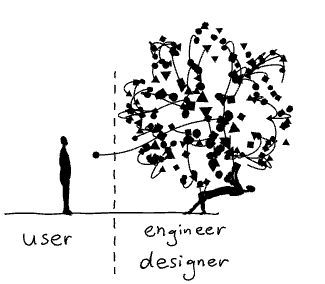
Unlocking Web Audio — the smarter way


The Web Audio API provides a powerful and versatile system for controlling audio on the Web, allowing developers to choose audio sources, add effects to audio, create audio visualizations, apply spatial effects (such as panning) and much more.
It can be used for developing sophisticated web-based games or interactive applications which include the capabilities of modern game audio engines as well as some of the mixing, processing, and filtering tasks found in modern desktop audio production applications; and it can be a very good complement to the more advanced graphics features offered by WebGL.
All this sounds awesome (pun intended), although, on iOS devices there is a slight caveat: the Web Audio API requires sounds to be triggered from an explicit user action, such as a tap, before any sound can be played on a web page.
The reason why iOS devices impose this user-gesture restriction is because they want to preserve a pleasant user experience by preventing ads or videos from playing sounds before user actually interacts with the content, and also to save battery life since playing audio does require additional processing power.
Within Web Audio API everything happens inside of an AudioContext, an audio-processing graph built from audio nodes linked together, which controls both the creation of the nodes it contains and the execution of the audio processing, or decoding.
On iOS devices this context is initially suspended (“locked”) and in order to enable sounds on a web page we need to get it out of the suspended state, or “unlock” it, within first user interaction.
Earlier solution to this issue proposed creating an empty sound on the fly and playing it back once user interacts with the page.
The reason why this approach works is because playing an audio source within a locked audio context sets it into running state before actually playing the audio.
Let’s start putting some code together in order to try and come up with a simpler solution. First we need to instantiate an audio context to be able to do any audio manipulation:
Then right after we create an audio context we should check its state property.
If the state is equal to suspended we might be dealing with an iOS device:
Some desktop browsers like Firefox Quantum leave an audio context in suspended state right after instantiating it, so in order to make sure we are really dealing with an iOS device we need to check if touch events are available as well:
If the audio context is suspended we can call its resume() method to set it into running state:
Now, you might be thinking “well, it can’t be this simple…”

…and you are right 😔. This code needs to be run within a user interaction in order to actually work. So we are going to wrap it up in a function and add that function as a touch event listener.
In order to try and unlock audio context as soon as possible we will run our code on the first touchstart event that occurs anywhere on the page:
One issue with this approach is that with some iOS versions trying to unlock Web Audio on touchstart event doesn’t work.
touchstart could be the beginning of a scroll gesture, and playing audio during this gesture could be completely undesirable from a user's perspective.
So to take this into account we also need to try to unlock Web Audio from within touchend event as well as on the initial touchstart event:
Once the audio context has been unlocked we would want to remove touch event listeners since we don’t need them anymore. For this we need to figure out when the audio context was actually unlocked.
Technique used in an earlier solution to determine this was to query the playbackState attribute of the sound, that was created on the fly, shortly after starting its playback. Doing it directly after wouldn’t work since starting a sound is an asynchronous action so querying had to be done from a timeout callback.
Then, if the sound was in PLAYING_STATE or FINISHED_STATE, you could assume that the context was unlocked.
This approach might still work in some cases but it is far from simple and introduces a compatibility issue since playbackState is no longer supported by the official Web Audio API specification.
One neat thing is that resume method of the audio context actually returns a Promise object. When that promise resolves we are certain that audio context has been unlocked and that we can remove touch event listeners:
And there you go: a bulletproof way of unlocking Web Audio on iOS devices!
Let’s make a few more adjustments to make this piece of code reusable. First let’s wrap it all in a function and put it in a try...catch block in order to prevent any unexpected errors from breaking our entire app:
And finally let’s provide some useful info like if there was an actual need to unlock Web Audio or if an error occurred and what was the reason for it. We can do this by wrapping everything inside of a Promise and returning it from our function:
Now you can use this function anywhere in your code like this:

Tuesday, January 30, 2018

Make me think!


the design of complexity

Until recently everyday objects were shaped by their technology. The design of a telephone was basically a hull around a machine. The task of the designers was to make technology look pretty.
It was up to the engineers to define the interfaces of those objects. Their main concern was the function of the machine, not its ease of use. We — the “users” — had to figure out how they worked.
With every technological innovation our everyday objects became richer and increasingly complex. Designers and engineers simply burdened the users with this increase in complexity. I am still having nightmares trying to get a train ticket from the old BART vending machines in San Francisco.

From complicated to simple

Fortunately, UX (User eXperience) designers have found ways to design beautiful interfaces that are easy to use. Their process can resemble a philosophical enquiry, where they constantly asks questions such as: What is this really about? How do we perceive this? What is our mental model?
Today, as a result of their efforts, we interact with wonderfully designed interfaces. Designers have been taming complexity for us. They make extremely sophisticated technology appear simple and easy to use.

From simple to too simple

And easy sells well. Thus more and more products are based on the promise to make our lives easier by using increasingly complex technologies with ever simpler interfaces.
Just tell your phone what you want and things will appear magically — whether it is the information on a screen or a package delivered to your doorstep. A gigantic amount of technologies and infrastructure is domesticated by brave designers and engineers who make all this work.
But we don’t see — let alone understand — what is going on behind the scenes, behind the simple appearance. We are kept in the dark.
You should see me whining like a spoiled brat when a video call is not working as smoothly as expected — all those interruptions and the bad sound quality! An experience which would have appeared nothing short of a miracle to people just 50 years ago and which requires the operation of a colossal infrastructure has become an expected normality for me.
We fail to appreciate and to empathise because we don’t understand what is going on.
So does technology makes us dumb? This question isn’t really new. Famously Plato warned us about the detrimental effects of writing — which we know of because he wrote them down.

The problem with “user centered” design

In his excellent book “Living with complexity” Donald Norman offers numerous strategies for how designers can harness the design of complexity to improve the user experience.
And there lies a problem.
I am increasingly wary of the term “user centered design”. The word “user” has a second meaning — “consumer of drugs”— which implies dependance, short-sighted gratification and a reliable source of income for the “dealer”. The word “centered” excludes pretty much everyone and everything else.

A holistic approach to complexity

As an alternative we should widen our perspective and ask questions such as:
Empowerment: Who’s having the fun?
Maybe being able to speak a foreign language is more fun than using a translation software.
Whenever we are about to substitute a laborious activity such as learning a language, cooking a meal, or tending to plants with a — deceptively — simple solution, we might always ask ourselves: Should the technology grow — or the person using it?
Resilience: Does it make us more vulnerable?
Highly sophisticated systems work flawlessly, as long as things go as expected.
When a problem occurs which hasn’t been anticipated by the designers, those systems are prone to fail. The more complex the systems are, the higher are the chances that things go wrong. They are less resilient.
A chronic dependance on a combination of electronics, artificial intelligence and a high speed internet connection for the simplest tasks is a recipe for disaster. It makes our lives more complicated, especially when we don’t understand what is going on behind the deceptively simple interface.
Empathy: What is the impact of simplification on others?
Our decisions have consequences for ourselves and others. A simplified appearance can make us blind to those consequences.
Our decision what smart phone to buy or what to have for dinner has a huge impact on other living beings. Knowing about the complexity behind such a decision can be of tremendous value. We need to know things better if we want to be better.
Embracing complexity
Simplification is a powerful design strategy. Naturally the button to make an emergency call should be as simple as possible. And yet, we also need further design strategies that help us accept, understand, and interact with complex situations in our lives.

Tuesday, January 16, 2018

5 App Monetization Trends To Watch In 2018


Which trends will shape app monetization in 2018? As the world becomes better adapted for mobile, developers will benefit from greater revenue than ever before. However to do this they must balance the needs of the user with app monetization practices.
We’ll look at five trends that will influence the way that app monetization will work in 2018.

App experience will become more important for developers relying on ads to generate revenue.

In-app ads remain a popular method of app monetization for developers. Despite them having obvious drawbacks when applied poorly.
In 2018 app advertising will be all about the user experience. developers must strike a balance between the number of ads, where they appear and how the user interacts with them. This will be pivotal to app monetization success. App owners will also have to consider how these changes will affect their users in 2018. Too many ads will negatively affect the user experience. But that doesn’t mean that it’s impossible to provide value whilst delivering in-app ads.
Mobile app advertising is maturing quickly. Make sure you look for a network that uses safe brands, smart ad targeting, and provides support for interactive ads.
When integrating an app advertising strategy you may find a trade-off between ease of integration and spamminess of ads. In 2018 it might be worth taking the time to focus on putting user experience first.
Don’t expect revenue from app ads to jump to new heights anytime soon. If anything expect app ad revenue to decrease as more apps adopt in-app advertising. Perhaps 2018 could be the year to supplement your app revenue with another method.

More apps will adopt a freemium model as more users are becoming used to an app being free at the point of use.

Freemium is allowing app owners to increase session length and generate engaged users. This is a great place from which to convert users into healthy revenue. After a positive app experience app users are more likely to opt-in for premium features. Having the chance to nurture and educate your users before this has a positive effect on your app monetization strategy.
Try not to appear like you are cheating your users. Make it clear that your app is a freemium app from the very beginning. They won’t want to invest a lot of time in a game or app to realise that they have to pay to use some features.
It seems that freemium is here to stay. With users finding it standard practice to not pay for an app at the point of purchase. Because of this, developers are finding it harder to justify an upfront fee. The freemium app monetization model is a great opportunity to engage and nurture audiences for app monetization.

Users will become dissatisfied if they have to commit huge amounts of time or money to unlock all app features.

In-app purchases as a method of app monetization is still experiencing healthy growth. This may be slightly overstated due to the inclusion of ‘services’ as purchases (think Uber etc).
One of the main trends well see in 2018 is that app developers will need to focus more on engagement rather than only increasing app monetization.
Once a user has purchased in-app content then they are more likely come back and spend more time in the app. This translates to better engagement and retention and in turn better monetization.
No category has benefited from in-app purchases more than the gaming category. Here, developers are benefiting by placing engagement first. The user now has the option to pay to advance through the game quicker or access powerups and features.
Developers need to make sure they are getting this balance right. In-app purchases are effective because a few users spend a lot. There will always be users who only want to play your game for free. True these users don’t generate revenue, but they are still important for your app to exist.
Whilst not being a mobile app, developers can still learn a lot from the EA debacle in the new Battlefront game. Users quickly noticed that to unlock some of the features they would have to play the game for 1000 hours. Alternatively, they could pay to unlock them. This seemed rather unfair, especially when they had purchased the game upfront.
To keep users happy, developers will need to strike the right balance between monetization and experience.
In 2018 more and more users will become aware of how apps monetize their users. That’s why app monetization methods must be clear and fair, in the long term it will benefit you.

A conversation will need to be had with users about monetization of data and opt-out methods.

Users are more aware than ever of the need for developers to monetize their app audience. The conversation around app monetization is shifting to help users understand why apps are free.
In 2018 consumer personalization will be a high priority for brands. They will achieve this by using consumer data to help provide an improved user experience.
Mobile app owners are sitting on a lot of behavioural data around their users. This is of value to those who wish to improve personlization for their users.
Data monetization is secure, private and becoming more popular amongst developers. Users are more likely to understand that this data will help to generate improved personlization. By communicating the benefits and education users about opt-in developers can monetize their app in this way.
A benefit of app data monetization is that the user experience remains intact. There are no intrusive adverts or the need for the user to pay anything upfront. This means that the user will spend more time in the app and engage with the app’s features. The app monetization strategy can be adopted alongside other methods of monetization.
Data monetization allows developers to monetize a much higher percentage of users. The users don’t need to be engaged for it to work. The revenue that you generate from each user will also be higher. This means you don’t have to worry about monetization in relation to platform. It’s the same regardless of the device.
Expect revenue from data monetization to increase from a high starting point with better technology. 2018 will see the consumer become more aware of the power of big data and better educated on how it affects them.

App subscription models will more closely resemble SAAS subscriptions.

The subscription model is one that looks to remain popular in 2018. Again, users are used to trialling an app and its features before parting with any cash
Subscription models are becoming more complex than a simple buy or don’t buy. In fact, many pricing structures now more closely resemble a SAAS model. It’s common to see several pricing tiers with many different features.
This allows app developers to persuade users who would previously not part with any cash to subscribe to a lower tier of membership. This method of app monetization is still the best fit for service apps.
A side effect of this is that developers will need to clearly help users understand the benefits of upgrading. More tiers and features mean a better explanation is needed.
Closing thoughts for 2018
Developers will continue to benefit from the app economy with revenue from app monetization set to grow throughout 2018. Free apps will become the new normal, compared to previously where single pay purchases were the most popular. This will allow developers to generate more revenue over a longer period of time.
Developers will need to place more emphasis on the monetization experience. This means that the developers are more likely to miss out on revenue from app monetization if the app experience is not up to scratch. Due to the free to download culture, more emphasis on experience and education is needed. This will help to persuade users to enter into premium models and subscriptions or to engage with in-app purchases.
More and more developers will need to adopt hybrid monetization strategies. Developers should
not rely on a single method of app monetization. Instead, spreading monetization across multiple strategies will provide stability. Especially in a market that can change quickly. The preference of app users is volatile. The changing platform rules around app monetization may also affect developers in 2018. It’s important to stay one step ahead!

Saturday, January 13, 2018

JavaScript — Null vs. Undefined


Learn the differences and similarities between null and undefined in JavaScript

At first glance, null and undefined may seem the same, but they are far from it. This article will explore the differences and similarities between null and undefined in JavaScript.

What is null?

There are two features of null you should understand:
  • null is an empty or non-existent value.
  • null must be assigned.
Here’s an example. We assign the value of null to a:
let a = null;
console.log(a);
// null

What is undefined?

Undefined most typically means a variable has been declared, but not defined. For example:
let b;
console.log(b);
// undefined
You can also explicitly set a variable to equal undefined:
let c = undefined;
console.log(c);
// undefined
Finally, when looking up non-existent properties in an object, you will receive undefined:
var d = {};
console.log(d.fake);
// undefined

Similarities between null and undefined

In JavaScript there are only six falsy values. Both null and undefined are two of the six falsy values. Here’s a full list:
  • false
  • 0 (zero)
  • “” (empty string)
  • null
  • undefined
  • NaN (Not A Number)
Any other value in JavaScript is considered truthy.
If you’re not familiar with truthy/falsy values in JavaScript, I recommend reading my previous article: JavaScript — Double Equals vs. Triple Equals
Also in JavaScript, there are six primitive values. Both null and undefined are primitive values. Here is a full list:
  • Boolean
  • Null
  • Undefined
  • Number
  • String
  • Symbol
All other values in JavaScript are objects (objects, functions, arrays, etc.).
Interestingly enough, when using typeof to test null, it returns object:
let a = null;
let b;
console.log(typeof a);
// object
console.log(typeof b);
// undefined
This has occurred since the beginning of JavaScript and is generally regarded as a mistake in the original JavaScript implementation.
If you’re not familiar with data types in JavaScript, I recommend reading my previous article: JavaScript Data Types Explained

null !== undefined

As you can see so far, null and undefined are different, but share some similarities. Thus, it makes sense that null does not strictly equal undefined.
null !== undefined 
But, and this may surprise you, null loosely equals undefined.
null == undefined
The explanation as to why this is true is a little complex, so bear with me. In JavaScript, a double equals tests for loose equality and preforms type coercion. This means we compare two values after converting them to a common type. Since both null and undefined are falsy values, when we compare them with loose equality, they are coerced to false prior to comparison.

Practical Differences

All of this is great, but what about a practical difference between null and undefined?
Consider the following code snippet:
let logHi = (str = 'hi') => {
  console.log(str);
}
The code above creates a function named logHi. This function requires one parameter and sets the default of that parameter to hi if it isn’t supplied. Here’s what that looks like:
logHi();
// hi
We can also supply a parameter to overwrite this default:
logHi('bye');
// bye
With default parameters, undefined will use the default while null does not.
logHi(undefined);
// hi
logHi(null);
// null
Thanks to Tim Branyen for the code inspiration.

Summary

  • null is an assigned value. It means nothing.
  • undefined typically means a variable has been declared but not defined yet.
  • null and undefined are falsy values.
  • null and undefined are both primitives. However an error shows that typeof null = object.
  • null !== undefined but null == undefined.

Friday, January 12, 2018

Learn mobile app development with these 10 online courses


Top 10 online courses to help your learn mobile app development plus some advice from the experts on why app prototyping makes all the difference!

Thinking about becoming a Mobile App Developer? You’re in luck! There’s never been a better time to learn mobile app development. Take a look:
For budding developers, it’s time to hop aboard the gravy train. But what’s the first step in learning mobile app development? What courses should you sign up for? Should you teach yourself app development? We’ve got you covered.
And yes, the first step is learning how to prototype a mobile app. Learn why here — plus get our top 10 online courses on mobile app development to get you started right away, no matter where you are!

10 free and paid online courses to help you learn mobile app development

Here are our top 10 online courses to help you learn mobile app development:

1 — Android Development Tips Weekly series on Lynda

Teach yourself app development with this series of Android development tips by David Gassner.
Each week, David shares techniques to help you speed up your coding, improve app functionality or make your apps more reliable and refined.
The tutorials cover developing the app’s user interface, backend processing and open source libraries, to get your coding knowledge off the ground even quicker.
  • Level: Beginner — Intermediate
  • Commitment: approximately 3h per video
  • Price-point: 30-day free trial, from $19.99 thereafter

2 — Mobile App Development for Beginners on Udemy

Dee Aliyu Odumosu’s mobile app development course is ideal if you’re looking to break into iOS.
Learn how to create and customize 10+ iPhone apps (using Swift 3 and Xcode 8) with easy step-by-step instructions. The course begins with implementation of basic elements — UILabel, UIButton, UITextField etc. — Auto Layout and multiple-sized icons, with more advanced classes covering memory issues, storyboarding and displaying rich local notifications.
Note that this course requires you to own and already be familiar with Mac.
  • Level: Beginner
  • Commitment: approximately 33 hours
  • Price-point: $10.99 (New Year discount, was $50.00)

3 — iOS App Development with Swift Specialization on Coursera

This is the ultimate Swift for iOS development course, brought to you by Parham Aarabi and the University of Toronto.
Using XCode, Parham will teach you how to design elegant interactions and create fully functioning iOS apps, such as the photo editing app for iPhone, iPad, and Apple Watch. The course also includes best practices to help you become proficient in functional Swift concepts.
Note that this course requires you to own and already be familiar with Mac.
  • Level: Intermediate (some previous experience required)
  • Commitment: 6 weeks
  • Price-point: 7-day free trial, $49 per month thereafter

4 — Introduction to Mobile Application Development using Android on edX

Learn mobile app development and the basics of Android Studio in Jogesh K Muppala’s introduction to the Android platform.
In this 5-week course, you’ll explore the basics of Android application components as well as Activities and their lifecycle, some UI design principles, Multimedia, 2D graphics and networking support for Android.
  • Level: Beginner
  • Commitment: 6 weeks
  • Price-point: free

5 — Full Stack Web and Multiplatform Mobile App Development Specialization on Coursera

If you’re learning mobile application development for Android and found the above course useful, try this course out next.
Here you’ll have the chance to build complete web and hybrid mobile solutions, as well as master front-end web, hybrid mobile app and server-side development.
  • Level: Intermediate (some previous experience required)
  • Commitment: approximately 20 weeks
  • Price-point: 7-day free trial, $39 per month thereafter

6 — iOS 9 and Swift 2: From Beginner to Paid Professional on Skillshare

Mark Price’s online course for iOS Swift is everything you need to know about iOS 9 development.
This is another great set of classes for novice iOS coders. Build 15+ apps for iOS 9, learn swift 2.0 and publish apps to the App Store. Warmups, class projects and exercises will help you keep on top of the workload.
  • Level: Beginner
  • Commitment: approximately 37 hours
  • Price-point: from $15 a month

7 — The iOS Development Course That Gets You Hired on Career Foundry

Jeffrey Camealy presents the iOS Development course to get your hired.
1-on-1 mentorship from industry experts and real-world projects complement a set of 6 structured modules. The course covers the very basic principles of iOS development and takes you right to the point of submitting an app to the App Store.
  • Level: Beginner
  • Commitment: 6 months
  • Price-point: $4000 (payment plans available)

8 — Get Started With React Native on TutsPlus

Markus Mühlberger’s course for React Native is perfect for anyone who wants to code for multiple mobile platforms.
Learn how to create and customize UI elements, build user interaction, and integrate third-party components into apps for both iOS and Android. Upon completion, you’ll be able to write mobile apps in React Native.
  • Level: Intermediate
  • Commitment: 1.2 hours
  • Price-point: $29 a month

9 — Build a Simple Android App with Java on Treehouse

Ben Deitch’s course will help you build simple mobile apps for Android with Java, without any prior knowledge.
Best-suited to budding Android developers, this course will explore programming in Android and some very basic concepts of the Android SDK. By the end of the course, you’ll have a working knowledge of how a basic app works.
  • Level: Beginner
  • Commitment: 1.5 hours
  • Price-point: from $25 a month

10 — Try iOS on Code School

Gregg Pollack’s tutorials on iOS app development from the ground up and requires only basic coding experience.
Write your first iPhone app code and learn about different UI elements, such as buttons, labels, tabs and images. Upon completion, you’ll be able to connect to the internet to fetch data, build out table views and navigate between different areas of your app.
  • Level: Beginner
  • Commitment: 6–8 hours
  • Price-point: $29 a month
It’s an exciting time for mobile app developers. And as you can see, there are plenty of resources out there to help get your career off the ground. But don’t forget to look at the big picture.
Prototyping is an integral part of the mobile app life cycle. Download Justinmind now and explore a prototyping tool that’s made with the entire product team in mind.

Tuesday, January 9, 2018

The Video Game Experience


Independent

Best: Rumu

Rumu is a very unique game, and of all the games on this list, I think it’s the one that has the most unique UI. This is most likely due to the fact that Rumu has pioneered the ‘Sentient Vaccuum Cleaner’ genre, and there’s simply no game similar enough to pull inspiration from. Because of this, I’ll briefly summarise the elements I liked the most, so you have an idea of what I’m talking about.
It’s fitting, then, that Rumu’s UI pulls from a number of different genres and also remains quite unique. Rumu (The titular vacuum cleaner himself) has a radial menu to manage it’s quest log and inventory. That’s about where the traditional UI ends, and you start to see some bespoke elements.
Tutorial tips for controls appear outside the environments. This is a nice detail, as it serves not only to communicate the key bind but also as a hint of what you’re supposed to do in any given space.
A similar method is used for doorways or vent spaces — each is earmarked with text or iconography to indicate whether the player can pass through. The difference is actually really important, because it serves to split how the player treats information throughout the game — if the information is inside the room, it’s something to be learned. If it exists outside of the game space, it’s something that little Rumu already knows.
There’s a ‘Datavision’ function that allows Rumu to see how the various smart devices and intractable objects connect. It’s a great way to declutter the environments when the player is being task oriented, and it also often hides hidden easter eggs or gadgets.
One of the smartest UX features of Rumu is how it uses it’s palette and art style to generate emotion. A clean, white kitchen feels calm and simple, while crawling through vents on a sinister dark background gives the game a sense of urgency and danger.
Rumu is beautiful, functional, unique, and incredibly evocative. It’s UX blends perfectly with the narrative of the game, and aids in the storytelling.
Conclusion:
Independent developers are constantly coming up with new, interesting ways to interact with their games. There’s even a few on this list: Hand of Fate 2 and Tooth of Tail both innovate in a well-trodden genre.

Rumu’s a little different, because the robot vacuum cleaner genre isn’t quite as mature as, say, first person shooters. Despite this, the interactions in Rumu feel natural; the spacial and diagetic elements are what I’d expect a robo-vacuum to see in the world, and the meta UI tips help move the player along without breaking the (sometimes literal) fourth wall.

I look forward to seeing the robot vacuum cleaner genre evolve.

Worst: Stationeers

Picking this game sparked an internal debate in my mind over having a ‘Worst’ section at all, but in the end I decided it’s always better to get your feelings out than internalise them.
I really enjoyed Stationeers; I played almost six hours straight in my first run through. It’s an incredibly complex space space station construction game. Most of it’s UI is inoffensive: a simple HUD with your vitals and atmosphere stats, and a slot-based inventory system.
It all falls apart for me in the item management. Rather than go into specifics, I’ll give you an example: I need to take the empty battery out of my welding torch, and replace it with a full one.
I have to press 5 to open my tool belt, use the scroll wheel to highlight the torch, press F to put it in my hand, press R to open the torch’s inventory, press E to change hands, press F to move the batter into my free hand.
Now I press 2 to open my suit inventory, scroll wheel to an empty slot, press F to place the flat batter in there. Scroll wheel to the full battery, press F to place it in my off hand. Press E to change hands. Press R to open the torch inventory. Press E to change hands. Press F to place the battery in.
That’s…15 key presses. I can see what they were going for with this system, but there’s got to be a better way.

Virtual Reality

Best: Lone Echo

If UX as a practice is still in it’s infancy, UX for VR is a single-celled organism attempting mitosis for the first time. Nobody really has any idea what’s going to work and what’s not going to work, and so many games have great executions with a poor UX.
Lone Echo feels like someone looking at what VR will be doing five years from now, and dragged it screaming back into 2017. I don’t think it’s hyperbole to say that Lone Echo’s UX will help define the future of virtual and augmented reality interfaces.
There’s no HUD in Lone Echo, instead opting to have your UI displayed from various arm-mounted gadgetry. Jack, the player character, has a number of controls and panels along his suit, each of which the player can interact with to reveal various elements interfaces.
This actually annoyed me at first — I wasn’t sure why a robot need any sort of interface at all. However, the interactions available are just so neat and genuinely enjoyable, it becomes a very small nitpick. You will also witness other characters in the game use the same interface, which gives some internal consistency to the game.
Talking to someone, for example, is a matter of simply looking at them and tapping a button the controller. This spawns a list of dialogue options that you select with your finger. It’s a simple thing, but being able to quickly interact with the object your looking at feels great.
Any panels you summon are intractable with your hand. You can scroll and tap like you would on an iPad. It feels completely natural to work with, and there were very few times after the opening minutes where I had trouble with this interaction style.
Similarly, Jack’s wrist holds a number of functions and features that are activated using your opposite hand. Slide across your forearm to open your objectives. Tap the top of your wrist for your scanner, or the side of your wrist for your welder. The interactions are so second-nature after having used them a few times that I found myself not even looking at my hands as I did these simple tasks.
Most of what you see in Lone Echo comes from somewhere. The locomotion, the dialogues, the tool interactions, are all borrowed from games that have come before it. Lone Echo proves that these interactions are unequivocally the right way to do them, and if done right, can be so immersive and intuitive that the player doesn’t have to remember them, they just become the way things are done.
Just like the brilliant writing and slick graphics, Lone Echo’s UX is the reason it’s such a successful game. It keeps the player completely immersed in everything they’re doing, no matter how complex the task. At it’s best, the interactions in Lone Echo are actually fun to use. Menus that are fun! If that’s not a revolution, I don’t know what is.
Conclusion:
The most immersive experience I’ve ever had in a video game. Lone Echo bends over backwards to put you in the moment with objects that behave like the user expects they should, and an environment that is consistently interactive.

Lone Echo isn’t held back by trying to fit it’s UI into it’s narrative — it’s built it’s entire user experience around the narrative, instead. Lone Echo sets the standard for VR UX to come.

Worst: None

It’s a cop out, I know. Truth be told, I haven’t played a VR game that released in 2017 that had any truly awful UX. There’s plenty of games that make some missteps, or the occasional obvious error, but this is going to happen with a still-growing genre like virtual reality. For now, VR gets a pass.
If you got this far, thanks for reading! Hopefully you found something interesting in my choices. Please feel free to comment with your opinions, especially if there’s something great that I missed.
I’m

Interested for our works and services?
Get more of our update !