Programming & IT Tricks . Theme images by MichaelJay. Powered by Blogger.

Copyright

Facebook

Post Top Ad

Search This Blog

Post Top Ad

Responsive Ads Here

Archive

Post Top Ad

Contact


Editors Picks

Follow us

Post Top Ad

Fashion

Music

News

Sports

Food

Technology

Featured

Videos

Fashion

Technology

Fashion

Label

Translate

About

Translate

Sponsor

test

Weekly

Comments

Recent

Connect With us

Over 600,000+ Readers Get fresh content from FastBlog

About

Showing posts with label UX. Show all posts

Thursday, February 1, 2018

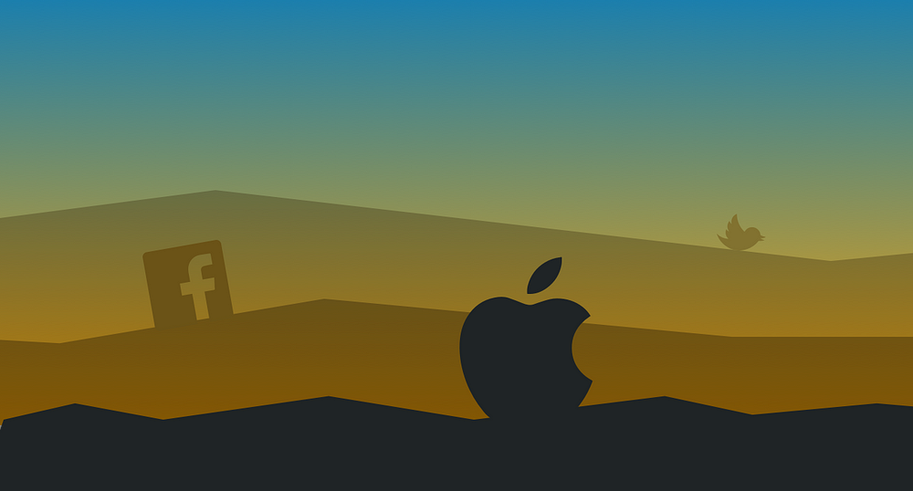
3 Product Design Predictions for 2018


Text & illustration: Andrew Wilshere
For better or worse, we begin 2018 in the wake of some historically significant political shifts. Across the U.S., Europe and beyond, establishment thinking and received wisdom failed to predict the electoral upheavals of 2016. In this piece, we explore some upheavals in the tech world that might also come sooner rather than later, manifesting a similar reaction against products and corporations that are increasingly perceived as both too powerful and too self-serving.

1. Apple will enter a full-blown identity crisis

Some might have thought that the corporate drama of Apple Computer would have ended after the Steve Jobs era — but the controversies that have come to characterize Tim Cook’s tenure have turned out to be just as enthralling.
The company Cook inherited in 2011 was very different from the one that Jobs found when he rejoined Apple in 1997. Jobs was brought in because the company had declined into near-irrelevance by the mid-90s; in contrast, Cook took over one of the largest and most successful companies in the world, boasting a highly desirable range of products and one of the most loyal customer bases around.
So, why this prediction — that 2018 is going to herald an identity crisis for Apple?
Well, things have been brewing for a while. First, there are the dumb design decisions that have characterised Cook’s tenure. Don’t get us wrong — Apple have always had a sideline in eccentric, overpriced, and failed products. Remember the 20th Anniversary Mac? Yeah, I thought not. One of the reasons I can’t forget it is that I think of it every time they show that episode of The Simpsons where Homer designs a car.
The 20th Anniversary Mac vs Homer Simpson’s car design
The doomed “hockey puck” — cute, but useless
Even in the Jobs era, there were some product design howlers, including the notoriously unusable “hockey puck” Apple Mouse that was released in 1998. Then, of course, there were the first-generation plastic MacBooks that first discoloured and then (literally) fell to pieces, earning themselves the nickname of “Crackbooks” in the process.
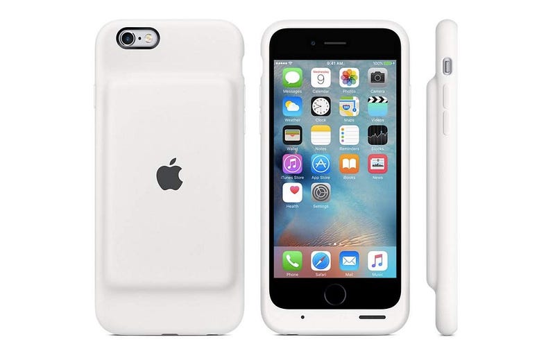
The top-case fiasco became a familiar sight for owners of the 2006 MacBook.
Dumb decisions in the Cook era have included a mouse that you have to turn upside-down to charge, and a battery pack for your iPhone that looks like a parody product, as well as making your phone look pregnant.
The official Apple Smart Battery Case for iPhone 6. Hmmm.
The 2015 Apple Magic Mouse 2. More hmmm.
Until recently, it was possible to take these eccentricities in good humor, largely because they were not that important. But things have been getting more serious in the past year.
For a start, Apple has embraced its market position and begun to systematically position its products as exclusive, premium alternatives to its run-of-the-mill competitors. This has included significant price hikes for its flagship products. A top-of-the-range MacBook Pro will set you back well over $4,000 with a 2TB hard drive, and the iPhone X begins at $999.
As a strategy, this might have been fine, had it not coincided with a 
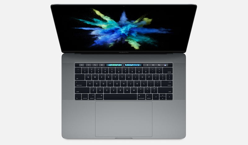
series of increasingly embarrassing product design blunders. The 2016 and 2017 MacBook Pro have widely-reported problems with creaking or cracking screen hinges, and failing keyboards. Add to that some bizarre design decisions — such as adding a largely useless Touch Bar and a comically oversized trackpad — and you start to wonder what is going on.
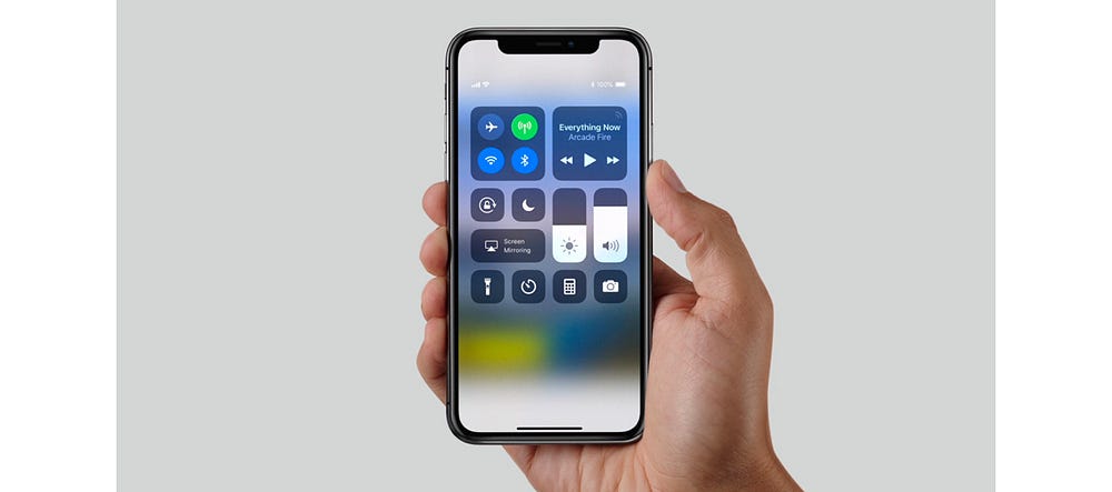
The late 2016 MacBook Pro — beautiful but botched
The most widely remarked-upon oddity of the iPhone X is the “notch”, though I doubt that’s going to be an enduring objection to the product; it may indeed prove to be a very useful piece of branding at a time when other “all-screen” smartphones are pretty much indistinguishable from one another.
More likely to hit the iPhone X’s reputation are emerging security problems with FaceID, which, combined with the product’s exceptionally high price, may go some way to explaining the reportedly slow sales of the handset and its rumoured discontinuation.
The iPhone X from 2017
In short, Apple has set itself up as being better than the rest, but has got into a bad habit of releasing products — both hardware and software — that can’t really support that claim, especially given that the quality of PC and Android products have increased markedly over the past 5 years.
In just the past few weeks, this mismatch between the company’s positioning, and what it is tending to deliver, was painfully evident in the disastrous flaws that MacOS High Sierra shipped with. One bug even allowed anyone to log in to any Mac as an administrator without a password, which led Apple to issue an emergency fix and a grovelling apology. Such a basic error would be inexcusable in a bargain-basement product; that it happened in a major release of MacOS is astonishing from a company that has set itself up as a paragon of virtue in its industry.
Which leads us to our prediction. It’s within Apple’s power to turn things around this year, but it’s going to be difficult. Some of these issues are probably evidence of failing processes within the company — for example, inadequate pre-release quality control and software testing — while the loss of genuinely “pro” features in the MacBook Pro in favor of expensive adapters and gimmicks like the Touch Bar show a lack of connection with user needs.
In 2018, if Apple wants to preserve its prime industry position and justify its price tags, it needs to return to real user-centered product design and re-focus on truly exceptional product execution. What’s more likely to happen, we fear, is that we will see another couple of botched product releases and embarrassing security problems, precipitating an identity crisis and maybe even some high-level departures from the company following 4 years of flat-lining revenue growth.

2. First-wave social media will start to decline

For the purposes of this article, we’re defining “first-wave” social media as Facebook and Twitter — though of course before that, there was the social media vanguard of MySpace, Bebo, and FriendsReunited.
If, like me, you have spent (too) much of the past decade reluctantly but compulsively attached to social media, you might find it hard to believe that Facebook or Twitter will ever die. But, of course, nothing lasts forever, and there are signs that these services are past their prime.
They were most popular amongst millennials, who hit adulthood in the mid-2000s and were excited by the prospect of an easy way to keep in touch with their nascent networks of friends and professional contacts. Facebook also offered an important, accessible way for older people to connect with friends and family far away.
A younger generation of post-millennials, though, have largely failed to see the attraction in these platforms, which offer the user very little granularity in how they relate to and share with different people. Generation Z have turned in their droves to Snapchat and encrypted services like WhatsApp for more secure and granular social networking — which can more faithfully mirror offline social relationships — and to Instagram for a more narrowly defined public sharing experience. Post-millennials have only ever known a data-driven, digital world, and easily see through “meaningless” Facebook friendships.
Facebook has made attempts to recapture the teenage and young adult market with apps like 2014’s Lifestage. This, however, was shut down last year following a lack of user uptake. They have also tried to bring in younger users by acquiring Instagram and other services that the demographic already use. More recently, Facebook acquired tbh, an anonymous compliments app for teens that was reportedly feared to be a potential commercial threat.
On top of this, we have a growing and diverse chorus of voices warning of the dangers of highly engineered social media services. These concerns have emerged partly in response to the alleged propagation of fake and planted news stories through social platforms during the 2016 US election. However, it runs deeper than that.
More importantly, critics draw attention to the fact that it is a core part of the design of first-wave social media platforms to create cognitive overload, psychological addiction, and compulsive sharing. It’s become common knowledge that many high-profile figures in the tech world limit their kids’ screen time or even send them to screen-free schools, perhaps to combat the expansion of tech into every realm of life.
At the Davos international trade summit a few days ago, billionaire George Soros had this to say:
“Mining and oil companies exploit the physical environment; social media companies exploit the social environment. This is particularly nefarious because social media companies influence how people think and behave without them even being aware of it. This has far-reaching adverse consequences on the functioning of democracy, particularly on the integrity of elections.”
Similarly, at the end of last year, Chamath Palihapitiya, a former Facebook executive for growth until he left in 2011, expressed regret at his role in the company’s expansion:
“the short-term, dopamine-driven feedback loops that we have created are destroying how society works. No civil discourse, no cooperation, misinformation, mistruth. […] This is not about Russian ads. This is a global problem. It is eroding the core foundations of how people behave by and between each other.”
And that’s not to mention the huge amounts of compromising personal data that users give over, unpaid, to multi-billion dollar companies to feed a lucrative advertising machine. Even The Economist — generally far from being a radical voice — is asking whether users should be paid for the data they currently freely surrender.
Our prediction is that 2018 will be a tipping point, as users become more aware of how corrosive first-wave social media platforms have become. To maintain their market position, Facebook and Twitter will need to go back to UX design basics and figure out afresh what 2018’s users actually want and need from a social app.
In the year ahead we are likely, at least, to see pushback against first-wave social media’s exhibitionist tendency. User preferences will shift towards more lo-fi, quasi-SMS interactions that require active participation rather than passive scrolling. Particularly in a world 
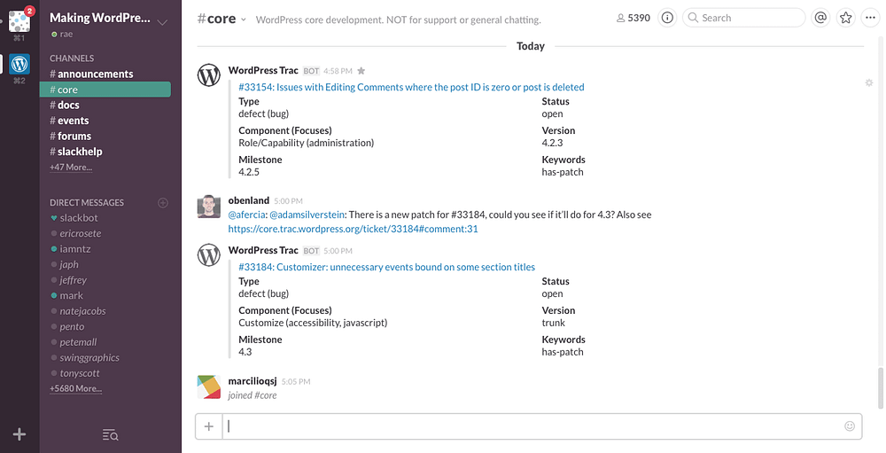
with an increasingly mobile workforce, business platforms such as Slack could provide a model for the future of social networking.
Slack’s desktop messaging interface
One important change in the decade since these platforms emerged is that users are now much more willing to pay for apps; paid subscriptions to Spotify and Netflix, which would once have been scandalous to the average web user, are now entirely normal.
User bases, even huge ones, can be fickle: once the time comes, or perhaps more importantly once the right new platform comes, we could see a brutal, mass exodus of regular users within a few years, towards paid platforms that deliver a more user-centered product.

3. Privacy and security will become more important user goals

Which leads us to our final prediction: in 2018, privacy and security will ratchet up the hierarchy of goals for many users. In the year ahead, experts deem it likely that there will be further international cyber-attacks in the wake of the WannaCry ransomware attack, which affected National Health Service (NHS) computer systems in the UK, leading to the closure of some services and diversion of ambulances. In turn, one of the reasons the ransomware propagated quickly was a failure to apply existing Windows 7 security patches that closed the EternalBlue exploit of a Windows vulnerability.
In a press release last year, David Dufour, vice president of engineering and cybersecurity at Webroot, stated that
“This past year was unlike anything we’ve ever seen. Attacks such as NotPetya and WannaCry were hijacking computers worldwide and spreading new infections through tried-and-true methods. This list is further evidence that cybercriminals will continue to exploit the same vulnerabilities in increasingly malicious ways. Although headlines have helped educate users on the devastating effects of ransomware, businesses and consumers need to follow basic cybersecurity standards to protect themselves.”
Individual users are beginning to wise up to the steps they can take to secure their privacy, security and identity, and will soon start to demand more of these controls from the devices and apps they use. To meet this demand, companies are likely to step up their efforts in these areas, perhaps accelerating programs to replace password systems or make 2-step verification mandatory.
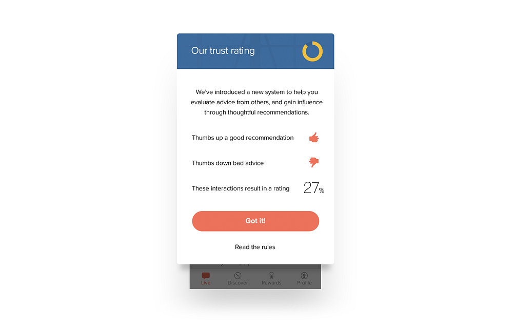
After all, there is a long way to go: less than 10% of Google users currently use 2-step verification. By the end of the year, we will see lots more screens like this one from Slack, as more major sites and services beginning to retire passwords completely in favour of other verification systems.
Growing awareness of security and privacy risks may also accelerate the decline of first-wave social media platforms, which are notoriously opaque when it comes to how they use personal data, and the steps that users can take to get it deleted.
In part, this has been a failure of national and international governance and regulation. Particularly with the introduction of significant legal measures such as the EU Data Protection Regulation, we will also see legislators adopting a less hands-off approach to tech companies’ use of data; in the year ahead legislative bodies around the world are likely to pass new laws demanding more rigorous data standards and greater user control.

Tuesday, January 30, 2018

Make me think!


the design of complexity

Until recently everyday objects were shaped by their technology. The design of a telephone was basically a hull around a machine. The task of the designers was to make technology look pretty.
It was up to the engineers to define the interfaces of those objects. Their main concern was the function of the machine, not its ease of use. We — the “users” — had to figure out how they worked.
With every technological innovation our everyday objects became richer and increasingly complex. Designers and engineers simply burdened the users with this increase in complexity. I am still having nightmares trying to get a train ticket from the old BART vending machines in San Francisco.

From complicated to simple

Fortunately, UX (User eXperience) designers have found ways to design beautiful interfaces that are easy to use. Their process can resemble a philosophical enquiry, where they constantly asks questions such as: What is this really about? How do we perceive this? What is our mental model?
Today, as a result of their efforts, we interact with wonderfully designed interfaces. Designers have been taming complexity for us. They make extremely sophisticated technology appear simple and easy to use.

From simple to too simple

And easy sells well. Thus more and more products are based on the promise to make our lives easier by using increasingly complex technologies with ever simpler interfaces.
Just tell your phone what you want and things will appear magically — whether it is the information on a screen or a package delivered to your doorstep. A gigantic amount of technologies and infrastructure is domesticated by brave designers and engineers who make all this work.
But we don’t see — let alone understand — what is going on behind the scenes, behind the simple appearance. We are kept in the dark.
You should see me whining like a spoiled brat when a video call is not working as smoothly as expected — all those interruptions and the bad sound quality! An experience which would have appeared nothing short of a miracle to people just 50 years ago and which requires the operation of a colossal infrastructure has become an expected normality for me.
We fail to appreciate and to empathise because we don’t understand what is going on.
So does technology makes us dumb? This question isn’t really new. Famously Plato warned us about the detrimental effects of writing — which we know of because he wrote them down.

The problem with “user centered” design

In his excellent book “Living with complexity” Donald Norman offers numerous strategies for how designers can harness the design of complexity to improve the user experience.
And there lies a problem.
I am increasingly wary of the term “user centered design”. The word “user” has a second meaning — “consumer of drugs”— which implies dependance, short-sighted gratification and a reliable source of income for the “dealer”. The word “centered” excludes pretty much everyone and everything else.

A holistic approach to complexity

As an alternative we should widen our perspective and ask questions such as:
Empowerment: Who’s having the fun?
Maybe being able to speak a foreign language is more fun than using a translation software.
Whenever we are about to substitute a laborious activity such as learning a language, cooking a meal, or tending to plants with a — deceptively — simple solution, we might always ask ourselves: Should the technology grow — or the person using it?
Resilience: Does it make us more vulnerable?
Highly sophisticated systems work flawlessly, as long as things go as expected.
When a problem occurs which hasn’t been anticipated by the designers, those systems are prone to fail. The more complex the systems are, the higher are the chances that things go wrong. They are less resilient.
A chronic dependance on a combination of electronics, artificial intelligence and a high speed internet connection for the simplest tasks is a recipe for disaster. It makes our lives more complicated, especially when we don’t understand what is going on behind the deceptively simple interface.
Empathy: What is the impact of simplification on others?
Our decisions have consequences for ourselves and others. A simplified appearance can make us blind to those consequences.
Our decision what smart phone to buy or what to have for dinner has a huge impact on other living beings. Knowing about the complexity behind such a decision can be of tremendous value. We need to know things better if we want to be better.
Embracing complexity
Simplification is a powerful design strategy. Naturally the button to make an emergency call should be as simple as possible. And yet, we also need further design strategies that help us accept, understand, and interact with complex situations in our lives.

Sunday, January 28, 2018

The User Experience of Lootboxes


I hope you like GIF’s. I brought GIF’s.

Disclaimer: In real life, when I’m not pretending I know how to write, I work for a gambling company here in Australia. This means that lootboxes — gambling — in video games is a unique point of interest for me. I’m not a gambler in any sense, but I deal with the industry on a daily basis. I think this gives me a unique perspective on the topic, and I want to be up front about where I’m coming from when I talk about it.
I believe gambling is much like drinking or smoking — it’s harmful to millions of people, and requires a significant effort by both gambling corporations and governments to regulate the medium effectively. I also, however, believe that just like drinking and smoking, it is an adults choice to participate in any form of gambling.
In gaming, gambling takes a different tone. There are very, very few barriers in most games for minors to participate in lootboxes, which absolutely are gambling. I believe there is an inherent ethical responsibility on any developer or publisher to put safeguards in place to protect kids. I also believe that it is the governments responsibility to enforce strict regulations on developers on how, and when, they institute gambling systems in games.
The views expressed in this article do not reflect the views of Tabcorp in any way. These are my own personal opinions.

I hope you like GIF’s. This article has a few.
Lootboxes were the number one gaming story of 2017. More specifically, games like Star Wars Battlefront 2 — a relatively good game in it’s own right that was significantly hampered by it’s extremely heavy-handed micro-transaction system.
I don’t want to dwell on the ethics or merits of these systems (I’ve done that enough in the disclaimer), but what I do want to talk about is how — from a UX perspective — these systems work and affect players.
I will say, however, that I unequivocally do not support games that put gameplay upgrades (especially those that grant power in a competitive setting) behind a paywall — commonly referred to as pay-to-win. I’m talking about games like FIFA Ultimate Team, Star Wars Battlefront 2, and to a lesser extent, Fortnite. Players shouldn’t have to pay money to have a better experience than other players.
There’s some key techniques successful lootboxes use to create an exciting opening experience — let’s see what they are:

Artificial Scarcity

Rarity is a massive driver in games. As soon as something is rare, it becomes intrinsically valuable to a player. This makes sense in the real world — there’s not much gold, so that which exists has value. In the digital world, everything is only as rare as a developer makes it.
Lootboxes often use thematic visual changes to represent time gates on certain boxes. Card packs or crates that are only available for certain periods have a unique style, so you feel as though you need to get it now, or you’ll miss out. This combines a sense of urgency and rarity — something that can powerfully influence a players’ decision to purchase.
Hearthstone’s extra touch — mousing over an unrevealed card gives you a glimpse of it’s rarity.
‘The Old Gods’ expansion features Lovecraftian-style packs.
Hearthstone is a good example of this. Each new expansion has it’s own card-pack style. It makes them feel special, and also gives that message that they’re new, or limited.
‘Knights of the Frozen Throne’ took a frostier route.
Hearthstone doesn’t remove these card packs for purchase, so there is technically no urgency (other than the need to have the best cards to stay competitive, of course), but the visual styling still motivates purchases.
EA Sports FIFA series actually does this a bit better. Their Ultimate Team mode has card packs that players can purchase (more on that later) that award football players for your teams.
This is an extreme example, but many players will genuinely have 6–8 versions in the game, most of which are time-sensitive rewards.
EA releases new, upgraded versions of players every week, alongside with regular events throughout the season. If you don’t buy packs that week/event, you can’t get that version of the player.
It’s very, very effective when your favourite player has a special edition card that you want. I may or may not have been brainwashed by this trick. More than once. Like, a lot, actually.

The Drumroll

Early lootboxes were simple — purchase me and get some loot. A few years ago, though, things got a little complex. Lootboxes started opening with some fancy graphics and cool effects. A big shift was what I call the drumroll. It’s that moment between clicking ‘Open’ and finding out what you’ve got, where often the box will reveal something about your rewards.
I’ve opened hundreds of these, but only just noticed that the box has disappeared when the camera comes back down…
This Overwatch box is a great example. There’s a moment where the rewards are spinning through the air and you catch a glimpse of the rarity of what you’re getting. When you see the orange glow of a legendary skin, it’s exciting and builds anticipation. Likewise, if you open 20 boxes and don’t get to see that orange hue, there’s tangible disappointment.
FIFA does this well, also. When you open a pack, the animation changes depending on the best player you recieve. Take a look at the three animations below:
A pack with a gold-ranked, non-rare player.
A pack with a gold-ranked, rare player.
A pack with a gold-ranked, rare, high-rated player.
The first two are relatively subtle, but even from the first moment of opening there’s some additional gold effects and a slightly different split effect for the rare opening.
The third opening is referred to as a ‘Walkout’ in the community — it’s reserved for highly rated players, and the player animation is personalised to one that player is known for in real life. When the billboards pop out of the pack, you immediately know you’re up for a good player. If that player jumps on screen, you’ve got one of the best in the game.
The excitement in these effects don’t start at the reveal, however. The excitement builds from the moment the pack starts to split and you recognise the unique effect that tells the player they’re in for something good.

The Big Reveal

As you might expect, the grand reveal is the most important part of any lootbox. This is where the player experiences limitless euphoria or bitter disappointment.
Ironically, there’s not too much to say about this. The boxes we’ve looked at so far are great examples of fun reveal moments; Hearthstone’s slow card-turn, FIFA’s staggered reveal of country, then position, then team, and finally the player’s name and portrait.
So, to change things up, let’s look at a few that I think are bad at this:
The infamous lootbox of Star Wars Battlefront 2
Star Wars Battlefront 2 drew so much ire in 2017 for offering powerful player upgrades in their lootboxes. They got slammed for this choice and, in turn, made some changes. It didn’t mean much though. What’s staggering is that despite this huge focus on a microtransaction model, the animation sucks. The holographic reveal has no impact, the color codes aren’t vibrant or exciting, and most packs came with intangible junk anyway. Boring.
I don’t remember this scene from Saving Private Ryan.
Call of Duty WWII had you call in ‘Supply Drops’ in a player populated hubspace between matches. This was a pretty transparent mechanism to show players who weren’t buying boxes just how much fun everyone else was having with their loot. The card flip lacks impact for me, and there’s no real drumroll beyond waiting for the cards to turn. Not great.
No Llamas were harmed in the making of Fortnite. Or so I’m told.
Aesthetically, I actually really like Fortnite’s loot-llamas. It’s also a relatively generous loot model, although it loses any possible browny points by having tangible upgrades locked behind purchasable lootboxes. Overall, it’s a creative execution that lacks any punch. The loot slows down the rarer it is, which actually feels more tedious than it does exciting.
That’s a big box for a little gun, Sergeant.
Battlefield 1’s crates are a prerendered animation followed by a static image of the weapon skin you get. It’s kind of cool the first two or three times, but once that delight wears off it feels more like an afterthought. Snore.

The Power of Choice

Something that’s come up relatively recently is giving players choices in their loot. There isn’t too many examples of this, but I did want to showcase a few games that use this technique. I think it’s a fun, pro-player way to create additional engagement in these sort of random drop systems.
Using the card backs to display rarity and type is a nice twist on a drumroll mechanic.
When you get a ‘Keg’ in Gwent, the fifth card in the pack is one you choose from a set of three. This is a great way to solve an ongoing problem with TCG games, where players rarely have the ability to purchase specific cards ad-hoc.
In Fortnite, at a certain tier of loot, the rarest item in a lootbox will be given to the player as a choice of two equally rare items. This is often between two weapon types, or two new heroes. It’s a nice way to make the loot more meaningful to the player, as they can choose something relevant to them.

In closing, I’d just like to say that lootboxes, for the most part, are completely evil.
I actually really like microtransactions as a concept. I think it’s a good way for developers to generate ongoing revenue and can be done in a way that doesn’t negatively impact the game, or the playerbase.
I also acknowledge that this concept has existed pretty much since Magic: The Gathering got big. Trading Card Games are almost exclusively built around a random-pack model (although the ability to trade cards mitigates this by creating a secondary market).
Furthermore, I admit that lootboxes when done right can be really fun. I quite like Overwatch’s interpretation — you earn them through standard gameplay, they only contain cosmetics, and you are rarely encouraged to make a purchase. There’s even a recovery mechanic in place so that you can outright purchase items you haven’t been lucky enough to recieve (Although this could be better).
But lootboxes, like booster packs, are gambling. They just are. And it’s a shame that such a large part of the industry (Including our two biggest publishers, EA and Activision Blizzard) are not so deeply entrenched in these systems as a way to sustain their games.
If you’re going to do lootboxes, please, fill them only with cosmetics. Having upgrades that affect gameplay in a randomised system compromises the integrity of your game, and forces players to choose between investing or being at a disadvantage.
There’s a right way and a wrong way to make systems like these work. There’s also a fun way. I don’t think lootboxes are going anywhere, but hopefully they’re going to get better.

Saturday, January 27, 2018

Designing Atlis, the future of local search


How Rainfall approaches all clients as an extension of their team.
Atlis is the next generation of local search, a platform where its community can get real, personalized recommendations for almost any type of business simply by asking. In essence, Atlis has brought word of mouth recommendations to the digital space by rewarding quality interactions from its users with cash, status, and most importantly a trustworthiness score.
When Rainfall was first approached by Atlis in the Spring of 2015, that product vision had not yet been created, or in better words, discovered. The story of our partnership is a journey that includes the creation of a product, a brand, and a new behavior from scratch through constant iteration, testing, and deployment.
Our approach to the next generation of branding
At Rainfall, we call projects like Atlis “full brand expressions” because we have the ability to affect every visual element and touchpoint, not only defining the rules for how the brand is presented, but literally designing each and every component in company’s suite whether it’s printed, on the web, or in the product itself.
When developing any large system we design multiple pieces simultaneously in order to test ideas on a broad scale. Sometimes a particular approach will work well in one situation but not adequately characterize the overall language of the brand. Working holistically allows us to spot those situations and find effective solutions earlier in the creative process.
Creating a full expression involves understanding how the visual language works as part of the narrative fabric without interrupting the audience’s ability to engage. This is especially true in the digital space, as each platform serves a higher purpose than simply communicating the brand’s visual identity. Atlis’s interaction model and methods for information hierarchy are themselves components of the identity, so on the web and in the product those elements are of highest importance.
Here’s a look at what we created together with Atlis.

The Atlis Visual Identity

Atlis helps users make decisions

At the start of our engagement Atlis existed as a big idea and a product MVP. The working idea was that they could be the ultimate platform for users to get trusted recommendations for businesses through a network of their peers. At the time the mechanism for bringing that idea to live was not yet complete, but there was a strong enough narrative structure in place that we could strategically build a brand, a “favorite” between two options.
The Atlis logo, a heart between two dots, symbolizes the platform’s aim to help it’s users make informed decisions when given multiple options. It is quite simply the love that one shows for one business over another. This mark fits with the company’s aim to strike friendly relationships with both consumers and businesses in order to create a platform that is mutually beneficial.

The Badges

At this point Atlis had a visual presence but lacked the personality required to excite its audience and encourage them to engage. As part of a larger strategic exercise in gamification we developed a series of badges to reward users for their participation and become the face of the brand.
We considered all of the individuals that compose the fabric of an urban neighborhood to conceptually link each badge to a stage in one’s knowledge of the businesses nearby. Each badge memorializes the journey of discovery while also putting a face on Atlis.

The Atlis Product

Central to Atlis is its mobile product, the main platform on which community members ask for advice finding businesses or respond to others with their own recommendations. As a concept the experience design is simple. There is a flow to ask for advice, a flow to view and respond to other users’ asks, as well as the necessary user and business profiles.
What started as a simple task of designing each of these flows developed into an approach of constantly iterating to optimize interaction and effectively display large amounts of supporting information.
The Ask Flow
#AskAtlis was a term coined early in the project that embodied the ease by which users would seek information. Our job was to deliver on that promise of ease by making the Ask flow as effortless as possible.
In early versions an Ask was just one step. The user would define what type of business they were looking for, write a brief supporting question, and confirm the preferred location all at once. While this seemed easiest we found that breaking that process into three focused steps resulted in a greater number of Asks and better insight into specifically what users were looking for.
The Response Flow
With over 20,000 users, recommendations begin to roll in almost immediately. Asking is only half of Atlis’s equation, and our main concern when testing the concept was that no one would respond as those Asks came in. Our approach was to make responding just as easy as asking, but with the added support of contextual information. When users opt to provide a recommendation Atlis suggests businesses that they have previously recommended or visited aided with additional context clues such as time of day, current location, and how long ago their last visit was.
Enticement
We knew that making it easy for users to respond wasn’t going to be enough, so we wove gamification into the core of the product experience. Each interaction with Atlis is an opportunity to earn points, increasing one’s standing within the community and represented with the badges developed as part of the identity. For additional appeal, users are rewarded in cash when someone acts on their recommendation and visits a business.

Trust

With a platform for recommendations involving status and cash we soon found it necessary to develop a means by which users could evaluate the advice from others. Were users thoughtfully suggesting businesses or were they recommending a place that they figured the asker would visit for other reasons? We wanted to create a democratized system in which users held each other accountable for good advice and where trust is earned through positive engagement with the community.
A simple thumbs up and down system encourages users to give their opinion as to whether advice is relevant to the asker’s intent. Users who give thoughtful advice increase their trust score, those who try to game the system will see it decrease, simple as that.
Available anywhere
We need to cater to everybody, from longtime Atlis community members, to newcomers, to businesses owners claiming their profiles. This means that Atlis takes on many formats and exists in various contexts throughout the course of a single day or a single user’s journey.
A full application suite serves this purpose, including a responsive web product, mobile apps, marketing landing pages, and soon more. For the web, every element is fully responsive with content and interaction models that adapt to contextual information including location and time.
The result — a positive experience for businesses
Atlis is extraordinarily beneficial for its users because they can finally get real recommendations from locals and friends who know their neighborhoods. With the addition of more ubiquitous touchpoints and machine learning currently in development, the quality of information will continue to increase.
The value that Atlis is creating is just the first step in ensuring a more positive ecosystem for businesses. Businesses can make themselves discoverable to new clientele without average ratings and negativity, while leveraging satisfied customers to promote their businesses.
Rainfall’s close partnership with Atlis resulted in a consumer brand and product suite with wild initial success. It is a demonstration that our approach of honesty and mutual respect with clients leads to work that engages users and encapsulates the brand’s ideals.


Wednesday, January 24, 2018

No Cutting Corners on the iPhone X


When the iPhone X launched, a lot of designers were put off about the screen shape. Those complaints have mostly died down, but I haven’t seen much design-nerd talk about cool corner treatment details. Fortunately, deep nerd shit is my specialty.
iPhone X screen shape

What’s Your Angle?

When you’re starting a design like this, the obvious, and comically cheaper option is to make all corners square. Machines exist and/or are calibrated to make those screens, so keeping edges squared requires fewer manufacturing changes and less talent along the pathway to production.
Everyone knows how to make a right angle — designers don’t have to do math, engineers need fewer calculations, the people making the machine are clear on what to do.
And yet, let’s examine how crappy all-square corners would look:
I’m a pixelated bear cub. Rawr.
Once Apple knew they wanted to take advantage of new full-screen technology, that gave them the opportunity to alter screen shape because they would need to address the manufacturing process anyway. Presumably, the expense was mostly built in.
Still, there were lots of ugly ways to do this:
Meh.
This is where they landed:
That’s better.

Screen Corners

Here’s where the nerd part comes in, iPhone X rounded screen corners don’t use the classic rounding method where you move in a straight line and then arc using a single quadrant of a circle. Instead, the math is a bit more complicated. Commonly called a squircle, the slope starts sooner, but is more gentle.
The difference is real subtle, even in gif-form, but here we go:
Difference between common rounded rectangle maths and Apple maths.
Apple has been doing this to the corners of laptops and iMacs for years, but this type of rounding didn’t penetrate iOS until version 7. This shape has classically been difficult to achieve, because it wasn’t available in 2D design editors, though that’s starting to change. Read about it more detail here.

The Notch

Now let’s talk about the notch itself. The left and right sides have two rounded corners. Because of the curve falloff, one curve doesn’t complete before the next one starts — they blend seamlessly into each other. As a result, no tangent line on this edge actually hits a perfect vertical.
Ooo. Fancy.

Come Correct

iPhone X templates I’ve seen out there don’t 100 percent duplicate the official shape, probably because it was either too hard to make or they haven’t noticed. This is why it’s good practice to use official assets from Apple, found in the design resources section of the developer site for creating icons and mockups.
Future iterations of this design will surely alter these sizes, so it will be interesting to compare how hardware sensor evolution impacts design shifts.
Overall, these decisions seem minor, but from a design viewpoint they’re fairly opinionated. Even when designers are willing to spend social capital to push these ideas, most organizations won’t put resources behind them.

Rounding the Bend

One of the things I love about indie apps is their ability to be opinionated. It’s nearly impossible to ship strong viewpoints from larger companies where there are fifty people in a room examining angles. So it’s cool to see Apple still has the ability to take a strong stance in this way.
Sweating thousands of minor details is what separates Apple from other companies. Their ability to do that is hard-won, but damn it’s pretty to watch.

Interested for our works and services?
Get more of our update !