Programming & IT Tricks . Theme images by MichaelJay. Powered by Blogger.

Copyright

Facebook

Post Top Ad

Search This Blog

Post Top Ad

Responsive Ads Here

Archive

Post Top Ad

Contact


Editors Picks

Follow us

Post Top Ad

Fashion

Music

News

Sports

Food

Technology

Featured

Videos

Fashion

Technology

Fashion

Label

Translate

About

Translate

Sponsor

test

Weekly

Comments

Recent

Connect With us

Over 600,000+ Readers Get fresh content from FastBlog

About

Showing posts with label apple. Show all posts

Thursday, October 11, 2018

Samsung Galaxy A9 (2018), the world's first smartphone with 4-inch rear camera launched


Samsung has launched the world's first-ever 4-rear camera smartphone Samsung Galaxy A9 (2018). The phone was launched at an event held in Malaysia's Kuala Lumpur on Thursday. The biggest feature of the Samsung Galaxy A9 (2018) is the launch of the Samsung Galaxy A9 (2018) 4 rear camera and has become the world's first smartphone with 4-rear camera. Let's tell you that the Galaxy A7 was launched with three rear cameras.
Samsung Galaxy A9 (2018) specification

This phone has the Android Orio 8.1 and 6.3-inch Full HD Plus Super Amoled display with dual SIM support. Apart from this, the phone will have Qualcomm Snapdragon 660 processor, up to 8 GB of RAM and 128 GB of storage.

Samsung Galaxy A9 is a 4-rear camera in 2019 with a 24-megapixel main lens, the second lens is a 10-megapixel telephoto with 2x optical zoom. The third lens is a 8-megapixel ultra wide angle lens and a fourth 5-megapixel lens. The four cameras are from the top down from the same line. The front has a 24-megapixel camera.

Samsung Galaxy A9 (2018) has a 3800 mAh battery that supports fast charging. There will be a fingerprint sensor in the phone's power button.
Price of Samsung Galaxy A9 (2018)

The price of Samsung Galaxy A9 (2018) is 599 euros, which is approximately Rs 51,300. However, there is still no explanation about how much Samsung Galaxy A9 (2018) will be worth in India. This phone will be available in Bubblegum Pink, Caver Black and Lemonade Blue Color Variants.

Thursday, September 13, 2018

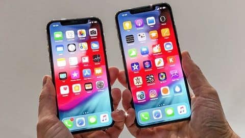
iPhone XS v/s iPhone X: Is it worth an upgrade?


Apple iPhone XS v/s iPhone X: The differences
As the successor to last year's tenth-anniversary edition iPhone X, Apple has launched the iPhone XS.
The new iPhone retains the edge-to-edge design of its predecessor but comes with an improved display and under the hood upgrades.
And given the iPhone XS is priced at $999, the same as iPhone X, the question is if it is worth the upgrade.
Here's a specifications-wise comparison.
In context: Apple iPhone XS v/s iPhone X: The differences

13 Sep 2018iPhone XS v/s iPhone X: Is it worth an upgrade?

As the successor to last year's tenth-anniversary edition iPhone X, Apple has launched the iPhone XS.
The new iPhone retains the edge-to-edge design of its predecessor but comes with an improved display and under the hood upgrades.
And given the iPhone XS is priced at $999, the same as iPhone X, the question is if it is worth the upgrade.
Here's a specifications-wise comparison.


Design At a glance


In terms of design, there's nothing new on the iPhone XS. So, you still have an edge-to-edge display with a notch that houses the front camera and Face ID module.

On the back, there's a dual camera setup and glass panel that enables wireless charging.

However, iPhone XS is now IP68 rated (iPhone X is IP67 rated) and is covered in a tougher glass.
All about the screen
DisplayAll about the screen

The iPhone XS has same 5.8-inch OLED Super Retina display with 458ppi of pixel density and 2,436x1,125 resolution.

However, Apple says the new display now offers 60% greater dynamic range of colors than its predecessor.

Further, the iPhone XS display also gets support for HDR 10, Dolby Vision, 120Hz touch sensitive, and the less-talked-about 3D Touch which debuted with the iPhone 6S.


Camera

For the shutterbugs and selfie lovers

In terms of camera, like the iPhone X, its successor sports a 12MP (f/1.8) wide-angle camera with OIS, 1.4-micron pixels, paired with a 12MP (f/2.4) telephoto lens with OIS and 2x optical zoom.

However, Apple has offered a faster sensor, a new image processing chipset that offers Smart HDR.

Up front, iPhone XS has the same 7MP TruDepth RGB camera with f/2.2 aperture.


Internals

All the important stuff

The most important upgrade is the new 7nm A12 Bionic chip which has a 6-core CPU, and a 4-core GPU.

The chipset comes paired with a new Apple-designed Neural Engine which can perform 5 trillion operations per second (600 billion operations on the older iteration).

Further, the new processor is 15% percent faster and 40% more power-efficient than the A11 chipset on iPhone X.


Sensors & Software

Lifeblood of your smartphone

In terms of software, there's the standard set of sensors you expect on a flagship smartphone.

Further, Apple's Face ID which debuted with the iPhone X, has now improved, thanks to the new Neutral Engine.

In terms of software, the iPhone XS will run iOS 12 out-of-the-box while iPhone X will get it as an OTA, starting September 17.

Battery & Connectivity

Staying connected

In terms of battery, Apple has said the iPhone XS will last half an hour more than iPhone X which packs a 2,716mAh battery.

Further, all connectivity options remain the same as seen on the iPhone X except for two major changes - Gigabit LTE that offers up to 1Gbps speed on 4G and support for dual SIMs (eSIM+Physical SIM).
]


    There's also a taller 6.5-inch iPhone XS Max
    Alongside the iPhone XS, Apple has also introduced a new 6.5-inch iPhone XS Max. The bigger iPhone packs the exact same specs as the iPhone XS but comes with a higher 2688x1242 resolution, and is claimed to last 60 minutes more than its smaller sibling.


Our result

How things stack up!

The iPhone XS is surely the most advanced iPhone yet. There's a new A12 chipset that will offer improved performance, better image processing, and graphical rendering.

However, starting at $999, like its predecessor, the new iPhone isn't much of an upgrade over the iPhone X.

That said, if you're on an iPhone 8 or older, the leap to iPhone XS will be worth it.


    Pricing and Availability
    The iPhone XS and iPhone XS Max will be offered in 64GB/256GB/512GB storage configurations with prices starting at $999 and $1099, respectively. These iPhones will become available starting September 28 in India.

Source


Thursday, February 1, 2018

The Apple Battery Cover-Up: Triumph of Management, Failure of Leadership


This is a difficult post for me to write. It’s a post about Apple — yet it’s not the same Apple where I spent 22 years of my career. It’s also a post about competent management — and, the utter failure of leadership.starti

You’ve probably seen the headlines by now. Apple recently rolled out an update that slows down older phones, ostensibly in an effort to preserve the life of aging batteries.
The thing is, Apple didn’t tell anyone that this was happening; a lot of iPhone users upgraded to newer models, when they could have simply bought new batteries — a much smaller financial investment — and continued to use their old phones.
It’s been a public relations nightmare, with multiple class action suits already filed. And Apple’s solution to the problem has been to apologize — rather feebly, and only after the whole thing was uncovered by a Reddit user — and knock down the battery replacement cost to $29. (It normally runs about $79.)

This is unbelievable to me.

When I was at Apple in the early 2000s, I ran into a somewhat similar problem, albeit on a much smaller scale. About 800 iBooks (yes there was actual hardware called an iBook), all of them in university settings, started exhibiting problems with their CD trays.

We acted quickly, and replaced every single one of those 800 units, no questions asked.

I know for a fact that we lost a couple of customers to Microsoft over this. I also know that we did the right thing. We were proud to have done the right thing. And most of our customers appreciated it.
Even with this slight inconvenience, they felt good about how we were treating them. Our response to the hardware malfunction enhanced our brand and our reputation.

Again: The Apple you’re reading about today is not the same company I worked for all those 22 years.

I can think of so many better ways they could have handled this:

1. The best solution would have been to just be upfront with customers in the first place. Say, “Hey, we’re glad you enjoy your old-school iPhone, but you’re going to be left behind; in order to download the latest iOS updates, you need to upgrade to a newer device.”
This kind of thing is, of course, totally normal in the tech world; you can’t run the latest macOS on an older MacBook any more than you can run the latest version of Windows on a 1980s PC. Tech changes, and eventually goes obsolete.
2. Another solution? In response to the aging battery issue, offer a coupon to those old-school iPhone users, giving them 50 percent off an iPhone 8. This is a feel-good solution — a new phone for a fraction of the price! Plus, it gets people into the Apple Store, and makes them actually happy.
3. Apple could even have offered to replace those old batteries in the store, free of charge — an inconvenient and cumbersome solution, but at least it would have shown some real customer service initiative. And again, it would generate traffic to the Apple Store and an opportunity to upgrade. Has everyone forgotten about the traffic conversion factor?
Any of those solutions would have been preferable to Apple’s secretive software upgrade — which, again, we only know about through social media users, not because Apple was forthcoming about it — to say nothing of its lame apology and its trifling $29 battery offer.
Here I might note that, according to some of my sources on the inside, the actual cost of a battery is in the single digits — so the fact that Apple is still making people pay $29 for a new one, in the face of a major PR scandal and with $200 billion in the reserves, is absolutely stunning.

Sure: In the short term, Apple’s saving a few bucks. That’s because the company is managing this problem well.

Managing a problem means getting through it with minimum trouble to the company. It involves a focus on numbers and accounting, but a short-sightedness when it comes to relationships and customer goodwill.
Instead of managing the problem, Apple should be leading it — not doing the bare minimum to save its neck, but doing the right thing, taking pride in doing the right thing, and trusting that customers will appreciate it. That’s what leadership means.
In other words, Apple should be thinking a few steps ahead, and realizing that a few bucks for free battery replacements (or discounted iPhone upgrades) mean nothing compared to the loss of goodwill the company now faces.

Goodwill (or relationships, when you get right down to it) is the most precious commodity it or any other company has. And Apple is squandering it.

And that’s to say nothing of the lack of communication here — as if Apple’s executives don’t know the old political adage, that the cover-up is always worse than the deed.
This whole episode may be seen as a turning point for Apple — its real transition from Steve’s company into Tim’s. Tim Cook is a great manager, and he’s certainly managing this situation ably.

But Steve would have done something better: He would have shown leadership.

3 Product Design Predictions for 2018


Text & illustration: Andrew Wilshere
For better or worse, we begin 2018 in the wake of some historically significant political shifts. Across the U.S., Europe and beyond, establishment thinking and received wisdom failed to predict the electoral upheavals of 2016. In this piece, we explore some upheavals in the tech world that might also come sooner rather than later, manifesting a similar reaction against products and corporations that are increasingly perceived as both too powerful and too self-serving.

1. Apple will enter a full-blown identity crisis

Some might have thought that the corporate drama of Apple Computer would have ended after the Steve Jobs era — but the controversies that have come to characterize Tim Cook’s tenure have turned out to be just as enthralling.
The company Cook inherited in 2011 was very different from the one that Jobs found when he rejoined Apple in 1997. Jobs was brought in because the company had declined into near-irrelevance by the mid-90s; in contrast, Cook took over one of the largest and most successful companies in the world, boasting a highly desirable range of products and one of the most loyal customer bases around.
So, why this prediction — that 2018 is going to herald an identity crisis for Apple?
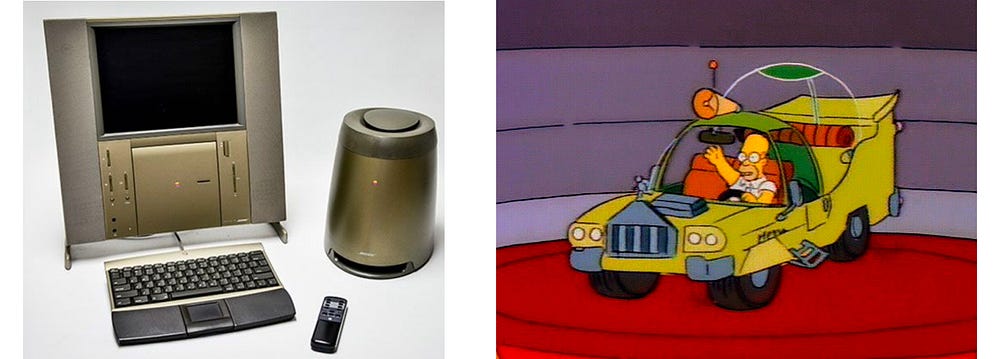
Well, things have been brewing for a while. First, there are the dumb design decisions that have characterised Cook’s tenure. Don’t get us wrong — Apple have always had a sideline in eccentric, overpriced, and failed products. Remember the 20th Anniversary Mac? Yeah, I thought not. One of the reasons I can’t forget it is that I think of it every time they show that episode of The Simpsons where Homer designs a car.
The 20th Anniversary Mac vs Homer Simpson’s car design
The doomed “hockey puck” — cute, but useless
Even in the Jobs era, there were some product design howlers, including the notoriously unusable “hockey puck” Apple Mouse that was released in 1998. Then, of course, there were the first-generation plastic MacBooks that first discoloured and then (literally) fell to pieces, earning themselves the nickname of “Crackbooks” in the process.
The top-case fiasco became a familiar sight for owners of the 2006 MacBook.
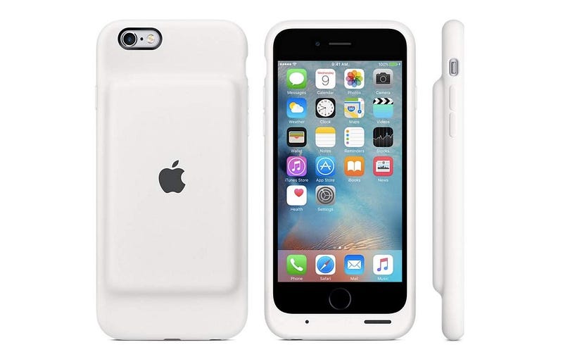
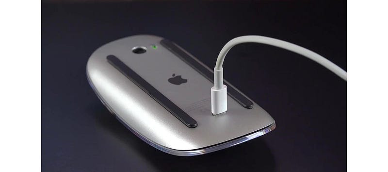
Dumb decisions in the Cook era have included a mouse that you have to turn upside-down to charge, and a battery pack for your iPhone that looks like a parody product, as well as making your phone look pregnant.
The official Apple Smart Battery Case for iPhone 6. Hmmm.
The 2015 Apple Magic Mouse 2. More hmmm.
Until recently, it was possible to take these eccentricities in good humor, largely because they were not that important. But things have been getting more serious in the past year.
For a start, Apple has embraced its market position and begun to systematically position its products as exclusive, premium alternatives to its run-of-the-mill competitors. This has included significant price hikes for its flagship products. A top-of-the-range MacBook Pro will set you back well over $4,000 with a 2TB hard drive, and the iPhone X begins at $999.
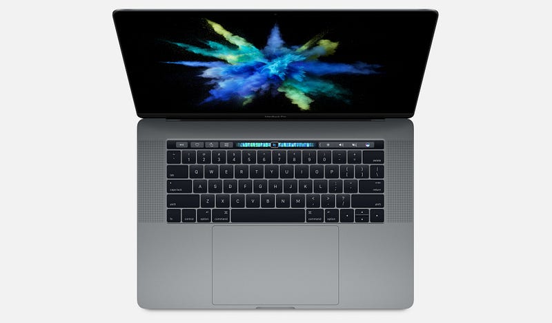
As a strategy, this might have been fine, had it not coincided with a series of increasingly embarrassing product design blunders. The 2016 and 2017 MacBook Pro have widely-reported problems with creaking or cracking screen hinges, and failing keyboards. Add to that some bizarre design decisions — such as adding a largely useless Touch Bar and a comically oversized trackpad — and you start to wonder what is going on.
The late 2016 MacBook Pro — beautiful but botched
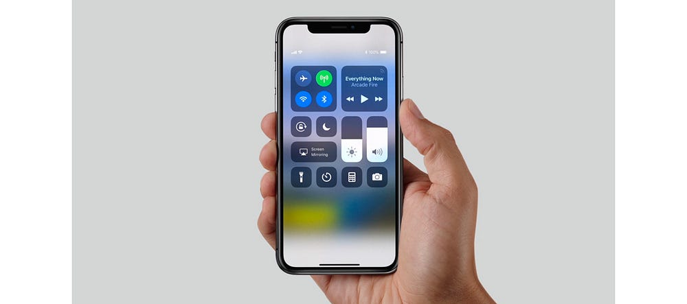
The most widely remarked-upon oddity of the iPhone X is the “notch”, though I doubt that’s going to be an enduring objection to the product; it may indeed prove to be a very useful piece of branding at a time when other “all-screen” smartphones are pretty much indistinguishable from one another.
More likely to hit the iPhone X’s reputation are emerging security problems with FaceID, which, combined with the product’s exceptionally high price, may go some way to explaining the reportedly slow sales of the handset and its rumoured discontinuation.
The iPhone X from 2017
In short, Apple has set itself up as being better than the rest, but has got into a bad habit of releasing products — both hardware and software — that can’t really support that claim, especially given that the quality of PC and Android products have increased markedly over the past 5 years.
In just the past few weeks, this mismatch between the company’s positioning, and what it is tending to deliver, was painfully evident in the disastrous flaws that MacOS High Sierra shipped with. One bug even allowed anyone to log in to any Mac as an administrator without a password, which led Apple to issue an emergency fix and a grovelling apology. Such a basic error would be inexcusable in a bargain-basement product; that it happened in a major release of MacOS is astonishing from a company that has set itself up as a paragon of virtue in its industry.
Which leads us to our prediction. It’s within Apple’s power to turn things around this year, but it’s going to be difficult. Some of these issues are probably evidence of failing processes within the company — for example, inadequate pre-release quality control and software testing — while the loss of genuinely “pro” features in the MacBook Pro in favor of expensive adapters and gimmicks like the Touch Bar show a lack of connection with user needs.
In 2018, if Apple wants to preserve its prime industry position and justify its price tags, it needs to return to real user-centered product design and re-focus on truly exceptional product execution. What’s more likely to happen, we fear, is that we will see another couple of botched product releases and embarrassing security problems, precipitating an identity crisis and maybe even some high-level departures from the company following 4 years of flat-lining revenue growth.

2. First-wave social media will start to decline

For the purposes of this article, we’re defining “first-wave” social media as Facebook and Twitter — though of course before that, there was the social media vanguard of MySpace, Bebo, and FriendsReunited.
If, like me, you have spent (too) much of the past decade reluctantly but compulsively attached to social media, you might find it hard to believe that Facebook or Twitter will ever die. But, of course, nothing lasts forever, and there are signs that these services are past their prime.
They were most popular amongst millennials, who hit adulthood in the mid-2000s and were excited by the prospect of an easy way to keep in touch with their nascent networks of friends and professional contacts. Facebook also offered an important, accessible way for older people to connect with friends and family far away.
A younger generation of post-millennials, though, have largely failed to see the attraction in these platforms, which offer the user very little granularity in how they relate to and share with different people. Generation Z have turned in their droves to Snapchat and encrypted services like WhatsApp for more secure and granular social networking — which can more faithfully mirror offline social relationships — and to Instagram for a more narrowly defined public sharing experience. Post-millennials have only ever known a data-driven, digital world, and easily see through “meaningless” Facebook friendships.
Facebook has made attempts to recapture the teenage and young adult market with apps like 2014’s Lifestage. This, however, was shut down last year following a lack of user uptake. They have also tried to bring in younger users by acquiring Instagram and other services that the demographic already use. More recently, Facebook acquired tbh, an anonymous compliments app for teens that was reportedly feared to be a potential commercial threat.
On top of this, we have a growing and diverse chorus of voices warning of the dangers of highly engineered social media services. These concerns have emerged partly in response to the alleged propagation of fake and planted news stories through social platforms during the 2016 US election. However, it runs deeper than that.
More importantly, critics draw attention to the fact that it is a core part of the design of first-wave social media platforms to create cognitive overload, psychological addiction, and compulsive sharing. It’s become common knowledge that many high-profile figures in the tech world limit their kids’ screen time or even send them to screen-free schools, perhaps to combat the expansion of tech into every realm of life.
At the Davos international trade summit a few days ago, billionaire George Soros had this to say:
“Mining and oil companies exploit the physical environment; social media companies exploit the social environment. This is particularly nefarious because social media companies influence how people think and behave without them even being aware of it. This has far-reaching adverse consequences on the functioning of democracy, particularly on the integrity of elections.”
Similarly, at the end of last year, Chamath Palihapitiya, a former Facebook executive for growth until he left in 2011, expressed regret at his role in the company’s expansion:
“the short-term, dopamine-driven feedback loops that we have created are destroying how society works. No civil discourse, no cooperation, misinformation, mistruth. […] This is not about Russian ads. This is a global problem. It is eroding the core foundations of how people behave by and between each other.”
And that’s not to mention the huge amounts of compromising personal data that users give over, unpaid, to multi-billion dollar companies to feed a lucrative advertising machine. Even The Economist — generally far from being a radical voice — is asking whether users should be paid for the data they currently freely surrender.
Our prediction is that 2018 will be a tipping point, as users become more aware of how corrosive first-wave social media platforms have become. To maintain their market position, Facebook and Twitter will need to go back to UX design basics and figure out afresh what 2018’s users actually want and need from a social app.
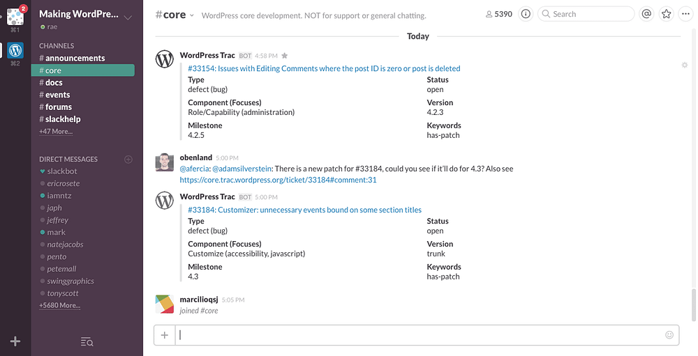
In the year ahead we are likely, at least, to see pushback against first-wave social media’s exhibitionist tendency. User preferences will shift towards more lo-fi, quasi-SMS interactions that require active participation rather than passive scrolling. Particularly in a world with an increasingly mobile workforce, business platforms such as Slack could provide a model for the future of social networking.
Slack’s desktop messaging interface
One important change in the decade since these platforms emerged is that users are now much more willing to pay for apps; paid subscriptions to Spotify and Netflix, which would once have been scandalous to the average web user, are now entirely normal.
User bases, even huge ones, can be fickle: once the time comes, or perhaps more importantly once the right new platform comes, we could see a brutal, mass exodus of regular users within a few years, towards paid platforms that deliver a more user-centered product.

3. Privacy and security will become more important user goals

Which leads us to our final prediction: in 2018, privacy and security will ratchet up the hierarchy of goals for many users. In the year ahead, experts deem it likely that there will be further international cyber-attacks in the wake of the WannaCry ransomware attack, which affected National Health Service (NHS) computer systems in the UK, leading to the closure of some services and diversion of ambulances. In turn, one of the reasons the ransomware propagated quickly was a failure to apply existing Windows 7 security patches that closed the EternalBlue exploit of a Windows vulnerability.
In a press release last year, David Dufour, vice president of engineering and cybersecurity at Webroot, stated that
“This past year was unlike anything we’ve ever seen. Attacks such as NotPetya and WannaCry were hijacking computers worldwide and spreading new infections through tried-and-true methods. This list is further evidence that cybercriminals will continue to exploit the same vulnerabilities in increasingly malicious ways. Although headlines have helped educate users on the devastating effects of ransomware, businesses and consumers need to follow basic cybersecurity standards to protect themselves.”
Individual users are beginning to wise up to the steps they can take to secure their privacy, security and identity, and will soon start to demand more of these controls from the devices and apps they use. To meet this demand, companies are likely to step up their efforts in these areas, perhaps accelerating programs to replace password systems or make 2-step verification mandatory.
After all, there is a long way to go: less than 10% of Google users currently use 2-step verification. By the end of the year, we will see lots more screens like this one from Slack, as more major sites and services beginning to retire passwords completely in favour of other verification systems.
Growing awareness of security and privacy risks may also accelerate the decline of first-wave social media platforms, which are notoriously opaque when it comes to how they use personal data, and the steps that users can take to get it deleted.
In part, this has been a failure of national and international governance and regulation. Particularly with the introduction of significant legal measures such as the EU Data Protection Regulation, we will also see legislators adopting a less hands-off approach to tech companies’ use of data; in the year ahead legislative bodies around the world are likely to pass new laws demanding more rigorous data standards and greater user control.

Tuesday, January 30, 2018

Designing beautiful mobile apps from scratch


I started learning graphic design when I was 13. I learned to design websites from online courses and used to play around with Photoshop and Affinity Designer all day. That experience taught me how to think like a designer.
I’ve been designing and developing apps for almost a year now. I attended a program at MIT where I worked with a team to develop Universeaty. Two months ago, I started working on a new app, Crypto Price Tracker, which I launched recently on 28th January.
In this post, I’ll share the step-by-step design process I follow along with examples of the app I worked on. This should help anyone who wants to learn or improve upon their digital design skills. Design is not all about knowing how to use design software, and this post won’t teach you how to use it. There’s hundreds of good quality tutorials online to learn. Design is also about understanding your product inside out, its features and functionality, and designing while keeping the end-user in mind. That’s what this post is meant to teach.
Design Process:
  1. Create a user-flow diagram for each screen.
  2. Create/draw wireframes.
  3. Choose design patterns and colour palettes.
  4. Create mock-ups.
  5. Create an animated app prototype and ask people to test it and provide feedback.
  6. Give final touch ups to the mock-ups to have the final screens all ready to begin coding.
Let’s start!

User-Flow Diagram

The first step is to figure out the features you want in your app. Once you’ve got your ideas, design a user-flow diagram. A user-flow diagram is a very high level representation of a user’s journey through your app/website.
Usually, a user flow diagram is made up of 3 types of shapes.
  • Rectangles are used to represent screens.
  • Diamonds are used to represent decisions (For example, tapping the login button, swiping to the left, zooming in).
  • Arrows link up screens and decisions together.
User-flow diagrams are super helpful because they give a good logical idea of how the app would function.
Here’s a user-flow diagram I drew when I started out working on the design of my app.
User-flow diagram for the Main Interface.

Wireframes

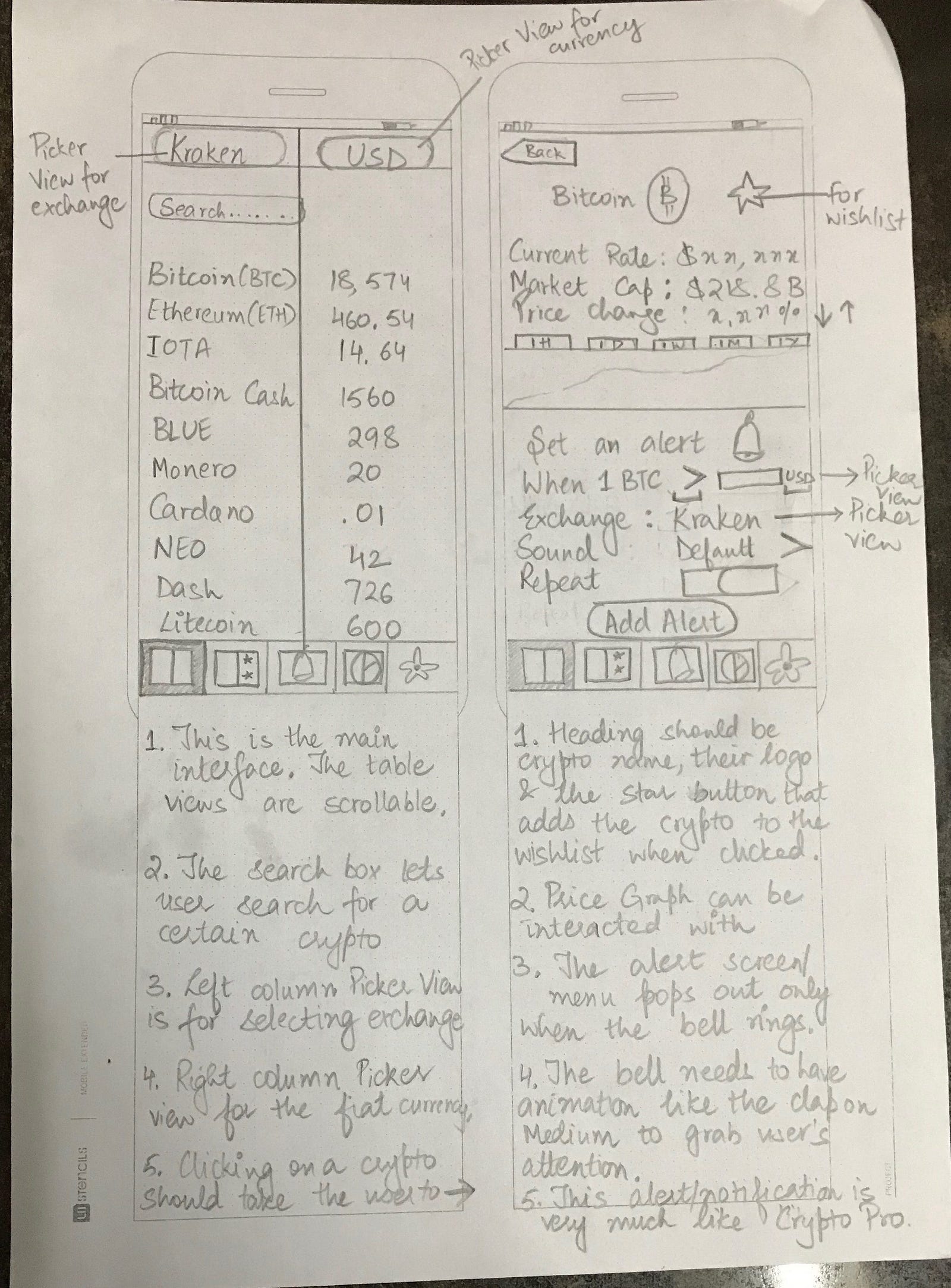
Once you’ve completed the user-flow diagrams for each screen and designed user journeys, you’ll begin working on wireframing all the screens. Wireframes are essentially low-fidelity representations of how your app will look. Essentially a sketch or an outline of where images, labels, buttons, and stuff will go, with their layout and positioning. A rough sketch of how your app will work.
I use printed templates from UI Stencils for drawing the wireframes. It saves time and gives a nice canvas to draw on and make notes.
Here’s an example wireframe.
Wireframe for the Main Interface.
After sketching the wireframes, you can use an app called Pop and take a pic of all your drawings using the app and have a prototype by linking up all the screens through buttons.

Design Patterns and Colour Palettes

This is my favourite part. It’s like window-shopping. Lots of design patterns and colour palettes to choose from. I go about picking the ones I like and experimenting with them.
The best platforms to find design patterns are Mobile Patterns and Pttrns. And to find good colour palettes, go to Color Hunt.

Mock-ups

This is when you finally move on to using design software. A mock-up in the design sense is a high-fidelity representation of your design. It’s almost like you went into this app in the future and you took some screenshots from it. It should look realistic and pretty much like the real thing.
There are design software and tools for creating mock-ups. I use Affinity designer. The most commonly used tool for iOS design is Sketch.
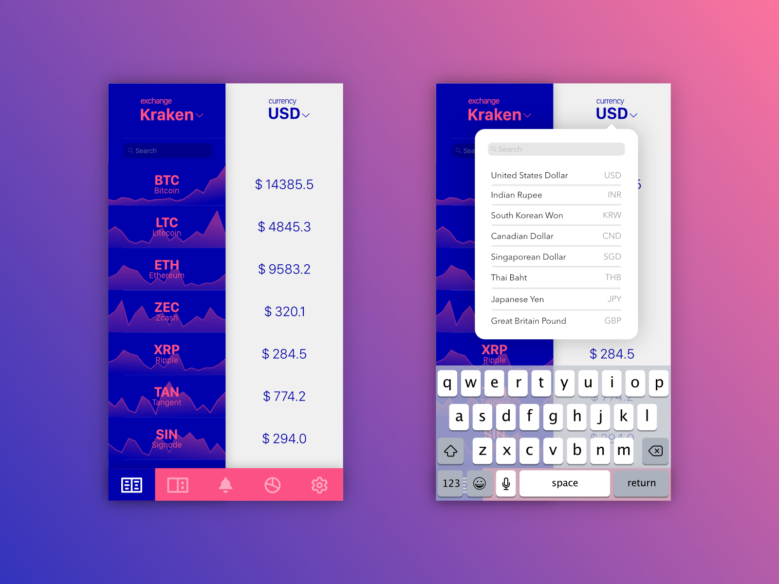
Here’s an example of some of the early designs of my app.
Bringing the pencil drawing to pixels!
I experimented more with various colour palettes.
I shared the initial mockups with my friends for their feedback. A lot of people seemed to like the gold gradient and black scheme.
Be willing to take feedback and experiment with new suggestions! You’ll find amazing ideas come from your users when you talk to them, not when you frantically scroll through Dribbble or Behance.
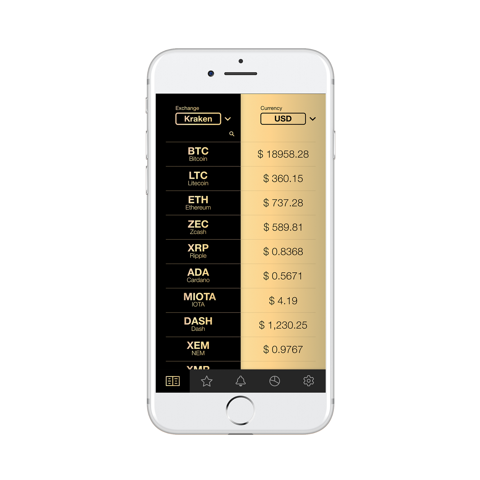
So I redesigned the mock-up and removed the background graphs because generating them was a technically time-consuming process and they reduced readability. This is what the redesigned mock-up looked like.
Gold gradient with black surprisingly looks good!
I was pretty satisfied with the colour scheme, icons on the tab bar, and overall layout. I went ahead and designed the rest of the screens following the same design guidelines. It was a long, but surely fun process!
Once all of my screens were ready, I put together a prototype in Adobe XD and asked a few friends to experiment and give feedback.
After final touches and such, this is what my final design looks like.
The Main Interface!
After all the screens were completed, I imported them into Xcode and began coding the app.
That’s it! I hope this post will help you get started with app design or help you become a better designer. And if you like my app, you can download it here.
I’m ending the post with one of my favourite quotes about design.
“Design is not just what it looks like and feels like. Design is how it works”
-Steve Jobs

Sunday, January 28, 2018

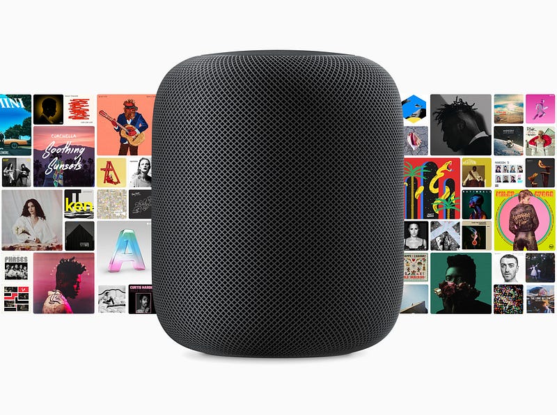
Up close with Apple HomePod, Siri’s expensive new home


Hello, HomePod. Image courtesy of Apple
If it were only a question of quality, Apple’s HomePod, which, after a months-long delay finally ships on February 9, should be an unqualified success. Its audio quality is excellent, especially considering its size.
Seven months ago, I sat is a small room and heard Apple’s 7-inch smart speaker play music for the first time. It sounded good, but the demonstration was short and lacking a key component of the smart speaker’s feature set: Siri integration.
Recently, though, I heard Apple’s HomePod again in a variety of scenarios and spaces. It sounded even better, especially when compared to larger Google Home Max and the aurally excellent Sonos One, the HomePod’s separation of sounds and fidelity to original instrumentation is astonishing.
This listening experience also added the smarts, or utility, that was missing back in June. Apple’s HomePod is, finally, a functioning Siri smart speaker.
Using the trigger phrase “Hey Siri,” HomePod responded to a variety of common Siri questions, activated HomeKit-enabled smart device tasks, and launched Siri-driven tasks, most revolving around Apple Music.
Put simply, Apple’s HomePod appears as good a smart speaker as most and a better audio device than many. However, it’s telling that Apple compares its first smart speaker to both the $399 Google Home Max and the $99.99 All New Amazon Echo. At $349, the HomePod is more expensive than virtually all of Amazon’s Echo line and most Google Home devices. The more comparably sized Google Home lists for $129.
This is a crucial moment for Siri, the voice assistant that now, according to Apple, has 500M monthly active devices. It lives in our iPhone, iPads and on our Apple Watches, but, until now, has never had a permanent place in the home. And it faces an uphill battle.
HomePod’s enters a crowded smart speaker market, one that Amazon owns, with a $350 product. This means Apple must work twice as hard to sell consumers on the HomePod’s ease-of-setup, standout audio qualities and its deep integration with the iOS, Siri and HomeKit ecosystem.
Does all that make it worth it? Let’s walk through some of the particulars and maybe you can decide.

Using the HomePod

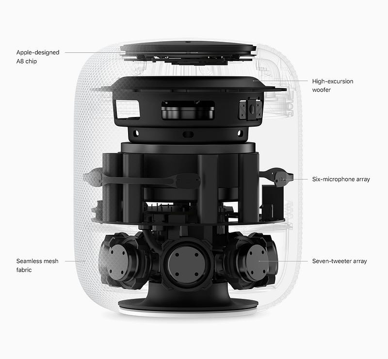
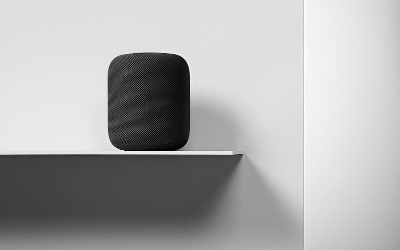
From the outside, the HomePod looks like a mesh-covered Mac Pro (it comes in white and space gray). Underneath, there’s a stacked array of audio technology, starting with seven horn-loaded tweeters at the base, a six-microphone array in the center and the sizeable woofer, with a claimed 22mm of travel, pointed straight up at the ceiling. Apple’s A8 chip handles the signal processing.
It is, in all an excellent hardware package that, unlike most of the other smart speakers, uses its own microphones to adjust audio for each listening environment.
The matrix of audio components is not inconsequential. In my listening party, songs like Ed Sheeran’s Shape of You picked apart the track, letting me hear both Sheeran’s guitar picking and the clarity of his voice. It was like he was playing in a small café for an audience of me. The bass notes on songs like Gregory Porter’s Holding On and Ariana Grande’s Side by Side were deep and resonant.
The HomePod setup process is as easy and fast as you would expect from an Apple device. With the latest version of iOS installed on your iPhone, 11.2.5, it will recognize the HomePod as soon as you put it near it. After that, the iPhone and HomePod steer you through a handful of settings including selecting the room where you’ll place the HomePod (it can get the list from the Home app, if you’re using it). It will also, with your permission, gather connections to your lists, reminders and will transfer all your iCloud and network settings so you don’t have to do things like manually enter user names, SSIDs and passwords. HomePod even grabs your Siri settings. Like a male voice? HomePod’s Siri will speak in that same male voice.
Then you get to the Apple Music portion of setup. Since Apple Music is the only natively supported music service, it’s pretty much your only option for streaming music, unless you use the HomePod as an AirPlay-connected speaker for your phone. At least every new HomePod comes with a three-month free subscription to Apple Music.
The combination of Siri and a smart speaker is quite compelling.
Since Apple Music has access to 45 million songs you can ask it pretty much any music question and get a good answer. From playing current hits, to finding a decent 80’s channel to playing various versions of the same song. The more you use Apple Music, the more it tailors responses to your preferences. I also noticed that, even with the volume at 90 percent, the HomePod could still hear when someone said, “Hey Siri, stop.”
Image courtesy of Apple
Apple updated Siri with a full-complement of Grammy-related responses, including playlists of the nominees and, after the Grammy Awards are announced, playlists of the winners. It’s a shame that the smart speaker doesn’t ship until after the awards show airs on January 28.

Siri house smarts

HomePod’s Siri integration works just as you would expect it to. You can ask Siri the latest news and it will launch a news brief from one of your favorite sources (CNN, Fox News, NPR). The white glowing spot on top of HomePod lets you know it’s listening. It has your weather update and can tell you if you need an umbrella. Siri has access to your reminders, so you can build a shopping list by talking to Siri.
It also lets you launch scenes with phrases like, “Hey Siri, Good Morning.” In the example I saw, that phrase triggered the raising of HomeKit-compatible blinds, turning on a coffee maker and raising the temperature through a smart thermostat. I like what I saw, but I don’t think the creation of Scenes in the Home app is as straightforward as it should be. I’m hoping Apple tears down and rebuilds the Home app, so it better integrates basic functions with automation and scene-building.
HomePod is also adept at sending messages to your contacts using only your voice and reading incoming messages back to you, as well. It also handles voice calls, but only as a speaker phone that accesses your WiFi-connected iPhone (you select the audio device on your phone). The Amazon Echo, can, by contrast, make calls to other Echos and those with the Alexa app without the need for smartphone.
Since Apple doesn’t sell information or let you buy products through the HomePod, it’s not interested in your personal information. They encrypt your queries and anonymize your personal data. Apple will even let you turn off “Hey Siri” listening, which means you must touch the device to launch a request (there’s also touch for volume control and mute).
Even with all these smart and home automation features. Apple believes most people use smart speakers like the HomePod for music, which is why it’s so surprising that it won’t ship with the ability to link up two HomePods as a stereo pair. Even after the February 9 ship date, you’ll have to wait for a software update to access that feature. If you do buy one or more HomePods, though, it’ll be worth the wait. Two HomePods playing just about anything is incredible.
What Apple has here is an ultra-high-quality speaker and the first physical instantiation of Siri without a screen. The fact that Apple is finally entering the smart speaker race is cause for muted celebration. It’s attractive, sounds amazing and is an excellent Siri ambassador. And it’s $349. Is better sound and solid iOS integration (plus the added cost of an Apple Music subscription) worth spending nearly four times as much as a decent sounding Echo?
Guess we’ll have our answer when the HomePod goes on pre-order this Friday.
Clarifications (1–26–2018): The HomePod does not support calendar. In addition, the iPhone call connection is over WiFi, not Bluetooth.

Thursday, January 25, 2018

9 Things Only iPhone Power Users Take Advantage of on Their Devices


For many, it’s difficult to imagine life before smartphones.
At the same time, it’s hard to believe that the original Apple iPhone, considered a genuine unicorn at the time thanks to its superior experience and stunning, rainbow-worthy display, released over 10 years ago.
Even though the iPhone is older than most grade school students, some of its capabilities remain a mystery to the masses.
Sure, we all hear about the latest, greatest features, but what about those lingering in the background just waiting to be discovered?
Getting your hands wrapped around those capabilities is what separates you, a soon-to-be power user, from those who haven’t truly unleashed its full potential.
So, what are you waiting for? Release that unicorn and let it run free like the productivity powerhouse it was always meant to be.
Here are 9 ways to get started.

1. Get Back Your Closed Tabs

We’ve all done it. While moving between tabs or screens, our fingers tap the little “x” and close an important browser tab.
With the iPhone, all is not lost. You can get that epic unicorn meme back from oblivion!
The included Safari browser makes recovering a recently closed tab a breeze. Learn more about the process here: Reopen Tabs

2. Smarter Photo Searching

Searching through photos hasn’t always been the most intuitive process…until now.
Before, you had to rely on labels and categories to support search functions. But now, thanks to new machine learning supported features, the photos app is more powerful than ever.
The iPhone has the ability to recognize thousands of objects, regardless of whether you’ve identified them. That means you can search using keywords to find images with specific items or those featuring a particular person.
Just put the keyword in the search box and let the app do the hard part for you.

3. Find Out Who’s Calling

Sometimes, you can’t simply look at your iPhone’s screen to see who’s calling. Maybe you are across the room, are driving down the road, or have the phone safely secured while jogging.
Regardless of the reason, just grabbing it quickly isn’t an option. But that doesn’t mean you want to sprint across the room, pull your car over, or stop your workout just to find out it’s a robo-dial.
Luckily, you can avoid this conundrum by setting up Siri to announce who’s calling. Then you’ll always know if you actually want to stop what you’re doing to answer before you break away from the task at hand.
See how here: Siri Announce Calls

4. Stop Squinting to Read Fine Print

In the business world, fine print is the donkey we all face on a regular basis. You can’t sign up for a service or look over a contract without facing some very small font sizes.
Thanks to the iPhone, you don’t have to strain your eyes (and likely give yourself a headache) to see everything you need to see when faced with fine print on paper. Just open the Magnifier, and your camera is now a magnifying glass.
See how it’s done here: Magnifier

5. Clear Notifications En Masse

Yes, notifications can be great. They let you know what’s happening without having to open every app individually.
But, if you haven’t tended to your iPhone for a while, they can also pile up quick. And who has the time to handle a huge listed of notifications one at a time?
iPhone’s that featured 3D Touch (iPhone 6S or newer) actually have the ability to let you clean all of your notifications at once.
Clear out here screen by following the instructions here: Clear Notifications

6. Close Every Safari Tab Simultaneously

iPhones running iOS 10 can support an “unlimited” number of Safari tabs at once. While this is great if you like keeping a lot of sites open, it can also get out of hand really quickly if you don’t formally close the ones you don’t need.
If you have more tabs open than stars in the sky, you can set yourself free and close them all at once.
To take advantage of this virtual reset, see the instructions here: Close All Safari Tabs

7. Request Desktop Site

While mobile sites are handy for the optimized experience, they can also be very limiting. Not every mobile version has the features you need to get things done, but requesting the desktop version wasn’t always the easiest process.
Now, you can get to the full desktop site with ease. Just press and hold on the refresh button at the top of the browser screen, and you’ll be given the option to request the desktop site.

8. Get a Trackpad for Email Cursor Control

There you are, doing the daily task of writing out emails or other long messages. As you go along, you spot it; it’s a mistake a few sentences back.
Trying to use a touchscreen to get back to the right place isn’t always easy, especially if the error rests near the edge of the screen.
Now, anyone with a 3D Touch enabled device can leave that frustration in the past. The keyboard can now be turned into a trackpad, giving you the cursor control you’ve always dreamed of having, the equivalent of finding a unicorn at the end of a rainbow.
Learn how here: Keyboard Trackpad

9. Force Close an Unresponsive App

If a single app isn’t doing its job, but the rest of your phone is operating fine, you don’t have to restart your phone to get the app back on track.
Instead, you can force close the unresponsive app through the multitasking view associated with recently used apps that are sitting in standby mode.
Check out how it’s done here: Force Close an App

Be a Unicorn in a Sea of Donkeys

Get my very best Unicorn marketing & entrepreneurship growth hacks.

Interested for our works and services?
Get more of our update !