Programming & IT Tricks . Theme images by MichaelJay. Powered by Blogger.

Copyright

Facebook

Post Top Ad

Search This Blog

Post Top Ad

Responsive Ads Here

Archive

Post Top Ad

Contact


Editors Picks

Follow us

Post Top Ad

Fashion

Music

News

Sports

Food

Technology

Featured

Videos

Fashion

Technology

Fashion

Label

Translate

About

Translate

Sponsor

test

Weekly

Comments

Recent

Connect With us

Over 600,000+ Readers Get fresh content from FastBlog

About

Showing posts with label game. Show all posts

Thursday, January 11, 2018

How to Lead High-Impact, Cross-Functional Projects


Even When You’re Not the Boss

This past summer I managed the largest acquisition campaign in my company’s history. I work at HubSpot, a marketing software company that popularized lead-gen campaigns and the whole idea of “inbound marketing,” so this is no small feat (we’ve run massive campaigns over the years).
The campaign, Four Days of Facebook, drove 10x the number of average leads of a typical acquisition campaign and 6x the lifetime value of projected customers.
But I didn’t do it alone. This campaign involved 11 teams and 33 people who directly contributed to the work.
Cross-functional campaigns like this can be big, complicated, and challenging which is why they so often take a boss or recognized leader to make them happen. So I wanted to share my experience as a “non-boss.” I hope it encourages other individual contributors out there to get their co-workers in other departments excited about working on high-impact, cross-functional projects.

Pre-planning: create alignment

You won’t have all the answers on day one, but make sure every conversation you’re having at this stage focuses on one thing: impact. You’ll be asking a lot of people to work hard on something outside of their normal day-to-day, make it clear that your asks will translate into business results.
  • Meet with senior leaders of each team before you ask for their employees commitment on helping. Again, make it clear that you won’t be wasting anyone’s time, you’re out to generate big results.
  • Have a kickoff meeting with the team who will be responsible for delivering the work. At a high-level, you want to let everyone know that you have senior leadership buy-in and the project will be worth their time. On a more tactical level, you’ll also want to get people up-to-speed on the tools you’ll be using to manage the project.
  • Go the extra mile to develop a team culture for your team. You know how developers name their projects crazy-sounding names? It’s surprisingly effective! Give your temporary team a name that makes people feel like they’re a part of something, set up an email alias, and create a Slack channel. Get people excited!
Throughout the pre-planning stage, keep your vision front and center. For Four Days of Facebook we were partnering with Facebook, a fact I repeated constantly.
If people are excited and engaged with your vision, they’ll put up with the inevitable bumps as you achieve lift-off.

During: maintain momentum

The Progress Principle is the idea that humans love the satisfaction of wins, even if they’re small. It’s your best friend as you seek to keep multiple teams and dozens of people aligned and moving in the right direction–constantly show (and celebrate) forward progress.
  • Display it: I put together a registration goal waterfall chart that was updated everyday to show progress. It’s motivating to close-in on and cross that goal line.
  • Never shut up about it: I linked to information about this campaign in my email signature, Slack rooms, wherever I had the attention of my co-workers. And that information was short, sweet, and up-to-date.
  • Be a good partner: You’re not technically the manager of the people on a cross-functional team, but you should implement some management best practices: give people autonomy, figure out how they like to work and what kind of support they need from you.
  • Ask for feedback: I asked questions constantly– Is this system or process working for you? Can I set up these reports in an easier way? At one point during this campaign I asked the senior manager of a few folks working on the project if she had thoughts on how I could run it better, she told me she would love to see weekly updates sent to her and other senior managers. I was avoiding this as I didn’t want to clutter inboxes, but it ended up being one of my best tools for building internal momentum around the campaign.
Don’t overlook the fundamentals of good project management. A framework like DARCI makes roles & responsibilities super easy so you the project lead can just say, “This meeting is for people who are Responsible and Accountable only, we’ll be covering deadlines for next week”, or “This meeting is for people that need to be Informed, it’ll be a milestone check-in.”
Find a project management framework, and stick to it.

Wrapping up: close-the-loop

I run 4–5 acquisition campaigns at HubSpot every quarter and running a campaign of this size and impact was a complete rush and I can’t wait to do it again. But before jumping into the next big project, it’s important to do a clean wrap-up, I want people to be excited to work with me and my team again in the future.
  • Say thank you: Do it publicly via a company announcement or email, and privately. I wrote handwritten notes to every person who contributed to this campaign.
  • Share results soon: Share the quantitative results, but don’t miss Twitter comments from attendees, feedback from partners, or the accolades of your co-workers. This is your chance to make it clear that you promised impact and delivered it.
  • Look for improvement opportunities: Because no matter how successful your campaign was, there are opportunities to do better — Were any deadlines missed? Why? Did any team members not work well together? Can this be addressed?
It’s easy to get stuck in a rut of executing one marketing campaign after the next, and it’s scary to think about leading a big cross-functional project that could potentially fail publicly.
But so often the answer to higher impact is better collaboration. Learning how to lead across teams 10x’ed the impact I was having at my company, I hope it does the same for you.

Tuesday, January 9, 2018

The Video Game Experience


Independent

Best: Rumu

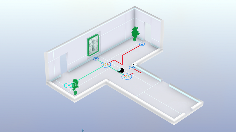
Rumu is a very unique game, and of all the games on this list, I think it’s the one that has the most unique UI. This is most likely due to the fact that Rumu has pioneered the ‘Sentient Vaccuum Cleaner’ genre, and there’s simply no game similar enough to pull inspiration from. Because of this, I’ll briefly summarise the elements I liked the most, so you have an idea of what I’m talking about.
It’s fitting, then, that Rumu’s UI pulls from a number of different genres and also remains quite unique. Rumu (The titular vacuum cleaner himself) has a radial menu to manage it’s quest log and inventory. That’s about where the traditional UI ends, and you start to see some bespoke elements.
Tutorial tips for controls appear outside the environments. This is a nice detail, as it serves not only to communicate the key bind but also as a hint of what you’re supposed to do in any given space.
A similar method is used for doorways or vent spaces — each is earmarked with text or iconography to indicate whether the player can pass through. The difference is actually really important, because it serves to split how the player treats information throughout the game — if the information is inside the room, it’s something to be learned. If it exists outside of the game space, it’s something that little Rumu already knows.
There’s a ‘Datavision’ function that allows Rumu to see how the various smart devices and intractable objects connect. It’s a great way to declutter the environments when the player is being task oriented, and it also often hides hidden easter eggs or gadgets.
One of the smartest UX features of Rumu is how it uses it’s palette and art style to generate emotion. A clean, white kitchen feels calm and simple, while crawling through vents on a sinister dark background gives the game a sense of urgency and danger.
Rumu is beautiful, functional, unique, and incredibly evocative. It’s UX blends perfectly with the narrative of the game, and aids in the storytelling.
Conclusion:
Independent developers are constantly coming up with new, interesting ways to interact with their games. There’s even a few on this list: Hand of Fate 2 and Tooth of Tail both innovate in a well-trodden genre.

Rumu’s a little different, because the robot vacuum cleaner genre isn’t quite as mature as, say, first person shooters. Despite this, the interactions in Rumu feel natural; the spacial and diagetic elements are what I’d expect a robo-vacuum to see in the world, and the meta UI tips help move the player along without breaking the (sometimes literal) fourth wall.

I look forward to seeing the robot vacuum cleaner genre evolve.

Worst: Stationeers

Picking this game sparked an internal debate in my mind over having a ‘Worst’ section at all, but in the end I decided it’s always better to get your feelings out than internalise them.
I really enjoyed Stationeers; I played almost six hours straight in my first run through. It’s an incredibly complex space space station construction game. Most of it’s UI is inoffensive: a simple HUD with your vitals and atmosphere stats, and a slot-based inventory system.
It all falls apart for me in the item management. Rather than go into specifics, I’ll give you an example: I need to take the empty battery out of my welding torch, and replace it with a full one.
I have to press 5 to open my tool belt, use the scroll wheel to highlight the torch, press F to put it in my hand, press R to open the torch’s inventory, press E to change hands, press F to move the batter into my free hand.
Now I press 2 to open my suit inventory, scroll wheel to an empty slot, press F to place the flat batter in there. Scroll wheel to the full battery, press F to place it in my off hand. Press E to change hands. Press R to open the torch inventory. Press E to change hands. Press F to place the battery in.
That’s…15 key presses. I can see what they were going for with this system, but there’s got to be a better way.

Virtual Reality

Best: Lone Echo

If UX as a practice is still in it’s infancy, UX for VR is a single-celled organism attempting mitosis for the first time. Nobody really has any idea what’s going to work and what’s not going to work, and so many games have great executions with a poor UX.
Lone Echo feels like someone looking at what VR will be doing five years from now, and dragged it screaming back into 2017. I don’t think it’s hyperbole to say that Lone Echo’s UX will help define the future of virtual and augmented reality interfaces.
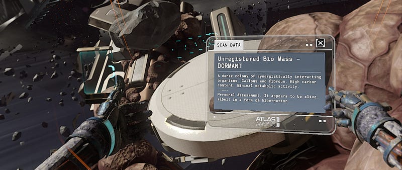
There’s no HUD in Lone Echo, instead opting to have your UI displayed from various arm-mounted gadgetry. Jack, the player character, has a number of controls and panels along his suit, each of which the player can interact with to reveal various elements interfaces.
This actually annoyed me at first — I wasn’t sure why a robot need any sort of interface at all. However, the interactions available are just so neat and genuinely enjoyable, it becomes a very small nitpick. You will also witness other characters in the game use the same interface, which gives some internal consistency to the game.
Talking to someone, for example, is a matter of simply looking at them and tapping a button the controller. This spawns a list of dialogue options that you select with your finger. It’s a simple thing, but being able to quickly interact with the object your looking at feels great.
Any panels you summon are intractable with your hand. You can scroll and tap like you would on an iPad. It feels completely natural to work with, and there were very few times after the opening minutes where I had trouble with this interaction style.
Similarly, Jack’s wrist holds a number of functions and features that are activated using your opposite hand. Slide across your forearm to open your objectives. Tap the top of your wrist for your scanner, or the side of your wrist for your welder. The interactions are so second-nature after having used them a few times that I found myself not even looking at my hands as I did these simple tasks.
Most of what you see in Lone Echo comes from somewhere. The locomotion, the dialogues, the tool interactions, are all borrowed from games that have come before it. Lone Echo proves that these interactions are unequivocally the right way to do them, and if done right, can be so immersive and intuitive that the player doesn’t have to remember them, they just become the way things are done.
Just like the brilliant writing and slick graphics, Lone Echo’s UX is the reason it’s such a successful game. It keeps the player completely immersed in everything they’re doing, no matter how complex the task. At it’s best, the interactions in Lone Echo are actually fun to use. Menus that are fun! If that’s not a revolution, I don’t know what is.
Conclusion:
The most immersive experience I’ve ever had in a video game. Lone Echo bends over backwards to put you in the moment with objects that behave like the user expects they should, and an environment that is consistently interactive.

Lone Echo isn’t held back by trying to fit it’s UI into it’s narrative — it’s built it’s entire user experience around the narrative, instead. Lone Echo sets the standard for VR UX to come.

Worst: None

It’s a cop out, I know. Truth be told, I haven’t played a VR game that released in 2017 that had any truly awful UX. There’s plenty of games that make some missteps, or the occasional obvious error, but this is going to happen with a still-growing genre like virtual reality. For now, VR gets a pass.
If you got this far, thanks for reading! Hopefully you found something interesting in my choices. Please feel free to comment with your opinions, especially if there’s something great that I missed.
I’m

Interested for our works and services?
Get more of our update !