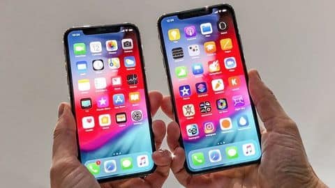
As the successor to last year's tenth-anniversary edition iPhone X, Apple has launched the iPhone XS.
The new iPhone retains the edge-to-edge design of its
predecessor but comes with an improved display and under the hood
upgrades.
And given the iPhone XS is priced at $999, the same as iPhone X, the question is if it is worth the upgrade.
Here's a specifications-wise comparison.
Design At a glanceIn terms of design, there's nothing new on the iPhone XS. So, you still have an edge-to-edge display with a notch that houses the front camera and Face ID module.
On the back, there's a dual camera setup and glass panel that enables wireless charging.
However, iPhone XS is now IP68 rated (iPhone X is IP67 rated) and is covered in a tougher glass.
All about the screen
DisplayAll about the screen
The iPhone XS has same 5.8-inch OLED Super Retina display with 458ppi of pixel density and 2,436x1,125 resolution.
However, Apple says the new display now offers 60% greater dynamic range of colors than its predecessor.
Further, the iPhone XS display also gets support for HDR 10, Dolby Vision, 120Hz touch sensitive, and the less-talked-about 3D Touch which debuted with the iPhone 6S.
Camera
For the shutterbugs and selfie lovers
In terms of camera, like the iPhone X, its successor sports a 12MP (f/1.8) wide-angle camera with OIS, 1.4-micron pixels, paired with a 12MP (f/2.4) telephoto lens with OIS and 2x optical zoom.
However, Apple has offered a faster sensor, a new image processing chipset that offers Smart HDR.
Up front, iPhone XS has the same 7MP TruDepth RGB camera with f/2.2 aperture.
Internals
All the important stuff
The most important upgrade is the new 7nm A12 Bionic chip which has a 6-core CPU, and a 4-core GPU.
The chipset comes paired with a new Apple-designed Neural Engine which can perform 5 trillion operations per second (600 billion operations on the older iteration).
Further, the new processor is 15% percent faster and 40% more power-efficient than the A11 chipset on iPhone X.
Sensors & Software
Lifeblood of your smartphone
In terms of software, there's the standard set of sensors you expect on a flagship smartphone.
Further, Apple's Face ID which debuted with the iPhone X, has now improved, thanks to the new Neutral Engine.
In terms of software, the iPhone XS will run iOS 12 out-of-the-box while iPhone X will get it as an OTA, starting September 17.
Battery & Connectivity
Staying connected
In terms of battery, Apple has said the iPhone XS will last half an hour more than iPhone X which packs a 2,716mAh battery.
Further, all connectivity options remain the same as seen on the iPhone X except for two major changes - Gigabit LTE that offers up to 1Gbps speed on 4G and support for dual SIMs (eSIM+Physical SIM).
]
There's also a taller 6.5-inch iPhone XS Max
Alongside the iPhone XS, Apple has also introduced a new 6.5-inch iPhone XS Max. The bigger iPhone packs the exact same specs as the iPhone XS but comes with a higher 2688x1242 resolution, and is claimed to last 60 minutes more than its smaller sibling.
Our result
How things stack up!
The iPhone XS is surely the most advanced iPhone yet. There's a new A12 chipset that will offer improved performance, better image processing, and graphical rendering.
However, starting at $999, like its predecessor, the new iPhone isn't much of an upgrade over the iPhone X.
That said, if you're on an iPhone 8 or older, the leap to iPhone XS will be worth it.
Pricing and Availability The iPhone XS and iPhone XS Max will be offered in 64GB/256GB/512GB storage configurations with prices starting at $999 and $1099, respectively. These iPhones will become available starting September 28 in India.
Source