Chinese smartphone maker Huawei has launched the Huawei Y9 (2019) smartphone in India. This phone has been launched at an event organized in Delhi. The price of this smartphone, priced at Rs 15,990 with a dual selfie camera. It has been launched in two color variants Midnight Black and Safer Blue.
This phone is being sold exclusively on Amazon. Apart from this, the phone buyer will get the Rokkersports Bluetooth headphone free of $ 2,990. Huawei Y9 (2019) specification
Huawei Y9 (2019) features a 6.5 inch full view display. This phone is equipped with a 3D Wrinkle design. The phone uses the Kirin 710 processor which comes with 7.0 with AI power. Talking about the camera, it has a dual-rear camera setup, with primary sensor 12 megapixels and second to 2 megapixels. Apart from this, a dual camera is also provided in the front, in which there is a sensor of 2 megapikles.
Apart from this, the dual cameras are also available in the front, in
which one sensor is 16 megapixels and the other is 2 megapixels. It is said that both cameras are equipped with AI.
The phone has been launched with 3GB and 4GB RAM variants and has 64GB
of inbuilt storage, which can be increased to 256 GB by memory card. Apart from this, it has a battery of 4000mAh for power.
In Huawei Y9 (2019) you will also find a fingerprint sensor equipped
with 4.0 identification technology and it is claimed that this
smartphone can be unlocked in 0.3 seconds. There is also fingerprint navigation in upgraded fingerprint technology. Which allows the user to manage all the notifications using one key.
Design
+ Sketch is a large collection of articles, tips, tutorials, and
stories on designing and prototyping with Sketch and beyond. Below
you’ll find a guideline, useful tips and info about the publication
process to keep in mind.
How does it work?
Send a link of your published article or draft via email to contact@sketchappsources.com
Note:
Medium only allows articles to be published to one publication at a
time. So if your article has already been published with a different
publication, you’ll have to make a decision what publication you’d like
to publish it under
We will contact you once we’ve reviewed your email and your article 📬(within 24 hours)
If your story has been successful, we’ll invite you to join as an official writer to the publication 👏
At this point, you’ll be able to submit your story. Medium has written a handy post on how to submit your work
Once you submit, your article will be added to our publishing queue and it will be added promptly
Once your article is published, you’ll see it as part of Design + Sketch 🎉
What the Design + Sketch community loves?
The
community loves genuine design and development opinions, tips, lists,
tutorials, plugins, and case studies on Sketch, User Experience Design,
User Interface Design, Usability, Interaction Design, Prototyping,
Product Design, and any other topic that relates to designing and
building plugins or digital products with Sketch and beyond.
Make
sure your article has a clear value to our readers so they can take
something away that will impact their productivity and improve their
design process. You can review current stories for inspiration 😃
What you could improve on before submitting?
If
you’re trying to sell or promote something, don’t forget that what
matters most is the value that you’re creating for others. Write about
the “Why?” and your experience, instead of pushing products, books, courses, or other tools with slimy sales tactics.
In order to keep the quality, we maintain the privilege to decline articles that don’t align with what the community desires.
We look forward to reading your story! Thank you for choosing Design + Sketch as the home for your work 🦄
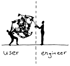
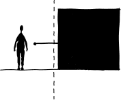
Until
recently everyday objects were shaped by their technology. The design
of a telephone was basically a hull around a machine. The task of the designers was to make technology look pretty.
It was up to the engineers to define the interfaces of those objects. Their main concern was the function of the machine, not its ease of use. We — the “users” — had to figure out how they worked.
With every technological innovation our everyday objects became richer and increasingly complex. Designers and engineers simply burdened the users with this increase in complexity. I am still having nightmares trying to get a train ticket from the old BART vending machines in San Francisco.
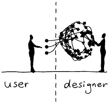
From complicated to simple
Fortunately,
UX (User eXperience) designers have found ways to design beautiful
interfaces that are easy to use. Their process can resemble a
philosophical enquiry, where they constantly asks questions such as: What is this really about? How do we perceive this? What is our mental model?
Today, as a result of their efforts, we interact with wonderfully designed interfaces. Designers have been taming complexity for us. They make extremely sophisticated technology appear simple and easy to use.
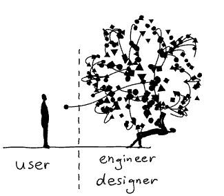
From simple to too simple
And easy sells well. Thus more and more products are based on the promise to make our lives easier by using increasingly complex technologies with ever simpler interfaces.
Just
tell your phone what you want and things will appear
magically — whether it is the information on a screen or a package
delivered to your doorstep. A gigantic amount of technologies and infrastructure is domesticated by brave designers and engineers who make all this work.
But we don’t see — let alone understand — what is going on behind the scenes, behind the simple appearance. We are kept in the dark.
You
should see me whining like a spoiled brat when a video call is not
working as smoothly as expected — all those interruptions and the bad
sound quality! An experience which would have appeared nothing short of a
miracle to
people just 50 years ago and which requires the operation of a colossal
infrastructure has become an expected normality for me.
We fail to appreciate and to empathise because we don’t understand what is going on.
So
does technology makes us dumb? This question isn’t really new. Famously
Plato warned us about the detrimental effects of writing — which we
know of because he wrote them down.
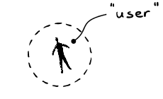
The problem with “user centered” design
In his excellent book “Living with complexity” Donald Norman offers numerous strategies for how designers can harness the design of complexity to improve the user experience.
And there lies a problem.
I am increasingly wary of the term “user centered design”. The word “user” has a second meaning — “consumer of drugs”— which implies dependance, short-sighted gratification and a reliable source of income for the “dealer”. The word “centered” excludes pretty much everyone and everything else.
A holistic approach to complexity
As an alternative we should widen our perspective and ask questions such as:
Empowerment: Who’s having the fun?
Maybe being able to speak a foreign language is more fun than using a translation software.
Whenever
we are about to substitute a laborious activity such as learning a
language, cooking a meal, or tending to plants with
a — deceptively — simple solution, we might always ask ourselves: Should the technology grow — or the person using it?
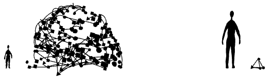
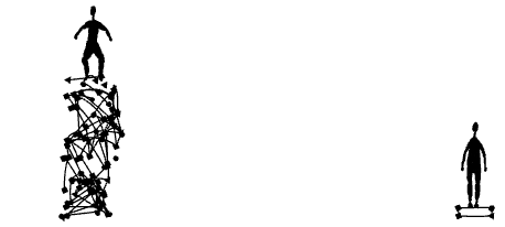
Resilience: Does it make us more vulnerable?
Highly sophisticated systems work flawlessly, as long as things go as expected.
When a problem occurs which hasn’t been anticipated by the designers, those systems are prone to fail. The more complex the systems are, the higher are the chances that things go wrong. They are less resilient.
A
chronic dependance on a combination of electronics, artificial
intelligence and a high speed internet connection for the simplest tasks
is a recipe for disaster. It makes our lives more complicated,
especially when we don’t understand what is going on behind the
deceptively simple interface.
Empathy: What is the impact of simplification on others?
Our decisions have consequences for ourselves and others. A simplified appearance can make us blind to those consequences.
Our
decision what smart phone to buy or what to have for dinner has a huge
impact on other living beings. Knowing about the complexity behind such a
decision can be of tremendous value. We need to know things better if we want to be better.
Embracing complexity
Simplification
is a powerful design strategy. Naturally the button to make an
emergency call should be as simple as possible. And yet, we also need
further design strategies that help us accept, understand, and interact
with complex situations in our lives.
An
idea emerged back in the 20th century about a brand new mode of
transport involving a magnetic pad to reduce friction. In 2012, when
California was all about the California High-Speed Rail project, Elon
Musk suggested Hyperloop. For several years now, the world’s best
engineers have been working toward a technological breakthrough. The
future is a tantalizing secret and we’re constantly trying to predict
and infer what will happen. Hyperloop One just disclosed their own
vision of the passenger app interface, and you can easily compare the
work they did with what we imagined to be the perfect Hyperloop app: https://techcrunch.com/2018/01/08/hyperloop-one-and-here-built-a-hyperloop-passenger-app/
Everything
changes at lightning speed, and we can’t always keep up with the latest
news. In the meantime, innovations encourage us to think up creative
solutions that have everyday applications using smartphones, tablets,
MacBooks, etc. Our company has a lab for generating experimental
interfaces where we’re always asking what kinds of challenges we’ll get
to see in a year or two, like:
An AR app for studying anatomy which shows you someone’s internal organs when you direct the camera view at them.
The messenger of the future which will boast additional functions like micro crowdfunding, dating options, and a bunch of other cool stuff.
A news service which uses AI to predict newsworthy events a spine-tingling 15 minutes before they actually occur.
In
this article, we want to talk about creating an app for Hyperloop.
After all, they call it the 5th transport mode, with its own
infrastructure. So its interface will be totally unique, with its own
functionality and usability.
Obviously, what interests us most is which cities are included in Hyperloop’s network, and how long travel will take.
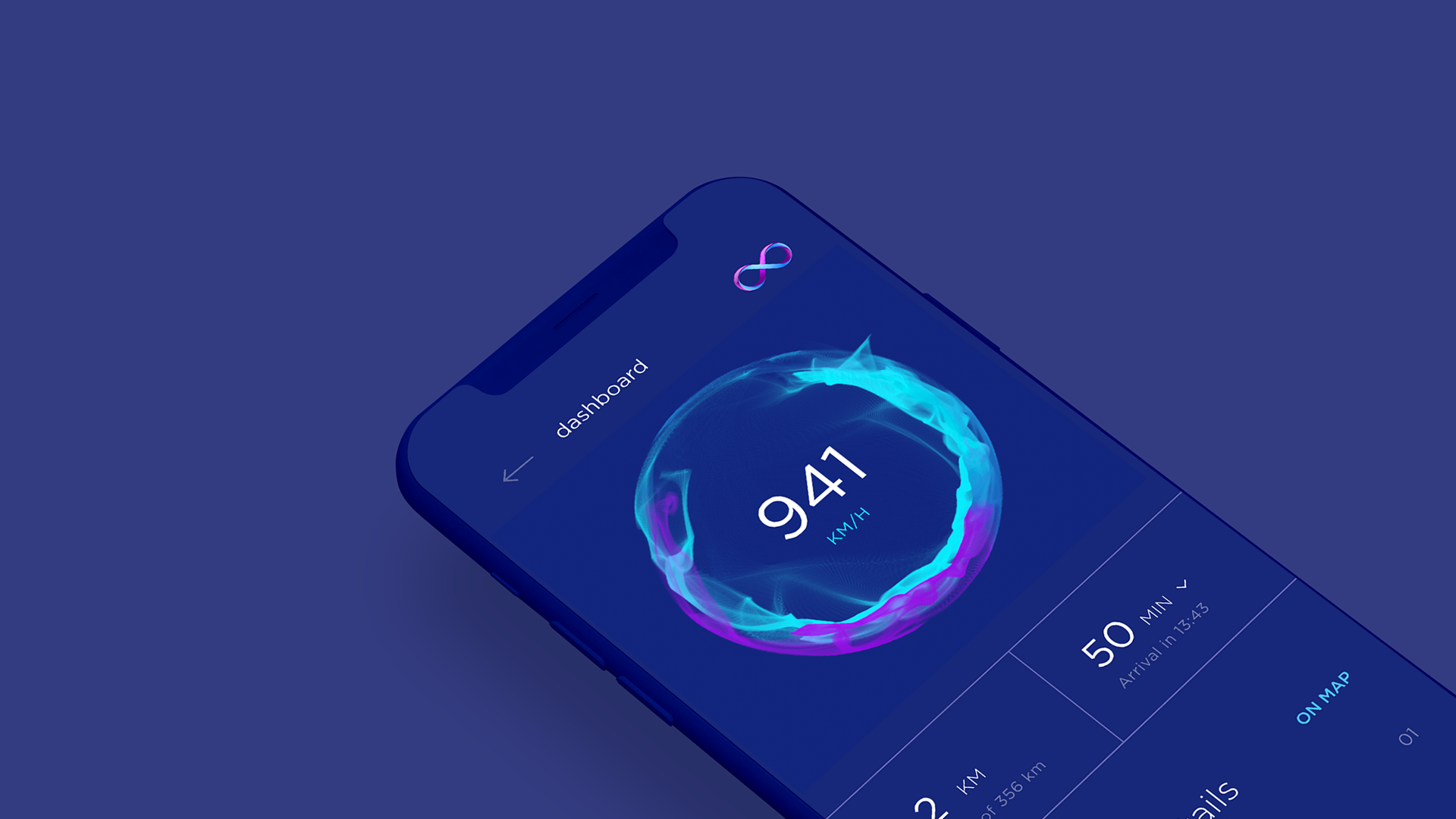
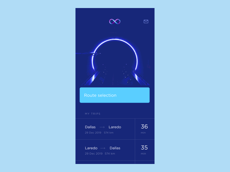
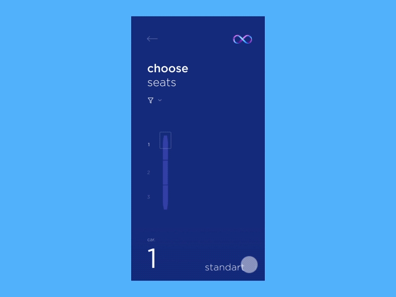
Route Selection
A
map of the US emphasizing key cities on Hyperloop’s map and indications
of travel time (in minutes, based on speeds of 1080 km/hr). The user
selects two cities on different coasts. The interface shows which
segments make up the route and calculates general travel time (taking
into account stops along the way). We see the route screen, which
presents the points of departure and arrival, travel time, cost, and a
“Choose Seats” button.
If
the trip takes 12 minutes, what kind of service can you offer to your
passenger? A meal? Unlikely. Movies or music? We hope there’ll be wifi
on board, which is more than enough to meet that demand. What about the
possibility of chatting with a new friend? Link to your Facebook profile
and the app will analyze your interests and select a spot beside
compatible traveling companions.
Let Your Hobbies Choose Your Seat
Sync
up your Facebook account and the app filters available seats next to
people who share your interests, whether they be web design, subway
construction, or volunteer work in Africa. The user can select one or
several interests. The app will show your neighbor’s photo and a brief
bio, something like: “Okay, we’ll seat you next to Amy Richards, she’s
an IT security specialist and has been involved in charity work in
Namibia for the past five years.”
What’s
the best thing you can inherit from good old airline companies and
railroads? Democracy! Hyperloop will suggest several classes of service
and possibly even a free trip to go with your submersion into a
diverting virtual reality which features ads.
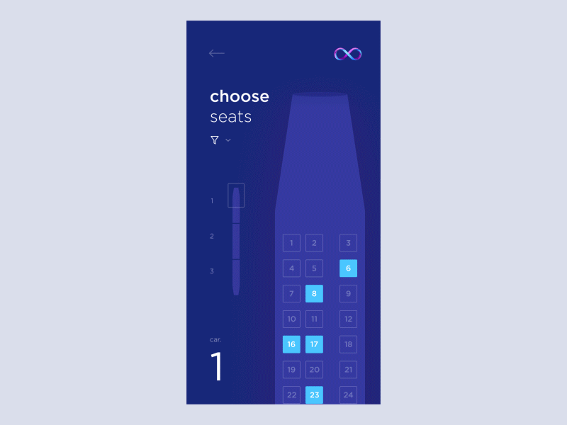
Selecting the Right Class of Service
Standard:
a carriage map with densely packed seats. Here you’ll see the seat cost
and the number of pre-selected seats. Swiping left takes you to the
Business class map, with fewer, comfier seats and more leg room. Suite:
this gets you a full carriage including a conference table and opulent
armchairs or sofas. Auto: this includes the option to bring your ride
along for the ride.
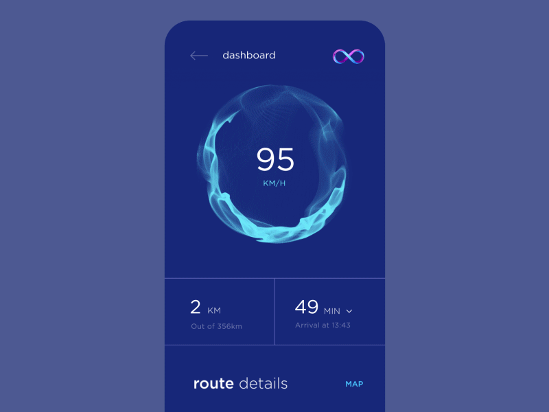
So,
I’m right in the middle of my 40-minute journey from Washington to
Seattle. Where am I? How fast am I going? What’s going on around me? The
app has to be totally able to answer such questions, especially when
you’re stuck in an enclosed space in a vacuum.
Useful Info Along the Journey
During
the trip you can check out a map with your designated route and trip
trajectory. You’ll also see all the information relevant to you: speed,
time en route, expected stops, and even points of interest along your
journey.
How
can a company make Hyperloop more accessible for ordinary people? By
lowering costs at the expense of advertisers, for example. But how to
tempt passengers into communicating with the brand? Easy: brand
promotion should be available to all the passengers on board.
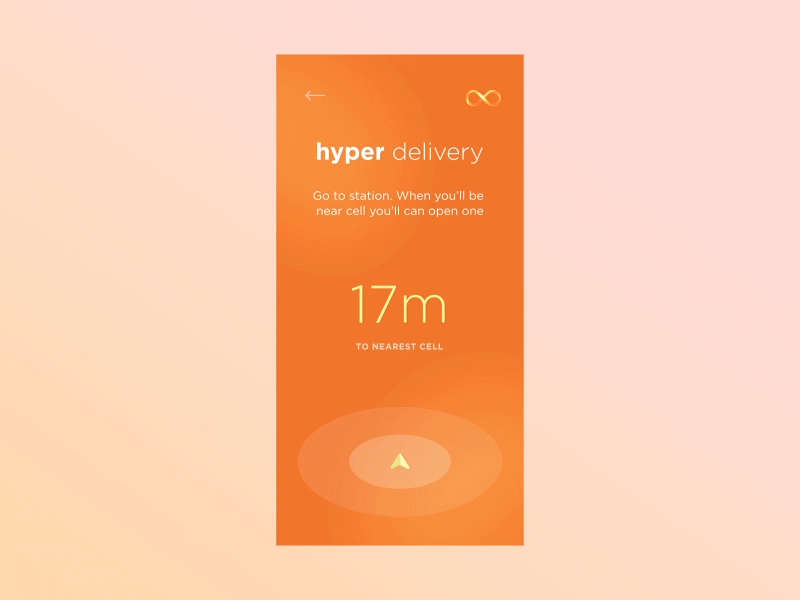
Lightning Speed Delivery
Every
station has a special carriage with compartments. Put together all your
shipment info in your Hyperloop app. Approach the carriage and use your
phone to open the compartment, then insert your package. The mail
carrier will take off on schedule and will soon arrive at its
destination. The recipient will get an alert and receipt location
beforehand. All that’s left to do is to go to the mail carriage and,
using a phone, open up the right compartment. Fast and easy.
Conclusion
Cutting-edge
technology expands our horizons and inspires us to think about how
we’ll benefit from it throughout the course of an ordinary day. These
intriguing concepts have been developed by our company, Cuberto, and we
totally get that sooner or later, all of this will become reality. We
grow and evolve with the times. It’s not just technology that’s
transforming, but also our attitudes to everyday objects. As a product
team, it’s our job to establish the most convenient conditions for the
use of these technologies.
For many, it’s difficult to imagine life before smartphones.
At the same time, it’s hard to believe that the original Apple iPhone, considered a genuine unicorn at the time thanks to its superior experience and stunning, rainbow-worthy display, released over 10 years ago.
Even though the iPhone is older than most grade school students, some of its capabilities remain a mystery to the masses.
Sure, we all hear about the latest, greatest features, but what about those lingering in the background just waiting to be discovered?
Getting your hands wrapped around those capabilities is what separates you, a soon-to-be power user, from those who haven’t truly unleashed its full potential.
So, what are you waiting for? Release that unicorn and let it run free like the productivity powerhouse it was always meant to be.
Here are 9 ways to get started.
1. Get Back Your Closed Tabs
We’ve all done it. While moving between tabs or screens, our fingers tap the little “x” and close an important browser tab.
With the iPhone, all is not lost. You can get that epic unicorn meme back from oblivion!
The included Safari browser makes recovering a recently closed tab a breeze. Learn more about the process here: Reopen Tabs
2. Smarter Photo Searching
Searching through photos hasn’t always been the most intuitive process…until now.
Before, you had to rely on labels and categories to support search functions. But now, thanks to new machine learning supported features, the photos app is more powerful than ever.
The iPhone has the ability to recognize thousands of objects, regardless of whether you’ve identified them. That means you can search using keywords to find images with specific items or those featuring a particular person.
Just put the keyword in the search box and let the app do the hard part for you.
3. Find Out Who’s Calling
Sometimes, you can’t simply look at your iPhone’s screen to see who’s calling. Maybe you are across the room, are driving down the road, or have the phone safely secured while jogging.
Regardless of the reason, just grabbing it quickly isn’t an option. But that doesn’t mean you want to sprint across the room, pull your car over, or stop your workout just to find out it’s a robo-dial.
Luckily, you can avoid this conundrum by setting up Siri to announce who’s calling. Then you’ll always know if you actually want to stop what you’re doing to answer before you break away from the task at hand.
In the business world, fine print is the donkey we all face on a regular basis. You can’t sign up for a service or look over a contract without facing some very small font sizes.
Thanks to the iPhone, you don’t have to strain your eyes (and likely give yourself a headache) to see everything you need to see when faced with fine print on paper. Just open the Magnifier, and your camera is now a magnifying glass.
Yes, notifications can be great. They let you know what’s happening without having to open every app individually.
But, if you haven’t tended to your iPhone for a while, they can also pile up quick. And who has the time to handle a huge listed of notifications one at a time?
iPhone’s that featured 3D Touch (iPhone 6S or newer) actually have the ability to let you clean all of your notifications at once.
Clear out here screen by following the instructions here: Clear Notifications
6. Close Every Safari Tab Simultaneously
iPhones running iOS 10 can support an “unlimited” number of Safari tabs at once. While this is great if you like keeping a lot of sites open, it can also get out of hand really quickly if you don’t formally close the ones you don’t need.
If you have more tabs open than stars in the sky, you can set yourself free and close them all at once.
To take advantage of this virtual reset, see the instructions here: Close All Safari Tabs
7. Request Desktop Site
While mobile sites are handy for the optimized experience, they can also be very limiting. Not every mobile version has the features you need to get things done, but requesting the desktop version wasn’t always the easiest process.
Now, you can get to the full desktop site with ease. Just press and hold on the refresh button at the top of the browser screen, and you’ll be given the option to request the desktop site.
8. Get a Trackpad for Email Cursor Control
There you are, doing the daily task of writing out emails or other long messages. As you go along, you spot it; it’s a mistake a few sentences back.
Trying to use a touchscreen to get back to the right place isn’t always easy, especially if the error rests near the edge of the screen.
Now, anyone with a 3D Touch enabled device can leave that frustration in the past. The keyboard can now be turned into a trackpad, giving you the cursor control you’ve always dreamed of having, the equivalent of finding a unicorn at the end of a rainbow.
When
the iPhone X launched, a lot of designers were put off about the screen
shape. Those complaints have mostly died down, but I haven’t seen much
design-nerd talk about cool corner treatment details. Fortunately, deep
nerd shit is my specialty.
iPhone X screen shape
What’s Your Angle?
When you’re starting a design like this, the obvious, and comically
cheaper option is to make all corners square. Machines exist and/or are
calibrated to make those screens, so keeping edges squared requires
fewer manufacturing changes and less talent along the pathway to
production.
Everyone
knows how to make a right angle — designers don’t have to do math,
engineers need fewer calculations, the people making the machine are
clear on what to do.
And yet, let’s examine how crappy all-square corners would look:
I’m a pixelated bear cub. Rawr.
Once
Apple knew they wanted to take advantage of new full-screen technology,
that gave them the opportunity to alter screen shape because they would
need to address the manufacturing process anyway. Presumably, the
expense was mostly built in.
Still, there were lots of ugly ways to do this:
Meh.
This is where they landed:
That’s better.
Screen Corners
Here’s
where the nerd part comes in, iPhone X rounded screen corners don’t use
the classic rounding method where you move in a straight line and then
arc using a single quadrant of a circle. Instead, the math is a bit more
complicated. Commonly called a squircle, the slope starts sooner, but
is more gentle.
The difference is real subtle, even in gif-form, but here we go:
Difference between common rounded rectangle maths and Apple maths.
Apple
has been doing this to the corners of laptops and iMacs for years, but
this type of rounding didn’t penetrate iOS until version 7. This shape
has classically been difficult to achieve, because it wasn’t available
in 2D design editors, though that’s starting to change. Read about it
more detail here.
The Notch
Now
let’s talk about the notch itself. The left and right sides have two
rounded corners. Because of the curve falloff, one curve doesn’t
complete before the next one starts — they blend seamlessly into each
other. As a result, no tangent line on this edge actually hits a perfect
vertical.
Ooo. Fancy.
Come Correct
iPhone
X templates I’ve seen out there don’t 100 percent duplicate the
official shape, probably because it was either too hard to make or they
haven’t noticed. This is why it’s good practice to use official assets
from Apple, found in the design resources section of the developer site for creating icons and mockups.
Future
iterations of this design will surely alter these sizes, so it will be
interesting to compare how hardware sensor evolution impacts design
shifts.
Overall,
these decisions seem minor, but from a design viewpoint they’re fairly
opinionated. Even when designers are willing to spend social capital to
push these ideas, most organizations won’t put resources behind them.
Rounding the Bend
One
of the things I love about indie apps is their ability to be
opinionated. It’s nearly impossible to ship strong viewpoints from
larger companies where there are fifty people in a room examining
angles. So it’s cool to see Apple still has the ability to take a strong
stance in this way.
Sweating
thousands of minor details is what separates Apple from other
companies. Their ability to do that is hard-won, but damn it’s pretty to
watch.
How to Design Social Systems (Without Causing Depression and War)
Here
I’ll present a way to think about social systems, meaningful
interactions, and human values that brings these often-hazy concepts
into focus. It’s also, in a sense, an essay on human nature. It’s
organized in three sections:
Reflection and Experimentation. How do people decide which values to bring to a situation?
Practice Spaces. Can we look at social systems and see which values they support and which they undermine?
Sharing Wisdom. What are the meaningful conversations that we, as a culture, are starved for?
I’ll
introduce these concepts and their implications for design. I will show
how, applied to social media, they address issues like election
manipulation, fake news, internet addiction, teen depression &
suicide, and various threats to children. At the end of the post, I’ll
discuss the challenges of doing this type of design at Facebook and in
other technology teams.
Reflection and Experimentation
As I tried to make clear in my letter, meaningful interactions and time well spent are a matter of values.
For each person, certain kinds of acts are meaningful, and certain ways
of relating. Unless the software supports those acts and ways of
relating, there will be a loss of meaning.
In the section below about practice spaces,
I’ll cover how to design software that’s supportive in this way. But
first, let’s talk about how people pick their values in the first place.
We often don’t know how we want to act, or relate, in a particular situation. Not immediately, at least.
When
we approach an event (a conversation, a meeting, a morning, a task),
there’s a process — mostly unconscious — by which we decide how we want
to be.
Interrupting
this can lead to doing things we regret. As we’ll see, it can lead to
internet addiction, to bullying and trolling, and to the problems teens
are having online.
So, we need to sort out the values with which we want to approach a situation. This is a process. I believe it’s the same process, whether you’re deciding something small — like how openly you will approach a particular conversation — or something big.
Let’s start with something big: many teenagers are engaged in sorting out their identities: they take ideas about how they ought
to act (manly, feminine, polite, etc) and make up their own minds about
whether to approach situations with these values in mind.
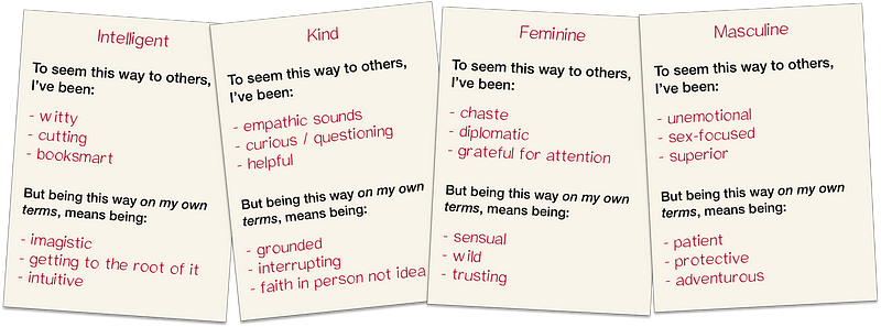
Worksheets from “On My Own Terms”. Join our community to play these games!
For
these teens, settling on the right values takes a mix of
experimentation and reflection. They need to try out different ways of
being manly, feminine, intelligent, or kind in different situations and see how they work. They also need to reflect on who they want to be and how they want to live.
These
two ingredients — experimentation and reflection — are required to sort
out our values. Even the small decisions (for example, deciding how to
balance honesty and tact in a conversation) require experimenting in real situations, and reflecting on what matters most.
This process can be intuitive, nonverbal, and unconscious, but it is vital.¹
If we don’t find the right values, it’s hard to feel good about what we
do. The following circumstances interfere with experimentation and
reflection:
High stakes.
When deviation from norms becomes disastrous in some way — for
instance, with very high reputational stakes — people are afraid to
experiment. People need space to make mistakes and systems and social scenes with high consequences interfere with this.
Low agency. To put values to the test, a person needs discretion
over the manner of their work: they need to experiment with moral
values, aesthetic values, and other guiding ideas. Some
environments — many of them corporate — make no room for being guided by
one’s own moral or aesthetic ideas.
Disconnection. One way we judge the values we’re experimenting with is via exposure to their consequences.
We all need to know how others feel when we treat them one way or
another, to help us decide how we want to treat them. Similarly, an
architect needs to know what it’s like to live in the buildings she
designs. When the consequences of our actions are hidden, we can’t sort out what’s important.²
Distraction and overwork.
We also lose the capacity to sort out our values when reflection
becomes impossible. This is the major cost of noisy environments,
infinite entertainment, push notifications, and some types of poverty.
Lack of faith in reflection. Finally, people can come to consider reflection to be useless — or to be avoided — even though it is so natural. The emotions which trigger reflection,
including doubt and confusion, can be brushed away as distractions. One
way this happens, is if people view their choices through a behaviorist
lens: as determined by habits, reinforcement learning, or permanent
drives.³
This makes it seem like people don’t have values at all, only habits,
tastes, and goals. Experimentation and reflection seem useless.
Software-based social spaces can be disastrous for experimentation and reflection.
One
reason that private group messaging (like WhatsApp and Messenger) is
replacing virality-based forums (like Twitter, News Feed, and
increasingly, Stories) is that the latter are horrible for experimenting
with who we are. The stakes are too high. They seem especially bad for
women, for teens, and for celebrities—which may partly explain the rise
in teen suicide—but they're bad for all of us.
A
related problem is online bullying, trolling, and political outrage.
Many bullies and trolls would embrace other values if they had a chance
to reflect and were better exposed to consequences. In-person spaces are
much better for this.
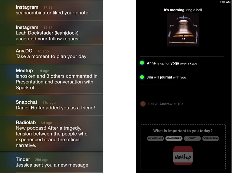
Reflection can be encouraged or discouraged by design — this much is clear from the variety of internet-use helpers, like Moment and Intent. All of us (not just bullies and trolls) would use the Internet differently if we had more room for reflection.
Two lockscreens: one design encourages reflection, and one doesn’t. [from “Empowering Design”]
Exercise: On My Own Terms
In order to learn to support users in experimentation and reflection, designers must experiment and reflect on their own values. On My Own Terms is an exercise for this. Players fill out a worksheet, then socialize in an experimental way.
“On My Own Terms”. Join our community to play these games!
In
the experimentation part, players defy norms they’ve previously obeyed,
and see how it works out. Often they find that people like them better
when they are less conventional — even when they are rude!
Here’s
one thing this game makes clear: we discover what’s important to us in
the context of real choices and their consequences. People often think
they have certain values (eating kale, recycling, supporting the
troops) but when they experiment and reflect on real choices, these
values are discarded. They thought they believed in them, but only out
of context.
This is how it was for me with consistency, rationality, masculinity, and being understated. When I played On My Own Terms, I decided to value these less.⁴ My true values are only clear through experimentation and reflection.
For
users to have meaningful interactions and feel their time was well
spent, they need to approach situations in a way they believe in. They
need space to experiment and reflect.
But this is not enough.
Practice Spaces
Every
social system makes some values easier to practice, and other values
harder. Even with our values in order, a social environment can
undermine our plans.
Most social platforms are designed in a way that encourages us to act against our values: less humbly, less honestly, less thoughtfully,
and so on. Using these platforms while sticking to our values would
mean constantly fighting their design. Unless we’re prepared for a
fight, we’ll likely regret our choices.
There’s a way to address this, but it requires a radical change in how we design: we must reimagine social systems as practice spaces for the users’ values — as virtual places custom built to make it easier for the user to relate and to act in accord with their values.
Designers must get curious about two things:
When users want to relate according to a particular value, what is hard about doing that?
What is it about some social spaces that can make relating in this way easier?
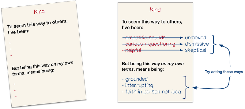
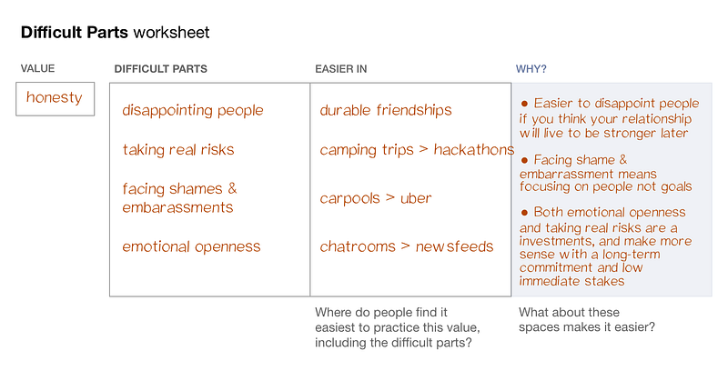
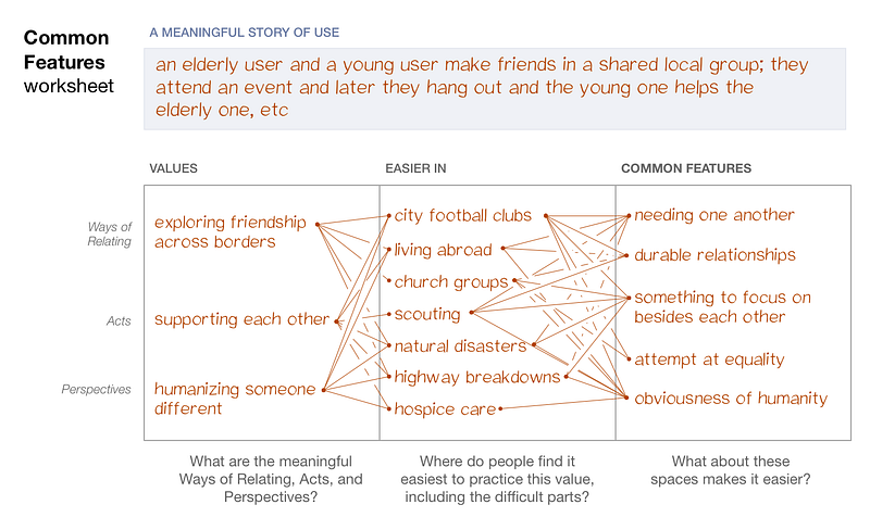
For example, if an Instagram⁵ user valued being creative, being honest, or connecting adventurously,
then designers would need to ask: what kinds of social environments
make it easier to be creative, to be honest, or to connect
adventurously? They could make a list of places where people find these
things easier: camping trips, open-mics, writing groups, and so on.
Next,
the designers would ask: which features of these environments make them
good at this? For instance, when someone is trying to be creative, do
mechanisms for showing relative status (like follower counts) help or
hurt? How about when someone wants to connect adventurously? Or, with
being creative, is this easier in a small group of close connections, or
a large group of distant ones? And so on.
To take another example, if a News Feed user believes in being open-minded,
designers would ask which social environments make this easier. Having
made such a list, they would look for common features. Perhaps it’s
easier to be open-minded when you remember something you respect about a
person’s previous views. Or, perhaps it’s easier when you can tell if
the person is in a thoughtful mood by reading their body language. Is
open-mindedness more natural when those speaking have to explicitly
yield time for others to respond? Designers would have to find out.⁶
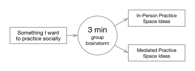
Exercise: Space Jam
To start thinking this way, it’s best if designers focus first on values which they themselves have trouble practicing. In this game, Space Jam, each player shares something they’d like to practice, some way of interacting. Then everyone brainstorms, imagining practice spaces (both online and offline) which could make this easier.
“Space Jam”. Join our community to play these games!
Here’s an example of the game, played over Skype with three designers from Facebook:
Eva says she wants to practice “changing the subject when a conversation seems like a dead end.”
Someone
comments that Facebook threads are especially bad at this. We set a
timer for three minutes and brainstorm on our own. Then everyone
presents one real-world way to practice, and one mediated way.
George’s
idea involves a timer. When it rings, everyone says “this conversation
doesn’t meet my need for ____”. Jennifer suggests something else:
putting a bowl in the middle of a conversation. Player can write out
alternate topics and put them in the bowl in a conspicuous but
non-interrupting way. (Jennifer also applies this idea to Facebook
comments, where the bowl is replaced by a sidebar.)
We
all wonder together: could it ever be “okay” for people to say things
like “this conversation doesn’t meet my need for ____”? Under what
circumstances is this safe to say?
This leads to new ideas.
In the story above, Eva is an honest person. But that doesn’t mean it’s always easy
to be honest. She struggles to be honest when she wants to change the
conversation. By changing the social rules, we can make it easier for
her to live according to her values.
Games like Space Jam
show how much influence the rules of social spaces have over us, and
how easy it is for thoughtful design to change those rules. Designers
become more aware of the values around them and why they can be
difficult to practice. They feel more responsible for the spaces they
are creating. (Not just the spaces they make for users, but also in
daily interactions with their colleagues). This gives them a fresh
approach to design.
If
designers learn this skill, they can support the broad diversity of
users’ values. Then users will no longer have to fight the software to
practice their values.
Sharing Wisdom
I hope the previous ideas—reflection, experimentation, and practice spaces—have given a sense for how to support meaningful actions. Let’s turn to the question of meaningful information and meaningful conversation.
We are having a problem in this area, too.
Amidst
nonstop communication — a torrent of articles, videos, and
posts — there is still a kind of conversation that people are starved
for, because our platforms aren’t built for it.
When this type of conversation — which I’ll call sharing wisdom — is
missing, people feel that no one understands or cares about what’s
important to them. People feel their values are unheeded, unrecognized,
and impossible to rally around.
As
we’ll see, this situation is easy to exploit, and the media and fake
news ecosystems have taken advantage. By looking at how this
exploitation works, we can see how conversations become ideological and
polarized, and how elections are manipulated.
But first, what do I mean by sharing wisdom?
Social
conversation is often understood as telling stories, sharing feelings,
or getting advice. But each of these can be seen as a way to discover
values.
When we ask our friends for advice — if you look carefully — we aren’t often asking about what we should do. Instead, we’re asking them about what’s important in our situation. We’re asking for values which might be new to us. Humans constantly ask each other “what’s important?” — in a spouse, in a wine, in a programming language.
I’ll call this kind of conversation (both the questions and the answers) wisdom.
Wisdom,
n. Information about another person’s hard-earned, personal
values — what, through experimentation and reflection, they’ve come to
believe is important for living.
Wisdom
is what’s exchanged when best friends discuss their relationships or
jobs, when we listen to stories told by grandmothers, church pastors,
startup advisors, and so on.
It comes in many forms: mentorship, texts, rituals, games. We seek it naturally, and in normal conditions it is abundant.
For
various reasons, the platforms are better for sharing other things
(links, recommendations, family news) than for asking each other what’s
important. So, on internet platforms, wisdom gets drowned out by other
forms of discourse:
By ideology.
Our personal values are easily eclipsed by ideological values (for
instance, by values designed to promote business, a certain elite, or
one side in a political fight). This is happening when posts about
partisan politics make us lose track of our shared (or sharable)
concerns, or when articles about productivity outpace our deeper life questions.
By scientism.
Sometimes “hard data” or pseudo-scientific “models” are used to justify
things that would be more appropriately understood as values. For
instance, when neuroscience research is used to justify a style of leadership, our discourse about values suffers.
By bullshit.
Many other kinds of social information can drown out wisdom. This
includes various kinds of self-promotion; it includes celebrities giving
advice for which they have no special experience; it includes news.
Information that looks like wisdom can make it harder to locate actual, hard-earned wisdom.
For
all these reasons, talk about personal values tends to evaporate from
the social platforms, which is why people feel isolated. They don’t
sense that their personal values are being understood.
In
this state, it’s easy for sites like Breitbart, Huffington Post,
Buzzfeed, or even Russia Today to capitalize on our feeling of
disconnection. These networks leverage the difficulty of sharing wisdom,
and the ease of sharing links. They make a person feel like they are
sharing a personal value (like living in a rural town or supporting women), when actually they are sharing headlines that twist that value into a political and ideological tool.
Exercise: Value Sharing Circle
For designers to get clear about what wisdom sounds like, it can be helpful to have a value sharing circle.
Each person shares one value which they have lived up to on the day
they are playing, and one which they haven’t. Here’s a transcript from
one of these circles:
There
are twelve of us, seated for dinner. We eat in silence for what feels
like a long time. Then, someone begins to speak. It’s Otto. He says he
works at a cemetery. At 6am this morning, they called him. They needed
him to carry a coffin during a funeral service. No one else could do it.
So, he went. Otto says he lived up to his values of showing up and being reliable.
But — he says — he was distracted during the service. He’s not sure he
did a good job. He worries about the people who were mourning, whether
they noticed his missteps, whether his lack of presence made the ritual
less perfect for them. So, he didn’t live up his values of supporting the sense of ritual and honoring the dead.
In
the course of such an evening, participants are exposed to values
they’ve never thought about. That night, other people spoke of their
attempts to be ready for adventure, be a vulnerable leader, and make parenthood an adventure.⁷
Playing
this makes the difference between true personal values and ideologies
very clear. Notice how different these values are from the values of
business. No one in the circle was particularly concerned with
productivity, efficiency, or socio-economic status. No one was even
concerned with happiness!
Social platforms could make it much easier to share our personal values (like small town living) directly, and to acknowledge one another and rally around them, without turning them into ideologies or articles.
This
would do more to heal politics and media than any “fake news”
initiative. To do it, designers will need to know what this kind of
conversation sounds like, how to encourage it, and how to avoid drowning
it out.
The Hardest Challenge
I’ve pointed out many challenges, but left out the big one. 😕
Only people with a particular mindset can do this type of design. It takes a new kind of empathy.
Empathy can mean understanding someone’s goals, or understanding someone’s feelings.⁸ And these are important.
But to build on these concepts — experimentation, reflection, wisdom, and practice spaces— a designer needs to see the experimental part of a person, the reflective part, the person’s desire for (and capacity for) wisdom, and what the person is practicing.⁹
As with other types of empathy, learning this means growing as a person.
Why?
Well, just as it’s hard to see others’ feelings when we repress our
own, or hard to listen to another person’s grand ambitions unless we are
comfortable with ours... it’s hard to get familiar with another
person’s values unless we are first cozy with our own, and with all the
conflicts we have about them.
This
is why the exercises I’ve listed (and others, which I didn’t have space
to include) are so important. Spreading this new kind of empathy is a
huge cultural challenge.
Hardik Gandhi is Master of Computer science,blogger,developer,SEO provider,Motivator and writes a Gujarati and Programming books and Advicer of career and all type of guidance.