Programming & IT Tricks . Theme images by MichaelJay. Powered by Blogger.

Copyright

Facebook

Post Top Ad

Search This Blog

Post Top Ad

Responsive Ads Here

Archive

Post Top Ad

Contact


Editors Picks

Follow us

Post Top Ad

Fashion

Music

News

Sports

Food

Technology

Featured

Videos

Fashion

Technology

Fashion

Label

Translate

About

Translate

Sponsor

test

Weekly

Comments

Recent

Connect With us

Over 600,000+ Readers Get fresh content from FastBlog

About

Showing posts with label Product Updates. Show all posts

Thursday, February 15, 2018

Zen Experience on Your Android Phone

Take back control of your phone (and your attention)


Photo by Kim S. Ly on Unsplash

The vast majority of consumers use their phone exactly as it was originally configured. The problem is that this default setup, with built-in apps, non-stop notifications, and constant cries for your attention has nothing to do with productivity or happiness.
I’ve seen this firsthand.
Several years ago, I had a job where I reviewed mobile phone apps and gadgets. In the course of this job, I realized how much our phones were taking over our lives each day. The entire industry is built around begging for your attention.
But you’re the boss of your phone, and you should be the one in charge of when and how you give your attention.
There’s a better way. Let’s take a look at the ways you can set up your Android phone for a more zen experience.
This guide will give you step-by-step instructions that will work for the majority of Android phones. The menus may look slightly different on your particular device, but the thought process will be the same.


Clear Your Lock Screen
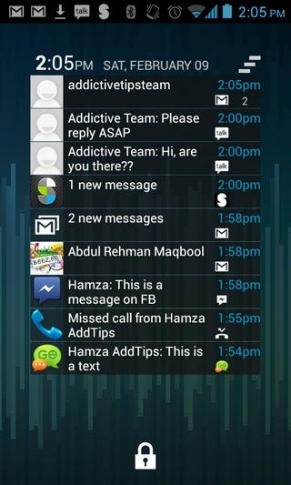


A supposed selling point for Android is how customizable the lock screen is. Some people like to add widgets, notifications, and all sorts of information to the lock screen. But these extra bells and whistles just tend to distract you; they take you away from the task that prompted you to pick up your phone in the first place.
Remember what the purpose of a lock screen is. It’s really just there as a security measure. You shouldn’t be reading notifications there — you should be confirming your identity and then moving on to more important tasks.
If you want the security of a lock screen that doesn’t display your notifications, here’s an easy way to do it.
  1. Tap “Settings”


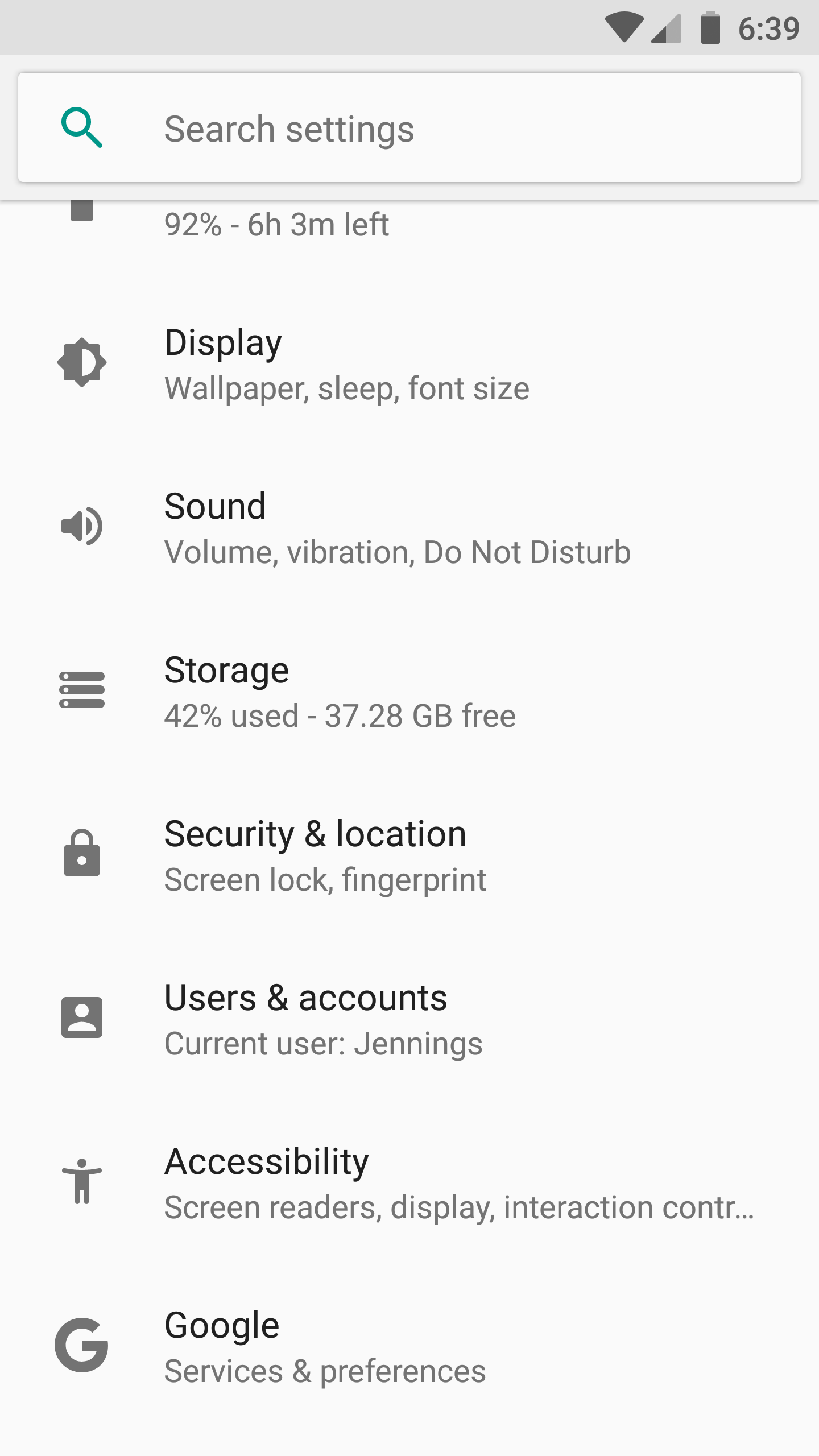
2. Tap “Security & location”
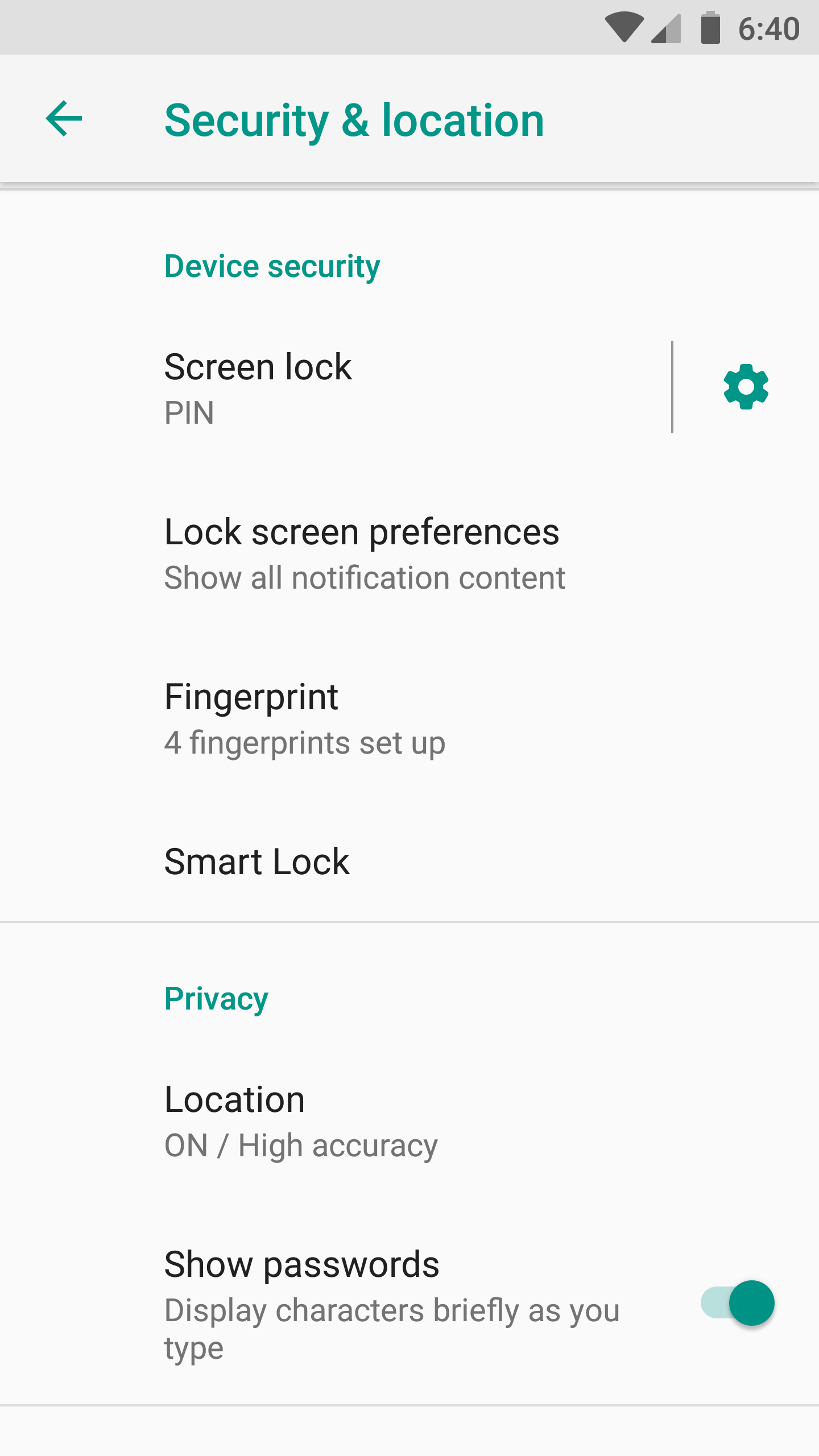

3. Tap “Lock screen preferences”


4. Tap “On the lock screen” and choose “Don’t show notifications at all”


Once you have this set up you’ll still have the security of a lock screen, without being bombarded by a stream of notifications as soon as you look at your phone.


Clear Your Home Screen


Most Android phones come with a home screen pre-configured. Often there are shortcuts to the apps the manufacturer assumes you’ll use the most. Worse, there are often some sponsored apps that companies have paid to get in front of you. You’re paying to be advertised to. That’s not cool.
In almost all cases, there are a lot of things that you just don’t need to be staring at.
The home screen certainly is a personal space that will vary from user to user. But here I will give you my rationale for why a clean, uncluttered home screen works the best.
My home screen has no app shortcuts. It does not has excessive widgets. It has nothing but a Google search icon, the date and weather, and navigation buttons.
Whenever I look at my home screen, I see nothing but the relaxing live wallpaper that I’ve installed. All of my apps are still easily accessible with a swipe up from the bottom, but there are no shortcuts with badges of unread messages or widgets displaying news headlines that I didn’t ask for.
A clear home screen equates to a clear mind, and it makes me far more productive.
App badges, in particular, are a case of the app manufacturing trying to control your behavior. If there’s one principle of this article, it’s that you should always be in control of your phone. I’m glad not to see those badges any more.
Here’s how to remove the clutter from your home screen:
  1. Long press on any app shortcut on your home screen
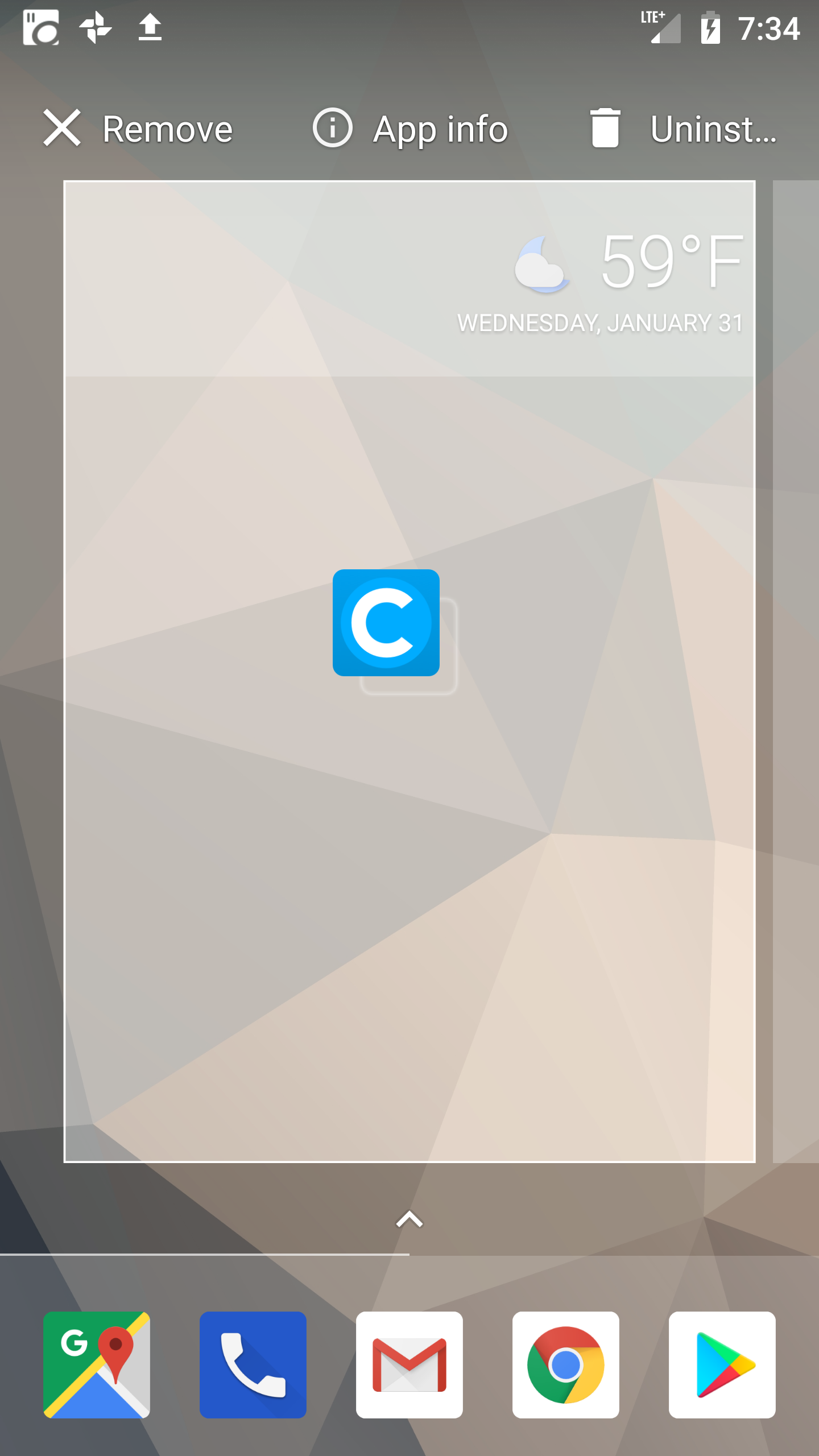

2. You’ll see some options appear at the top of the page (Remove, App info, Uninstall)
3. Drag the icon into the option that says “Remove”
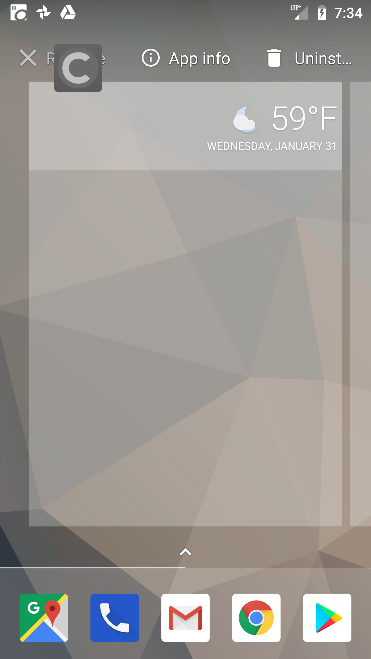

4. Repeat the process for any widget or app shortcut that you no longer want to see on the home screen
Don’t worry, removing an app shortcut from your home screen doesn’t entirely remove the app from your phone — it just takes away that visual distraction. You’ll still be able to open the app from your app drawer, but only when you need to complete a task!


Hide (Almost) All Notifications

The smartphone notification has become a scourge of modern society. People are always checking for new notifications and searching for the shot of dopamine they receive when they obtain new information.
Linda Stone has the best phrase for the multitasking world we live in: continuous partial attention.
It may sound jarring, but I recommend turning off all notifications. You won’t miss them. In fact, there are many reasons why the biggest lovers of productivity, like the editor of this publication, are turning off their notifications.
I know it can be an uncomfortable thought, but it will be worth the head space you’re freeing up. Remember that all of the notifications are still on your phone; you don’t need them to pop up and take control of your time.
Turning off the notifications allows you to regain that control.
Social media apps should be the first ones to go. You can still check your favorite social media apps if you need to, but don’t let them distract you throughout the day! Shutting off these notifications puts you back in control. You’d be surprised at how unimportant most of these notifications are.
Are there any other apps that are needlessly notifying you? Maybe a photo sharing app telling you to remember the photo you took on this day 4 years ago? Perhaps you downloaded a game that keep reminding you of the latest high scores? We all have downloaded an app at some point that just starts notifying us when we least expect it. At the very least you need to disable these notifications. You may also want to reassess if you need the app on your phone at all.
E-mail should be the next notification that you tackle. Yes, we all need to check e-mail throughout the day, but you don’t need to be told when each and every new message has arrived in your inbox. Your postal mail carrier delivers all of your mail at one time, right? You don’t receive each piece of mail individually, and your e-mail should be received the same way. Disable these email notifications, and just check your inbox a few times throughout the day.
Texting and SMS are typically the most urgent messages that are received on a smart phone. This is the one area where I think it’s okay to allow notifications. If your friends and family know that you’re not checking the other notifications frequently, they can rely on the fact that you’ll check your text messages. This doesn’t mean that you need to drop everything and reply to each message on the spot, but if it’s something urgent you’ll know about it.
Here’s how you can turn off your notifications:
  1. Go to “Settings”


2. “Apps & Notifications”
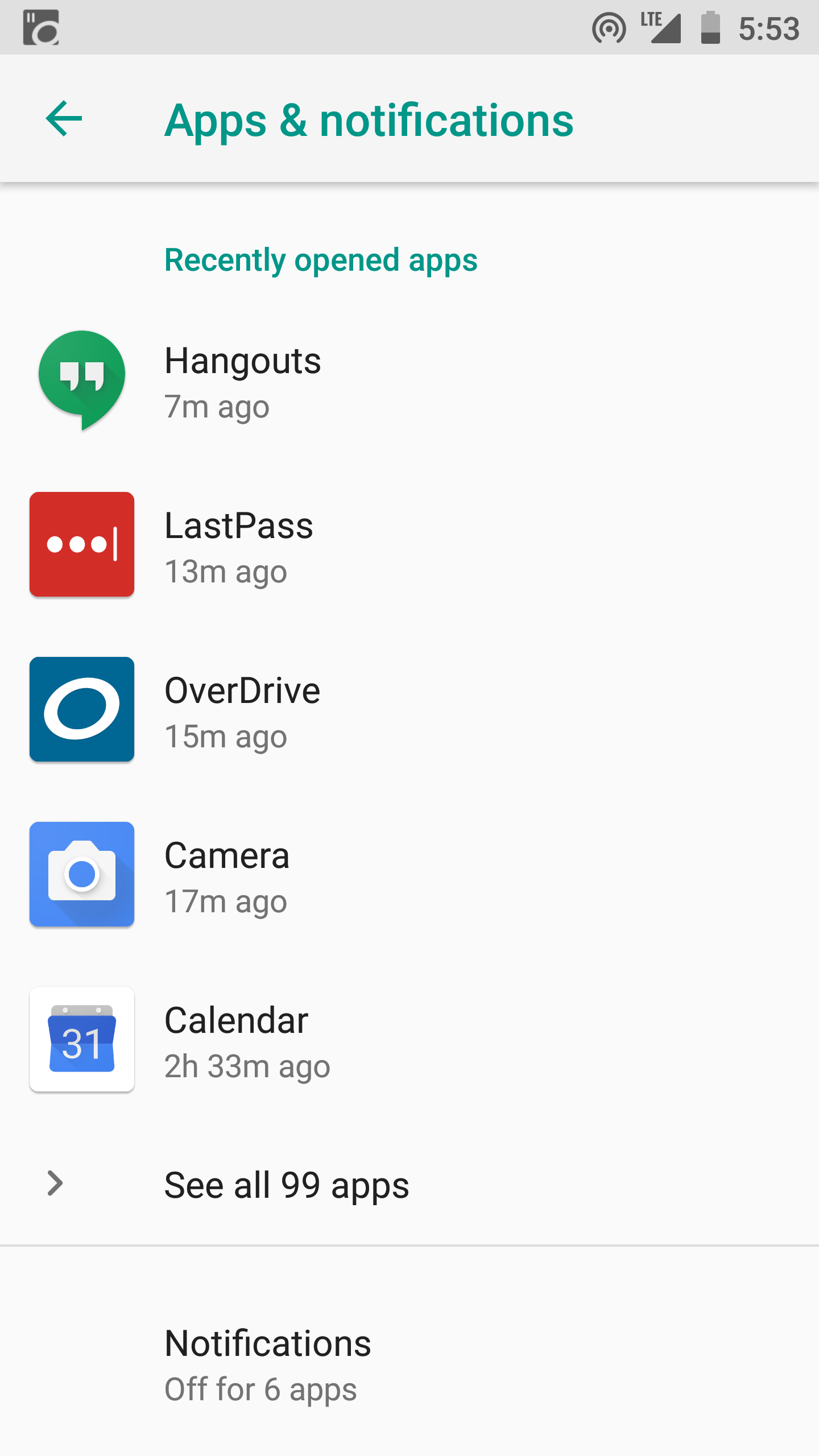

3. “Notifications”
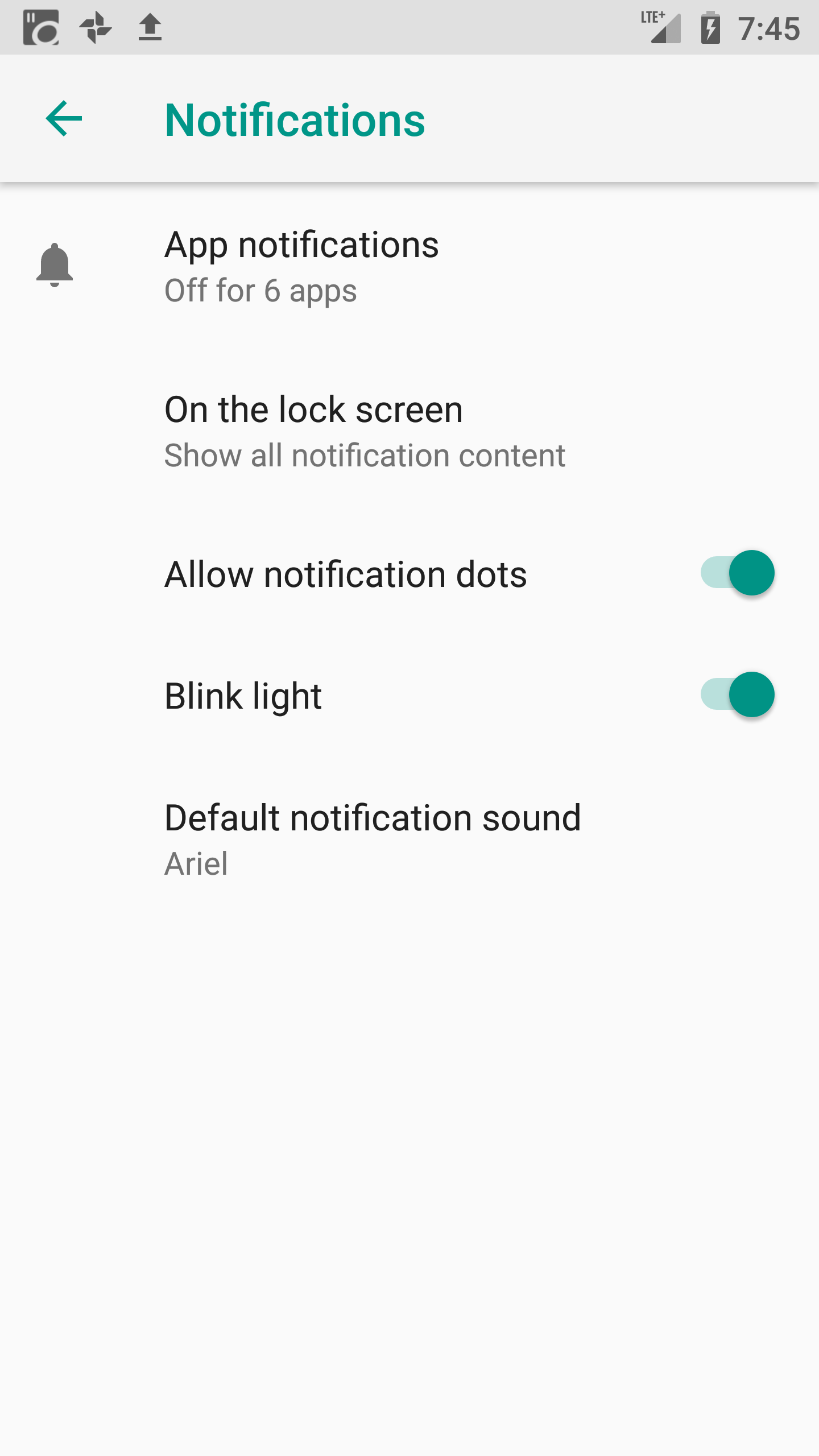

4. “App notifications”
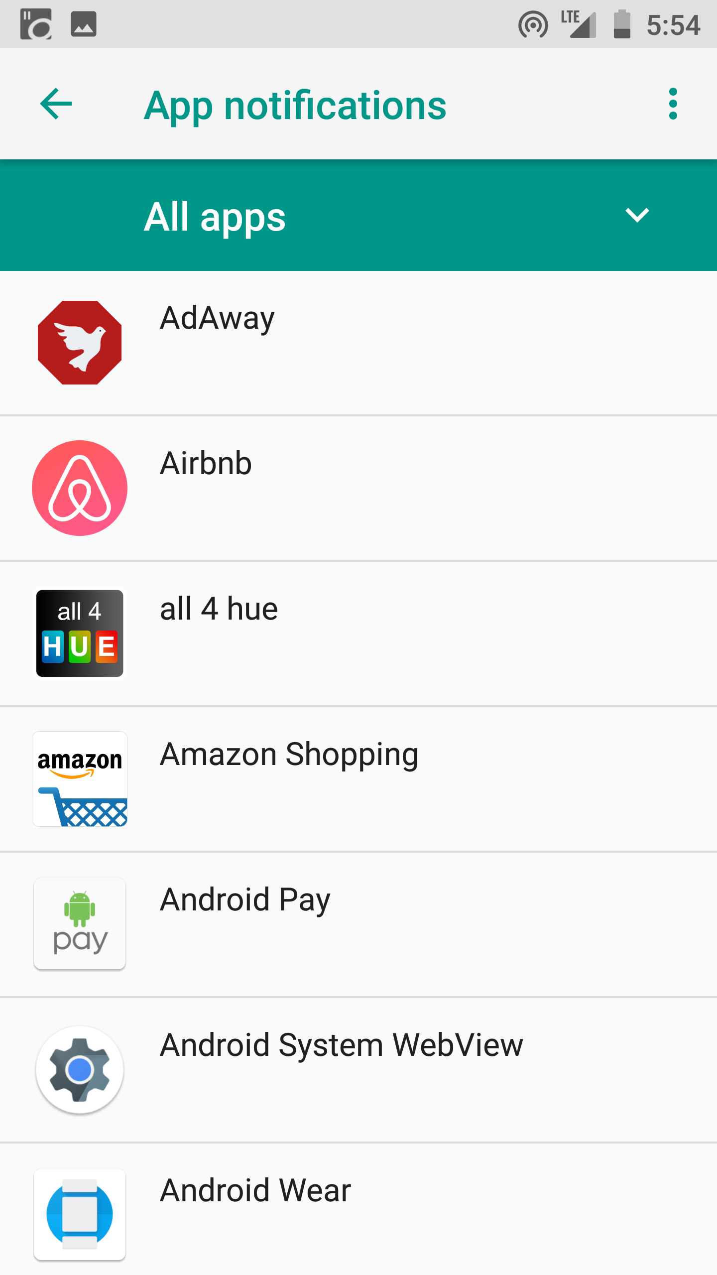

5. You’ll see a list of all the apps on your phone
6. Tap any app
7. Here you can toggle notifications on or off for any given app
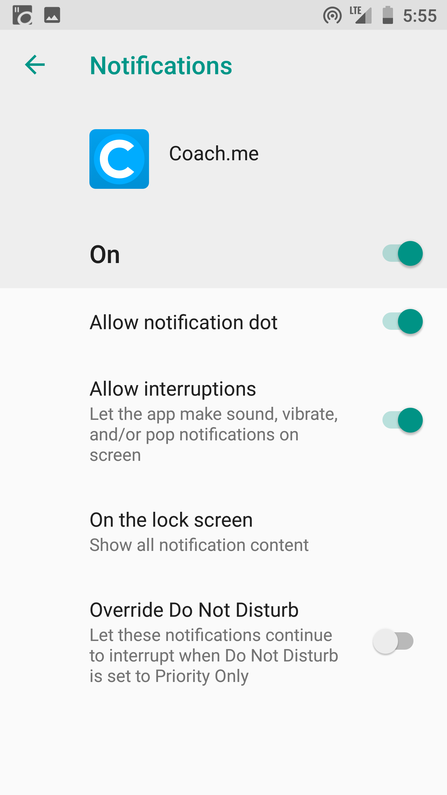

The beauty of this method is that it allows you to take control of your notifications. There may be some apps where you still want to allow notifications, but you can turn off the ones that you know are distracting you the most.


Set Quiet Hours or “Do Not Disturb”

We all need time to rest and recharge away from our smartphones.
Fortunately, there are easy ways to disconnect during certain hours. All Android phones now allow you to set quiet or “do not disturb” hours, during which your phone will be silent. Depending on your sleep schedule, I’d recommend setting these for an hour before bedtime and an hour after you wake up.
This allows you to have a wind down period when you’re preparing for sleep when you’re not checking your phone. It’s also important to allow yourself some time to wake up in the morning and plan your day before you jump straight into checking your phone.
Here’s how you setup “Do Not Disturb” on your phone:
  1. Go to “Settings”


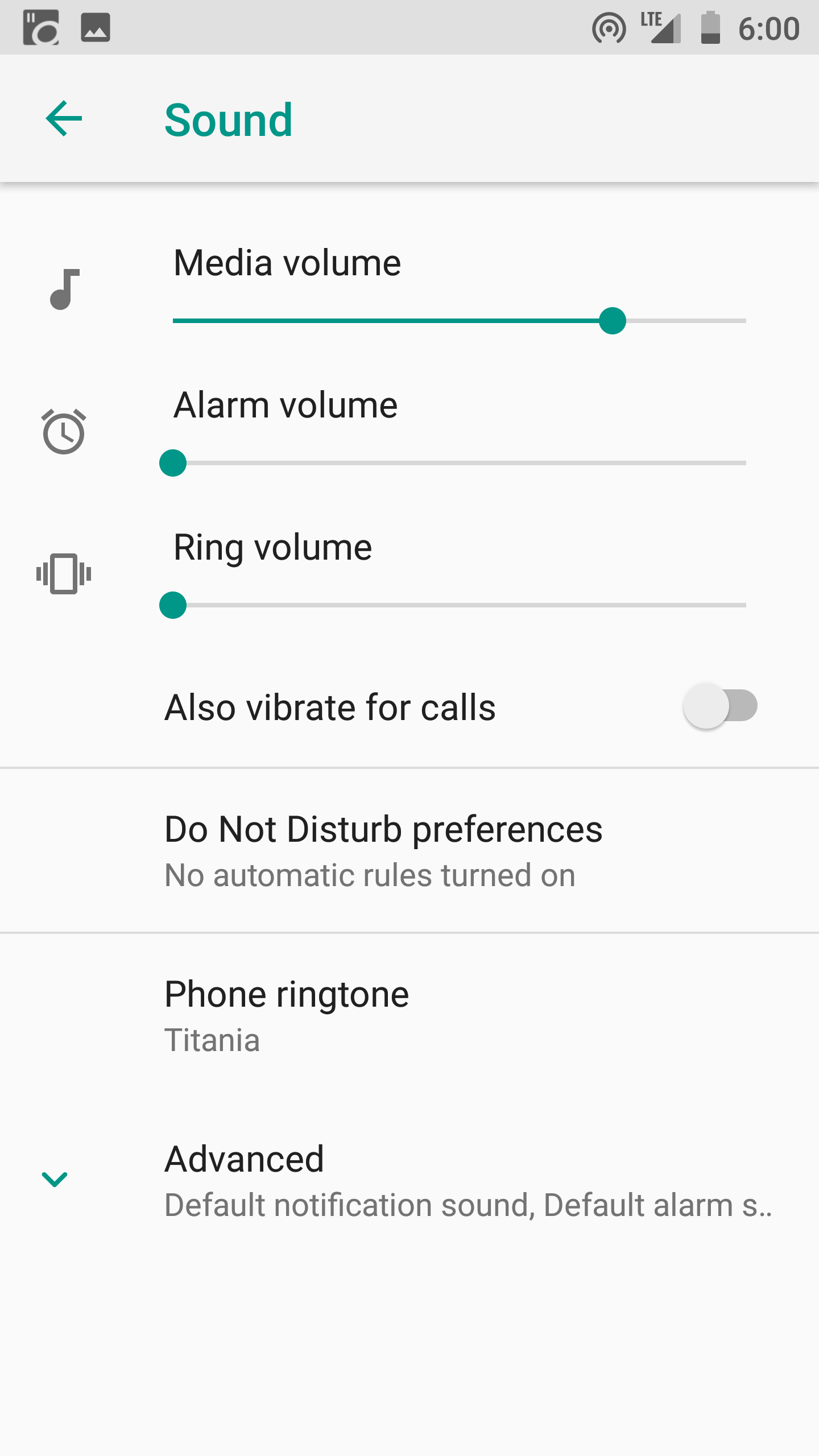
2. Click “Sound”


3. “Do Not Disturb Preferences”
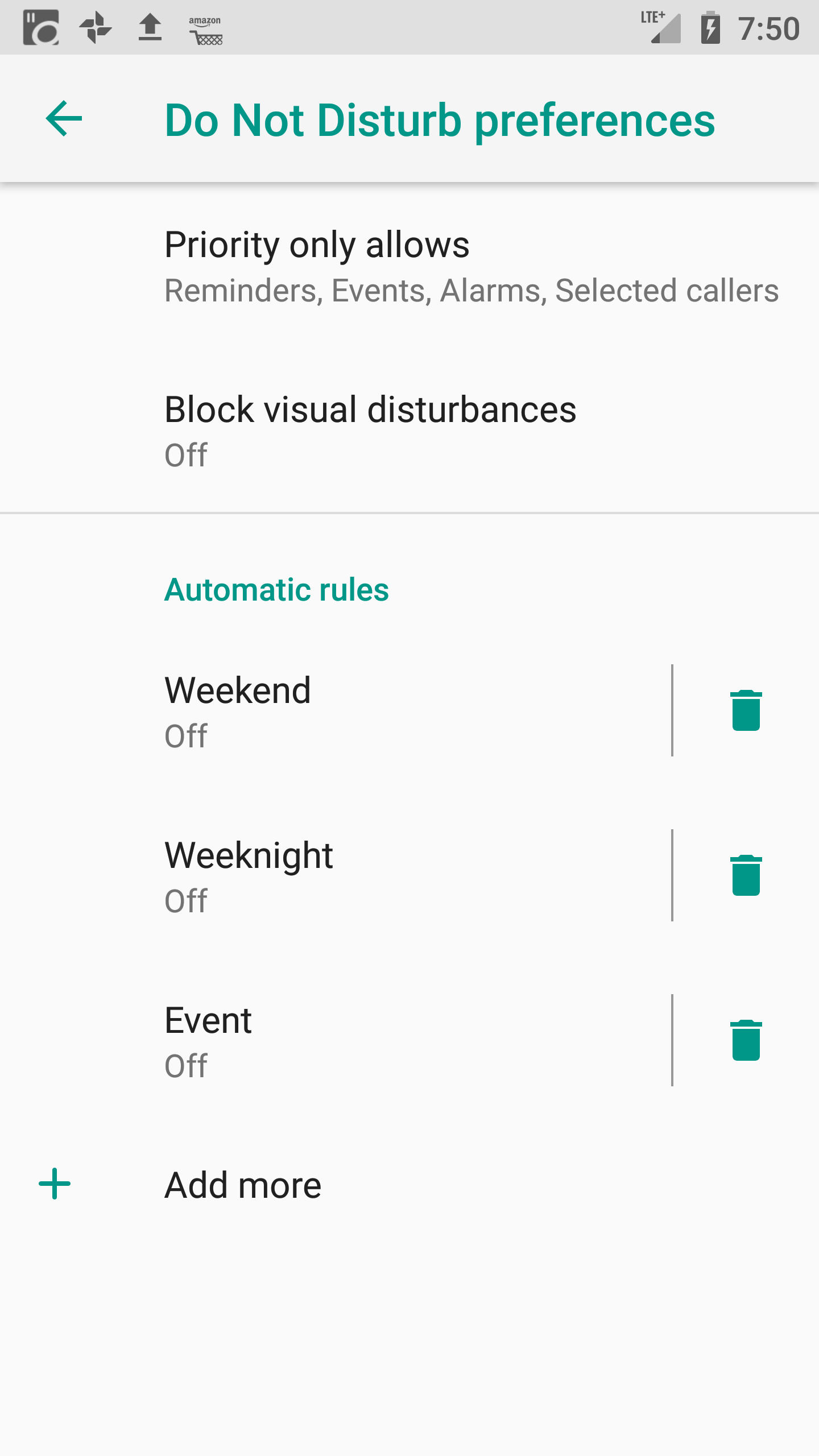

4. This screen gives you options to set up different rules based on days of the week or special events. (Maybe you don’t want to be disturbed after 8pm during the week, but you’re okay with pushing it to 10pm on the weekends.)
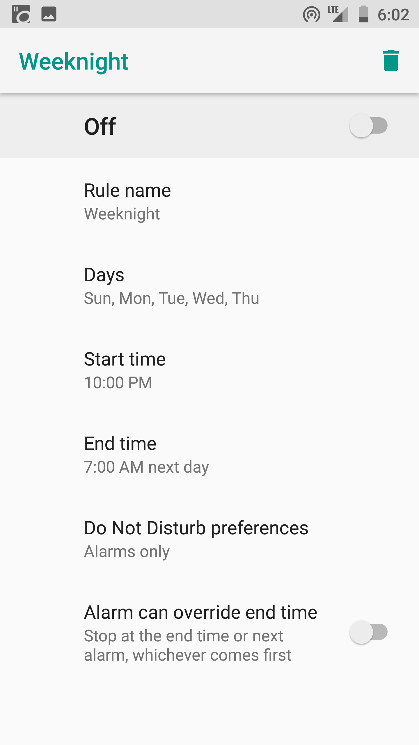

5. Configure each rule as you see fit (Give it a name, days of the week, start & end time, and allow overrides if you’d like)
Everyone has a different schedule, and you’ll obviously have different “Do Not Disturb” hours that make sense for you. For me, not being disturbed between 9pm and 6am works really well any day of the week.
Experiment for yourself until you find what works!

Night Light & Blue Light Filters

Much has been written on how the blue light from our phones is keeping us awake at night. It’s just not natural for human eyes to stare at such bright lights at all hours of the day. Sure, not looking at a phone at all is the best option. But the next best option is to calibrate your screen to block the blue light wavelength and go easy on your eyes.
Some of the latest Android phones (from Samsung and LG specifically) come equipped with night time modes that dim the screen and reconfigure the wavelengths of the light being emitted. If your phone doesn’t have this capability straight out of the box, I highly recommend downloading an app to help. My personal favorite is CF.lumen, but I’ve also used Twilight in the past and it has worked well.
Whichever app you choose, just set some initial parameters and then let it do its thing. Yes, there may be a few instances where the dimmed light is hard to see, so you can temporarily disable it as needed. But your eyes will surely thank you compared to the typical brightness of a phone screen.
Here’s how to setup a basic sleep filter that comes standard in the Android OS:
  1. Go to “Settings”


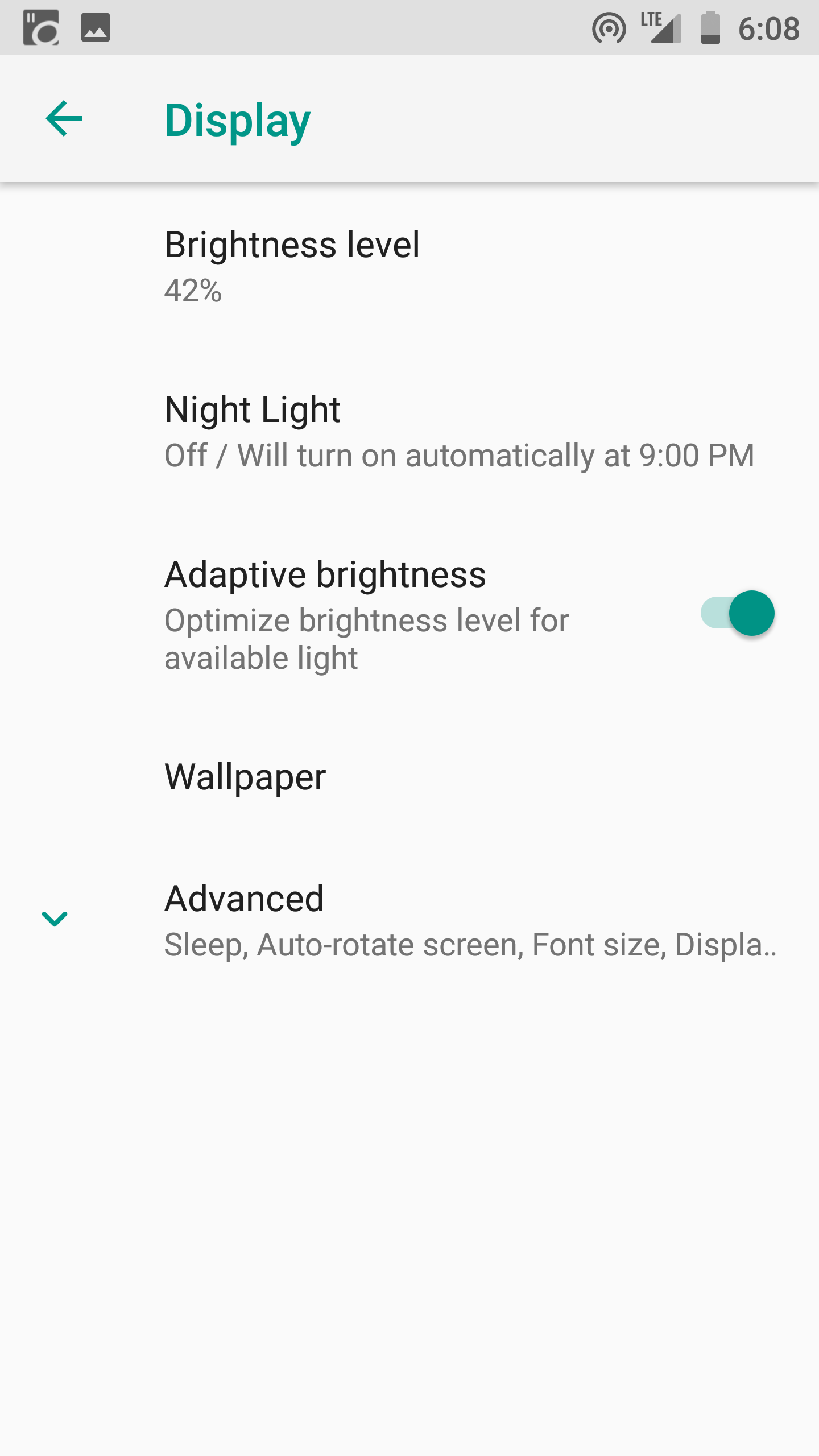
2. “Display”


3. “Night Light”
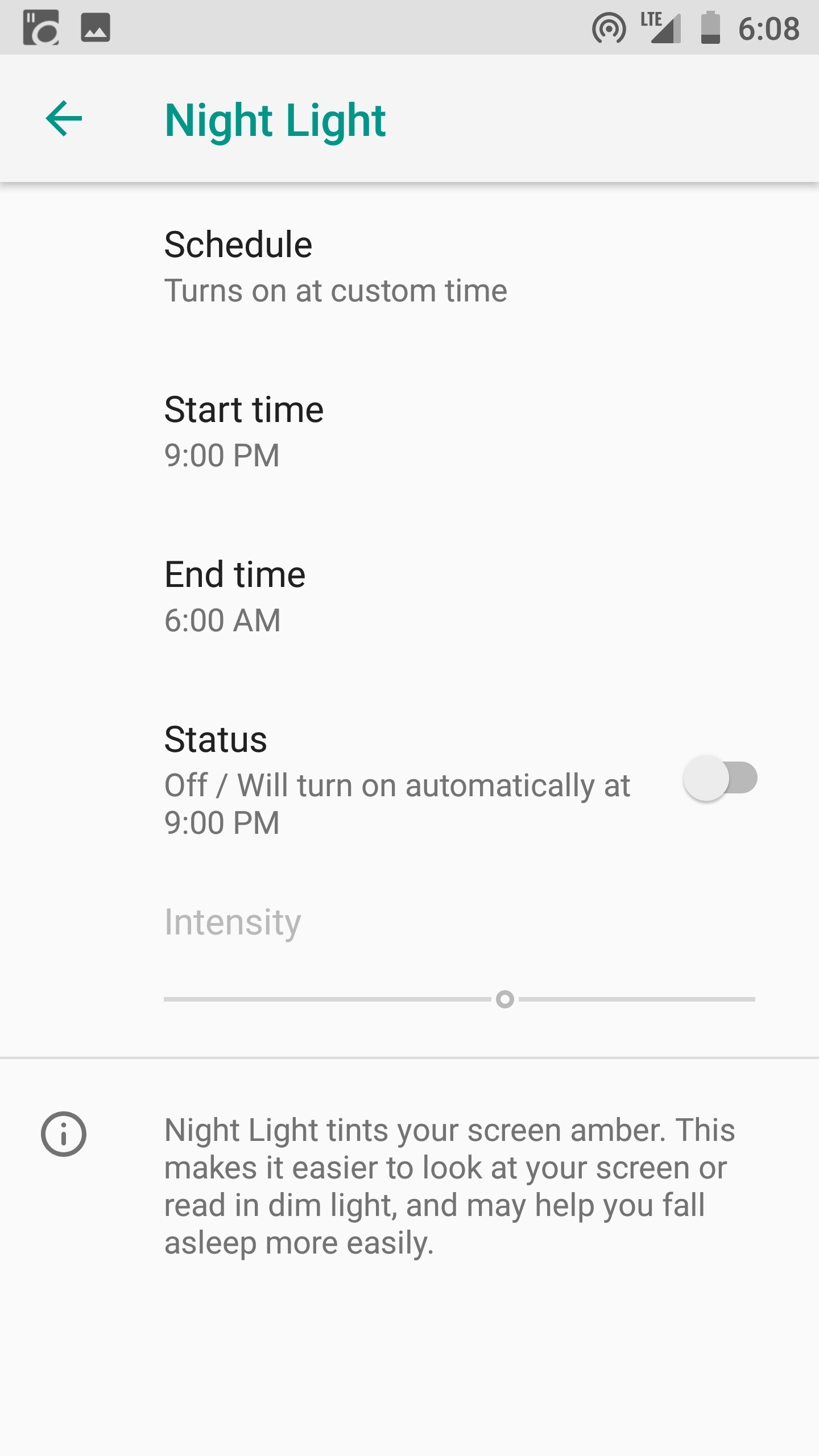

4. From here, you can customize exactly how you want your night light to work
5. Choose a custom on/off time
6. Set your desired intensity for the screen brightness
For most people, this will be plenty. But if you’re looking for some more advanced features, here is a quick guide on getting CF.lumen setup:
  1. Download CF.lumen from the Google Play Store
  2. If your phone is rooted, you’ll have greater control over some of the settings. If you have no idea what rooting is, no worries! You can still use the app just fine.
  3. Yes, CF.lumen can look super intimidating, but stick with me!
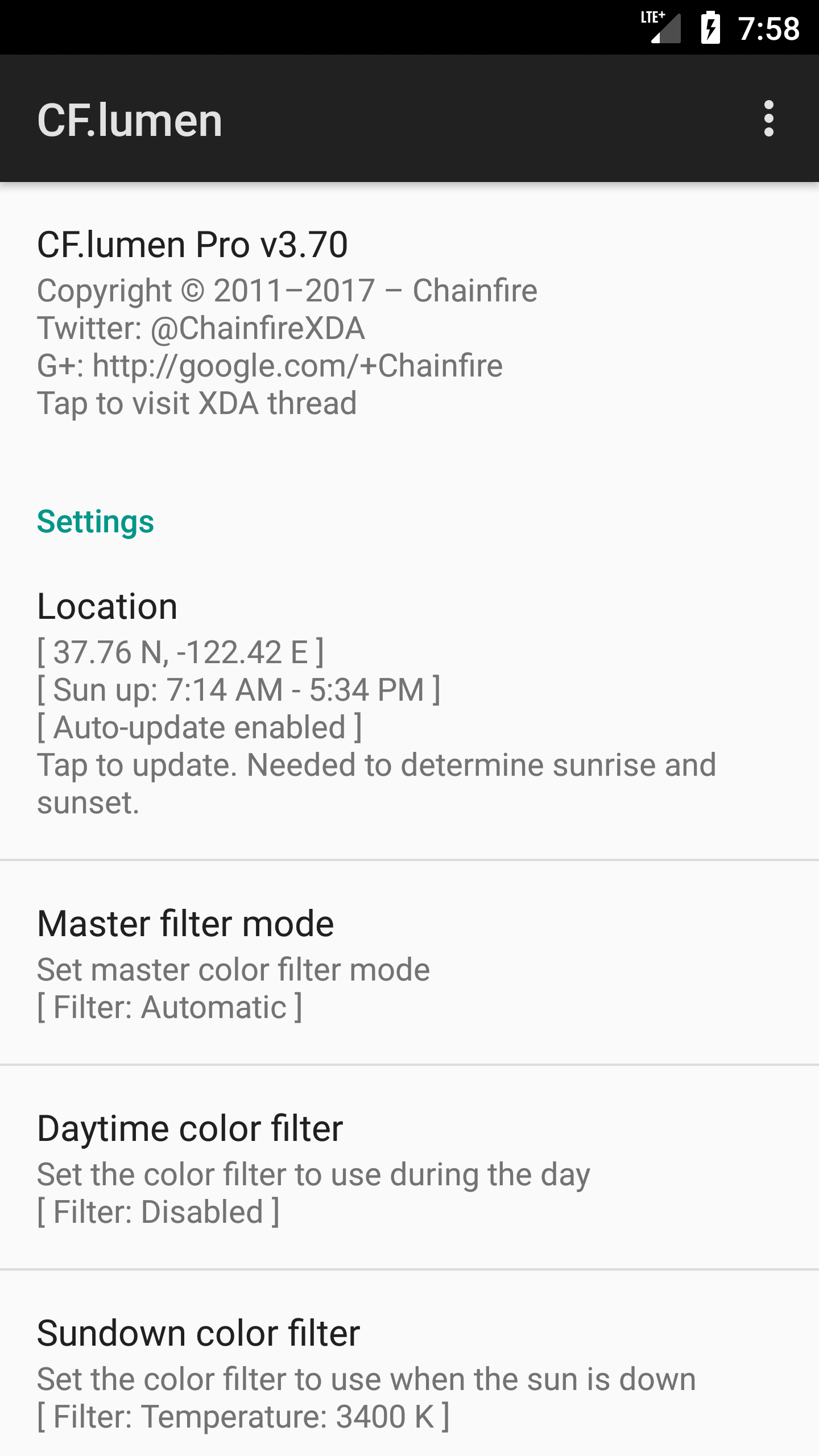

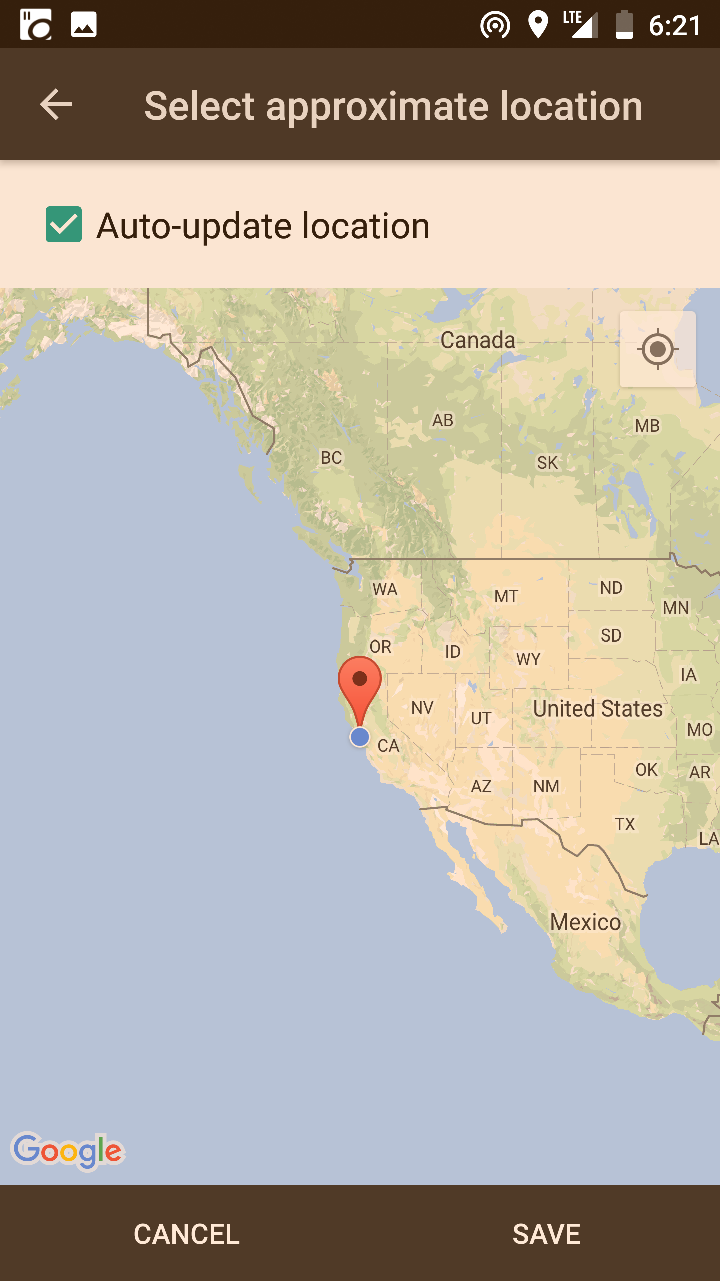
4. Tap on the “Location” section to set your location. (don’t be scared off by the longitude and latitude, the GPS on your phone will detect it automatically. This is used to calibrate the sunset and sunrise times for your location)

5. You’ll want to set the “Sleep: Start time” and “Sleep: End time” to know the specific times to start the blue light filtering
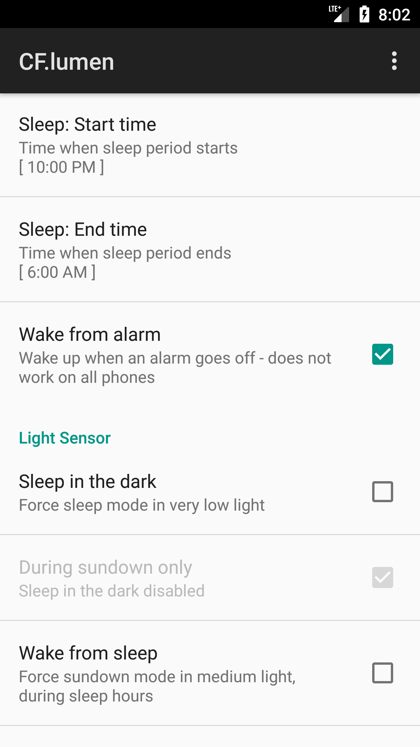

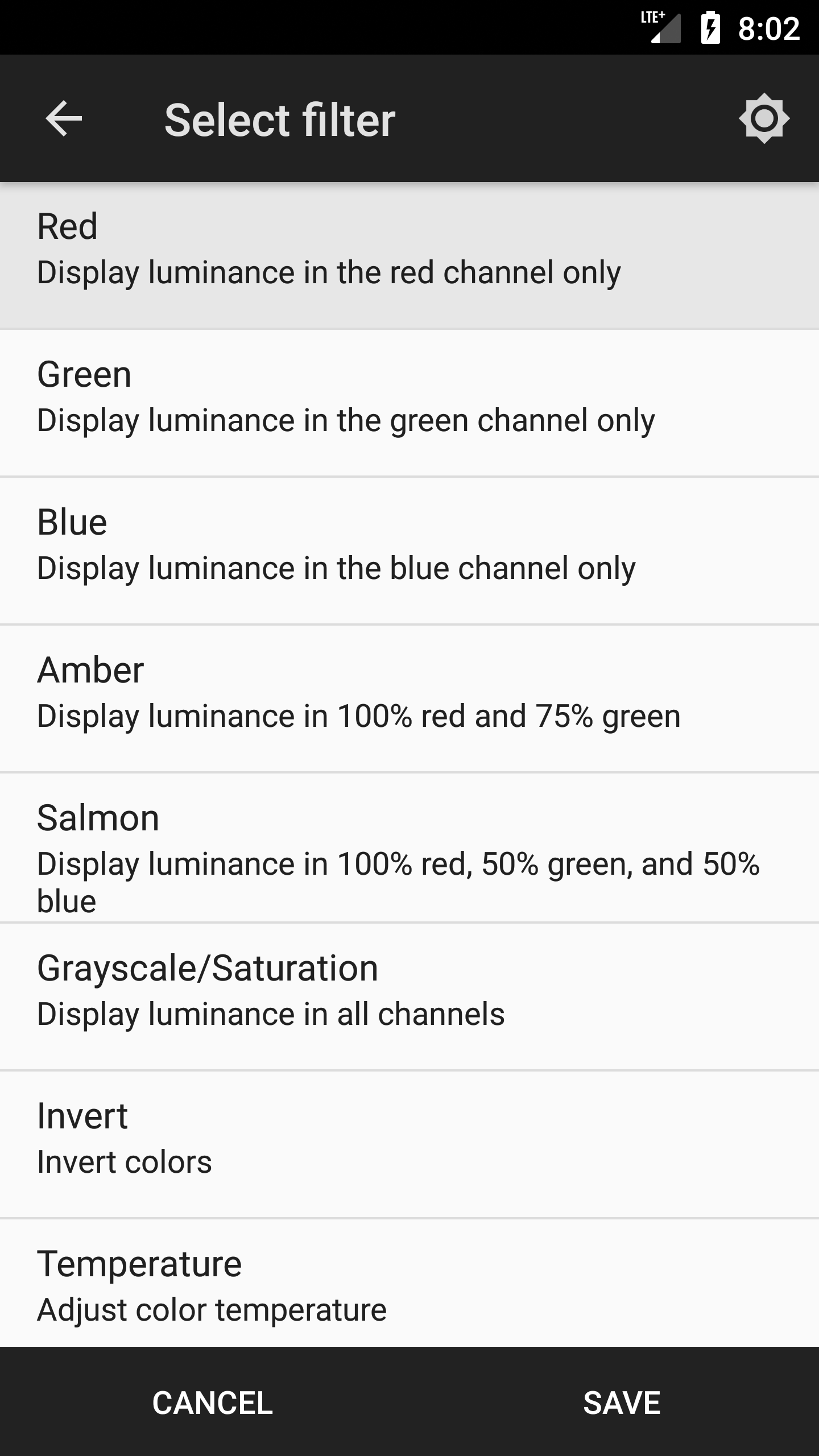
6. Those are really the only required settings, the rest of the options are for power users to customize things. (For instance, you can make CF.lumen start automatically when you boot up your phone, or manually set up the color filter if you want to try something more extreme)


Concluding Thoughts

Taking these steps will certainly improve your experience. But it’s important to realize that every Android user needs to find their own personal balance of function and aesthetics. What works for me may not work for you.
The beauty of the Android eco-system is that it’s built on choice and customization. You may find that a clean home screen brings you joy but a blue light filter just frustrates you. That’s okay! Only make changes that you think will genuinely improve your experience.
We’re staring at our phones for nearly 5 hours per day. You owe it to yourself to maximize the visual experience and efficiency of that time.


Source

Thursday, February 1, 2018

3 Product Design Predictions for 2018


Text & illustration: Andrew Wilshere
For better or worse, we begin 2018 in the wake of some historically significant political shifts. Across the U.S., Europe and beyond, establishment thinking and received wisdom failed to predict the electoral upheavals of 2016. In this piece, we explore some upheavals in the tech world that might also come sooner rather than later, manifesting a similar reaction against products and corporations that are increasingly perceived as both too powerful and too self-serving.

1. Apple will enter a full-blown identity crisis

Some might have thought that the corporate drama of Apple Computer would have ended after the Steve Jobs era — but the controversies that have come to characterize Tim Cook’s tenure have turned out to be just as enthralling.
The company Cook inherited in 2011 was very different from the one that Jobs found when he rejoined Apple in 1997. Jobs was brought in because the company had declined into near-irrelevance by the mid-90s; in contrast, Cook took over one of the largest and most successful companies in the world, boasting a highly desirable range of products and one of the most loyal customer bases around.
So, why this prediction — that 2018 is going to herald an identity crisis for Apple?
Well, things have been brewing for a while. First, there are the dumb design decisions that have characterised Cook’s tenure. Don’t get us wrong — Apple have always had a sideline in eccentric, overpriced, and failed products. Remember the 20th Anniversary Mac? Yeah, I thought not. One of the reasons I can’t forget it is that I think of it every time they show that episode of The Simpsons where Homer designs a car.
The 20th Anniversary Mac vs Homer Simpson’s car design
The doomed “hockey puck” — cute, but useless
Even in the Jobs era, there were some product design howlers, including the notoriously unusable “hockey puck” Apple Mouse that was released in 1998. Then, of course, there were the first-generation plastic MacBooks that first discoloured and then (literally) fell to pieces, earning themselves the nickname of “Crackbooks” in the process.
The top-case fiasco became a familiar sight for owners of the 2006 MacBook.
Dumb decisions in the Cook era have included a mouse that you have to turn upside-down to charge, and a battery pack for your iPhone that looks like a parody product, as well as making your phone look pregnant.
The official Apple Smart Battery Case for iPhone 6. Hmmm.
The 2015 Apple Magic Mouse 2. More hmmm.
Until recently, it was possible to take these eccentricities in good humor, largely because they were not that important. But things have been getting more serious in the past year.
For a start, Apple has embraced its market position and begun to systematically position its products as exclusive, premium alternatives to its run-of-the-mill competitors. This has included significant price hikes for its flagship products. A top-of-the-range MacBook Pro will set you back well over $4,000 with a 2TB hard drive, and the iPhone X begins at $999.
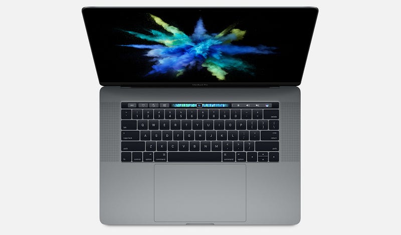
As a strategy, this might have been fine, had it not coincided with a series of increasingly embarrassing product design blunders. The 2016 and 2017 MacBook Pro have widely-reported problems with creaking or cracking screen hinges, and failing keyboards. Add to that some bizarre design decisions — such as adding a largely useless Touch Bar and a comically oversized trackpad — and you start to wonder what is going on.
The late 2016 MacBook Pro — beautiful but botched
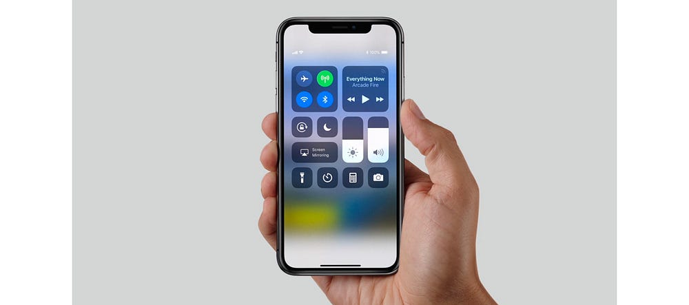
The most widely remarked-upon oddity of the iPhone X is the “notch”, though I doubt that’s going to be an enduring objection to the product; it may indeed prove to be a very useful piece of branding at a time when other “all-screen” smartphones are pretty much indistinguishable from one another.
More likely to hit the iPhone X’s reputation are emerging security problems with FaceID, which, combined with the product’s exceptionally high price, may go some way to explaining the reportedly slow sales of the handset and its rumoured discontinuation.
The iPhone X from 2017
In short, Apple has set itself up as being better than the rest, but has got into a bad habit of releasing products — both hardware and software — that can’t really support that claim, especially given that the quality of PC and Android products have increased markedly over the past 5 years.
In just the past few weeks, this mismatch between the company’s positioning, and what it is tending to deliver, was painfully evident in the disastrous flaws that MacOS High Sierra shipped with. One bug even allowed anyone to log in to any Mac as an administrator without a password, which led Apple to issue an emergency fix and a grovelling apology. Such a basic error would be inexcusable in a bargain-basement product; that it happened in a major release of MacOS is astonishing from a company that has set itself up as a paragon of virtue in its industry.
Which leads us to our prediction. It’s within Apple’s power to turn things around this year, but it’s going to be difficult. Some of these issues are probably evidence of failing processes within the company — for example, inadequate pre-release quality control and software testing — while the loss of genuinely “pro” features in the MacBook Pro in favor of expensive adapters and gimmicks like the Touch Bar show a lack of connection with user needs.
In 2018, if Apple wants to preserve its prime industry position and justify its price tags, it needs to return to real user-centered product design and re-focus on truly exceptional product execution. What’s more likely to happen, we fear, is that we will see another couple of botched product releases and embarrassing security problems, precipitating an identity crisis and maybe even some high-level departures from the company following 4 years of flat-lining revenue growth.

2. First-wave social media will start to decline

For the purposes of this article, we’re defining “first-wave” social media as Facebook and Twitter — though of course before that, there was the social media vanguard of MySpace, Bebo, and FriendsReunited.
If, like me, you have spent (too) much of the past decade reluctantly but compulsively attached to social media, you might find it hard to believe that Facebook or Twitter will ever die. But, of course, nothing lasts forever, and there are signs that these services are past their prime.
They were most popular amongst millennials, who hit adulthood in the mid-2000s and were excited by the prospect of an easy way to keep in touch with their nascent networks of friends and professional contacts. Facebook also offered an important, accessible way for older people to connect with friends and family far away.
A younger generation of post-millennials, though, have largely failed to see the attraction in these platforms, which offer the user very little granularity in how they relate to and share with different people. Generation Z have turned in their droves to Snapchat and encrypted services like WhatsApp for more secure and granular social networking — which can more faithfully mirror offline social relationships — and to Instagram for a more narrowly defined public sharing experience. Post-millennials have only ever known a data-driven, digital world, and easily see through “meaningless” Facebook friendships.
Facebook has made attempts to recapture the teenage and young adult market with apps like 2014’s Lifestage. This, however, was shut down last year following a lack of user uptake. They have also tried to bring in younger users by acquiring Instagram and other services that the demographic already use. More recently, Facebook acquired tbh, an anonymous compliments app for teens that was reportedly feared to be a potential commercial threat.
On top of this, we have a growing and diverse chorus of voices warning of the dangers of highly engineered social media services. These concerns have emerged partly in response to the alleged propagation of fake and planted news stories through social platforms during the 2016 US election. However, it runs deeper than that.
More importantly, critics draw attention to the fact that it is a core part of the design of first-wave social media platforms to create cognitive overload, psychological addiction, and compulsive sharing. It’s become common knowledge that many high-profile figures in the tech world limit their kids’ screen time or even send them to screen-free schools, perhaps to combat the expansion of tech into every realm of life.
At the Davos international trade summit a few days ago, billionaire George Soros had this to say:
“Mining and oil companies exploit the physical environment; social media companies exploit the social environment. This is particularly nefarious because social media companies influence how people think and behave without them even being aware of it. This has far-reaching adverse consequences on the functioning of democracy, particularly on the integrity of elections.”
Similarly, at the end of last year, Chamath Palihapitiya, a former Facebook executive for growth until he left in 2011, expressed regret at his role in the company’s expansion:
“the short-term, dopamine-driven feedback loops that we have created are destroying how society works. No civil discourse, no cooperation, misinformation, mistruth. […] This is not about Russian ads. This is a global problem. It is eroding the core foundations of how people behave by and between each other.”
And that’s not to mention the huge amounts of compromising personal data that users give over, unpaid, to multi-billion dollar companies to feed a lucrative advertising machine. Even The Economist — generally far from being a radical voice — is asking whether users should be paid for the data they currently freely surrender.
Our prediction is that 2018 will be a tipping point, as users become more aware of how corrosive first-wave social media platforms have become. To maintain their market position, Facebook and Twitter will need to go back to UX design basics and figure out afresh what 2018’s users actually want and need from a social app.
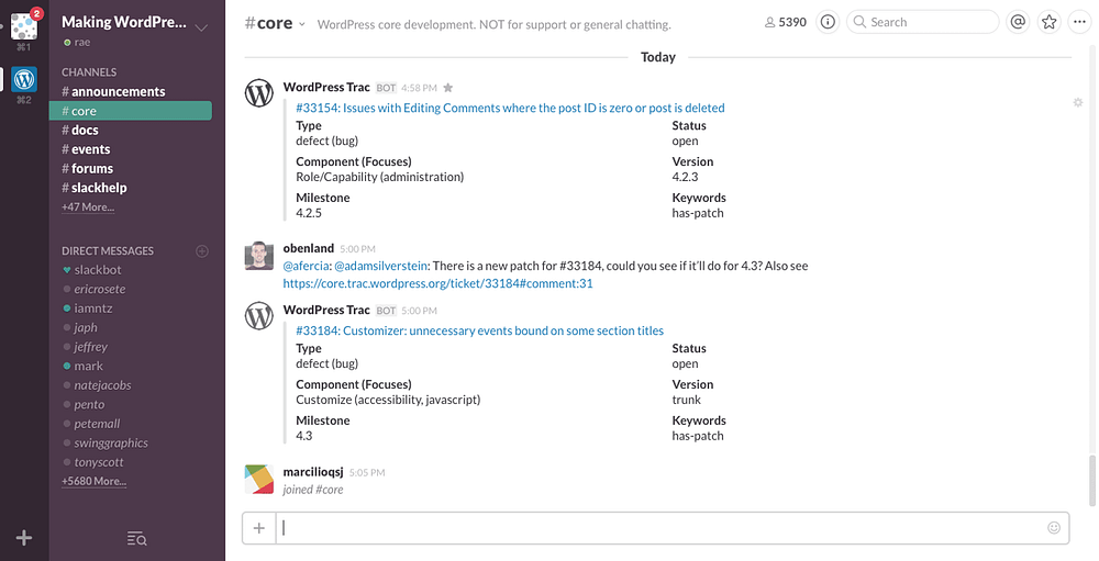
In the year ahead we are likely, at least, to see pushback against first-wave social media’s exhibitionist tendency. User preferences will shift towards more lo-fi, quasi-SMS interactions that require active participation rather than passive scrolling. Particularly in a world with an increasingly mobile workforce, business platforms such as Slack could provide a model for the future of social networking.
Slack’s desktop messaging interface
One important change in the decade since these platforms emerged is that users are now much more willing to pay for apps; paid subscriptions to Spotify and Netflix, which would once have been scandalous to the average web user, are now entirely normal.
User bases, even huge ones, can be fickle: once the time comes, or perhaps more importantly once the right new platform comes, we could see a brutal, mass exodus of regular users within a few years, towards paid platforms that deliver a more user-centered product.

3. Privacy and security will become more important user goals

Which leads us to our final prediction: in 2018, privacy and security will ratchet up the hierarchy of goals for many users. In the year ahead, experts deem it likely that there will be further international cyber-attacks in the wake of the WannaCry ransomware attack, which affected National Health Service (NHS) computer systems in the UK, leading to the closure of some services and diversion of ambulances. In turn, one of the reasons the ransomware propagated quickly was a failure to apply existing Windows 7 security patches that closed the EternalBlue exploit of a Windows vulnerability.
In a press release last year, David Dufour, vice president of engineering and cybersecurity at Webroot, stated that
“This past year was unlike anything we’ve ever seen. Attacks such as NotPetya and WannaCry were hijacking computers worldwide and spreading new infections through tried-and-true methods. This list is further evidence that cybercriminals will continue to exploit the same vulnerabilities in increasingly malicious ways. Although headlines have helped educate users on the devastating effects of ransomware, businesses and consumers need to follow basic cybersecurity standards to protect themselves.”
Individual users are beginning to wise up to the steps they can take to secure their privacy, security and identity, and will soon start to demand more of these controls from the devices and apps they use. To meet this demand, companies are likely to step up their efforts in these areas, perhaps accelerating programs to replace password systems or make 2-step verification mandatory.
After all, there is a long way to go: less than 10% of Google users currently use 2-step verification. By the end of the year, we will see lots more screens like this one from Slack, as more major sites and services beginning to retire passwords completely in favour of other verification systems.
Growing awareness of security and privacy risks may also accelerate the decline of first-wave social media platforms, which are notoriously opaque when it comes to how they use personal data, and the steps that users can take to get it deleted.
In part, this has been a failure of national and international governance and regulation. Particularly with the introduction of significant legal measures such as the EU Data Protection Regulation, we will also see legislators adopting a less hands-off approach to tech companies’ use of data; in the year ahead legislative bodies around the world are likely to pass new laws demanding more rigorous data standards and greater user control.

Saturday, January 27, 2018

Designing Atlis, the future of local search


How Rainfall approaches all clients as an extension of their team.
Atlis is the next generation of local search, a platform where its community can get real, personalized recommendations for almost any type of business simply by asking. In essence, Atlis has brought word of mouth recommendations to the digital space by rewarding quality interactions from its users with cash, status, and most importantly a trustworthiness score.
When Rainfall was first approached by Atlis in the Spring of 2015, that product vision had not yet been created, or in better words, discovered. The story of our partnership is a journey that includes the creation of a product, a brand, and a new behavior from scratch through constant iteration, testing, and deployment.
Our approach to the next generation of branding
At Rainfall, we call projects like Atlis “full brand expressions” because we have the ability to affect every visual element and touchpoint, not only defining the rules for how the brand is presented, but literally designing each and every component in company’s suite whether it’s printed, on the web, or in the product itself.
When developing any large system we design multiple pieces simultaneously in order to test ideas on a broad scale. Sometimes a particular approach will work well in one situation but not adequately characterize the overall language of the brand. Working holistically allows us to spot those situations and find effective solutions earlier in the creative process.
Creating a full expression involves understanding how the visual language works as part of the narrative fabric without interrupting the audience’s ability to engage. This is especially true in the digital space, as each platform serves a higher purpose than simply communicating the brand’s visual identity. Atlis’s interaction model and methods for information hierarchy are themselves components of the identity, so on the web and in the product those elements are of highest importance.
Here’s a look at what we created together with Atlis.

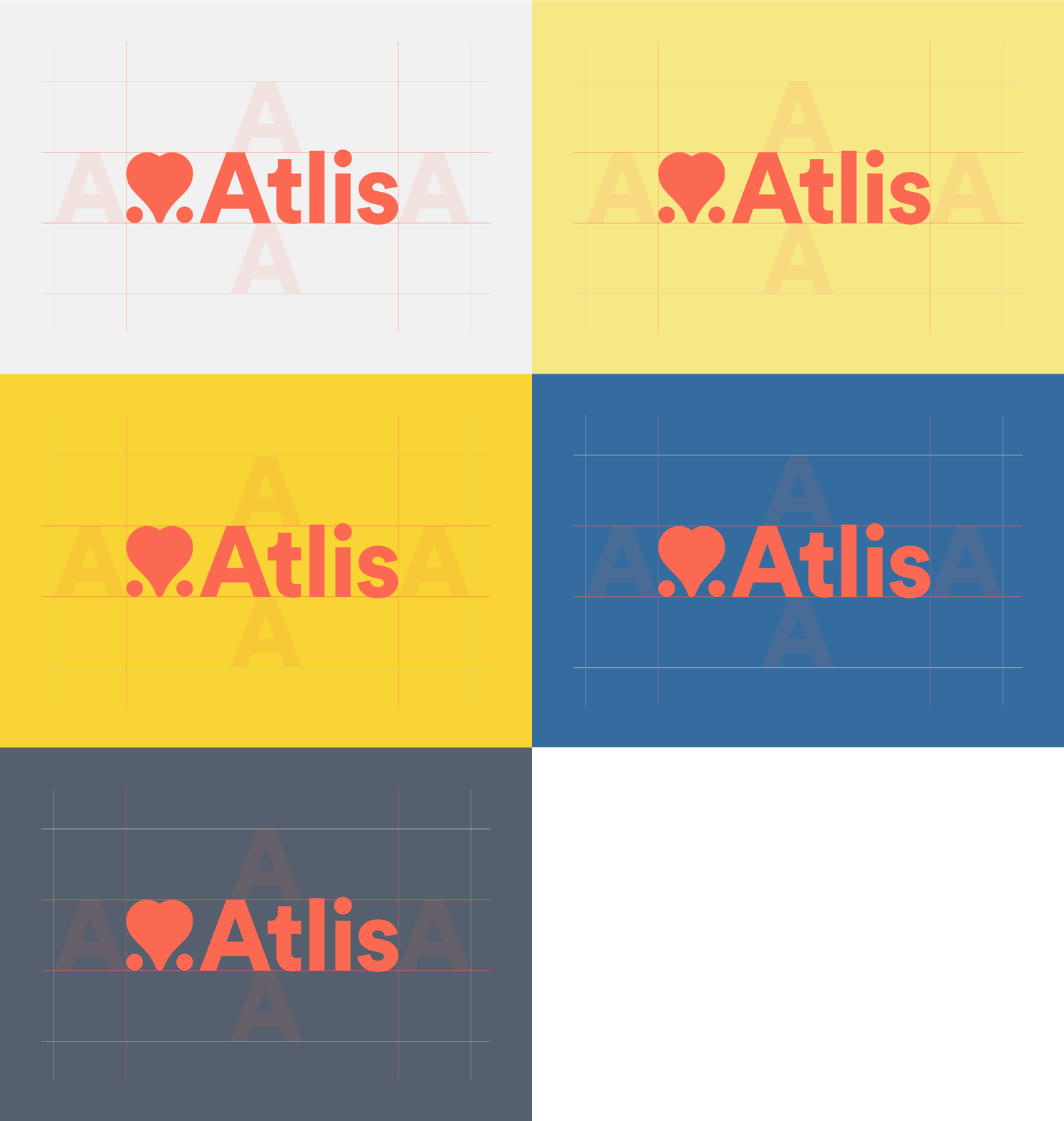
The Atlis Visual Identity

Atlis helps users make decisions

At the start of our engagement Atlis existed as a big idea and a product MVP. The working idea was that they could be the ultimate platform for users to get trusted recommendations for businesses through a network of their peers. At the time the mechanism for bringing that idea to live was not yet complete, but there was a strong enough narrative structure in place that we could strategically build a brand, a “favorite” between two options.
The Atlis logo, a heart between two dots, symbolizes the platform’s aim to help it’s users make informed decisions when given multiple options. It is quite simply the love that one shows for one business over another. This mark fits with the company’s aim to strike friendly relationships with both consumers and businesses in order to create a platform that is mutually beneficial.

The Badges

At this point Atlis had a visual presence but lacked the personality required to excite its audience and encourage them to engage. As part of a larger strategic exercise in gamification we developed a series of badges to reward users for their participation and become the face of the brand.
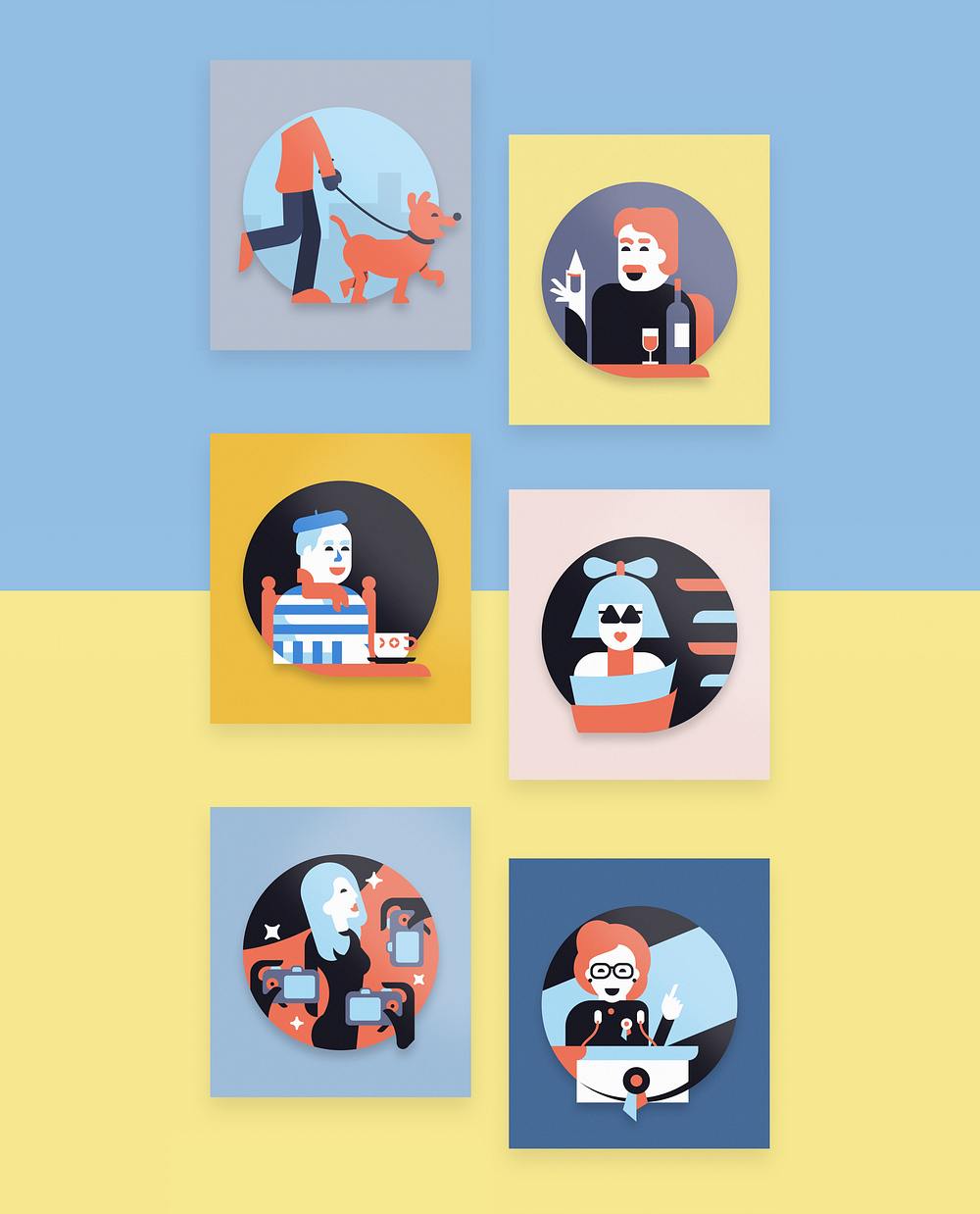
We considered all of the individuals that compose the fabric of an urban neighborhood to conceptually link each badge to a stage in one’s knowledge of the businesses nearby. Each badge memorializes the journey of discovery while also putting a face on Atlis.

The Atlis Product

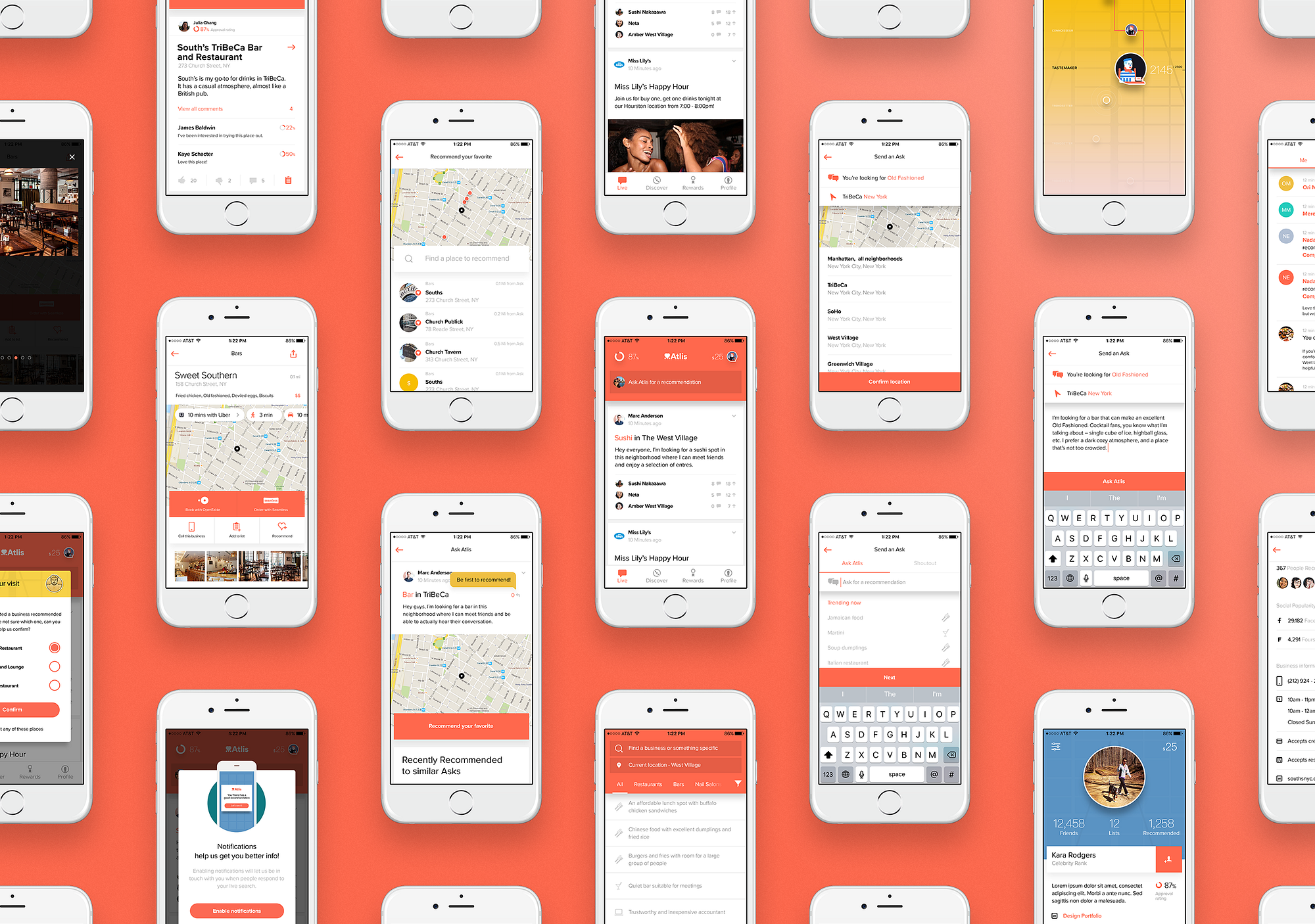
Central to Atlis is its mobile product, the main platform on which community members ask for advice finding businesses or respond to others with their own recommendations. As a concept the experience design is simple. There is a flow to ask for advice, a flow to view and respond to other users’ asks, as well as the necessary user and business profiles.
What started as a simple task of designing each of these flows developed into an approach of constantly iterating to optimize interaction and effectively display large amounts of supporting information.
The Ask Flow
#AskAtlis was a term coined early in the project that embodied the ease by which users would seek information. Our job was to deliver on that promise of ease by making the Ask flow as effortless as possible.
In early versions an Ask was just one step. The user would define what type of business they were looking for, write a brief supporting question, and confirm the preferred location all at once. While this seemed easiest we found that breaking that process into three focused steps resulted in a greater number of Asks and better insight into specifically what users were looking for.
The Response Flow
With over 20,000 users, recommendations begin to roll in almost immediately. Asking is only half of Atlis’s equation, and our main concern when testing the concept was that no one would respond as those Asks came in. Our approach was to make responding just as easy as asking, but with the added support of contextual information. When users opt to provide a recommendation Atlis suggests businesses that they have previously recommended or visited aided with additional context clues such as time of day, current location, and how long ago their last visit was.
Enticement
We knew that making it easy for users to respond wasn’t going to be enough, so we wove gamification into the core of the product experience. Each interaction with Atlis is an opportunity to earn points, increasing one’s standing within the community and represented with the badges developed as part of the identity. For additional appeal, users are rewarded in cash when someone acts on their recommendation and visits a business.

Trust

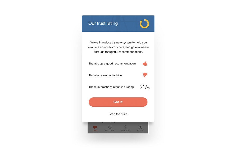
With a platform for recommendations involving status and cash we soon found it necessary to develop a means by which users could evaluate the advice from others. Were users thoughtfully suggesting businesses or were they recommending a place that they figured the asker would visit for other reasons? We wanted to create a democratized system in which users held each other accountable for good advice and where trust is earned through positive engagement with the community.
A simple thumbs up and down system encourages users to give their opinion as to whether advice is relevant to the asker’s intent. Users who give thoughtful advice increase their trust score, those who try to game the system will see it decrease, simple as that.
Available anywhere
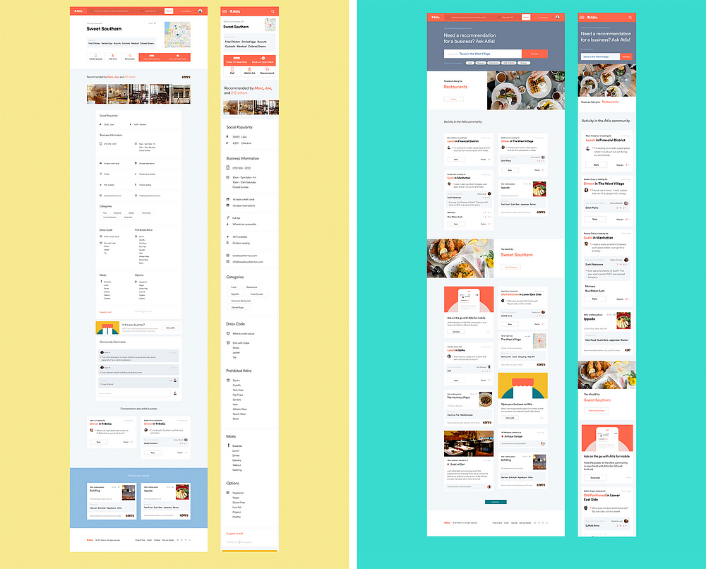
We need to cater to everybody, from longtime Atlis community members, to newcomers, to businesses owners claiming their profiles. This means that Atlis takes on many formats and exists in various contexts throughout the course of a single day or a single user’s journey.
A full application suite serves this purpose, including a responsive web product, mobile apps, marketing landing pages, and soon more. For the web, every element is fully responsive with content and interaction models that adapt to contextual information including location and time.
The result — a positive experience for businesses
Atlis is extraordinarily beneficial for its users because they can finally get real recommendations from locals and friends who know their neighborhoods. With the addition of more ubiquitous touchpoints and machine learning currently in development, the quality of information will continue to increase.
The value that Atlis is creating is just the first step in ensuring a more positive ecosystem for businesses. Businesses can make themselves discoverable to new clientele without average ratings and negativity, while leveraging satisfied customers to promote their businesses.
Rainfall’s close partnership with Atlis resulted in a consumer brand and product suite with wild initial success. It is a demonstration that our approach of honesty and mutual respect with clients leads to work that engages users and encapsulates the brand’s ideals.


Monday, January 22, 2018

A Eulogy for the Headphone Jack


Sometime in the mid-2000s, I was a freelance web developer in Philadelphia with some pretty crappy health insurance. I started having occasional heart palpitations, like skipped heart beats. My doctor said it was probably not serious, but she could do tests to rule out very unlikely potential complications for about $1,000. That seemed pretty expensive to rent a portable EKG for a single day, so I googled around for some schematics. Turned out you could build a basic three-lead EKG with about $5 worth of Radio Shack parts (I no longer have the exact schematic, but something like this). I didn’t really understand what the circuit did, but I followed the directions and soldered it together on some protoboard, connected a 9V battery, and used three pennies as electrodes that I taped to my chest. I hooked the output of the device to my laptop’s line in and pressed ‘record’.
screenshot of my heartbeat in Audacity
Audacity displayed the heartbeat signal live as it recorded. Sure enough, I was having pretty common/harmless Premature Ventricular Contractions. There’s one on the right side of the screenshot above.
Calling the 1/8th inch connectors you’d find on pretty much every piece of consumer electronics until recently “audio jacks” does them a disservice. It’s like calling your car a “grocery machine”. Headphone and microphone ports are, at their most basic, tools for reading and producing voltages precisely and rapidly over time.
My homemade EKG is a voltage converter. Electrodes attached to points around my heart measure tiny differences in voltage produced by signals that keep it beating. Those measured signals are amplified to about plus or minus 2 volts. That new voltage travels through an audio cable to the “Line In” on my sound card.
Sound cards happen to carry sound most of the time, but they are perfectly happy measuring any AC voltage from -2 to +2 volts at 48,000 times per second with 16 bits of accuracy. Put another way, your microphone jack measures the voltage on a wire (two wires for stereo) every 0.2 milliseconds, and records it as a value between 0 and 65,535. Your headphone jack does the opposite, by applying a voltage between -2 and +2 to a wire every 0.2 milliseconds, it creates a sound.

To any headphone jack, all audio is raw in the sense that it exists as a series of voltages that ultimately began as measurements by some tool, like a microphone or an electric guitar pickup or an EKG. There is no encryption or rights management, no special encoding or secret keys. It’s just data in the shape of the sound itself, as a record of voltages over time. When you play back a sound file, you feed that record of voltages to your headphone jack. It applies those voltages to, say, the coil in your speaker, which then pushes or pulls against a permanent magnet to move the air in the same way it originally moved the microphone whenever the sound was recorded.
Smartphone manufacturers are broadly eliminating headphone jacks going forward, replacing them with wireless headphones or BlueTooth. We’re going to all lose touch with something, and to me it feels like something important.
The series of voltages a headphone jack creates is immediately understandable and usable with the most basic tools. If you coil up some copper, and put a magnet in the middle, and then hook each side of the coil up to your phone’s headphone jack, it would make sounds. They would not be pleasant or loud, but they would be tangible and human-scale and understandable. It’s a part of your phone that can read and produce electrical vibrations.
Without that port, we will forever be beholden to device drivers between our sounds and our speakers. We’ll lose reliable access to an analog voltage we could use to drive any magnetic coil on earth, any pair of headphones. Instead, we’ll have to pay a toll, either through dongles or wireless headphones. It will be the end of a common interface for sound transfer that survived more or less unchanged for a century, the end of plugging your iPod into any stereo bought since WWII.
Entrepreneurs and engineers will lose access to a nearly universal, license-free I/O port. Independent headphone manufacturers will be forced into a dongle-bound second-class citizenry. Companies like Square — which made brilliant use of the headphone/microphone jack to produce credit card readers that are cheap enough to just give away for free — will be hit with extra licensing fees.
Because a voltage is just a voltage. Beyond an input range, nobody can define what you do with it. In the case of the Square magstripe reader, it is powered by the energy generally used to drive speakers (harvesting the energy of a sine wave being played over the headphones), and it transmits data to the microphone input.
There’s also the HiJack project, which makes this whole repurposing process open source and general purpose. They provide circuits that cost less than $3 to build that can harvest 7mW of power from a sound playing out of an iPhone’s headphone jack. Because you have raw access to some hardware that reads and writes voltages, you can layer an API on top of it to do anything you want, and it’s not licensable or limited by outside interests, just some reasonably basic analog electronics.
I don’t know exactly how losing direct access to our signals will harm us, but doesn’t it feel like it’s going to somehow? Like we may get so far removed from how our devices work, by licenses and DRM, dongles and adapters that we no longer even want to understand them? There’s beauty in the transformation of sound waves to electricity through a microphone, and then from electricity back to sound again through a speaker coil. It is pleasant to understand. Compare that to understanding, say, the latest BlueTooth API. One’s an arbitrary and fleeting manmade abstraction, the other a mysterious and dazzlingly convenient property of the natural world.

So, if you’re like me and you like headphone jacks, what can you do? Well, you could only buy phones that have them, which I think you’ll be able to do for a couple years. Vote with your dollar!
You can also tell companies that are getting rid of headphone jacks that you don’t like it. That your mother did not raise a fool. That aside from maybe water-resistance, there’s not a single good reason you can think of to give up your headphone jack. Tell them you see what they’re up to, and you don’t like it. You can say this part slightly deeper, through gritted teeth, if you get to say it aloud. Or, just italicize it so they know you are serious.

Interested for our works and services?
Get more of our update !