


Does your app need a night mode?
With
the introduction of OLED screens to the iPhone X, more and more people
are requesting night themes in their favourite apps to take advatage of
the true blacks on OLED screens, to save battery, and to make it easier
on the eyes in some cases. But should you add this option to your app?
Don’t confuse choice with convenience.
If
you ask any user if they’d want the option of night mode in your app,
they would say yes. As consumers we think we need more choices. It
sounds very logical. The more choices I have, the more likely I am to
choose something that suits me and makes me happy. But does more choice actually make users happier? In the TED Talk, The Art of Choosing, Sheena Iyengar explains how that might not actually be true.
Just
because users are asking for options, doesn’t mean they’re going to
start using them or that it’s the right choice for them. Depending on
the type of content that you provide to your users, a night mode might
actually hurt their engagement.
You have to ask yourself why you’re thinking about a night mode. If
you’re doing it solely to give your users options, then please, do
yourself and your users a favour and stop. There are many downsides to
having a night mode that you have to consider and be OK with before
adding it to your app.
A
night mode creates inconsistency within your app. It’s already hard
enough to keep your apps consistent with iOS and Android, and if you
have a website having that be consistent with everything too. Why would
you go out of your way to make it even more difficult for yourself?
A
night mode might reduce your users’ engagement with your app. Your
users are the reason that you have created your app. They have been
using your app and are used to it. If you have good information
architecture and user experience, they might be even using your app with
muscle memory. These users are your friends. They have already
memorized your app’s hierarchy and are using affordances and clues in
your app to navigate it fluently. Introducing a dark mode would change
all of that. Now they have to re-learn your app. Even though everything
is in the same place, they have to re-learn the affordances and clues
and repeat the process of getting used to it all over again, and this
risks alienating your users. They might see the dark mode and think
that’s a good choice for them and turn it on, but the next time they
open your app they won’t know how to navigate it and it will feel
strange. Remember when Instagram switched their UI design to the new
flat one with the new logo and everyone was running around setting
things on fire and protesting on the streets? Ok no one protested on the
streets but some users were pissed. Do you want your users to be
pissed? Looking back the re-design of Instagram was a success because it
simplified the interface to make room for new features like stories and
bookmarking photos and such. But a night mode is not a re-design.
Instead of moving your design forward, you would give it a split
personality.
Designing
a night mode for an app is no easy task either. You might think that
it’s just as easy as flipping the background and text colours, but
there’s actually a lot to consider. If there are photos in your app, are
they going to look their best in dark mode? On each given page, is the
right content being highlighted when the colours are switched? Do users’
attention still flow the same way they did in the regular mode? How
does the setting page look? Should the setting page also be switched to
dark mode? It would look very weird, wouldn’t it? what about all the
sub-pages of the settings page? how about the keyboard? Do we change it
to the dark keyboard in iOS when in night mode? If you have a black
tab-bar, should it now suddenly be white? because if it stays black then
there would be no contrast, but if you turn it white, there’s a big
bright object at the bottom getting all the attention from the rest of
the screen, and that’s not really what you want.
What
if my users have sensitive eyes and can’t handle bright lights? Or it’s
very hard for them to read balck on white due to dyslexia? Both iOS and
Android have very thorough accessibility features to accomodate the
whole experience for them. Having those settings on an app-by-app basis
would be confusing and inconsistent. There are options to reduce white
points, invert colours without inverting the photos, greyscale, adding a
tint, and options for different kinds of colour blindness built into
the system. So these don’t become an excuse for you to add a night mode
to your app.
OK. So there are many reasons why someone shouldn’t add a night mode to their app. But is there a good time to add a night mode? Yes.
It
all depends on the context — the type of content or service you are
providing your users and the context in which the users use your app.
The main complaint around the lack of night mode is prolonged reading at
night in a dark environment, mostly in bed or while in a car.
If your app is a game, then don’t bother.
If
it’s a productivity app, it’s still a very hard no as changing the
colour of the tools and the layout in an app that users depend heavily
on might confuse them. Unless you know for a fact that your users are
for some reason only using your app in bed with the lights off, then for
their sake do not add a night mode.
If
your app is related to messaging, then it’s be best to optimize for the
Smart Invert feature and let the user control the dark mode from the
accessibility section in settings if they wish.
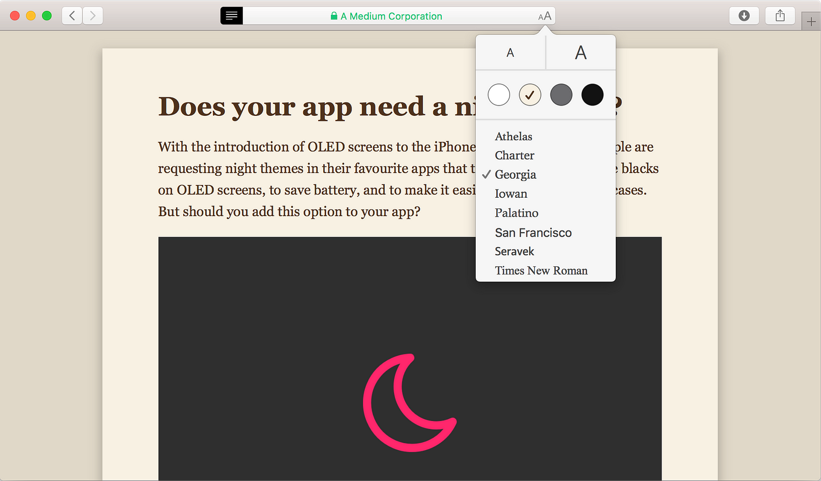
If
your app focuses on reading, *cough* Medium *cough*, then it’s a good
idea to provide options for your users to adjust the reading environment
to their comfort. A great example of this is the Reader mode in Safari.
If
your app is related to driving, like Google Maps or Podcasts, and might
stay open while a user is behind the wheel, it’s a good idea to add
automatic night mode so that it won’t distract the users while they’re
behind the wheel (can’t wait for self-driving cars).
I’ve
seen a lot of confusion and frustration from users and designers
surrounding night mode and if it should be a system-wide feature or not.
I hope this article made it a bit clearer if you should or shouldn’t
add a night mode to your app. Happy designing! ❤️
