When
the iPhone X launched, a lot of designers were put off about the screen
shape. Those complaints have mostly died down, but I haven’t seen much
design-nerd talk about cool corner treatment details. Fortunately, deep
nerd shit is my specialty.
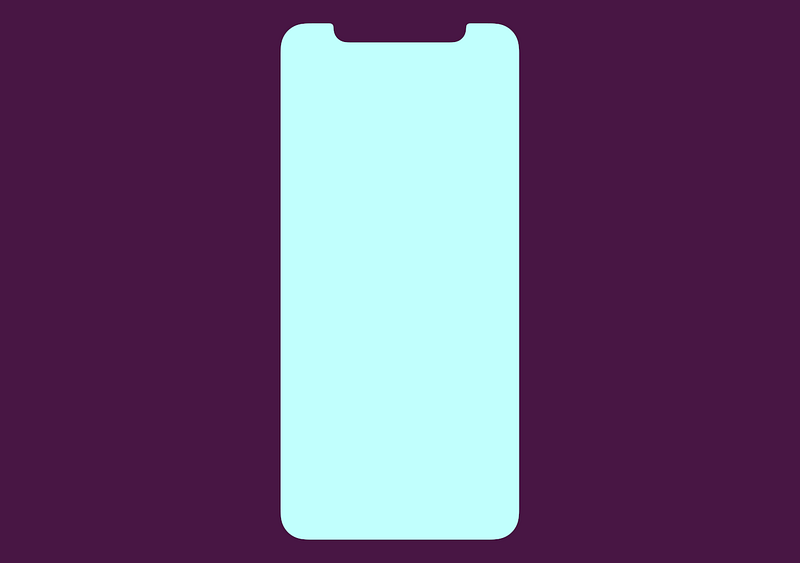
iPhone X screen shape
What’s Your Angle?
When you’re starting a design like this, the obvious, and comically
cheaper option is to make all corners square. Machines exist and/or are
calibrated to make those screens, so keeping edges squared requires
fewer manufacturing changes and less talent along the pathway to
production.
Everyone
knows how to make a right angle — designers don’t have to do math,
engineers need fewer calculations, the people making the machine are
clear on what to do.
And yet, let’s examine how crappy all-square corners would look:
I’m a pixelated bear cub. Rawr.
Once
Apple knew they wanted to take advantage of new full-screen technology,
that gave them the opportunity to alter screen shape because they would
need to address the manufacturing process anyway. Presumably, the
expense was mostly built in.
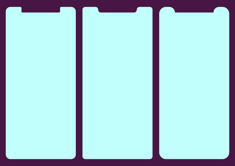
Still, there were lots of ugly ways to do this:
Meh.
This is where they landed:
That’s better.
Screen Corners
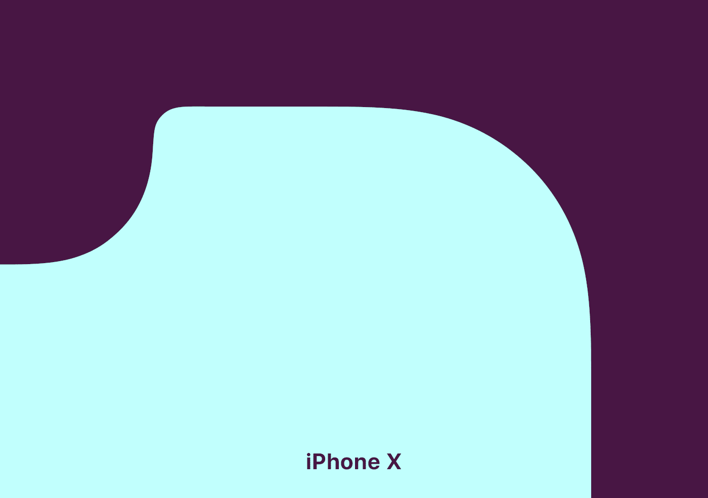
Here’s
where the nerd part comes in, iPhone X rounded screen corners don’t use
the classic rounding method where you move in a straight line and then
arc using a single quadrant of a circle. Instead, the math is a bit more
complicated. Commonly called a squircle, the slope starts sooner, but
is more gentle.
The difference is real subtle, even in gif-form, but here we go:
Difference between common rounded rectangle maths and Apple maths.
Apple
has been doing this to the corners of laptops and iMacs for years, but
this type of rounding didn’t penetrate iOS until version 7. This shape
has classically been difficult to achieve, because it wasn’t available
in 2D design editors, though that’s starting to change. Read about it
more detail here.
The Notch
Now
let’s talk about the notch itself. The left and right sides have two
rounded corners. Because of the curve falloff, one curve doesn’t
complete before the next one starts — they blend seamlessly into each
other. As a result, no tangent line on this edge actually hits a perfect
vertical.
Ooo. Fancy.
Come Correct
iPhone
X templates I’ve seen out there don’t 100 percent duplicate the
official shape, probably because it was either too hard to make or they
haven’t noticed. This is why it’s good practice to use official assets
from Apple, found in the design resources section of the developer site for creating icons and mockups.
Future
iterations of this design will surely alter these sizes, so it will be
interesting to compare how hardware sensor evolution impacts design
shifts.
Overall,
these decisions seem minor, but from a design viewpoint they’re fairly
opinionated. Even when designers are willing to spend social capital to
push these ideas, most organizations won’t put resources behind them.
Rounding the Bend
One
of the things I love about indie apps is their ability to be
opinionated. It’s nearly impossible to ship strong viewpoints from
larger companies where there are fifty people in a room examining
angles. So it’s cool to see Apple still has the ability to take a strong
stance in this way.
Sweating
thousands of minor details is what separates Apple from other
companies. Their ability to do that is hard-won, but damn it’s pretty to
watch.
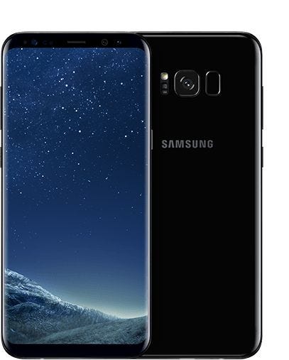
I’ve
switched back-and-forth between iPhone and Android in the past and I’ve
always felt the iPhone edged out any Android phone, but not any more.
I switched to a Galaxy S8 months ago and I don’t see myself going back to iPhone, even the X. The iPhone is dead to me. Here’s why.
iPhones don’t age well
On
my iPhone 6+, most apps crash on first open. Apps freeze for 5–10
seconds whenever launched or switched to. I lose 3–4%/min on my battery
and Apple Support insists that my battery is perfectly healthy. I went
through “apps using significant power” and uninstalled most of them.
On
top of all of this, it was recently discovered that Apple is
intentionally degrading the user experience based on your battery
quality. Yes, they’re releasing a software update to give transparency
to users and reducing the cost of a battery replacement (which is on a
months-long backlog — more on Apple support later), but it feels like
planned obsolescence and they’re just trying to avoid losing a
class-action lawsuit.
The
video app is busted. Many times I record a video and all I see is a
zero-second-long black frame saved. I’ve given up on taking photos
because the camera app takes forever to start up and has seconds of
shutter lag.
This
phone worked just fine three years ago. The minimal benefits of the
previous iOS updates are far outweighed by the horrible user experience
it’s created.
I have the original Moto X (from 2013) and it still runs buttery smooth.
AppleCare and Apple support are incompetent
This isn’t related to my previous iPhone, but it illustrates the lack of quality of Apple.
Recently,
a bottom rubber foot on my MacBook came off. It was still under
AppleCare so I took it into the store, my first time to the Apple Genius
Bar. They told me that AppleCare wouldn’t cover the replacement because
it was cosmetic. How the rubber foot isn’t part of the laptops utility is astonishing. When you typed on it, it would wobble. To fix it, the entirebottom chassis had to be replaced, which would cost $250.
I
told the Apple rep that I was surprised and I’d call Apple Care later. I
asked him to file a ticket for tracking and he replied that he had.
Later,
I called Apple Care and they assured me that the replacement was
covered. They also said they didn’t find a ticket in the system from the
Apple rep that I had spoken to earlier. They told me I would have to go
back into the store to get a rep to look at the physical laptop again
and verify the foot was missing. Frustrated, I asked them to call the
original store I had visited to confirm. They agreed and and eventually
confirmed it.
Before
this, I had asked them to send the part to an Apple store that was
closer to my house and not the original Apple store that I had visited. A
week later, I received a call confirming the part had arrived at the store furthest away.
Surprised, I asked them to send it to the other store (which was ~15
miles away). They said that they’d have to send it back to the warehouse
and then the other store would have to order the part.
A
week later, the other store finally receives the part. I visited the
store, they took my laptop, and I waited a couple of hours to replace
the bottom. The rep came back with the laptop telling me that it’s
ready. I inspected the bottom and the rubber foot was still missing.
Confused, he sent the laptop back. The rep returned five minutes later
with a new chassis, fixing the rubber foot. So not only had they some
how not repaired the bottom originally, in reality it only takes a tech
five minutes to repair it, not hours.
The cascading incompetence at Apple support was mind blowing.
Related
to the battery issue above, if you try to replace your battery you’re
facing months-long delays. On top of that, you have to mail your phone
in or take it into a store, with both options facing the risk that
you’re without a phone for as much as a week. Who can really live
without their phone that long? Is this incompetence or intentionally
meant to drive people away from replacing their batteries?
iPhone’s hardware design feels dated
Even
the iPhone X feels dated compared to the S8. This is much more of a
personal opinion, but the S8 feels damn sexy in your hand. When I watch a
movie, the true blacks of the OLED screen just blend in to the body. It
feels like a bezel-less phone from a science fiction movie. Whereas the
iPhone’s design still separates the screen from the chassis with
bezels.
More
objectively, even thought it was released after the S8, the screen on
the iPhone X isn’t as good. It’s lower resolution and it has more bezel.
Here
are the specs: Galaxy S8–5.8-inch Super AMOLED, 2960 x 1440 pixels (570
ppi pixel density), 1000 nits, 83.6% screen-to-body ratio vs iPhone
X — 5.8-inch 18.5:9 True Tone OLED, 2436 x 1125 pixels (458 ppi), 625
nits, 82.9%, screen-to-body ratio.
Plus,
iPhone X has that notch. As a developer I abhor it. As a user it’s
annoying to have wasted space when, for example, I’m browsing the web.
Price
Not
only is S8 a better phone than iPhone X, it’s significantly cheaper. I
just bought my S8 and a 256GB SD card for less than $700. The equivalent
iPhone X would have cost me $1,252, plus another $10 for a dongle to
use my headphones. That’s nearly the price of two S8s.
Android and S8 has better features
Where to start? Here’s an incomplete list in no particular order.
LastPass
auto-fill. Sure, this is an app feature, but it’s impossible to build
on iPhone. This felt like a game changer when I switched, shaving a ton
of time setting up my phone.
NFC for two-factor auth. You can use a Yubikey on an iPhone but it requires a dongle (like everything else these days).
SD card slot. I ran out of space on my previous iPhone and had no way to deal with it other than buy a new phone or delete apps.
Trusted locations for unlock. It’s a huge time saver to not have to constantly unlock my phone at home or in the office.
Samsung Pay works on any credit card reader, Apple Pay doesn’t, which hamstrings its use case massively.
The notifications are better. Interactions are great, they actually work, and the overall design is better.
I don’t have to buy a dongle for my headphones.
Androids
unlocking mechanisms are generally faster than iPhone X’s facial
recognition. And there are more options. And the fingerprint scanner
feels better on the back.
More battery saving options.
GearVR.
Built-in call spam detection. Call spam has been ramping up in the United States so this is very welcome.
A
free hardware button. Yes, that side hardware button on the S8 that’s
dedicated to Bixby sucks at first. However, with BXActions, you can make
it do whatever you want, like triggering the flashlight. Now I wish
every phone had an extra hardware button.
Google
backs up your data. I’m thrilled not to have to use iTunes any more
(which deserves a completely different post) or be forced to pay for
iCloud.
An option to keep the phone on if you’re looking at it.
iOS is suffocating
On
Android, you can install apps that automatically update your wallpaper,
change your entire app launcher (I’m using Evie) including a dedicated
search bar, start Google Now by swiping up, handle your SMS. Also custom
phone dialers, Facebook Messenger chat heads, Samsung Edge
(surprisingly I like this feature). You can even download apps outside
of the app store.
Did
I mention that Google Photos actually always syncs in the background?
Versus the iPhone, where you need to open it every 10 minutes to make
sure it’s syncing. Custom keyboards are reliable, whereas on iOS they
still crash randomly.
iOS doesn’t offer any of this because they restrict what developers can build.
Even
if you eliminate all of the “power user” features above, I think the
S8, and Android broadly, is a better choice for the average user.
Siri is still next to useless
Google
is just hands down better at search, including things that you would
imagine Siri would be good at by now, like dictation. I think everyone
already agrees with this point, so moving on.
Apple doesn’t feel like Apple
Apple
has generally been a fast-follow copier, perfecting features that that
have already been released. Lately they’ve just felt like a slow
follower that has the same or fewer features.
For example, Samsung devices have had wireless charging for a while now and Apple is just catching up with the same feature set. The charging speed is the same.
Samsung
is also experimenting with fascinating things like VR and DeX. Are they
perfect? No. But I also don’t believe that Apple is capable of swooping
in and perfecting them now.
Apple’s
“new and innovative features” aren’t impressive either. Animoji could
be done with a standard camera, but they’re locked the the iPhone X.
It’s pure marketing to sell more Xs. I’ve had force touch for years now
and have never used it. And the list goes on.
Sometime
in the mid-2000s, I was a freelance web developer in Philadelphia with
some pretty crappy health insurance. I started having occasional heart
palpitations, like skipped heart beats. My doctor said it was probably
not serious, but she could do tests to rule out very unlikely potential
complications for about $1,000. That seemed pretty expensive to rent a
portable EKG for a single day, so I googled around for some schematics.
Turned out you could build a basic three-lead EKG with about $5 worth of
Radio Shack parts (I no longer have the exact schematic, but something like this).
I didn’t really understand what the circuit did, but I followed the
directions and soldered it together on some protoboard, connected a 9V
battery, and used three pennies as electrodes that I taped to my chest. I
hooked the output of the device to my laptop’s line in and pressed ‘record’.
screenshot of my heartbeat in Audacity
Audacity
displayed the heartbeat signal live as it recorded. Sure enough, I was
having pretty common/harmless Premature Ventricular Contractions.
There’s one on the right side of the screenshot above.
Calling
the 1/8th inch connectors you’d find on pretty much every piece of
consumer electronics until recently “audio jacks” does them a
disservice. It’s like calling your car a “grocery machine”. Headphone
and microphone ports are, at their most basic, tools for reading and
producing voltages precisely and rapidly over time.
My
homemade EKG is a voltage converter. Electrodes attached to points
around my heart measure tiny differences in voltage produced by signals
that keep it beating. Those measured signals are amplified to about plus
or minus 2 volts. That new voltage travels through an audio cable to
the “Line In” on my sound card.
Sound cards happen to carry sound most of the time, but they are perfectly happy measuring any AC
voltage from -2 to +2 volts at 48,000 times per second with 16 bits of
accuracy. Put another way, your microphone jack measures the voltage on a
wire (two wires for stereo) every 0.2 milliseconds, and records it as a
value between 0 and 65,535. Your headphone jack does the opposite, by applying a voltage between -2 and +2 to a wire every 0.2 milliseconds, it creates a sound.
To
any headphone jack, all audio is raw in the sense that it exists as a
series of voltages that ultimately began as measurements by some tool,
like a microphone or an electric guitar pickup or an EKG. There is no
encryption or rights management, no special encoding or secret keys.
It’s just data in the shape of the sound itself, as a record of voltages
over time. When you play back a sound file, you feed that record of
voltages to your headphone jack. It applies those voltages to, say, the
coil in your speaker, which then pushes or pulls against a permanent
magnet to move the air in the same way it originally moved the
microphone whenever the sound was recorded.
Smartphone manufacturers are broadly eliminating headphone jacks
going forward, replacing them with wireless headphones or BlueTooth.
We’re going to all lose touch with something, and to me it feels like
something important.
The
series of voltages a headphone jack creates is immediately
understandable and usable with the most basic tools. If you coil up some
copper, and put a magnet in the middle, and then hook each side of the
coil up to your phone’s headphone jack, it would make sounds.
They would not be pleasant or loud, but they would be tangible and
human-scale and understandable. It’s a part of your phone that can read
and produce electrical vibrations.
Without that port, we will forever be beholden to device drivers
between our sounds and our speakers. We’ll lose reliable access to an
analog voltage we could use to drive any magnetic coil on earth, any
pair of headphones. Instead, we’ll have to pay a toll, either through
dongles or wireless headphones. It will be the end of a common interface
for sound transfer that survived more or less unchanged for a century,
the end of plugging your iPod into any stereo bought since WWII.
Entrepreneurs
and engineers will lose access to a nearly universal, license-free I/O
port. Independent headphone manufacturers will be forced into a
dongle-bound second-class citizenry. Companies like Square — which made
brilliant use of the headphone/microphone jack to produce credit card
readers that are cheap enough to just give away for free — will be hit with extra licensing fees.
Because
a voltage is just a voltage. Beyond an input range, nobody can define
what you do with it. In the case of the Square magstripe reader, it is
powered by the energy generally used to drive speakers (harvesting the
energy of a sine wave being played over the headphones), and it
transmits data to the microphone input.
There’s also the HiJack project,
which makes this whole repurposing process open source and general
purpose. They provide circuits that cost less than $3 to build that can
harvest 7mW of power from a sound playing out of an iPhone’s headphone
jack. Because you have raw access to some hardware that reads and writes
voltages, you can layer an API on top of it to do anything you want,
and it’s not licensable or limited by outside interests, just some
reasonably basic analog electronics.
I don’t know exactly how
losing direct access to our signals will harm us, but doesn’t it feel
like it’s going to somehow? Like we may get so far removed from how our
devices work, by licenses and DRM, dongles and adapters that we no
longer even want to understand them? There’s beauty
in the transformation of sound waves to electricity through a
microphone, and then from electricity back to sound again through a
speaker coil. It is pleasant to understand. Compare that to
understanding, say, the latest BlueTooth API. One’s an arbitrary and
fleeting manmade abstraction, the other a mysterious and dazzlingly convenient property of the natural world.
So,
if you’re like me and you like headphone jacks, what can you do? Well,
you could only buy phones that have them, which I think you’ll be able
to do for a couple years. Vote with your dollar!
You
can also tell companies that are getting rid of headphone jacks that
you don’t like it. That your mother did not raise a fool. That aside
from maybe water-resistance,
there’s not a single good reason you can think of to give up your
headphone jack. Tell them you see what they’re up to, and you don’t like it.
You can say this part slightly deeper, through gritted teeth, if you
get to say it aloud. Or, just italicize it so they know you are serious.
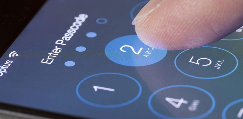
People
appreciated how Apple addressed security. For decades, the company was
building multi-layered ecosystem to secure its customers and protect its
software and hardware systems from most online threats. Apple products
do have some flaws (who doesn’t?) but overall its mobile systems were the most secure among all competitors.
Things
have changed. Although iOS 11 brought us great SOS feature and the need
to type in the passcode for establishing trust with new computers, it
also introduced some questionable changes that will be described in this
article.
The
final goal of these changes was making it easier for users to operate
their devices but each new small change caused a tradeoff in overall
security.
Put
together, these tradeoffs stripped all layers of protection off once
secure ecosystem. The only security layer that is left in iOS 11 is the
passcode. In case someone gets hold of your iPhone and manages to find
out your passcode, you end up losing your Apple ID, your data files, all
passwords to third-party web accounts, access to other Apple devices
registered with that ID. It is possible to do even more bad things
thanks to the fact that Apple removed all previous protection levels and
left only the passcode in iOS 11.
The key problem:
In
sensitive environments, it is not enough to secure only the front door
of the building and leave all inner rooms without additional keys and
checks. Sad, but it is exactly what happened to iOS. If you have a
passcode, you may get everything else.
Bellow, you will see what attackers can do to user’s data if they have access to the device and passcode.
iTunes backup password
iPhone
backups that are made with the help of iTunes can be safeguarded with a
password. With each new version, Apple successfully increased backup
passwords security addressing the growing threats coming from password
breaking crooks.
All
of a sudden, in iOS 11, Apple allows resetting that extremely secure
password. Having the device and knowing the passcode, there is no need
any more to break your head creating sophisticated attacks, you can just
remove the backup password.
Before
I tell you why this is so important, let me explain how it was
implemented earlier. In iOS 8, 9, and 10 you could create a password in
iTunes to secure your backups. You had to do it just once and all future
backups on any of your numerous devices would stay protected with a
password.
It
is important that this password belonged to your Apple device and not
the computer or iTunes. You were able to connect an iPhone to a
different PC with a new copy of iTunes and male a backup. That backup
would be safeguarded by the backup password you set previously, maybe
very long time ago.
The
iOS controlled all password changes and removal attempts. It required
to provide your old password first. People who forgot their passwords
had stuck with what they had or reset the device to factory settings
thus losing all data.
That
was really a secure way to handle passwords. But users wept, the police
started to snivel, and the FBI started to complain. Apple decided to
give up.
Pillaging backup passwords in iOS 11
Although
you can still go to iTunes and get a backup password that cannot be
later changed without the original one, this all means nothing because
it is possible to completely remove the backup password from iOS.
Apple knowledge base says:
You
can’t restore an encrypted backup without its password. You won’t be
able to use previous encrypted backups, BUT you can back up your CURRENT
data using iTunes and setting a new backup password.
Now
for crooks to extract sensitive information from the device, they just
need to make a new backup. They may create a temporary password 1234 for
example for the new backup. Once it is ready, they may extract user
data like credit card info, passwords, health data etc. Turning this
information into readable format will require some forensic tools but
they are widely available on the market.
While
getting all those passwords, most probably you stumble upon the Google
account password. With that in hands, you may access a whole lot of
personal data. In case Google account has multi-factor authentication,
the very iPhone in your hand (often) includes the tied SIM card.
Imagine
hackers got control over an iPhone with the previous version of iOS. It
is a win again because updating the iOS to version 11 is not a problem.
Yes, iPhone 5 cannot run iOS 11 but good and old jailbreaking of 32-bit
devices still allows to gain full physical control.
Again,
this post implies crooks know the passcode. But if you grabbed your
boss’s iPhone you can relatively easy brute-force the passcode with the
help of numerous tools that are common these days.
Summarizing the above said, with iPhone and passcode, it is possible to get:
· Application data
· Local images and videos
· Passwords from local keychain
· Just everything located in a local backup
Is
this just massive? Wait, it is just the begging. Next goes changing
Apple ID password, disabling the iCloud lock, and locking or erasing
other user’s devices remotely.
Apple ID password
With
all other services I use, to change an account password, I need to
provide my old password. Apple sees it differently. To reset Apple ID
password (using the device) you need just to confirm the device
passcode. It works for accounts with multi-factor authentication but
again most probably your device has the necessary SIM.
Moving forward on our list, now you can also:
· Change the Apple ID password
· Deactivate iCloud lock and consequently reset iPhone using different account
· Get access to just everything stored in that iCloud account
·
See on the map the actual location of other i-devices registered with
the same account and remotely erase or lock those i-devices
· Change the phone number and begin receiving multi-factor codes to your SIM
So,
in order to reset the Apple account and iCloud password, you need to go
to Settings > Apple ID > Password & Security > Change
Password. You will now have to enter the passcode and then you will be
able to change the password for Apple ID and iCloud. It is that simple.
Next, you can change the Trusted Phone Number. Just add and confirm a new number and then remove the old one.
Getting into iCloud
Having
reset the victim’s iCloud password together with adding your own phone
number to receive 2FA codes, gives us access to everything the victim
has on his Apple account. These are call logs, contact list, iCloud
Keychain, photos taken with all other i-devices, iCloud backups, etc.
And ICloud backups may contain tons of information as Apple allows to
keep three recent backups per each device registered on one Apple ID.
Synced Data
Moreover,
iCloud allows crooks to access information synced across all i-devices
like browser passwords, bookmarks, browsing history (but not the VPN data), notes etc. In case the user also has a Mac, you can get his desktop files and documents.
iCloud KeyChain
To
sync Safari passwords, payment info, and auth tokens, Apple uses a
cloud service cold iCloud KeyChain. Once you change the iCloud password,
you can download all then KeyChain data. Now you will be able to even
see the old (original) victim’s password for his (now yours) Apple
account. Additionally, you will have access to email account passwords
and Wi-Fi passwords, and actually every password the victims typed in
his browser.
Bottom line
iOS 11 breaks the delicate convenience/security balance moving heavily into user convenience side.
If an attacker
steals
your iPhone and recovers the passcode, there will never be any extra
layer of protection to secure your data. You will be completely exposed.
As the passcode is the only protection left, be sure to use all six digits allowed.
Evil
kills good people with mass shootings, tensions with North Korea
increase daily, and actors abuse actors as sexual playthings.
Yet despite the torture of humanity, thousands of people complain about the iPhone X’s notch.
Not
me. I enjoyed the iPhone tittle tattle. In the run up to the iPhone X’s
release I salivated over articles on the X’s lush colours, OLED screen,
Face ID, super-duper performance, glass construction, wireless
charging, bionic chips. Oh, how I could go on.
I read political stories too but only to feel more adult.
On
October 27th I sat by the iMac and waited until 08:00 am to pre-order
the iPhone X — like millions of other people — I hit refresh repeatedly.
What
is it about the iPhone X that drives me to pre-order, and because I
expected a 10th anniversary phone, join the Apple Upgrade Programme?
Is it madness?
More money than sense?
Am I still 13½ years old?
(Those were rhetorical questions).
The
answer might be clever marketing because after two months with the
iPhone X, I’ve done nothing the one-year-old 7 Plus wasn’t capable of.
Close Encounters of the Apple Kind
My
first encounter with Apple — the iPod Classic — was a difficult
decision. A friend recommended the Creative Zen MP3 player, but it was
near obsolete so I opted for the iPod and the addiction began.
Perhaps if I’d opted for the Zen, I’d be using an Android phone today.
A
few years passed and BBC News featured a new phone called iPhone. But I
gazed at my silver Sony Ericsson and wondered what more you’d want in a
phone?
And
the cost 11 years ago? I would never pay £30 a month for a carrier
contract. However after coffee with friends, who all had an iPhone,
coupled with an illness in the family to emphasise the impermanence of
life, I went iPhone.
One iTunes library, four iPhones, two iPads, one iMac and a MacBook Pro later, I’m beyond redemption.
But brand loyalty can’t be why I ‘rented’ the iPhone X. I could have kept the 7 Plus.
El Notch, Yosemite
Go Figure 8
I tried to resist the X and considered the smaller iPhone 8. The size was perfect, but the camera would be a step down.
The
8 is cheaper on the upgrade programme. £18 less than the X or £12 less
for the Plus. But the iPhone 8 Plus offers little that’s new since it’s
the 7 Plus in glass.
Wireless charging?
There’s no such thing. The charger mat still needs plugged in.
The iPhone 8 is a decoy phone — the iPhone 7s.
But iPhone 8 can’t be why I fell for the X. My 7 Plus was still a premium phone without a scratch.
Drip, Drip, Drip
When I was a child, I got excited about Christmas from around September.
For
Apple’s 10th anniversary iPhone my anticipation began one year before
release. No sooner was the 7 Plus in my hand, the tech press speculated
on the next iPhone.
The whole market place was primed by the media and whipped into a frenzy.
Rumours, from people familiar with the situation, leaked as usual but with one difference.
2017
saw the leaking of price. Customers needed to be acclimatised to the
first £1000 phone so when it became official, the shock factor would be
lost.
You’ve been primed.
In
marketing terms, priming is the preparation of subconscious consumer
behaviour through the subtle use of information. The new X for example,
was secret, but there was just enough sexy news to whet your appetite.
The X was everywhere and nowhere.
But
stories about a non-existent phone cannot be the reason I wanted one.
There are stories about HomePods, cellular watches and iPad Pros and I
want none of those (fingers crossed).
Apple Framed the X as The Future… Today
After a succession of similar iPhones, the X promised reinvention.
The X’s keynote described the product as the future and you can hold it in your hand.
The
message was misleading. Edge to edge displays, wireless charging, OLED
screens and facial recognition, have been available on other phones for
years.
But
know this, the X looks beautiful, when switched on. When off, it looks
like the Blackberry Leap. The build quality is superb though.
It’s
a wonder of marketing. You can feel unique using a product when
millions upon millions of people across the world have the product too.
But
an OLED screen and facial recognition can’t be reasons to spend £56 a
month. The 7 Plus screen is fabulous and fingerprint ID seamless.
If having the future isn’t enough to make you buy, there’s always fear.
Scarcity
Scarcity and fear of missing out (FOMO) come into play.
If one thing puts the fear of God into consumers, it’s the wait to get what they want.
When
I was a small boy, my favourite superhero was Spider-man. I begged Mum
to buy me a Spider-man figure. At the toyshop we discovered it would be
weeks before Spider-man would be back in stock.
So
what did I do? I settled for the Human Torch (one of the Fantastic
Four). I regretted it soon after and my impatience meant I didn’t get
Spider-man, ever.
When impatience strikes, I think Spider-man.
Drip feeding consumers with stories of scarcity and production line problems fan the flames of fear, the fear of missing out.
I
knew the X’s production would be fine and prepared to wait. Supply
problem stories come out before every iPhone launch. In terms of missing
out, of all features, only Face ID and Animojis were absent from the 7
Plus.
So, FOMO can’t be why I wanted an iPhone X.
Prize Value
£1000 is scary for a phone but it’s not £1000 more than we’re used to paying.
Prices
have crept up for years, and be honest, if you can afford £700 or £800
for a phone, you can also afford £1000. Apple know it too.
It may be borderline out of reach but it’s also borderline within reach.
A high price is one tactic marketers use to put the quality of a product in the mind of consumers.
The high price tag of the X may set it apart from competitors but cost definitely isn’t the reason to want the X.
Here and Now and Why
My
late Dad used to say there’s no such thing as a bad car. In the 1970s,
cars looked good in the showroom but once you drove one and it rained,
they rusted and fell apart before you got home. Cars are not like that
anymore.
Like cars today, there’s no such thing as a bad phone. Most brands have caught up.
You’ll not do anything different on the X than you could do on many of the latest smart phones.
The
X may not be the future, just a brilliant phone that perfects what
others have already done, while leaving room for development.
Over
a year I’ll pay £677 to hire Apple’s latest palm-top computer. The
device I use everywhere to read, write, take pictures, research, web
browse, meditate, enjoy music. Oh and make phone calls.
Why do I want one?
It’s not brand loyalty, decoys, scarcity or the features.
In 1923 when asked by a New York Times reporter why he wanted to climb Everest, George Mallory said “Because it is there”.
I want the iPhone X for the same reason you do — because it is there.
When
design leads to friendship, and that friendship leads back to design,
magic happens. This is the story of how an intern and her mentor
designed Apple’s original emoji set and together changed the way people
communicate around the world. It was also a project that led them to
become lifelong friends, a key ingredient in the success of these tiny
icons. In a nutshell, I was the intern and Raymond is my lifelong friend
and mentor. In the course of three months, together we created some of
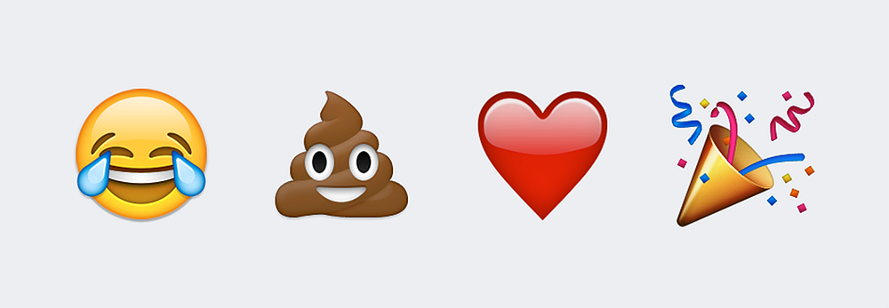
the most widely used emoji: face with tears of joy, pile of poo, red
heart, and party popper, plus around 460 additional ones. Later, as a
full time Apple employee, I even got to create a few more.
It
was the summer of 2008, and I was one year away from receiving my MFA
in Graphic Design from the Rhode Island School of Design (RISD). It was
the same summer I landed an internship at Apple on a team I was eager to
meet. The same design team responsible for the iPhone; a magical device
that launched the year prior at Macworld Expo in San Francisco. One
could only imagine the size of my butterflies as I flew to Cupertino and
arrived at 1 Infinite Loop. To add to the uncontrollable fluttering, I
had no idea what project I would be given, the size of the team, where I
would sit, or if I could really bike to work (I’m terrible on bikes).
Soon
after my arrival and meeting the team (oh and biking to work!) I was
handed my project. I was still trying to make sense of the assignment
I’d just received when someone asked if I knew what an emoji was. And
well, I didn’t, and at the time, neither did the majority of the English
speaking world. I answered ‘no’. This would all change, of course, as
the iPhone would soon popularize them globally by offering an emoji
keyboard. Moments later I learned what this Japanese word meant and that
I was to draw hundreds of them. Just as I was looking down the hallway
and internally processing, “This isn’t type or an exercise in layout,
these are luscious illustrations,” I was assigned my mentor.
For
the next three months Raymond and I would share an office and
illustrated an array of faces, places, flags, animals, food, clothing,
symbols, holidays, sports, and well, you probably know the rest. But
long before any of this was complete, I had to learn how to design
Apple-styled icons. We split the batch and the lesson in humility and
craftsmanship began.
Raymond
designed the face with tears of joy and pile of poo and I designed the
red heart and party popper. Emoji examples are from Emojipedia.
Raymond
taught me everything there was to know about icon design. Little did I
know that he, my humble mentor, was one of the best icon designers in
the world. In other words, I sat next to one of the best iconographers,
got to pick his brain until I could kick off my training wheels, all the
while exchanging stories of our time growing up in South Florida
including our trips to ‘Pollo Tropical’ in the search of amazing
plantains. Lesson in humility, check.
My
first emoji was the engagement ring, and I chose it because it had
challenging textures like metal and a faceted gem, tricky to render for a
beginner. The metal ring alone took me an entire day. Pretty soon,
however, I could do two a day, then three, and so forth. Regardless of
how fast I could crank one out, I constantly checked the details: the
direction of the woodgrain, how freckles appeared on apples and
eggplants, how leaf veins ran on a hibiscus, how leather was stitched on
a football, the details were neverending. I tried really hard to
capture all this in every pixel, zooming in and zooming out, because
every detail mattered. And for three months I stared at hundreds of
emoji on my screen. Somewhere in there we also had our first Steve Jobs
review, which had created a shared experience of suspense and success
when they were approved for launch. And if Steve said it was good to go,
I’d say lesson in craftsmanship, check.
Sometimes our emoji turned out more comical than intended and some have a backstory. For example, Raymond reused his happy poop swirl as the top of the ice cream cone. Now that you know, bet you’ll never forget. No one else who discovered this little detail did either.
Another
example is the order in which we drew them. We left the tough ones to
last, so the dancer with the red dress emerged towards the end of my
internship as it was the one that kept getting punted. You can thank her
ruffled dress for that and Raymond for the final output. The woman’s
turquoise dress with the brown waist band, on the other hand, was one I
drew earlier in the process. It was inspired by the color palette and
proportions of a dress that my sister had created in real life that same
year.
So
from funny backstories to realizing he and I attended high schools less
than 30 miles apart, our shared past and days drawing together
triggered unstoppable laughing spells with watery eyes and all, in other
words, with tears of joy. Ten years after my internship, Raymond and I
still fill a room with laughter and he continues to provide me with the
most flat out honest feedback to keep me in check, and vice versa. All
this is what I believe made the emoji successful, our friendship through
design.
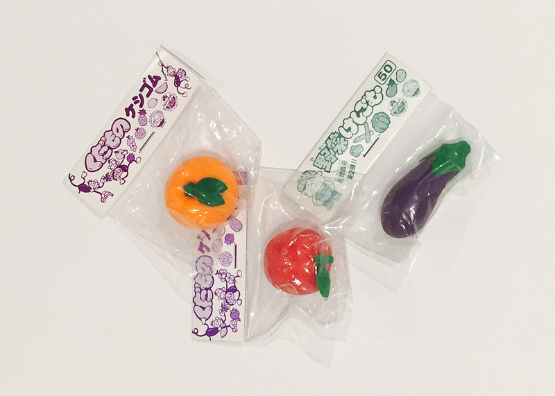
When
I spotted the ever-changing rock found at Bernal Heights Park in San
Francisco, both Raymond and I had to pay tribute to the magical pile of
poo. Photo taken in 2016.
This
year will mark the tenth anniversary of Apple’s original emoji launch.
They were first released in Japan on November of 2008, shortly after my
internship at Apple concluded. I had no idea that within a few months of
completing such project, it would revolutionize our culture’s way of
communicating or how the emoji would physically appear everywhere. And I
mean everywhere: toys, apparel, stickers, candy, music videos, books,
jewelry, landmarks, movies, and whatever else you’ve seen.
It
should be noted that although Raymond and I, Angela Guzman, are the
original Apple emoji designers responsible for the initial batch of
close to 500 characters (and were awarded a US patent for them), there
are of course additional Apple designers. Amongst them, Ollie Wagner
created around a dozen of the original set after the conclusion of my
internship, and many more the following year. The set now totals
somewhere in the thousands — some are even animated!
Ten years ago Raymond and I worked on one of my favorite projects to date, one that led me to experience my own ikigai.
This Japanese term is defined as the place where one’s passion,
mission, vocation, and profession intersect; what some would say the
reason to get up in the morning — literally me in 2008. I would eagerly
wake up, and on the days I had to bike, I’d carry my bike down three
long flights of stairs and head to work with a smile on my face. Now
that’s magic!
Gift
from Raymond upon the conclusion of my internship, his version of real
life emoji. The orange, apple, and eggplant were part of a set that I
had created.
On
that note, I would suggest to any designer looking for their reason to
get up in the morning to find their humble mentor, or be one, and get on
the road to friendship. Because magic happens when design leads to
friendship, and that friendship leads back to design. For every emoji
made, I learned something new. For every emoji made, Raymond and I
became better friends. The better friends we became, the better designer
I became. In this case, friendship and design happened one emoji at a
time. And that’s a story worth sharing.
Have you read Paid Applications Agreement, Schedule 2, Section 3.8(b)?
If
you’ve ever submitted an app to the App Store, you know the frustration
when Apple rejects your submission. Even more so when you thought you’d
followed all the rules. As it turns out, Apple can bury requirements
wherever they want, and it’s your burden to keep up.
About
a year ago, Apple started rejecting apps that didn’t comply with
Schedule 2, Section 3.8(b) of the Paid Applications Agreement, a verbose
list of self-evident truths about subscriptions. The Paid Applications
Agreement is a 37-page document that you had to agree to before you
could submit your app. It is only available via iTunes Connect in the
form of downloadable PDF.
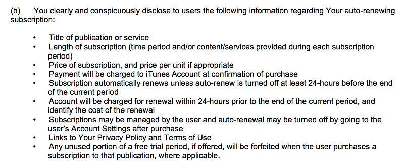
The actual contents of Schedule 2, Section 3.8(b):
I really like the part about privacy policies.
3.8(b)
requires that you “clearly and conspicuously disclose to users” all of
the above bullets. The first few items seem harmless enough but then we
start to get off into the weeds.
Apple
wants you to reproduce, “clearly and conspicuously”, all the details of
auto-renewing subscriptions. This information should be part of the
standard StoreKit subscription purchase flow. None of these bullets have
anything app specific to them. They are just boilerplate legalese.
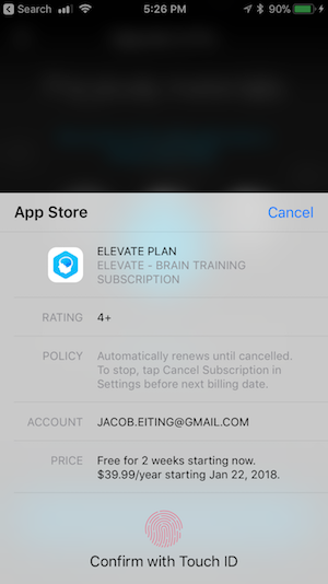
iOS’s purchase UI, more than enough information.
Apple
has an iOS level user interface flow for in-app purchases that is quite
good as of iOS 11. This view already covers most of the in-the-weeds
bullets, except telling users about the 24-hour renewal policy.
Requiring
every developer to implement their version of 3.8(b) is costly and
creates a fractured experience for the user. Apple should be putting it
in the standard sheet. But it’s Apple’s walled garden. When they say
jump, you say “fine, whatever.”
How to Comply With 3.8(b)
According
to recent rejections that I’ve seen (as of Jan. 8th, 2018), reviewers
are being more particular about what your purchase flow requires. From a
recent rejection:
Adding
the above information to the StoreKit modal alert is not sufficient;
the information must also be displayed within the app itself, and it
must be displayed clearly and conspicuously during the purchase flow
without requiring additional action from the user, such as opening a
link.
All
of the information in 3.8(b) must be “displayed clearly and
conspicuously during the purchase flow without requiring additional
action from the user, such as opening a link.” Your beautiful and
compact purchase flow must include in it, somewhere, nine bullets
written by a lawyer.
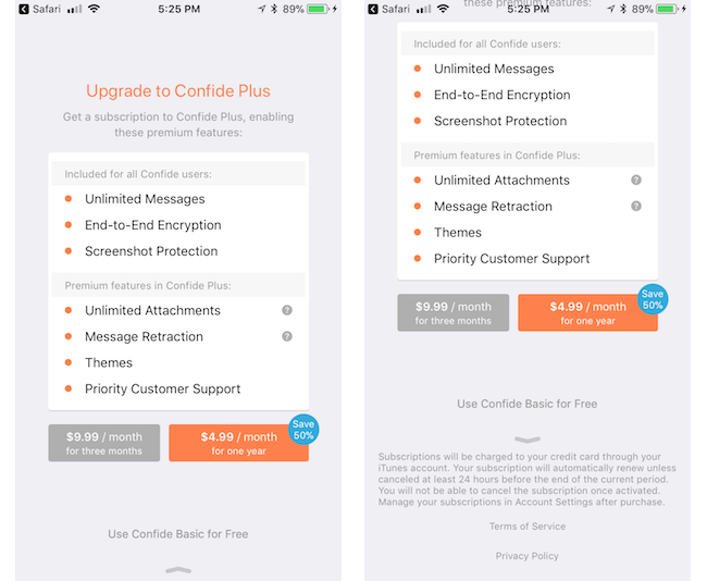
Confide, recently updated, achieved it with the following:
According to one reviewer, being below the fold with a leading arrow qualifies as “clearly and conspicuously.”
For another data point, I know of one recently rejected developer who had the same information, but in another view that was linked from the purchase flow with a button. This did not qualify (according to one reviewer).
A Template
Include a customized version of the following “clearly and conspicuously” in your purchase flow:
A
[purchase amount and period] purchase will be applied to your iTunes
account [at the end of the trial or intro| on confirmation].
Subscriptions
will automatically renew unless canceled within 24-hours before the end
of the current period. You can cancel anytime with your iTunes account
settings. Any unused portion of a free trial will be forfeited if you
purchase a subscription.
For more information, see our [link to ToS] and [link to Privacy Policy].
Put
it on the screen where you initiate the in-app purchase, below the fold
might be OK, but you might want to put something to lead users there.
UPDATE:
Readers are telling me it may also be required that you include it in
your app store description. It’s a much easier change to include so I
recommend you add it there to.
Why has Apple Taken a Legal Problem and made it Ours?
Apple
shouldn’t be burying submission requirements in the bodies of contracts
that nobody will read. If Apple wants developers to know something,
they should put it in the App Store Guidelines, HIG, or developer
documentation. The cost of making changes in a software project right at
the end can be astronomical. Dropping a bomb like this on developers at
submission shows a total lack of regard for our costs.
Why
didn’t they just update the iOS in-app purchase sheet? I speculate that
Apple discovered some legal exposure from in-app subscriptions and
fixed it with lawyers instead of designers. This problem could be
universally solved with an iOS update, but I think some side effect of
Apple being a vast, lumbering bureaucracy made forcing 3.8(b) onto
developers the more politically convenient path. Apple, if you are
reading this, please either update the iOS sheet or move the
requirements to the App Store guidelines, so fewer developers get caught
unawares.
RevenueCat
is the best way to implement subscriptions in your mobile app. We
handle all the complicated parts so you can get back to building.
Request an invite today at https://www.revenuecat.com/
MVP
is a great way for your app to find its early adopters, investors and
even customers. But, experience has shown that raw MVP without, at
least, tolerable UI and UX fails miserably. OK, but how much will MVP
app design cost me? Spoiler: not much. And you will be surprised with the result.
What
is the point of an MVP? To show off the core features of your app to a
target audience and investors before even starting the development. In
other words, to test the waters.
However, it doesn’t mean at all that you have to produce an ugly monster with absent UI. As one more crucial goal of MVP is to find your customers. Great UI in pair with convenient UX is your key to success.
But what is the cost of MVP app design? How much resources you have to spare on design purposes? Let’s find it out.
Preparations
To
get more or less decent design of your MVP you can’t just draw some
lines and boxes on a napkin and give it to a design company or
freelancers. Actually, you can do that, but it will cost you, and a lot.
We’ll talk about that further on. Now let’s get back to the point.
If you want to save time and, consequently, money it is a good idea to get prepared, prior meeting with a design agency. Wireframe and some mockups are pretty much everything you might need.
Moreover,
by presenting comprehensive app wireframe and mockups, you can be sure
that there won’t be any unpleasant surprises. As a hired freelancers or
guys from a contracted agency will know for sure what end-result they
are ought to provide.
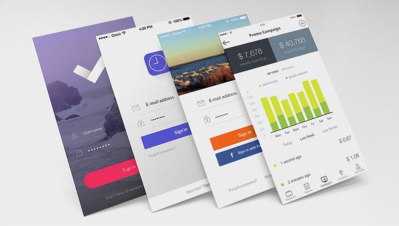
Wireframe of the app
A
skeleton of your app. That is a rough, or even drawn on a napkin
(yes-yes), layout of the navigation, screens and elements in your app.
It also outlines the core features of it. And the best thing is that you
finally have a, more or less, complete idea of your app.
Sure thing, making a wireframe is more than DIY-appropriate. Tools like Bootstrap may come in handy here. The coolest part is, that almost none programming skills are required. Only basic knowledge of HTML and CSS. And, probably, some video guides. :)
With
available templates, you’ll be capable of building a rough layout
within hours. Plus it is completely free. Unless you’ll require some
advanced templates. But you can always look out for those on the other
platforms.
Needless
to say, it will help a lot for the initial pitching session. Even if
you decide to entrust all this job to an agency — some minimum wireframe
would be very helpful prior approaching them.
On the average, wireframe might take 10–30 hours in development. It might cost you nothing if you’ll do it by yourself. But if you’re going to ask an agency — $500 — $3.000 would be a fair price, depending on the complexity of the app.
Mockup of the app
Mockup
is what your customers and investors will see. It can make them fall in
love with your app or drive them away. In a nutshell, that is an
approximate final look of your app.
There is a good rule for mockup estimation. Landing page will cost you around $500. And every additional screen will, usually, cost about $50–70.
Count the number of screens you are going to have. Simply add
everything to get the total price. That is the most common practice how
companies and freelancers usually charge for their services.
But what about DIY? Of course,if you are familiar with such great tools like Adobe Photoshop and Adobe Experience Design it
won’t be a problem for you to make a simple (or brilliant, depending on
your skills) mockup. Those are the most common and handy tools. And
while Photoshop will cost you $10-$20 (depending on the plan), Experience Design is completely free.
Interactive mockup
Speaking of simple mockups, there is a great way to improve those — interactivity.
Interactive mockup
— is a good chance for you to improve client engagement. Customers or
investors would better prefer interactive solution over a static image.
One more big plus — those are easy to spread over various devices.
Tools like Framer and inVision
are your best helpers here. They work pretty much like usual app
building platforms. Take your mockups, drag-and-drop different elements,
adjust navigation and features, et voila! Now you have it.
Interactive mockups cost just a slightly more than the usual
ones. You’ll just need your usual mockups and subscription for one of
those tools. Or you can give this job to the designers you’ve hired.
Anyway, additional expenses won’t exceed $100-$500. But potential profit may be a lot bigger.
Total price
Those blessed ones, who chose DIY way, might pay from complete nothing to a few hundred bucks (subscriptions, paid content, etc.).
And those who decide to hire somebody, might receive a bill on $1000-$10.000. Price varies drastically because of:
complexity of your app
desired features
region where you hire
One more good advice. Design agencies, usually, take fixed (and pretty high) price. Freelancers or outsource companies, on the other hand, often, charge onper hour basis.
So hiring few freelancers in India for $10/hour might be a good idea
for your wallet. But is it so when it comes to the quality?
Hardik Gandhi is Master of Computer science,blogger,developer,SEO provider,Motivator and writes a Gujarati and Programming books and Advicer of career and all type of guidance.