When
the iPhone X launched, a lot of designers were put off about the screen
shape. Those complaints have mostly died down, but I haven’t seen much
design-nerd talk about cool corner treatment details. Fortunately, deep
nerd shit is my specialty.
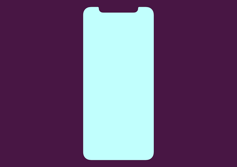
What’s Your Angle?
When you’re starting a design like this, the obvious, and comically
cheaper option is to make all corners square. Machines exist and/or are
calibrated to make those screens, so keeping edges squared requires
fewer manufacturing changes and less talent along the pathway to
production.
Everyone
knows how to make a right angle — designers don’t have to do math,
engineers need fewer calculations, the people making the machine are
clear on what to do.
And yet, let’s examine how crappy all-square corners would look:

Once
Apple knew they wanted to take advantage of new full-screen technology,
that gave them the opportunity to alter screen shape because they would
need to address the manufacturing process anyway. Presumably, the
expense was mostly built in.
Still, there were lots of ugly ways to do this:
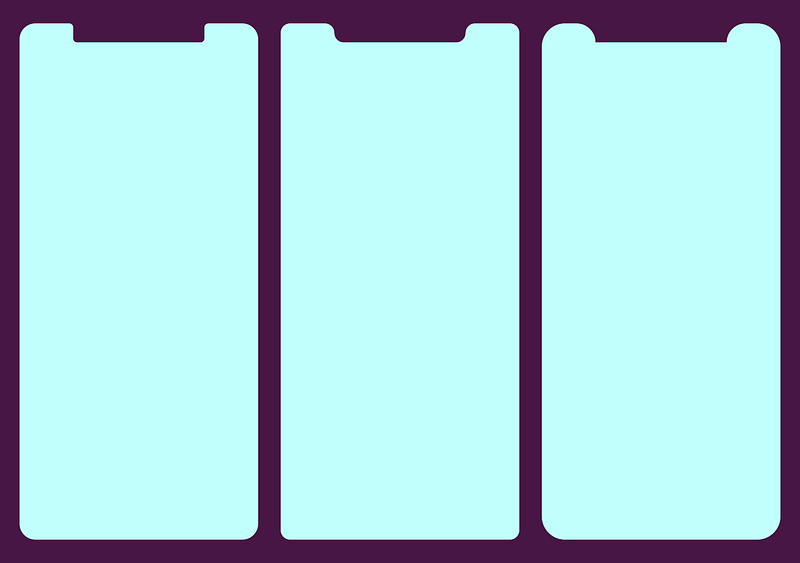
This is where they landed:

Screen Corners
Here’s
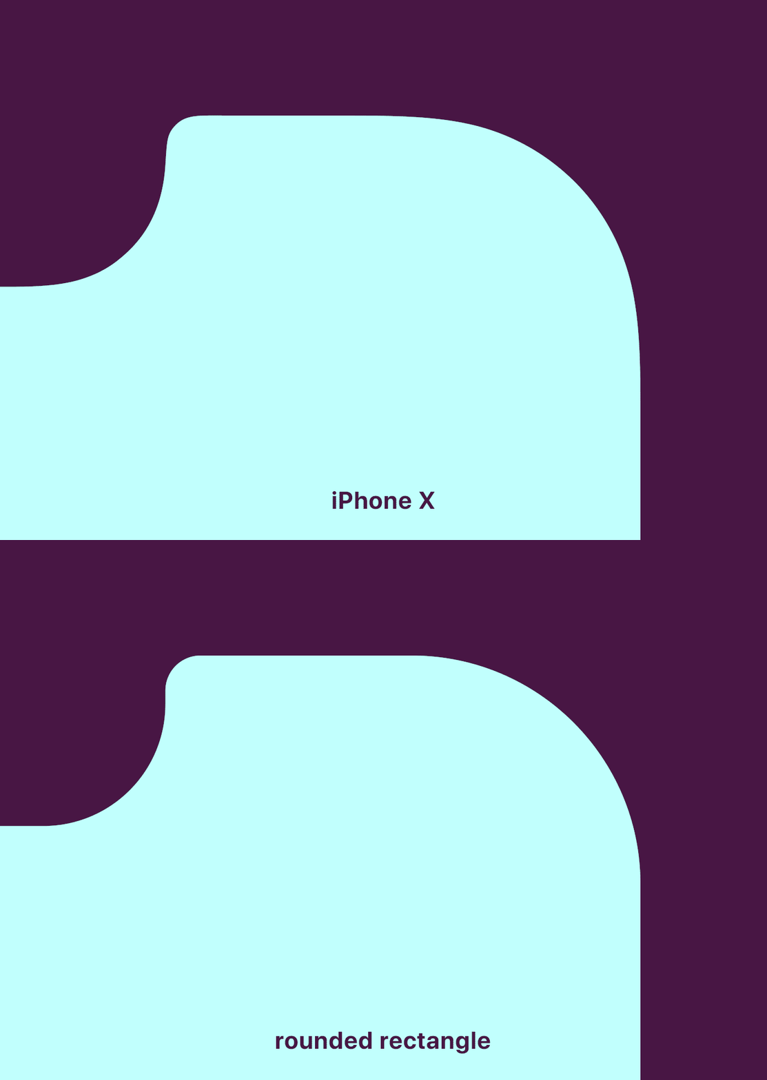
where the nerd part comes in, iPhone X rounded screen corners don’t use
the classic rounding method where you move in a straight line and then
arc using a single quadrant of a circle. Instead, the math is a bit more
complicated. Commonly called a squircle, the slope starts sooner, but
is more gentle.
The difference is real subtle, even in gif-form, but here we go:
Apple
has been doing this to the corners of laptops and iMacs for years, but
this type of rounding didn’t penetrate iOS until version 7. This shape
has classically been difficult to achieve, because it wasn’t available
in 2D design editors, though that’s starting to change. Read about it
more detail here.
The Notch
Now
let’s talk about the notch itself. The left and right sides have two
rounded corners. Because of the curve falloff, one curve doesn’t
complete before the next one starts — they blend seamlessly into each
other. As a result, no tangent line on this edge actually hits a perfect
vertical.

Come Correct
iPhone
X templates I’ve seen out there don’t 100 percent duplicate the
official shape, probably because it was either too hard to make or they
haven’t noticed. This is why it’s good practice to use official assets
from Apple, found in the design resources section of the developer site for creating icons and mockups.
Future
iterations of this design will surely alter these sizes, so it will be
interesting to compare how hardware sensor evolution impacts design
shifts.
Overall,
these decisions seem minor, but from a design viewpoint they’re fairly
opinionated. Even when designers are willing to spend social capital to
push these ideas, most organizations won’t put resources behind them.
Rounding the Bend
One
of the things I love about indie apps is their ability to be
opinionated. It’s nearly impossible to ship strong viewpoints from
larger companies where there are fifty people in a room examining
angles. So it’s cool to see Apple still has the ability to take a strong
stance in this way.
Sweating
thousands of minor details is what separates Apple from other
companies. Their ability to do that is hard-won, but damn it’s pretty to
watch.


No comments:
Write comments