A three minute introduction into shorthand variable assignment
This article will take a (very) quick look at shorthand variable assignment in JavaScript.
Assigning Variables to Other Variables
As you’re probably aware, you can assign values to variables separately, like this:
var a = 1;
var b = 1;
var c = 1;
However, if all variables are being assigned equal values, you can shorthand and assign the variables like this:
var a = b = c = 1;
The assignment operator = in JavaScript has right-to-left associativity. This means that it works from the right of the line, to the left of the line. In this example, here is the order of operation:
1 — First, c is set to 1.
2 — Next, b is set equal to c which is already equal to 1. Therefor, b is set to 1.
3 — Finally, a is set equal to b which is already equal to 1. Therefor, a is set to 1.
As you can now see, the shorthand above results in a, b, and c all being set to 1.
However, this is not a recommended way to assign variables. That’s because in the shorthand variable assignment shown above, we actually never end up declaring variables b or c. Because of this, b and c wont be locally scoped to the current block of code. Both variables b and c will instead be globally scoped and end up polluting the global namespace.
Using Commas When Assigning Variables
Lets look at a new example. Consider the following variable declarations and assignments:
var d = 2;
var e = 3;
var f = 4;
We can shorthand this code using commas:
var d = 2,
    e = 3,
    f = 4;
As you see, we are separating each variable assignment with a comma which allows us to assign different values to each variable.
For ease of reading, most coders who prefer using the comma method will structure their variable assignments like this:
var d = 2,
e = 3,
f = 4;
Best of all, in the shorthand variable assignment shown above, we are declaring all three variables: d, e, and f. Because of this, all variables will be locally scoped and we’re able to avoid any scoping problems.
Want to Learn More Shorthands?
Check out my other articles on shorthand coding techniques in JavaScript:
As
a scholar, I like arguing against myself. Thesis, anti-thesis,
synthesis: the Hegelian dialectic can be one of the more productive and
entertaining paths to truth.
And so, in this post, I attack the central thesis of my research: that
the ability to program a computer, and the computational thinking that
can come with it, is a power that must be democratized.
Why
do I believe this? I believe that a severe concentration of power
nearly always leads to injustice, and justice is one of my core values.
That only 20 million people write the software that shapes the digital
experiences of the 7.5 billion people on Earth is concentration of power
second only to global income inequality. My research aims to lower the
barriers to acquiring the power to code, which I hope will more evenly
distribute this power, which in turn will reduce injustice.
Agree
with me? Great! But that’s no fun. And it leaves this position open to
attack, with no sense of how robust it actually is. My position might
even be wrong.
So let’s consider three anti-theses to my thesis.
Ability is an arms race
One
critique of my thesis is that the ability to code is an arms race. No
matter how easy we make it to learn to code, this greater ease will only
amplify the abilities of those who already could. The privileged few
who learn to code now will learn younger and faster. All of those
talented new engineers that didn’t have jobs before still won’t get jobs
at Google because everyone else will be that much more talented. No
matter what we do, power will remain concentrated, because the
underlying social structures that protect that power will remain
unchanged.
This is an instance of Kentaro Toyama’s argument about technology as an amplifier rather than a catalyst of social change.
The argument is that technology of any kind, whether a learning
technology, a better pedagogy, a simpler programming language, or a
better developer tool, will only intensify whatever social structures
exist. It’s up to us to change our behavior, our values, and ultimately,
our institutions, if we want to redistribute power. More effective
learning will not.
Software is evil
Another critique of my thesis is that the software itself is a net loss for humanity. Communication technologies have eroded our relationships, democratization of publishing has eroded truth, platforms have eroded innovation, and automation has eroded our livelihood.
There may be some good things that come from digitizing information and
automating decisions, but on the whole, they take more than they give.
We should therefore have less software, not more, and so we should have
fewer people that can code, not more. Like nuclear weapons, we should
use software sparingly, if it all.
This argument abounds in pop culture of today. As all dystopian sci-fi has for a century, Black Mirror
is popularizing this position, portraying how even small changes in how
we use software can lead to plausible and horrifying outcomes.
Software is dangerous
One of the critiques I’ve heard most is the idea that software is too powerful
to be democratized. As in medicine, engineering, and law, some
knowledge should be regulated, only accessible to people with
appropriate training. The risk of allowing everyone have the ability to
code is that we increase harm. And perhaps were already seeing the
result of unregulated access to the ability to code: software fails,
people die. In fact, I analyzed 30 years of software failures reported in the news,
finding that about once per month, the news reports at least one death,
injury, or threatened access to food or shelter due to software
problems. Is all of this faulty software really worth this increasingly
frequent harm?
Some countries such as Canada do regulate software engineering.
These efforts are often poorly implemented and premature, but not
necessarily wrong in principle. We don’t want a billion people to know a
little bit about heart surgery. Why would we want a billion people to
know a little bit about software development?
Now, to synthesis. How can we reconcile these conflicting stances?
All
four of these arguments have a kernel of truth. The small number of
developers in the world really do concentrate power, and that does lead
to injustice like algorithmic bias, poor software accessibility for
people with disabilities, and innovations that primarily serve the
privileged classes that created them. And yet, software does cause harm
and can be evil. It’s entirely possible that by helping more people
learn to code, we’ll just end up with more people with brittle knowledge
of how to create software, more bad software, and the same people in
power.
The fatal flaw that puts these positions in conflict is that none of them make explicit who will learn to code and what
they will do with that knowledge. I envision a world in which a vast
majority of educated people understand enough about code not to become
engineers, but to advocate for justice. Some of those people will become
software engineers, but they will be different, more diverse people,
who represent society, unlike the engineers we have now. This larger
group won’t make any more software than we would have made otherwise
(and therefore won’t cause any more harm or evil than we would have had
otherwise). Rather, this new majority of computationally literate
citizens will be a political force that demands justice.
This
literacy could not be more pressing. For the next century, we will be
heavily debating net neutrality, privacy, the regulation of automation.
We will be trying to parent in the presence of social media. We will be
trying to make objective journalism sustainable and desirable. We need
every parent, politician, and person in power to understand what code is
and what it isn’t. And we need the 20 plus million developers in the
world to reflect everyone, so the software they create serves everyone.
The
other fatal flaw in all of the positions above is that they don’t make
clear what “learning to code” means. What does everyone need to
understand about software to be in a position to advocate objectively?
It’s not necessarily knowing a programming language. It might mean
knowing what programming languages are and are not capable of. It might
mean understanding the intersection between computing and policy. It
might mean understanding how software is engineered and who engineers
it, so everyone can comprehend what any particular policy proposal
they’re voting on would actually mean in practice. Some of these ideas
have made it into our curricular standards and assessments, but most have not. We need to understand what this knowledge is and invent ways of teaching it effectively.
Software
is not going away. It will continue to be evil and dangerous. It will
continue to bring joy and prosperity. But it will not bring social
change, and it will not provide universal access to knowledge about
computing. That’s up to us.
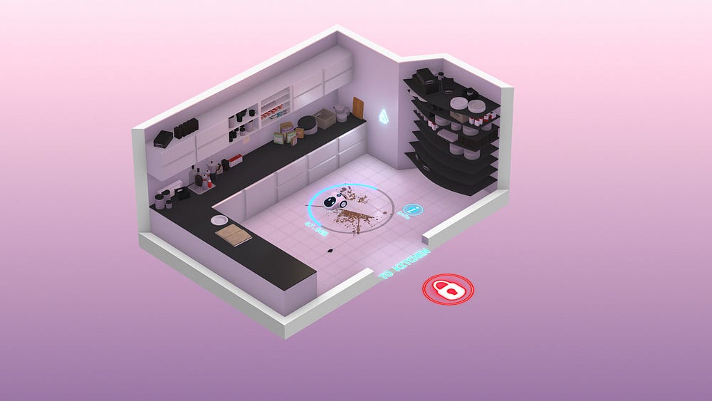
Rumu
is a very unique game, and of all the games on this list, I think it’s
the one that has the most unique UI. This is most likely due to the fact
that Rumu has pioneered the ‘Sentient Vaccuum Cleaner’ genre, and
there’s simply no game similar enough to pull inspiration from. Because
of this, I’ll briefly summarise the elements I liked the most, so you
have an idea of what I’m talking about.
It’s
fitting, then, that Rumu’s UI pulls from a number of different genres
and also remains quite unique. Rumu (The titular vacuum cleaner himself)
has a radial menu to manage it’s quest log and inventory. That’s about
where the traditional UI ends, and you start to see some bespoke
elements.
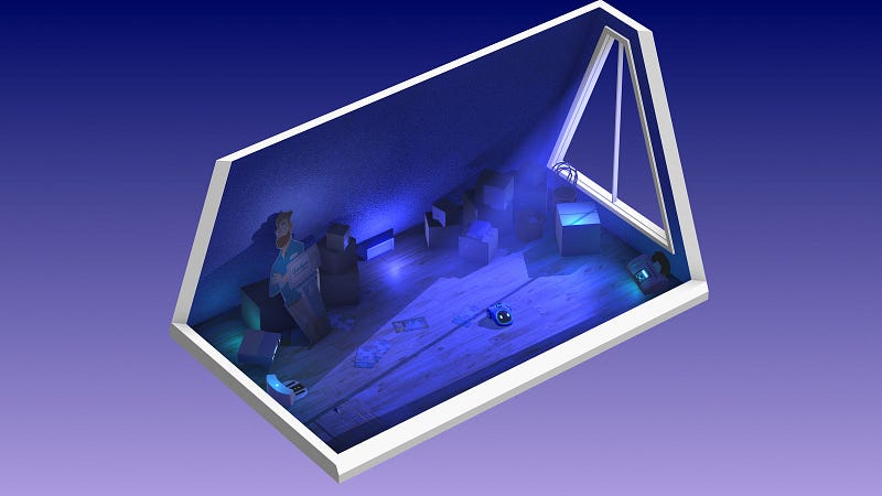
Tutorial
tips for controls appear outside the environments. This is a nice
detail, as it serves not only to communicate the key bind but also as a
hint of what you’re supposed to do in any given space.
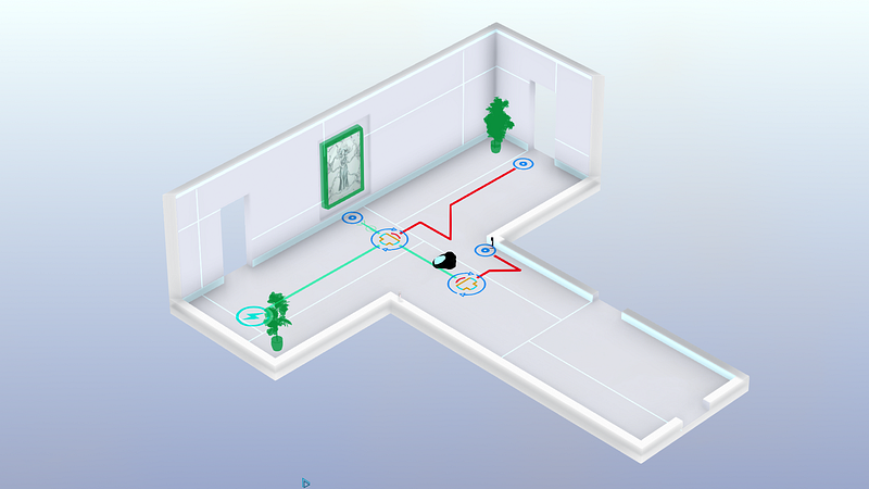
A
similar method is used for doorways or vent spaces — each is earmarked
with text or iconography to indicate whether the player can pass
through. The difference is actually really important, because it serves
to split how the player treats information throughout the game — if the
information is inside the room, it’s something to be learned. If it
exists outside of the game space, it’s something that little Rumu
already knows.
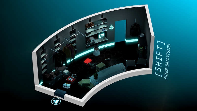
There’s
a ‘Datavision’ function that allows Rumu to see how the various smart
devices and intractable objects connect. It’s a great way to declutter
the environments when the player is being task oriented, and it also
often hides hidden easter eggs or gadgets.
One
of the smartest UX features of Rumu is how it uses it’s palette and art
style to generate emotion. A clean, white kitchen feels calm and
simple, while crawling through vents on a sinister dark background gives
the game a sense of urgency and danger.
Rumu
is beautiful, functional, unique, and incredibly evocative. It’s UX
blends perfectly with the narrative of the game, and aids in the
storytelling.
Conclusion: Independent
developers are constantly coming up with new, interesting ways to
interact with their games. There’s even a few on this list: Hand of Fate
2 and Tooth of Tail both innovate in a well-trodden genre.
Rumu’s
a little different, because the robot vacuum cleaner genre isn’t quite
as mature as, say, first person shooters. Despite this, the interactions
in Rumu feel natural; the spacial and diagetic elements are what I’d
expect a robo-vacuum to see in the world, and the meta UI tips help move
the player along without breaking the (sometimes literal) fourth wall.
I look forward to seeing the robot vacuum cleaner genre evolve.
Worst: Stationeers
Picking
this game sparked an internal debate in my mind over having a ‘Worst’
section at all, but in the end I decided it’s always better to get your
feelings out than internalise them.
I
really enjoyed Stationeers; I played almost six hours straight in my
first run through. It’s an incredibly complex space space station
construction game. Most of it’s UI is inoffensive: a simple HUD with
your vitals and atmosphere stats, and a slot-based inventory system.
It
all falls apart for me in the item management. Rather than go into
specifics, I’ll give you an example: I need to take the empty battery
out of my welding torch, and replace it with a full one.
I
have to press 5 to open my tool belt, use the scroll wheel to highlight
the torch, press F to put it in my hand, press R to open the torch’s
inventory, press E to change hands, press F to move the batter into my
free hand.
Now
I press 2 to open my suit inventory, scroll wheel to an empty slot,
press F to place the flat batter in there. Scroll wheel to the full
battery, press F to place it in my off hand. Press E to change hands.
Press R to open the torch inventory. Press E to change hands. Press F to
place the battery in.
That’s…15 key presses. I can see what they were going for with this system, but there’s got to be a better way.
Virtual Reality
Best: Lone Echo
If
UX as a practice is still in it’s infancy, UX for VR is a single-celled
organism attempting mitosis for the first time. Nobody really has any
idea what’s going to work and what’s not going to work, and so many
games have great executions with a poor UX.
Lone
Echo feels like someone looking at what VR will be doing five years
from now, and dragged it screaming back into 2017. I don’t think it’s
hyperbole to say that Lone Echo’s UX will help define the future of
virtual and augmented reality interfaces.
There’s
no HUD in Lone Echo, instead opting to have your UI displayed from
various arm-mounted gadgetry. Jack, the player character, has a number
of controls and panels along his suit, each of which the player can
interact with to reveal various elements interfaces.
This
actually annoyed me at first — I wasn’t sure why a robot need any sort
of interface at all. However, the interactions available are just so
neat and genuinely enjoyable, it becomes a very small nitpick. You will
also witness other characters in the game use the same interface, which
gives some internal consistency to the game.
Talking
to someone, for example, is a matter of simply looking at them and
tapping a button the controller. This spawns a list of dialogue options
that you select with your finger. It’s a simple thing, but being able to
quickly interact with the object your looking at feels great.
Any
panels you summon are intractable with your hand. You can scroll and
tap like you would on an iPad. It feels completely natural to work with,
and there were very few times after the opening minutes where I had
trouble with this interaction style.
Similarly,
Jack’s wrist holds a number of functions and features that are
activated using your opposite hand. Slide across your forearm to open
your objectives. Tap the top of your wrist for your scanner, or the side
of your wrist for your welder. The interactions are so second-nature
after having used them a few times that I found myself not even looking
at my hands as I did these simple tasks.
Most
of what you see in Lone Echo comes from somewhere. The locomotion, the
dialogues, the tool interactions, are all borrowed from games that have
come before it. Lone Echo proves that these interactions are
unequivocally the right way to
do them, and if done right, can be so immersive and intuitive that the
player doesn’t have to remember them, they just become the way things are done.
Just like the brilliant writing and slick graphics, Lone Echo’s UX is the reason it’s
such a successful game. It keeps the player completely immersed in
everything they’re doing, no matter how complex the task. At it’s best,
the interactions in Lone Echo are actually fun to use. Menus that are fun! If that’s not a revolution, I don’t know what is.
Conclusion: The
most immersive experience I’ve ever had in a video game. Lone Echo
bends over backwards to put you in the moment with objects that behave
like the user expects they should, and an environment that is
consistently interactive.
Lone Echo isn’t held back by trying to
fit it’s UI into it’s narrative — it’s built it’s entire user
experience around the narrative, instead. Lone Echo sets the standard
for VR UX to come.
Worst: None
It’s
a cop out, I know. Truth be told, I haven’t played a VR game that
released in 2017 that had any truly awful UX. There’s plenty of games
that make some missteps, or the occasional obvious error, but this is
going to happen with a still-growing genre like virtual reality. For
now, VR gets a pass.
If
you got this far, thanks for reading! Hopefully you found something
interesting in my choices. Please feel free to comment with your
opinions, especially if there’s something great that I missed.
This
week, the Federal Communications Commission will vote on the future of
net neutrality. Whether you’ve been following the political back and forth,
skimming the headlines, or struggling to decode acronyms, the decision
will have an impact on what we can do online (and who can afford to do
it). Because the internet has effectively been free and open since the
day it was born, it’s easy to lose sight of the impact this vote will
have.
The reality is, the internet is a fragile thing. Open, crazy, weird spaces where people swap stories and secrets, create rad digital art projects,
type furiously and freely with people seven time zones away — these
spaces are rare. People build them, people sustain them, and now, people
are trying to restrict them. If this week’s vote passes — which is
looking increasingly likely — the internet’s gatekeepers will have more
control over their gates than ever before.
Because
we live and breathe the internet, laugh and cry on the internet,
connect with people who’ve tangibly changed our lives on the internet,
we decided to gather some perspectives on this moment in time. Why it
matters, how we got here, and what the future may hold. Here are some of
the most insightful essays we’ve found on Medium to help us make sense
of the fight to keep the net wild and free.
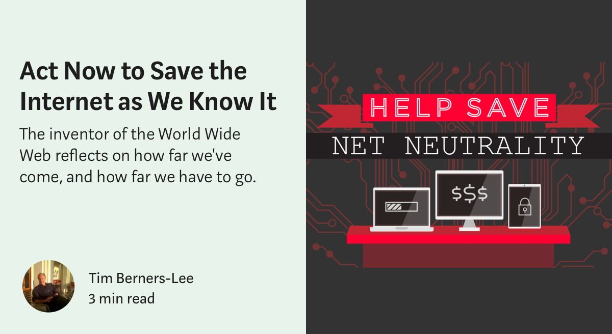
In 1989, Tim Berners-Lee
invented the World Wide Web. Now, he’s defending it. “I want an
internet where consumers decide what succeeds online, and where ISPs
focus on providing the best connectivity,” Berners-Lee emphasizes.
Content and connectivity are two distinct markets, and they must remain
separate. Conflating them risks blocking innovation, free expression, and the kind of creativity that can only thrive online.
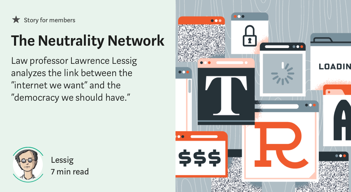
What’s happening now is not just about net neutrality, law professor Lawrence Lessig
argues, but about the foundations of our democracy. Tracing the history
of the concept from its origins in the aughts (one of his students, Tim Wu,
coined the term “net neutrality”), Lessig sees the rollback of
Obama-era regulations as a symptom of a larger issue: a democracy that
doesn’t serve its people.
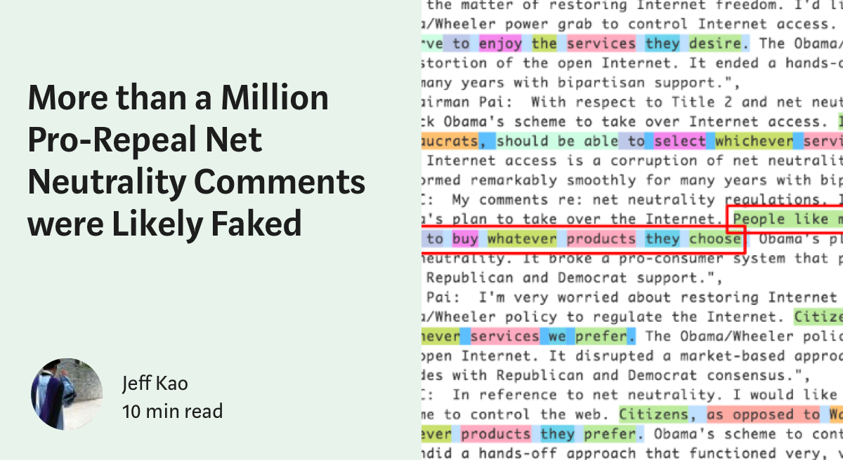
Through statistical analysis and natural language processing, data scientist Jeff Kao
shows that millions of pro-repeal comments submitted to the FCC were
faked. Organic public comments, according to Kao’s analysis,
overwhelmingly supported preserving existing regulations. The report
calls into question the legitimacy of the FCC’s comment process, and the
basis of chairman Pai’s intention to roll back regulations.
In part one of a five-part series on net neutrality, computer scientist Tyler Elliot Bettilyon
takes us back to FDR’s New Deal. Piecing together the history of
“common carrier” laws — those that govern everything from shipping to
telephone lines — Bettilyon contextualizes today’s fight for a free and
open internet.
Social psychologist E Price
interrogates the idea that the internet we’ve grown to love is really
as “free and open” as we’d like to think. “Internet activity is already
deeply centralized,” Erika writes, and major social media sites are
today’s answer to the Big Three TV networks of a few decades ago. The
internet is closer to cable than we think, and it’s (probably) about to
get even closer.
Why should the internet be a public utility? Economist umair haque
debunks the “competition will lower prices” argument against internet
regulation, and makes a compelling case for why going online, “just like
water, energy, and sanitation,” should be a basic right: “It
dramatically elevates our quality of life, best and truest when we all
have free and equal access to it.”
Visit battleforthenet to write or call your congressperson in advance of the vote. You can also text a few words of your choice to Resistbot.
Version
47 of Sketch saw the long-awaited introduction of Libraries which
allows you to sync your symbols globally across all of your Sketch
files. Design Systems especially stand to gain from a feature like
this — being able to have an accessible way of bringing in design system
assets while ensuring they stay up-to-date for everyone is a designer’s
dream come true. After trying everything from InVision’s Craft to
creating our own Sketch Plugin, we were happy to finally have this in
Sketch as a native feature. Here are some of the decisions we arrived at
and lessons we learned as we put our design system into a Library.
Goals of Our Library
In
order to understand some of the thinking that went into our decisions,
here’s a brief overview of what the goals with our Library were:
A one-stop shop for our designers. Just one file they could pull in and have the latest that our design system has to offer.
As close to a 1:1 match as possible with our coded components, regardless of platform, both visually and structurally.
Easy to maintain. Component updates or additions should be simple so that designers get the latest without much wait.
Nested vs. Single
In this excellent Sketch Together video,
Pablo Stanley talks about how to nest Libraries. Doing so allows you to
split things like colors and components into different Sketch files and
then reference symbols across those files. If you make an update to a
symbol in one of the files, it will still propagate to the other files
that reference that symbol.
The
other option is to put everything into one file. You don’t get the
clean separation that having separate Sketch files give you, but for our
purposes, this actually ended up working better because:
Maintenance is easier since we only need to have one file open when we’re making updates to the Library (Goal #3).
It requires our designers to add just one Library (Goal #1).
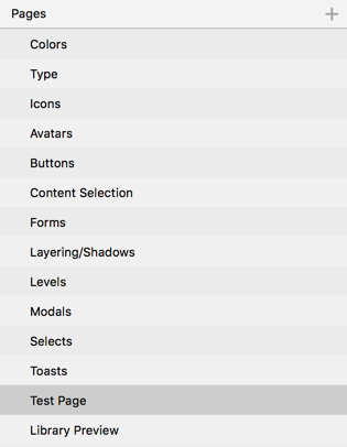
Using Pages for Organization
Dumping
all of our colors, icons, components and so on into one file is not the
first thing that comes to mind when thinking “easy to maintain”.
Fortunately, you can split your library into pages within Sketch. Here’s
a rundown of how we did ours:
Keeping things separated by Pages makes even a large Library easy to maintain.
Key
parts of our design system (Color, Type, Icons) are at the top and then
we simply listed our components alphabetically. You’ll see at the
bottom are two additional pages. The Test Page, if you hadn’t guessed
it, is a page where we can quickly test out any new symbols we add. The
Library Preview uses Sketch Hunt’s freebie
to give our Library a custom preview image when you go to add the
Library in Sketch’s preferences (this is now supported by default in
Sketch as of v48).
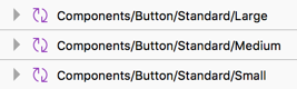
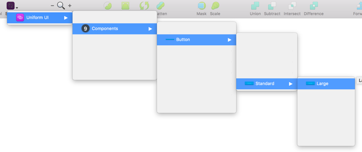
Naming Symbols
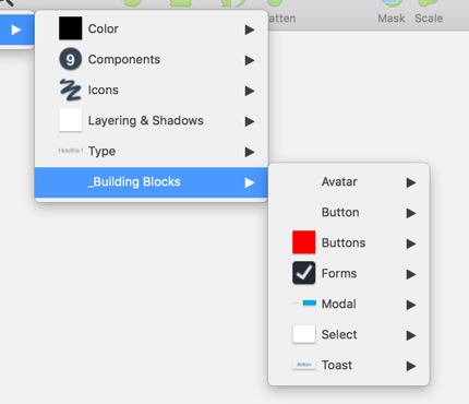
Items in the Symbols menu can be grouped by how you name symbols. Separating things with a \
puts them in a new menu group. Using the organization we outlined above
and knowing how things are grouped on the component side, we went with
what felt most logical; for something like buttons, that looks like
this:
Which creates a menu that looks something like this (edited a bit to make it easier to see):
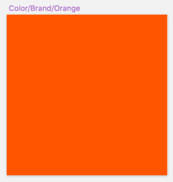
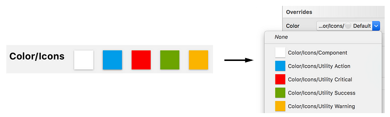
Adding Color
Currently,
Sketch doesn’t have a way of sharing colors with the Libraries feature.
Sure, there are plugins that allow you to create shareable palettes,
but that went against our goals of a one-stop shop and easy
maintainability. Instead, we created our colors using just plain old
rectangles.
We use our color symbols as the main building block for our other components.
While
it’s not ideal, it’s not too much of a hassle for our designers since a
majority of their color needs should be handled on each component’s
symbol overrides. Plus, it allows us to use those colored rectangles to
build out those actual components (explained below). If we make an
update to the color, it will update every component that’s using that
color symbol.
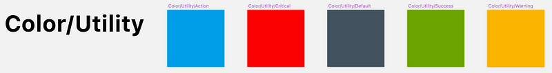
Our
main-level colors (such as brand, utilities, background colors) are
contained on the Colors page and grouped accordingly. Colors that are
specific to a component go on that component’s page to keep that ease of
maintenance. We can still create rectangle symbols that reference
main-level colors if necessary which makes updates later on much
quicker.
These utility colors can be brought into any other component page as necessary — buttons, toasts, icons, etc.
The
last bit of house-cleaning we needed to do was making sure when you
opened a color override, you weren’t blasted with a huge list of colors.
To remedy this, we simply sized those color rectangles in increments of
10, since the grouping of symbol overrides is based on size. For
example, brand colors are 20px by 20px, utility colors are 30px by 30px,
and so on. Now, when a designer wants to switch to a different icon
color, they are only seeing the icon colors and not every other color in
the Library.
Adding Icons
Icons
were handled in a similar fashion to colors in that we logically
grouped them by their usage (navigation, sports, filetypes, etc.). To
allow designers to switch between the different colors we have for
icons, we simply added those colors as masks.
Every icon includes a color mark from our list of icon colors.
Remember
that sizing things similarly makes them show up in the override menu
together. With that in mind, we sized our icon colors the same so that
when a designer goes to change a color, they are only seeing the colors
available for icons.
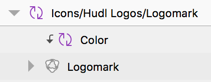
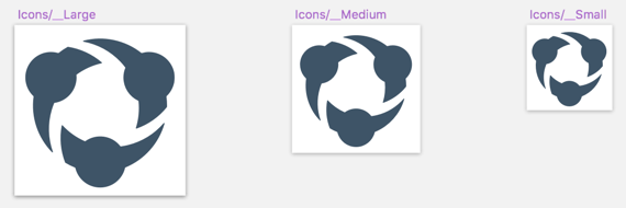
One
challenge we had was handling the three different sizes our icons come
in. To get around this, we simply created three symbols each at their
correct size with a default icon (our logo). Since we’re using a symbol,
a designer can now just choose a different icon from the overrides
panel — keep in mind you can resize an inserted symbol to your heart’s
content without affecting what you see in the Overrides panel. With a
lot of icons, it can get to be a pretty gnarly list, especially compared
to the nicely categorized way of doing icons above. We don’t have a lot
of cases where an icon is needed in anything other than size medium, so
this workaround, uh, works for us.
The same symbol, just resized.
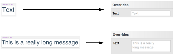
Adding Type
This
is another area where the Libraries feature doesn’t quite meet our
needs. Editing text in the Overrides panel can be a bit of a pain
considering how small the textbox is. Just make your initial Much like
colors, there are Sketch Plugins that can handle bringing Type into your
Sketch documents as Text Styles, but they go against our
easy-to-maintain, and one-stop shop goals.
We
ultimately decided to create symbols anyway. Designers can either use
the textbox in the Overrides panel or just Detach From Symbol and edit
the text as they normally would. And, as of Sketch v48, you can enlarge
the textbox in the Overrides panel by increasing the amount of text in
the symbol by default.
The amount of text in the symbol determines how large of a textbox you get in the overrides panel.
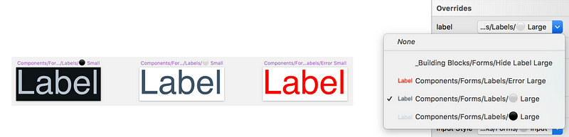
There’s
one last thing we have to address with text and that’s colors. With our
text, it’s already set in the component correctly. But what about a
different environment, theming, or things like error states? For that,
we are again relying on the sizing of the symbol to determine what shows
up in the overrides. For something like a form label, we just ensure
those particular text symbols are all the same size.
Different
colored labels at the same size make it easy for our designers to pick
among the allowable colors for something like form labels.
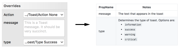
Adding Components
After
creating all of the hard stuff, making the buttons, modals, toasts,
etc., was actually pretty simple. For something like Modals, we just
bring in the right background color, add a type symbol with a good
default message, and finally drop in the Close icon. At this point,
we’re getting very close to making symbols like how we would with React.
And
that’s intentional since we want our symbols to be as close to a 1:1
match of our components as possible. To that end, we name the symbol
overrides exactly how we name our component props in code. To make it
even more clear to our designers these are component props, we even keep
the names lowercase. Anything that’s not actually part of the
component’s code(such as padding blocks which we’ll discuss below), we
Title case. Keeping symbol overrides named identically to the component
props is a great way to bridge that designer/developer discussion when
it comes time to build out the interfaces.
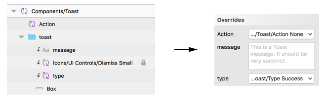
When
designers and developers talk, they should be using the same language.
Our Sketch override naming matches the naming in the actual coded
components.
Tips & Tricks
Here’s a few other things we learned as we were building out components that may help you:
Make things easier for yourself and download the Sketch Symbol Organizer
plugin. You can organize your symbols alphabetically and group things
based on the name. Additionally, it’ll even space things out how you
want. A big timesaver.
The
order of your layers in your symbols matter. How they’re ordered in the
symbol is how they’ll be ordered in the Overrides panel.
It’s
worth repeating here for the millionth time that the size of your
layers matter as well. Remember: that’s how things like backgrounds,
type, icons, etc., can become grouped.
You’ll
most likely have symbols your designers don’t really need, but are
important to the makeup of your components. We decided to create a
_Building Blocks menu item (the underscore keeps it anchored to the
bottom) that acts a bit as a junk drawer. These items stay on the
respective component’s page, but are named with the _Building Blocks
prefix to ensure they all go under that menu item.
Prefixing
items you don’t want to be shown, like we have with “_Building Blocks”
here, ensures they’re all thrown into this junk drawer.
Sketch
doesn’t currently handled nested symbol resizing very well. To get
around this, we usually create what we call “spacing blocks”. An example
of where this might be necessary is buttons; you drop in a button, give
it more text than the default and suddenly the padding is out of whack.
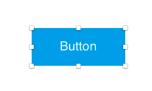
For this, we have a show/hide spacing block symbol that drops in semi-transparent “blocks”. The designer now just needs to resize the button until the blocks line up.
These blocks can be added to any component to reduce the guesswork when it comes to resizing.
Making It Available
After
the library was complete, we needed a way to make sure it would always
stay up-to-date for our designers. We use Google Drive, so that was the
obvious place to put it. We locked access to the library file itself to
ensure no unnecessary deletions or additions happened and then wrote up a
Getting Started guide.
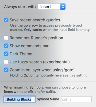
One thing our Getting Started guide features is instructions on getting set up with Sketch Runner.
While this goes a bit against our goal of being a one-stop shop, we
find the benefits of using this plugin goes well beyond just using it
with our library — it’s a really invaluable tool.
With
Sketch Runner, you can quickly insert symbols just by typing their
name, which for a lot of people is quite a bit faster than going through
the menus. We recommended to our designers to turn off Fuzzy Search in
the options and add the “_Building Blocks” to the ignored prefix in the
Settings.
Here’s our recommended settings for Runner.
Since
launch, we’ve received a lot of feedback on how much time has been
saved by using the library. We’re looking forward to Sketch continuing
to make improvements in the future to make it an even more impressive
tool.
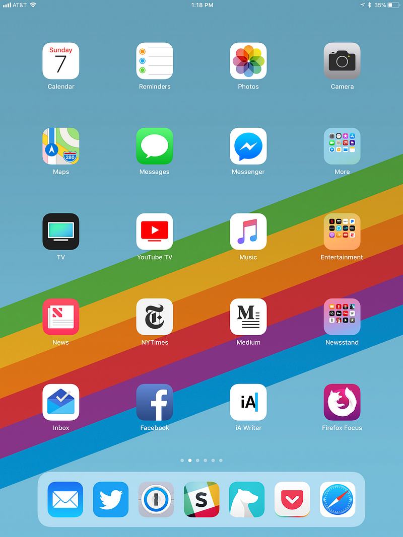
Each year, I post a screenshot of the homescreen of my iPhone
to end the year. It’s something I often get asked about — though I
suspect people are always sightly disappointed with the outcome. Because
there aren’t a lot of new/undiscovered apps to be found there. Instead,
I find the general trends of what apps I’m using (and which ones I no
longer am) interesting. The same is true of the iPad. And while I don’t
do this every year, given that my usage of the device continues to increase (I use it far more than my MacBook these days for the vast majority of my computing tasks), I thought I’d post it again.
The last time I post my iPad homescreen was 2015.
As you can see, quite a bit has changed in the past couple of years.
First and foremost, iOS itself has changed quite a bit on the iPad.
Whereas you used to be able to fit 6 apps in the dock, now you can
fit — well actually I’m not sure how many you can fit. But it’s a lot. I
currently keep 7 apps there — mainly because of the 3 slots taken by
the recently-used apps to the right of those (not pictured). A 10-app
dock feels like a good size, especially on a 10.5-inch iPad Pro.¹
So my iPad dock is similar to what it was a couple years ago, with Mail replacing Inbox (just as on my iPhone) and Slack replacing Facebook Messenger (just as on my iPhone). Bear and 1Password
are new additions to the dock, simply because I’m using them both all
of the time, and it’s great to have them right there at a swipe-up no
matter where you are. Medium is still on my homescreen, but it didn’t feel necessary to be in the dock, as it was. Twitter, Pocket, and Safari, unsurprisingly, remain.
Elsewhere on the iPad, Videos has morphed into ‘TV’
— a name which makes very little sense since the content housed within
is far more than television content. In fact, I have far more movie
content in there. This whole branding confounds me. It’s the new iTunes (an app which now, of course, does far more than deliver music).
My actual TV app of choice is YouTube TV.
I’ve tried a lot of these new, skinny bundles over the years, and I
definitely like YouTube’s offering the most — the app is really well
done. Can’t wait for the Apple TV version (soon, hopefully?).
While
Newsstand the app (container?) is long gone, I still create my own
version of it in folder-form (just as I did two years ago). As you might
imagine, I use the iPad most often for reading. So I keep various
magazine apps that I subscribe to in there (though these apps are still less than ideal, to say the least) as well as iBooks/Kindle. I’m a Kindle guy, myself, but have a few things on iBooks (and I still prefer the interface of iBooks — Amazon continues to need help when it comes to app design and interface, though their new Kindle icon is brilliant). I also have my RSS reader of choice, Reeder, in here — remember RSS? Anyone?
I also added a new folder for Entertainment apps — Netflix, HBO Now, Amazon Prime Video, etc. This is also where I house the Podcasts and Audible apps (which I use less on my iPad than I do on my iPhone).
Just as on my iPhone, Apple’s own News app has a place on my iPad homescreen. As does The New York Times (The Economist is in the Newsstand because I mainly listen to it on the iPhone, while reading along with the print version — true story!)
iA Writer has a slot as I do a ton of writing on my iPad (two years ago, I was mainly using Byword for this — still a great app, I just switch things up from time to time). Firefox Focus, my favorite fast browser/search app, is there as well, just as on my iPhone (replacing the Google app).
In terms of what’s gone, Foursquare is now on the second screen alongside Flipboard and Periscope. Facebook, for better or worse, endures…
So
that’s my iPad homescreen and workflow right now. Nothing too exciting,
but I feel pretty comfortable with it these days — again, this is the
machine on which I do the majority of my reading and writing (yes, I use a keyboard: Apple’s keyboard cover). Not to mention watching, which I increasingly do on the road. My iPad is increasinglyfull of bundles. Funny that.
Just in case you wanted to see portrait mode as well…
Hardik Gandhi is Master of Computer science,blogger,developer,SEO provider,Motivator and writes a Gujarati and Programming books and Advicer of career and all type of guidance.