


Version
47 of Sketch saw the long-awaited introduction of Libraries which
allows you to sync your symbols globally across all of your Sketch
files. Design Systems especially stand to gain from a feature like
this — being able to have an accessible way of bringing in design system
assets while ensuring they stay up-to-date for everyone is a designer’s
dream come true. After trying everything from InVision’s Craft to
creating our own Sketch Plugin, we were happy to finally have this in
Sketch as a native feature. Here are some of the decisions we arrived at
and lessons we learned as we put our design system into a Library.
Goals of Our Library
In
order to understand some of the thinking that went into our decisions,
here’s a brief overview of what the goals with our Library were:
- A one-stop shop for our designers. Just one file they could pull in and have the latest that our design system has to offer.
- As close to a 1:1 match as possible with our coded components, regardless of platform, both visually and structurally.
- Easy to maintain. Component updates or additions should be simple so that designers get the latest without much wait.
Nested vs. Single
In this excellent Sketch Together video,
Pablo Stanley talks about how to nest Libraries. Doing so allows you to
split things like colors and components into different Sketch files and
then reference symbols across those files. If you make an update to a
symbol in one of the files, it will still propagate to the other files
that reference that symbol.
The
other option is to put everything into one file. You don’t get the
clean separation that having separate Sketch files give you, but for our
purposes, this actually ended up working better because:
- Maintenance is easier since we only need to have one file open when we’re making updates to the Library (Goal #3).
- It requires our designers to add just one Library (Goal #1).
Using Pages for Organization
Dumping
all of our colors, icons, components and so on into one file is not the
first thing that comes to mind when thinking “easy to maintain”.
Fortunately, you can split your library into pages within Sketch. Here’s
a rundown of how we did ours:
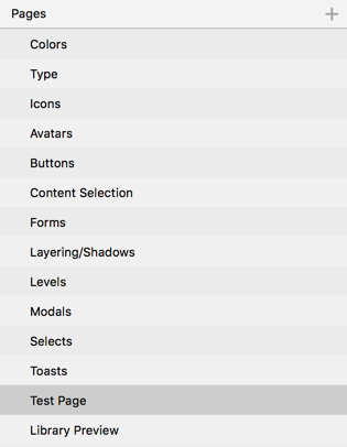
Key
parts of our design system (Color, Type, Icons) are at the top and then
we simply listed our components alphabetically. You’ll see at the
bottom are two additional pages. The Test Page, if you hadn’t guessed
it, is a page where we can quickly test out any new symbols we add. The
Library Preview uses Sketch Hunt’s freebie
to give our Library a custom preview image when you go to add the
Library in Sketch’s preferences (this is now supported by default in
Sketch as of v48).
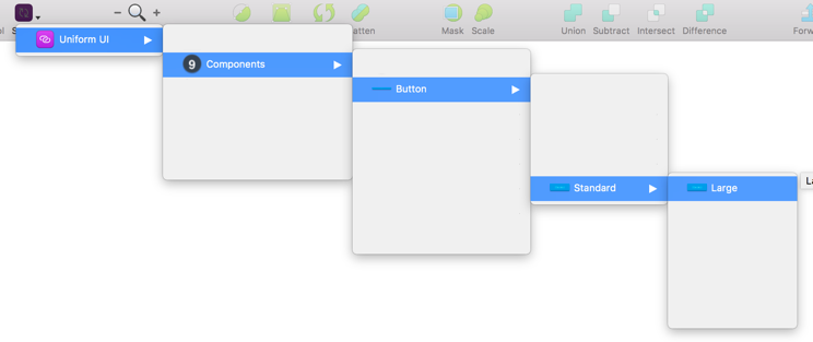
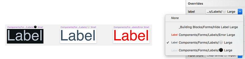
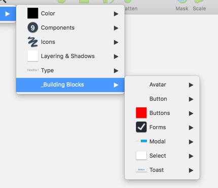
Naming Symbols
Items in the Symbols menu can be grouped by how you name symbols. Separating things with a
\
puts them in a new menu group. Using the organization we outlined above
and knowing how things are grouped on the component side, we went with
what felt most logical; for something like buttons, that looks like
this: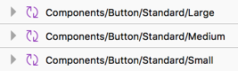
Which creates a menu that looks something like this (edited a bit to make it easier to see):
Adding Color
Currently,
Sketch doesn’t have a way of sharing colors with the Libraries feature.
Sure, there are plugins that allow you to create shareable palettes,
but that went against our goals of a one-stop shop and easy
maintainability. Instead, we created our colors using just plain old
rectangles.
While
it’s not ideal, it’s not too much of a hassle for our designers since a
majority of their color needs should be handled on each component’s
symbol overrides. Plus, it allows us to use those colored rectangles to
build out those actual components (explained below). If we make an
update to the color, it will update every component that’s using that
color symbol.
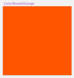
Our
main-level colors (such as brand, utilities, background colors) are
contained on the Colors page and grouped accordingly. Colors that are
specific to a component go on that component’s page to keep that ease of
maintenance. We can still create rectangle symbols that reference
main-level colors if necessary which makes updates later on much
quicker.
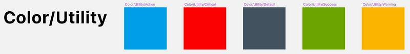
The
last bit of house-cleaning we needed to do was making sure when you
opened a color override, you weren’t blasted with a huge list of colors.
To remedy this, we simply sized those color rectangles in increments of
10, since the grouping of symbol overrides is based on size. For
example, brand colors are 20px by 20px, utility colors are 30px by 30px,
and so on. Now, when a designer wants to switch to a different icon
color, they are only seeing the icon colors and not every other color in
the Library.
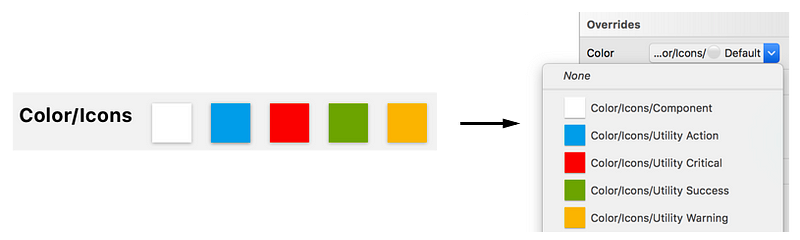
Adding Icons
Icons
were handled in a similar fashion to colors in that we logically
grouped them by their usage (navigation, sports, filetypes, etc.). To
allow designers to switch between the different colors we have for
icons, we simply added those colors as masks.
Remember
that sizing things similarly makes them show up in the override menu
together. With that in mind, we sized our icon colors the same so that
when a designer goes to change a color, they are only seeing the colors
available for icons.
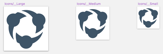
One
challenge we had was handling the three different sizes our icons come
in. To get around this, we simply created three symbols each at their
correct size with a default icon (our logo). Since we’re using a symbol,
a designer can now just choose a different icon from the overrides
panel — keep in mind you can resize an inserted symbol to your heart’s
content without affecting what you see in the Overrides panel. With a
lot of icons, it can get to be a pretty gnarly list, especially compared
to the nicely categorized way of doing icons above. We don’t have a lot
of cases where an icon is needed in anything other than size medium, so
this workaround, uh, works for us.
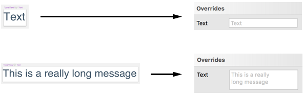
Adding Type
This
is another area where the Libraries feature doesn’t quite meet our
needs. Editing text in the Overrides panel can be a bit of a pain
considering how small the textbox is. Just make your initial Much like
colors, there are Sketch Plugins that can handle bringing Type into your
Sketch documents as Text Styles, but they go against our
easy-to-maintain, and one-stop shop goals.
We
ultimately decided to create symbols anyway. Designers can either use
the textbox in the Overrides panel or just Detach From Symbol and edit
the text as they normally would. And, as of Sketch v48, you can enlarge
the textbox in the Overrides panel by increasing the amount of text in
the symbol by default.
There’s
one last thing we have to address with text and that’s colors. With our
text, it’s already set in the component correctly. But what about a
different environment, theming, or things like error states? For that,
we are again relying on the sizing of the symbol to determine what shows
up in the overrides. For something like a form label, we just ensure
those particular text symbols are all the same size.
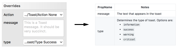
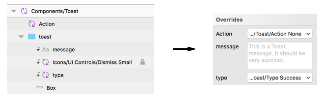
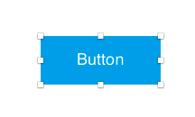
Adding Components
After
creating all of the hard stuff, making the buttons, modals, toasts,
etc., was actually pretty simple. For something like Modals, we just
bring in the right background color, add a type symbol with a good
default message, and finally drop in the Close icon. At this point,
we’re getting very close to making symbols like how we would with React.
And
that’s intentional since we want our symbols to be as close to a 1:1
match of our components as possible. To that end, we name the symbol
overrides exactly how we name our component props in code. To make it
even more clear to our designers these are component props, we even keep
the names lowercase. Anything that’s not actually part of the
component’s code(such as padding blocks which we’ll discuss below), we
Title case. Keeping symbol overrides named identically to the component
props is a great way to bridge that designer/developer discussion when
it comes time to build out the interfaces.
Tips & Tricks
Here’s a few other things we learned as we were building out components that may help you:
- Make things easier for yourself and download the Sketch Symbol Organizer plugin. You can organize your symbols alphabetically and group things based on the name. Additionally, it’ll even space things out how you want. A big timesaver.
- The order of your layers in your symbols matter. How they’re ordered in the symbol is how they’ll be ordered in the Overrides panel.
- It’s worth repeating here for the millionth time that the size of your layers matter as well. Remember: that’s how things like backgrounds, type, icons, etc., can become grouped.
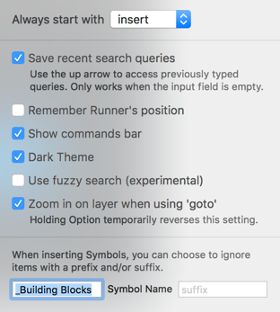
- You’ll most likely have symbols your designers don’t really need, but are important to the makeup of your components. We decided to create a _Building Blocks menu item (the underscore keeps it anchored to the bottom) that acts a bit as a junk drawer. These items stay on the respective component’s page, but are named with the _Building Blocks prefix to ensure they all go under that menu item.
- Sketch doesn’t currently handled nested symbol resizing very well. To get around this, we usually create what we call “spacing blocks”. An example of where this might be necessary is buttons; you drop in a button, give it more text than the default and suddenly the padding is out of whack. For this, we have a show/hide spacing block symbol that drops in semi-transparent “blocks”. The designer now just needs to resize the button until the blocks line up.
Making It Available
After
the library was complete, we needed a way to make sure it would always
stay up-to-date for our designers. We use Google Drive, so that was the
obvious place to put it. We locked access to the library file itself to
ensure no unnecessary deletions or additions happened and then wrote up a
Getting Started guide.
One thing our Getting Started guide features is instructions on getting set up with Sketch Runner.
While this goes a bit against our goal of being a one-stop shop, we
find the benefits of using this plugin goes well beyond just using it
with our library — it’s a really invaluable tool.
With
Sketch Runner, you can quickly insert symbols just by typing their
name, which for a lot of people is quite a bit faster than going through
the menus. We recommended to our designers to turn off Fuzzy Search in
the options and add the “_Building Blocks” to the ignored prefix in the
Settings.
Since
launch, we’ve received a lot of feedback on how much time has been
saved by using the library. We’re looking forward to Sketch continuing
to make improvements in the future to make it an even more impressive
tool.

No comments:
Write comments