Programming & IT Tricks . Theme images by MichaelJay. Powered by Blogger.

Copyright

Facebook

Post Top Ad

Search This Blog

Post Top Ad

Responsive Ads Here

Archive

Post Top Ad

Contact


Editors Picks

Follow us

Post Top Ad

Fashion

Music

News

Sports

Food

Technology

Featured

Videos

Fashion

Technology

Fashion

Label

Translate

About

Translate

Sponsor

test

Weekly

Comments

Recent

Connect With us

Over 600,000+ Readers Get fresh content from FastBlog

About

Showing posts with label Tech. Show all posts

Friday, January 26, 2018

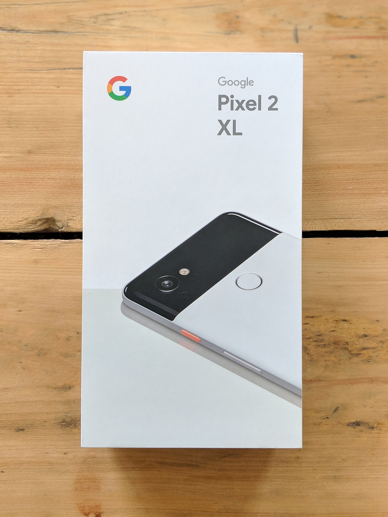
Switching from iPhone 7 to Google’s Pixel 2 XL


The Google product lineup
I recently spoke to a friend who said he “didn’t care about what a phone looks like anymore — they’re all the same”. It’s true; pretty much every phone looks like the same cold, lifeless slab of glass and aluminium. Even Apple’s iPhones, once lauded for bringing hardware design to a higher level, have started to feel boring. It seems like the looks of a phone played a way larger role a few years ago. Now, we want a phone that works well and takes great photos.
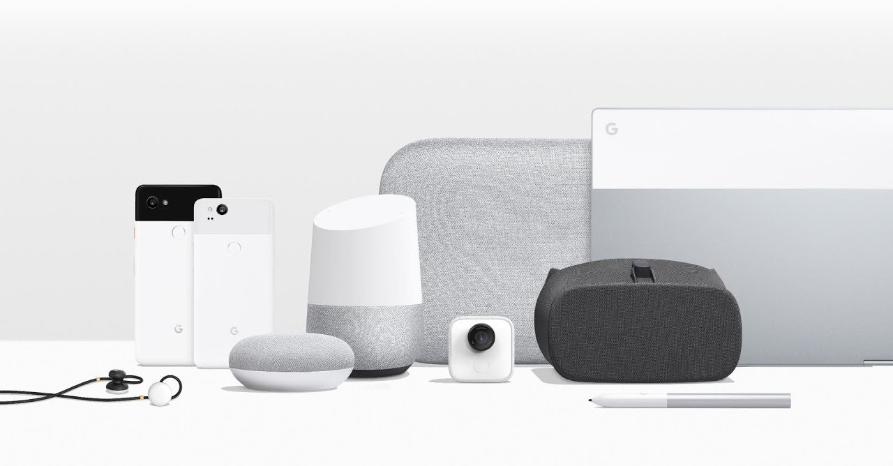
Google’s announcement of the Pixel 2 phones, Google Homes, the creepy camera, the VR headset, their Pixel buds, speaker and laptop/tablet hybrid made me think of Dieter Rams’ work for Braun—although the great Teenage Engineering also popped up.
Rams has created or overseen the creation of numerous products for Braun. Most, if not all these products, have a certain elegance and timelessness, mostly due to their materials, the sparse use of colour and typography, and their ease of use.
Without lingering on it too much, I think this line of Google products is close to achieving the same thing. Their speakers and Home products look like furniture that will seamlessly blend into their surroundings. Their phones feel like—bear with me—a useful utility made for a human being, rather than a brick of computing power. From a product design point-of-view, the look of these products is an exciting development.
If you’re interested in reading more about Google’s hardware design, have a look at this article on Design Milk.

The Google Pixel 2 XL

On size and battery life

I’m not going back to 4.7”

One of my fears was that the phone would be too big. I’ve been an iPhone user since the iPhone 4 and have never chosen the larger model. After six weeks with the Pixel 2 XL, I don’t see myself going back to a small phone anytime soon.
While comparing the Pixel 2 XL to the smaller version, I noticed the difference in size between the two is minor. I’d say the Pixel 2 is more awkwardly sized than the XL version, and the XL gives you a lot more screen. It runs all the way to the edges, while the screen of the smaller version reveals larger bezels. Even if you have small hands, it might be worth holding both before deciding that a big phone is not for you. I worried it might slip out of my hands, but the Pixel 2 XL has an aluminium body and the matte coating provides more grip.
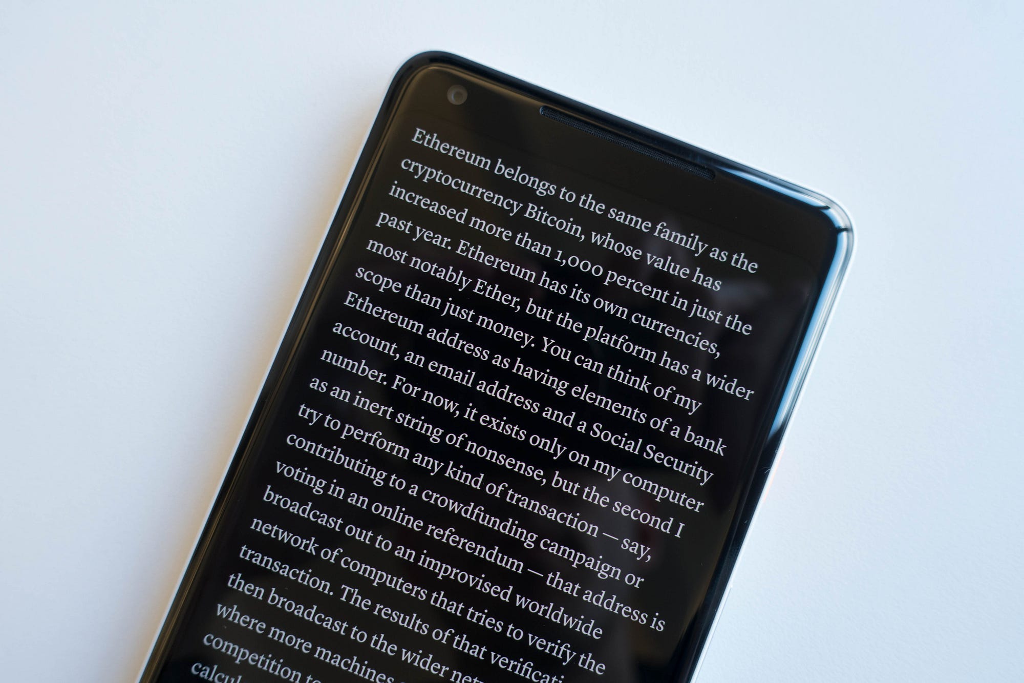
I’ve enjoyed the larger screen a lot so far. Reading articles on Instapaper’s black background is very immersive. The edges of the screen seem to disappear completely. With this phone I’ve done more reading in the Kindle app than I used to, and watching YouTube or Netflix in fullscreen is great.
Instapaper in fullscreen

One charge every two days

My iPhone 7 running iOS 11 was a shitshow when it comes to battery life. I had to charge it around 8pm every evening if I wanted to keep it on until bedtime.
The Google phone’s battery lasts me so long I can afford to forget charging it. On a full charge I can use it for at least a full day. That’s snapping photos and Instagram stories, sending messages on Telegram or Whatsapp, listening to podcasts for about an hour, a Headspace session, and reading an article or chapter of a book here and there. I’ll go to bed without having thought of charging the battery. When I wake up, it’s usually at 55%, lasting me another day before charging it the following evening.

From iOS to Android

Many friends mentioned being “locked into the Apple ecosystem”. For me, switching was as easy as or easier than switching from one iPhone to the other. The phone comes with a dongle you can plug into your iPhone. Within half an hour it has copied your contacts and whatever apps you’ve decided to keep, provided they are available for Android.
After switching I realised I’m more locked in to Google’s ecosystem than I am into Apple’s. I use Google Maps, Google Mail, and Google Photos, as Apple’s offering has sucked on those fronts for as long as I can remember. I only used iCloud to sync iA Writer documents between my phone and computer, but using Dropbox instead was a piece of cake.

Nifty details and customisation

I had a ton of duplicate contacts on my iPhone for whatever reason. Deleting them on iOS is a pain, so I never got around to it and accepted a contact list three times the size it should be. After importing all my contacts, the Google phone first asked if I wanted to merge all my duplicates in one tap. Aces! ✨
It’s details like those that make the Android OS a delight to work with. The control centre is customisable — I know, Apple also introduced that recently — and if the keyboard is not to your liking, you can choose a theme (light, dark, with or without button shapes) that better suits you. It listens to music playing around you and provides you with the song on your lock screen, which is scary and more convenient than I’d imagined. You can choose to set several widgets on your home screen; my calendar widget shows me my next upcoming appointment, if available.
If you feel like going all-in with customisation, you can tap the phone’s build number 10 times to enable developer mode. “You are now a developer!”, it’ll say, after which you can customise even more things, like the speed of animations. I won’t encourage messing too much with those, but the fact that the OS has numerous ways of customising it to your personal preference is a big plus.
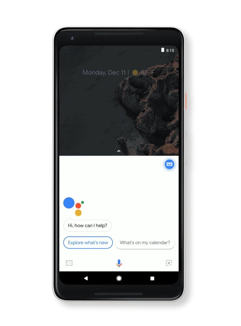
Squeeze for help

The Google Assistant — which you can bring up by long pressing the home button or squeezing the phone — is a gazillion times better than Siri. I actually use it now and, occasional screw ups aside, it’s very accurate. Also, you can squeeze the phone to bring up the Assistant!
😏
At home I use a Chromecast Audio to stream music to my speakers. Pairing it with an iPhone was pretty OK, although it did force me to turn Spotify or wifi on/off on a regular basis. With the Google phone, connecting is instant and I haven’t had any problems. I wouldn’t expect otherwise from one Google product talking to the other, but it’s nice nonetheless.

Swiping and squeezing

Fingerprint sensor and NFC payments

The fingerprint sensor is on the back, conveniently placed for your index finger. Swiping down on the scanner brings down the notification/control centre. When the phone is on its back, you don’t have to pick it up to see your notifications. Double tap the screen to light up the lock screen and see if you have any. The way notifications are displayed on the lock screen minimises my urge to open apps, which is a plus.
Photo: Mark Wilson (Fast Co Design)
The phone has a built in NFC chip, so I can now use it to pay at PIN terminals. I had to install an app from my bank to enable it. After that I could hold it near a terminal once the cashier had entered the amount. It has proven to be quicker than pulling a card out of your wallet, and it has worked without fault almost every time.

Photos of my food have never looked better

The camera is great. I’ve taken some photos in low light and they come out very well. It has a Portrait Mode, which blurs the background and leaves you with a nice portrait. Much has been said about the difference between Google and Apple’s portrait mode (one being software-based while the other is created by hardware), but I don’t see or care much about the difference. I’m not going to use this phone for professional photography. I just want to take a nice picture of my girlfriend or a plate of food now and then, and it more than does the job for that.
A photo in low light and Portrait Mode used on a bowl of ramen

Google Lens

The camera has Google Lens integrated. Snap a photo, hit the Lens button and it will try to find whatever it sees in the photo. Again, this works very well and has been convenient for looking stuff up now and then. It’s also built into the Google Assistant, allowing you to open the camera and tap anything you’d like to find more information about. See below.
Google Lens integrated into Google Assistant ✨

A note on apps

The only apps I’ve missed so far are Darkroom, for editing photos, and Things, for my to-dos. Luckily, Things recently added a feature that allows you to email tasks to your to-do list, so that helps. It’s a bit of a bummer that I can’t look at my to-dos on my phone — and judging by Cultured Code’s development speed, an Android app might be scheduled for 2022 — but it’s not that big of a deal. For editing photos I’ve simply switched back to VSCO.
I used iMessage with my girlfriend and 6 other friends, and have switched to Telegram or Messenger with them. This might be a hassle if you’re all-in on iMessage, but it was hardly an issue for me.
Google’s apps are high quality and I enjoy using them. Some apps from third-party developers have proven to be a little less great than they are on iOS. Instagram’s compression on videos taken with an Android phone is lousy, for whatever reason. Instapaper crashes more often than I’m used to, and it expresses the time it takes to read an article in a range of dots instead of minutes. I have no idea why an Android user would prefer that. Goodreads is an absolute mess on Android, but that’s no surprise.
Watching videos on YouTube in fullscreen is glorious 👌
I’ve found a worthy replacement for the iOS Podcasts app in Pocket Casts. For email and my calendar I use Outlook — which is basically Sunrise, rest in peace—and I’ve been keeping my notes in the great Dropbox Paper more often. The Twitter app on Android is fine (as it is on iOS). Google’s Inbox is great for email too.
Overall, the Material Design language does make well-designed apps more fun and immersive to use. As Owen Williams put it:
Apps are full of color, playful animation and fun design flourishes. Where iOS has become flat, grey and uniform, Google went the opposite direction: bright colors, full-on fluid animations and much, much more.
Aside from this, apps are able to integrate more closely with the OS. A good example of this is that Spotify, Sonos or Pocket Casts can show on your lock screen persistently, allowing you to skip or pause playback. Overall, I’m finding the Google ecosystem to be much more pleasant to work with than Apple’s, and agree (again) with Owen that Google is eating Apple’s ecosystem for lunch.

TL;DR — I am very happy with this phone

The Google phone is here to stay. I’m not tempted to go back to iOS, as I haven’t missed it since I switched. If you’re considering making the switch, I’d fully recommend the Pixel 2 XL 🔁
I’m currently tempted to purchase a Google Home Mini and might even replace my Apple TV (which has mostly been an expensive disappointment) with a Chromecast. Slippery slope.
I look forward to see what Google will do on their next iteration!

Wednesday, January 24, 2018

No Cutting Corners on the iPhone X


When the iPhone X launched, a lot of designers were put off about the screen shape. Those complaints have mostly died down, but I haven’t seen much design-nerd talk about cool corner treatment details. Fortunately, deep nerd shit is my specialty.
iPhone X screen shape

What’s Your Angle?

When you’re starting a design like this, the obvious, and comically cheaper option is to make all corners square. Machines exist and/or are calibrated to make those screens, so keeping edges squared requires fewer manufacturing changes and less talent along the pathway to production.
Everyone knows how to make a right angle — designers don’t have to do math, engineers need fewer calculations, the people making the machine are clear on what to do.
And yet, let’s examine how crappy all-square corners would look:
I’m a pixelated bear cub. Rawr.
Once Apple knew they wanted to take advantage of new full-screen technology, that gave them the opportunity to alter screen shape because they would need to address the manufacturing process anyway. Presumably, the expense was mostly built in.
Still, there were lots of ugly ways to do this:
Meh.
This is where they landed:
That’s better.

Screen Corners

Here’s where the nerd part comes in, iPhone X rounded screen corners don’t use the classic rounding method where you move in a straight line and then arc using a single quadrant of a circle. Instead, the math is a bit more complicated. Commonly called a squircle, the slope starts sooner, but is more gentle.
The difference is real subtle, even in gif-form, but here we go:
Difference between common rounded rectangle maths and Apple maths.
Apple has been doing this to the corners of laptops and iMacs for years, but this type of rounding didn’t penetrate iOS until version 7. This shape has classically been difficult to achieve, because it wasn’t available in 2D design editors, though that’s starting to change. Read about it more detail here.

The Notch

Now let’s talk about the notch itself. The left and right sides have two rounded corners. Because of the curve falloff, one curve doesn’t complete before the next one starts — they blend seamlessly into each other. As a result, no tangent line on this edge actually hits a perfect vertical.
Ooo. Fancy.

Come Correct

iPhone X templates I’ve seen out there don’t 100 percent duplicate the official shape, probably because it was either too hard to make or they haven’t noticed. This is why it’s good practice to use official assets from Apple, found in the design resources section of the developer site for creating icons and mockups.
Future iterations of this design will surely alter these sizes, so it will be interesting to compare how hardware sensor evolution impacts design shifts.
Overall, these decisions seem minor, but from a design viewpoint they’re fairly opinionated. Even when designers are willing to spend social capital to push these ideas, most organizations won’t put resources behind them.

Rounding the Bend

One of the things I love about indie apps is their ability to be opinionated. It’s nearly impossible to ship strong viewpoints from larger companies where there are fifty people in a room examining angles. So it’s cool to see Apple still has the ability to take a strong stance in this way.
Sweating thousands of minor details is what separates Apple from other companies. Their ability to do that is hard-won, but damn it’s pretty to watch.

Sunday, January 21, 2018

How you can build your own VR headset for $100


My name is Maxime Coutté. I’m 16 and I built my own VR headset with my best friends, Jonas Ceccon and Gabriel Combe. And it ended up costing us $100.
I started programming when I was 13, thanks to my math teacher. Every Monday and Tuesday, my friends and I used to go to his classroom to learn and practice instead of having a meal at the cafeteria.
I spent one year building a very basic 8-bit OS from scratch and competing in robotics contests with my friends.
I then got interested in VR and with my friends we agreed that it would be really cool to create our own world in VR where we could spend time after school. But facing the fact that an Oculus was $700 at the time, we decided to build our own headset.
3D printed parts of the headset

Making VR accessible to everyone?

DARROW; J. R. EYERMAN/THE LIFE PICTURE COLLECTION/GETTY IMAGES
It was because of an anime called Sword Art Online where the main character is in a virtual reality RPG that I fell in love with VR. I wanted to understand every aspect of it.
I bought the cheapest components I could and we started by learning the very basics of the physics and math behind VR (proper acceleration, antiderivatives, quaternions…). And then we re-invented VR. I wrote WRMHL, and then FastVR with Gabriel. Putting all of this together, we ended up with a $100 VR headset.

A fully hackable VR headset and development kit

To speed up VR development time, we built FastVR, an open-source SDK for developers that is easy to understand and customize. It works like this:
  • The core headset computes the position of the headset in space;
  • The position is sent from the headset to WRMHL, and part of the CPU’s power is dedicated to reading those messages;
  • Then FastVR retrieves the data and uses them to render the VR game.
Everything you need to build the headset has been open-sourced and can be hacked.

Why open source?

I want to make VR mainstream. So I reached out to Oussama Ammar, one of the co-founders at The Family. I talked to him about setting up a company and launching a Kickstarter.
But he convinced me that for now, it’s better to wait on starting a business, to keep meeting others who have the same goals, and to keep learning.
We took a trip to Silicon Valley and Oussama introduced me to the chief architect at Oculus, Atman Brinstock. And they gave me some precious advice: make all of this open source.

The Next Step?

There are still a lot of technical points that we want to improve.
Our big focus right now is on a standalone VR headset, which we already have as a simple version, and cheaper 3D tracking.
All of this will be released soon.

How do I get started?

If you want to learn more about the technical side and build your headset, just follow the guide by clicking here. Star the repo if you liked it ⭐️

Saturday, January 20, 2018

How to Design Social Systems (Without Causing Depression and War)


How to Design Social Systems (Without Causing Depression and War)

Here I’ll present a way to think about social systems, meaningful interactions, and human values that brings these often-hazy concepts into focus. It’s also, in a sense, an essay on human nature. It’s organized in three sections:
  • Reflection and Experimentation. How do people decide which values to bring to a situation?
  • Practice Spaces. Can we look at social systems and see which values they support and which they undermine?
  • Sharing Wisdom. What are the meaningful conversations that we, as a culture, are starved for?
I’ll introduce these concepts and their implications for design. I will show how, applied to social media, they address issues like election manipulation, fake news, internet addiction, teen depression & suicide, and various threats to children. At the end of the post, I’ll discuss the challenges of doing this type of design at Facebook and in other technology teams.

Reflection and Experimentation

As I tried to make clear in my letter, meaningful interactions and time well spent are a matter of values. For each person, certain kinds of acts are meaningful, and certain ways of relating. Unless the software supports those acts and ways of relating, there will be a loss of meaning.
In the section below about practice spaces, I’ll cover how to design software that’s supportive in this way. But first, let’s talk about how people pick their values in the first place.
We often don’t know how we want to act, or relate, in a particular situation. Not immediately, at least.
When we approach an event (a conversation, a meeting, a morning, a task), there’s a process — mostly unconscious — by which we decide how we want to be.
Interrupting this can lead to doing things we regret. As we’ll see, it can lead to internet addiction, to bullying and trolling, and to the problems teens are having online.
So, we need to sort out the values with which we want to approach a situation. This is a process. I believe it’s the same process, whether you’re deciding something small — like how openly you will approach a particular conversation — or something big.
Let’s start with something big: many teenagers are engaged in sorting out their identities: they take ideas about how they ought to act (manly, feminine, polite, etc) and make up their own minds about whether to approach situations with these values in mind.
Worksheets from “On My Own Terms”. Join our community to play these games!
For these teens, settling on the right values takes a mix of experimentation and reflection. They need to try out different ways of being manly, feminine, intelligent, or kind in different situations and see how they work. They also need to reflect on who they want to be and how they want to live.
These two ingredients — experimentation and reflection — are required to sort out our values. Even the small decisions (for example, deciding how to balance honesty and tact in a conversation) require experimenting in real situations, and reflecting on what matters most.
This process can be intuitive, nonverbal, and unconscious, but it is vital.¹ If we don’t find the right values, it’s hard to feel good about what we do. The following circumstances interfere with experimentation and reflection:
  • High stakes. When deviation from norms becomes disastrous in some way — for instance, with very high reputational stakes — people are afraid to experiment. People need space to make mistakes and systems and social scenes with high consequences interfere with this.
  • Low agency. To put values to the test, a person needs discretion over the manner of their work: they need to experiment with moral values, aesthetic values, and other guiding ideas. Some environments — many of them corporate — make no room for being guided by one’s own moral or aesthetic ideas.
  • Disconnection. One way we judge the values we’re experimenting with is via exposure to their consequences. We all need to know how others feel when we treat them one way or another, to help us decide how we want to treat them. Similarly, an architect needs to know what it’s like to live in the buildings she designs. When the consequences of our actions are hidden, we can’t sort out what’s important.²
  • Distraction and overwork. We also lose the capacity to sort out our values when reflection becomes impossible. This is the major cost of noisy environments, infinite entertainment, push notifications, and some types of poverty.
  • Lack of faith in reflection. Finally, people can come to consider reflection to be useless — or to be avoided — even though it is so natural. The emotions which trigger reflection, including doubt and confusion, can be brushed away as distractions. One way this happens, is if people view their choices through a behaviorist lens: as determined by habits, reinforcement learning, or permanent drives.³ This makes it seem like people don’t have values at all, only habits, tastes, and goals. Experimentation and reflection seem useless.
Software-based social spaces can be disastrous for experimentation and reflection.
One reason that private group messaging (like WhatsApp and Messenger) is replacing virality-based forums (like Twitter, News Feed, and increasingly, Stories) is that the latter are horrible for experimenting with who we are. The stakes are too high. They seem especially bad for women, for teens, and for celebrities—which may partly explain the rise in teen suicide—but they're bad for all of us.
A related problem is online bullying, trolling, and political outrage. Many bullies and trolls would embrace other values if they had a chance to reflect and were better exposed to consequences. In-person spaces are much better for this.
Reflection can be encouraged or discouraged by design — this much is clear from the variety of internet-use helpers, like Moment and Intent. All of us (not just bullies and trolls) would use the Internet differently if we had more room for reflection.
Two lockscreens: one design encourages reflection, and one doesn’t. [from “Empowering Design”]

Exercise: On My Own Terms

In order to learn to support users in experimentation and reflection, designers must experiment and reflect on their own values. On My Own Terms is an exercise for this. Players fill out a worksheet, then socialize in an experimental way.
“On My Own Terms”. Join our community to play these games!
In the experimentation part, players defy norms they’ve previously obeyed, and see how it works out. Often they find that people like them better when they are less conventional — even when they are rude!

Here’s one thing this game makes clear: we discover what’s important to us in the context of real choices and their consequences. People often think they have certain values (eating kale, recycling, supporting the troops) but when they experiment and reflect on real choices, these values are discarded. They thought they believed in them, but only out of context.
This is how it was for me with consistency, rationality, masculinity, and being understated. When I played On My Own Terms, I decided to value these less. My true values are only clear through experimentation and reflection.
For users to have meaningful interactions and feel their time was well spent, they need to approach situations in a way they believe in. They need space to experiment and reflect.
But this is not enough.

Practice Spaces

Every social system makes some values easier to practice, and other values harder. Even with our values in order, a social environment can undermine our plans.
Most social platforms are designed in a way that encourages us to act against our values: less humbly, less honestly, less thoughtfully, and so on. Using these platforms while sticking to our values would mean constantly fighting their design. Unless we’re prepared for a fight, we’ll likely regret our choices.
There’s a way to address this, but it requires a radical change in how we design: we must reimagine social systems as practice spaces for the users’ values — as virtual places custom built to make it easier for the user to relate and to act in accord with their values.
Designers must get curious about two things:
  1. When users want to relate according to a particular value, what is hard about doing that?
  2. What is it about some social spaces that can make relating in this way easier?
For example, if an Instagram user valued being creative, being honest, or connecting adventurously, then designers would need to ask: what kinds of social environments make it easier to be creative, to be honest, or to connect adventurously? They could make a list of places where people find these things easier: camping trips, open-mics, writing groups, and so on.
Next, the designers would ask: which features of these environments make them good at this? For instance, when someone is trying to be creative, do mechanisms for showing relative status (like follower counts) help or hurt? How about when someone wants to connect adventurously? Or, with being creative, is this easier in a small group of close connections, or a large group of distant ones? And so on.
To take another example, if a News Feed user believes in being open-minded, designers would ask which social environments make this easier. Having made such a list, they would look for common features. Perhaps it’s easier to be open-minded when you remember something you respect about a person’s previous views. Or, perhaps it’s easier when you can tell if the person is in a thoughtful mood by reading their body language. Is open-mindedness more natural when those speaking have to explicitly yield time for others to respond? Designers would have to find out.

Exercise: Space Jam

To start thinking this way, it’s best if designers focus first on values which they themselves have trouble practicing. In this game, Space Jam, each player shares something they’d like to practice, some way of interacting. Then everyone brainstorms, imagining practice spaces (both online and offline) which could make this easier.
“Space Jam”. Join our community to play these games!
Here’s an example of the game, played over Skype with three designers from Facebook:
Eva says she wants to practice “changing the subject when a conversation seems like a dead end.”
Someone comments that Facebook threads are especially bad at this. We set a timer for three minutes and brainstorm on our own. Then everyone presents one real-world way to practice, and one mediated way.
George’s idea involves a timer. When it rings, everyone says “this conversation doesn’t meet my need for ____”. Jennifer suggests something else: putting a bowl in the middle of a conversation. Player can write out alternate topics and put them in the bowl in a conspicuous but non-interrupting way. (Jennifer also applies this idea to Facebook comments, where the bowl is replaced by a sidebar.)
We all wonder together: could it ever be “okay” for people to say things like “this conversation doesn’t meet my need for ____”? Under what circumstances is this safe to say?
This leads to new ideas.

In the story above, Eva is an honest person. But that doesn’t mean it’s always easy to be honest. She struggles to be honest when she wants to change the conversation. By changing the social rules, we can make it easier for her to live according to her values.
Games like Space Jam show how much influence the rules of social spaces have over us, and how easy it is for thoughtful design to change those rules. Designers become more aware of the values around them and why they can be difficult to practice. They feel more responsible for the spaces they are creating. (Not just the spaces they make for users, but also in daily interactions with their colleagues). This gives them a fresh approach to design.
If designers learn this skill, they can support the broad diversity of users’ values. Then users will no longer have to fight the software to practice their values.

Sharing Wisdom

I hope the previous ideas—reflection, experimentation, and practice spaces—have given a sense for how to support meaningful actions. Let’s turn to the question of meaningful information and meaningful conversation.
We are having a problem in this area, too.
Amidst nonstop communication — a torrent of articles, videos, and posts — there is still a kind of conversation that people are starved for, because our platforms aren’t built for it.
When this type of conversation — which I’ll call sharing wisdom — is missing, people feel that no one understands or cares about what’s important to them. People feel their values are unheeded, unrecognized, and impossible to rally around.
As we’ll see, this situation is easy to exploit, and the media and fake news ecosystems have taken advantage. By looking at how this exploitation works, we can see how conversations become ideological and polarized, and how elections are manipulated.
But first, what do I mean by sharing wisdom?
Social conversation is often understood as telling stories, sharing feelings, or getting advice. But each of these can be seen as a way to discover values.
When we ask our friends for advice — if you look carefully — we aren’t often asking about what we should do. Instead, we’re asking them about what’s important in our situation. We’re asking for values which might be new to us. Humans constantly ask each other “what’s important?” — in a spouse, in a wine, in a programming language.
I’ll call this kind of conversation (both the questions and the answers) wisdom.
Wisdom, n. Information about another person’s hard-earned, personal values — what, through experimentation and reflection, they’ve come to believe is important for living.
Wisdom is what’s exchanged when best friends discuss their relationships or jobs, when we listen to stories told by grandmothers, church pastors, startup advisors, and so on.
It comes in many forms: mentorship, texts, rituals, games. We seek it naturally, and in normal conditions it is abundant.
For various reasons, the platforms are better for sharing other things (links, recommendations, family news) than for asking each other what’s important. So, on internet platforms, wisdom gets drowned out by other forms of discourse:
  • By ideology. Our personal values are easily eclipsed by ideological values (for instance, by values designed to promote business, a certain elite, or one side in a political fight). This is happening when posts about partisan politics make us lose track of our shared (or sharable) concerns, or when articles about productivity outpace our deeper life questions.
  • By scientism. Sometimes “hard data” or pseudo-scientific “models” are used to justify things that would be more appropriately understood as values. For instance, when neuroscience research is used to justify a style of leadership, our discourse about values suffers.
  • By bullshit. Many other kinds of social information can drown out wisdom. This includes various kinds of self-promotion; it includes celebrities giving advice for which they have no special experience; it includes news. Information that looks like wisdom can make it harder to locate actual, hard-earned wisdom.
For all these reasons, talk about personal values tends to evaporate from the social platforms, which is why people feel isolated. They don’t sense that their personal values are being understood.
In this state, it’s easy for sites like Breitbart, Huffington Post, Buzzfeed, or even Russia Today to capitalize on our feeling of disconnection. These networks leverage the difficulty of sharing wisdom, and the ease of sharing links. They make a person feel like they are sharing a personal value (like living in a rural town or supporting women), when actually they are sharing headlines that twist that value into a political and ideological tool.

Exercise: Value Sharing Circle

For designers to get clear about what wisdom sounds like, it can be helpful to have a value sharing circle. Each person shares one value which they have lived up to on the day they are playing, and one which they haven’t. Here’s a transcript from one of these circles:
There are twelve of us, seated for dinner. We eat in silence for what feels like a long time. Then, someone begins to speak. It’s Otto. He says he works at a cemetery. At 6am this morning, they called him. They needed him to carry a coffin during a funeral service. No one else could do it. So, he went. Otto says he lived up to his values of showing up and being reliable. But — he says — he was distracted during the service. He’s not sure he did a good job. He worries about the people who were mourning, whether they noticed his missteps, whether his lack of presence made the ritual less perfect for them. So, he didn’t live up his values of supporting the sense of ritual and honoring the dead.
In the course of such an evening, participants are exposed to values they’ve never thought about. That night, other people spoke of their attempts to be ready for adventure, be a vulnerable leader, and make parenthood an adventure.

Playing this makes the difference between true personal values and ideologies very clear. Notice how different these values are from the values of business. No one in the circle was particularly concerned with productivity, efficiency, or socio-economic status. No one was even concerned with happiness!
Social platforms could make it much easier to share our personal values (like small town living) directly, and to acknowledge one another and rally around them, without turning them into ideologies or articles.
This would do more to heal politics and media than any “fake news” initiative. To do it, designers will need to know what this kind of conversation sounds like, how to encourage it, and how to avoid drowning it out.

The Hardest Challenge

I’ve pointed out many challenges, but left out the big one. 😕
Only people with a particular mindset can do this type of design. It takes a new kind of empathy.
Empathy can mean understanding someone’s goals, or understanding someone’s feelings. And these are important.
But to build on these concepts — experimentation, reflection, wisdom, and practice spaces— a designer needs to see the experimental part of a person, the reflective part, the person’s desire for (and capacity for) wisdom, and what the person is practicing.
As with other types of empathy, learning this means growing as a person.
Why? Well, just as it’s hard to see others’ feelings when we repress our own, or hard to listen to another person’s grand ambitions unless we are comfortable with ours... it’s hard to get familiar with another person’s values unless we are first cozy with our own, and with all the conflicts we have about them.
This is why the exercises I’ve listed (and others, which I didn’t have space to include) are so important. Spreading this new kind of empathy is a huge cultural challenge.
But it’s the only way forward for tech.

Thanks for reading. (Here are the credits and footnotes.)
Please clap for this and the previous post!
And…

Friday, January 19, 2018

How video streaming works on the web: An introduction


Note: this article is an introduction to video streaming in JavaScript and is mostly targeted to web developers. A large part of the examples here make use of HTML and modern JavaScript (ES6).
 If you’re not sufficiently familiar with them, you may find it difficult to follow through, especially the code example.
Sorry in advance for that.

The need for a native video API

From the early to late 2000s, video playback on the web mostly relied on the flash plugin.
Screen warning that the user should install the flash plugin, at the place of a video
This was because at the time, there was no other mean to stream video on a browser. As a user, you had the choice between either installing third-party plugins like flash or silverlight, or not being able to play any video at all.
To fill that hole, the WHATWG began to work on a new version of the HTML standard including, between other things, video and audio playback natively (read here: without any plugin). This trend was even more accelerated following Apple stance on flash for its products.
This standard became what is now known as HTML5.
The HTML5 Logo. HTML5 would be changing the way video are streamed on web pages
Thus HTML5 brought, between other things, the <video> tag to the web.
This new tag allows you to link to a video directly from the HTML, much like a <img> tag would do for an image.
This is cool and all but from a media website’s perspective, using a simple img-like tag does not seem sufficient to replace our good ol' flash:
  • we might want to switch between multiple video qualities on-the-fly (like YouTube does) to avoid buffering issues
  • live streaming is another use case which looks really difficult to implement that way
  • and what about updating the audio language of the content based on user preferences while the content is streaming, like Netflix does?
Thankfully, all of those points can be answered natively on most browsers, thanks to what the HTML5 specification brought. This article will detail how today’s web does it.

The video tag

As said in the previous chapter, linking to a video in a page is pretty straightforward in HTML5. You just add a video tag in your page, with few attributes.
For example, you can just write:
This HTML will allow your page to stream some_video.mp4 directly on any browser that supports the corresponding codecs (and HTML5, of course).
Here is what it looks like:
Simple page corresponding to the previous HTML code
This video tag also provides various APIs to e.g. play, pause, seek or change the speed at which the video plays.
Those APIs are directly accessible through JavaScript:
However, most videos we see on the web today display much more complex behaviors than what this could allow. For example, switching between video qualities and live streaming would be unnecessarily difficult there.
YouTube displays some more complex usecases: quality switches subtitles a tightly controlled progressive-download of the video…
All those websites actually do still use the video tag. But instead of simply setting a video file in the src attribute, they make use of much more powerful web APIs, the Media Source Extensions.

The Media Source Extensions

The “Media Source Extensions” (more often shortened to just “MSE”) is a specification from the W3C that most browsers implement today. It was created to allow those complex media use cases directly with HTML and JavaScript.
Those “extensions” add the MediaSource object to JavaScript. As its name suggests, this will be the source of the video, or put more simply, this is the object representing our video’s data.
The video is here “pushed” to the MediaSource, which provides it to the web page
As written in the previous chapter, we still use the HTML5 video tag. Perhaps even more surprisingly, we still use its src attribute. Only this time, we're not adding a link to the video, we're adding a link to the MediaSource object.
You might be confused by this last sentence. We’re not talking about an URL here, we’re talking about an abstract concept from the JavaScript language, how can it be possible to refer to it as an URL on a video tag, which is defined in the HTML?
To allow this kind of use cases the W3C defined the URL.createObjectURL static method. This API allows to create an URL, which will actually refer not to a resource available online, but directly to a JavaScript object created on the client.
This is thus how a MediaSource is attached to a video tag:
And that’s it! Now you know how the streaming platforms play videos on the Web!
… Just kidding. So now we have the MediaSource, but what are we supposed to do with it?
The MSE specification doesn’t stop here. It also defines another concept, the SourceBuffers.

The Source Buffers

The video is not actually directly “pushed” into the MediaSource for playback, SourceBuffers are used for that.
A MediaSource contains one or multiple instances of those. Each being associated to a type of content.
To stay simple, let’s just say that we have only three possible types:
  • audio
  • video
  • both audio and video
In reality, a “type” is defined by its MIME type, which may also include information about the media codec(s) used
SourceBuffers are all linked to a single MediaSource and each will be used to add our video’s data to the HTML5 video tag directly in JavaScript.
As an example, a frequent use case is to have two source buffers on our MediaSource: one for the video data, and the other for the audio:
Relations between the video tag, the MediaSource, the SourceBuffers and the actual data
Separating video and audio allows to also manage them separately on the server-side. Doing so leads to several advantages as we will see later. This is how it works:
And voila!
We’re now able to manually add video and audio data dynamically to our video tag.

It’s now time to write about the audio and video data itself. In the previous example, you might have noticed that the audio and video data where in the mp4 format.
“mp4” is a
container format, it contains the concerned media data but also multiple metadata describing for example the start time and duration of the media contained in it.
The MSE specification does not dictate which format must be understood by the browser. For video data, the two most commons are mp4 and webm files. The former is pretty well-known by now, the latter is sponsored by Google and based on the perhaps more known matroska format (“.mkv” files).
Both are well-supported in most browsers.

Media Segments

Still, many questions are left unanswered here:
  • Do we have to wait for the whole content to be downloaded, to be able to push it to a SourceBuffer (and therefore to be able to play it)?
  • How do we switch between multiple qualities or languages?
  • How to even play live contents as the media isn’t yet finished?
In the example from the previous chapter, we had one file representing the whole audio and one file representing the whole video. This can be enough for really simple use cases, but not sufficient if you want to go into the complexities offered by most streaming websites (switching languages, qualities, playing live contents etc.).
What actually happens in the more advanced video players, is that video and audio data are splitted into multiple “segments”. These segments can come in various sizes, but they often represent between 2 to 10 seconds of content.
Artistic depiction of segments in a media file
All those video/audio segments then form the complete video/audio content. Those “chunks” of data add a whole new level of flexibility to our previous example: instead of pushing the whole content at once, we can just push progressively multiple segments.
Here is a simplified example:
This means that we also have those multiple segments on server-side. From the previous example, our server contains at least the following files:
./audio/
  ├── segment0.mp4
  ├── segment1.mp4
  └── segment2.mp4
./video/
  └── segment0.mp4
Note: The audio or video files might not truly be segmented on the server-side, the Range HTTP header might be used instead by the client to obtain those files segmented (or really, the server might do whatever it wants with your request to give you back segments).
However these cases are implementation details. We will here always consider that we have segments on the server-side.
All of this means that we thankfully do not have to wait for the whole audio or video content to be downloaded to begin playback. We often just need the first segment of each.
Of course, most players do not do this logic by hand for each video and audio segments like we did here, but they follow the same idea: downloading sequentially segments and pushing them into the source buffer.
A funny way to see this logic happen in real life can be to open the network monitor on Firefox/Chrome/Edge (on linux or windows type “Ctrl+Shift+i” and go to the “Network” tab, on Mac it should be Cmd+Alt+i then “Network”) and then launching a video in your favorite streaming website.
You should see various video and audio segments being downloaded at a quick pace:
Screenshot of the Chrome Network tab on the Rx-Player’s demo page
By the way, you might have noticed that our segments are just pushed into the source buffers without indicating WHERE, in terms of position in time, it should be pushed.
The segments’ containers do in fact define, between other things, the time where they should be put in the whole media. This way, we do not have to synchronize it at hand in JavaScript.

Adaptive Streaming

Many video players have an “auto quality” feature, where the quality is automatically chosen depending on the user’s network and processing capabilities.
This is a central concern of a web player called adaptive streaming.
YouTube “Quality” setting. The default “Auto” mode follows adaptive streaming principles
This behavior is also enabled thanks to the concept of media segments.
On the server-side, the segments are actually encoded in multiple qualities. For example, our server could have the following files stored:
./audio/
  ├── ./128kbps/
  |     ├── segment0.mp4
  |     ├── segment1.mp4
  |     └── segment2.mp4
  └── ./320kbps/
        ├── segment0.mp4
        ├── segment1.mp4
        └── segment2.mp4
./video/
  ├── ./240p/
  |     ├── segment0.mp4
  |     ├── segment1.mp4
  |     └── segment2.mp4
  └── ./720p/
        ├── segment0.mp4
        ├── segment1.mp4
        └── segment2.mp4
A web player will then automatically choose the right segments to download as the network or CPU conditions change.
This is entirely done in JavaScript. For audio segments, it could for example look like that:
As you can see, we have no problem putting together segments of different qualities, everything is transparent on the JavaScript-side here. In any case, the container files contain enough information to allow this process to run smoothly.

Switching between languages

On more complex web video players, such as those on Netflix, Amazon Prime Video or MyCanal, it’s also possible to switch between multiple audio languages depending on the user settings.
Example of language options in Amazon Prime Video
Now that you know what you know, the way this feature is done should seem pretty simple to you.
Like for adaptive streaming we also have a multitude of segments on the server-side:
./audio/
  ├── ./esperanto/
  |     ├── segment0.mp4
  |     ├── segment1.mp4
  |     └── segment2.mp4
  └── ./french/
        ├── segment0.mp4
        ├── segment1.mp4
        └── segment2.mp4
./video/
  ├── segment0.mp4
  ├── segment1.mp4
  └── segment2.mp4
This time, the video player has to switch between language not based on the client’s capabilities, but on the user’s preference.
For audio segments, this is what the code could look like on the client:
You may also want to “clear” the previous SourceBuffer’s content when switching a language, to avoid mixing audio contents in multiple languages.
This is doable through the SourceBuffer.prototype.remove method, which takes a starting and ending time in seconds:
Of course, it’s also possible to combine both adaptive streaming and multiple languages. We could have our server organized as such:
./audio/
  ├── ./esperanto/
  |     ├── ./128kbps/
  |     |     ├── segment0.mp4
  |     |     ├── segment1.mp4
  |     |     └── segment2.mp4
  |     └── ./320kbps/
  |           ├── segment0.mp4
  |           ├── segment1.mp4
  |           └── segment2.mp4
  └── ./french/
        ├── ./128kbps/
        |     ├── segment0.mp4
        |     ├── segment1.mp4
        |     └── segment2.mp4
        └── ./320kbps/
              ├── segment0.mp4
              ├── segment1.mp4
              └── segment2.mp4
./video/
  ├── ./240p/
  |     ├── segment0.mp4
  |     ├── segment1.mp4
  |     └── segment2.mp4
  └── ./720p/
        ├── segment0.mp4
        ├── segment1.mp4
        └── segment2.mp4
And our client would have to manage both languages and network conditions instead:
As you can see, there’s now a lot of way the same content can be defined.
This uncovers another advantage separated video and audio segments have over whole files. With the latter, we would have to combine every possibilities on the server-side, which might take a lot more space:
segment0_video_240p_audio_esperanto_128kbps.mp4
segment0_video_240p_audio_esperanto_320kbps.mp4
segment0_video_240p_audio_french_128kbps.mp4
segment0_video_240p_audio_french_320kbps.mp4
segment0_video_720p_audio_esperanto_128kbps.mp4
segment0_video_720p_audio_esperanto_320kbps.mp4
segment0_video_720p_audio_french_128kbps.mp4
segment0_video_720p_audio_french_320kbps.mp4
segment1_video_240p_audio_esperanto_128kbps.mp4
segment1_video_240p_audio_esperanto_320kbps.mp4
segment1_video_240p_audio_french_128kbps.mp4
segment1_video_240p_audio_french_320kbps.mp4
segment1_video_720p_audio_esperanto_128kbps.mp4
segment1_video_720p_audio_esperanto_320kbps.mp4
segment1_video_720p_audio_french_128kbps.mp4
segment1_video_720p_audio_french_320kbps.mp4
segment2_video_240p_audio_esperanto_128kbps.mp4
segment2_video_240p_audio_esperanto_320kbps.mp4
segment2_video_240p_audio_french_128kbps.mp4
segment2_video_240p_audio_french_320kbps.mp4
segment2_video_720p_audio_esperanto_128kbps.mp4
segment2_video_720p_audio_esperanto_320kbps.mp4
segment2_video_720p_audio_french_128kbps.mp4
segment2_video_720p_audio_french_320kbps.mp4
Here we have more files, with a lot of redundancy (the exact same video data is included in multiple files).
This is as you can see highly inefficient on the server-side. But it is also a disadvantage on the client-side, as switching the audio language might lead you to also re-download the video with it (which has a high cost in bandwidth).

Live Contents

We didn’t talk about live streaming yet.
Live streaming on the web is becoming very common (twitch.tv, YouTube live streams…) and is again greatly simplified by the fact that our video and audio files are segmented.
Screenshot taken from twitch.tv, which specializes on video game live streaming
To explain how it basically works in the simplest way, let’s consider a YouTube channel which had just begun streaming 4 seconds ago.
If our segments are 2 seconds long, we should already have two audio segments and two video segments generated on YouTube’s server:
  • Two representing the content from 0 seconds to 2 seconds (1 audio + 1 video)
  • Two representing it from 2 seconds to 4 seconds (again 1 audio + 1 video)
./audio/
  ├── segment0s.mp4
  └── segment2s.mp4
./video/
  ├── segment0s.mp4
  └── segment2s.mp4
At 5 seconds, we didn’t have time to generate the next segment yet, so for now, the server has the exact same content available.
After 6 seconds, a new segment can be generated, we now have:
./audio/
  ├── segment0s.mp4
  ├── segment2s.mp4
  └── segment4s.mp4
./video/
  ├── segment0s.mp4
  ├── segment2s.mp4
  └── segment4s.mp4
This is pretty logical on the server-side, live contents are actually not really continuous, they are segmented like the non-live ones but segments continue to appear progressively as time evolves.
Now how can we know from JS what segments are available at a certain point in time on the server?
We might just use a clock on the client, and infer as time goes when new segments are becoming available on the server-side.
We would follow the “segmentX.mp4" naming scheme, and we would increment the “X” from the last downloaded one each time (segment0.mp4, then, 2 seconds later, Segment1.mp4 etc.).
In many cases however, this could become too imprecise: media segments may have variable durations, the server might have latencies when generating them, it might want to delete segments which are too old to save space…
As a client, you want to request the latest segments as soon as they are available while still avoiding requesting them too soon when they are not yet generated (which would lead to a 404 HTTP error).
This problem is usually resolved by using a transport protocol (also sometimes called Streaming Media Protocol).

Transport Protocols

Explaining in depth the different transport protocol may be too verbose for this article. Let’s just say that most of those have the same core concept: the Manifest.
A Manifest is a file describing which segments are available on the server.
Example of a DASH Manifest, based on XML
With it, you can describe most things we learn in this article:
  • Which audio languages the content is available in and where they are on the server (as in, “at which URL”)
  • The different audio and video qualities available
  • And of course, what segments are available, in the context of live streaming
The most common transport protocols used in a web context are:
  • DASH
    used by YouTube, Netflix or Amazon Prime Video (and many others). DASH’ manifest is called the Media Presentation Description (or MPD) and is at its base XML.
    The DASH specification has a great flexibility which allow MPDs to support most use cases (audio description, parental controls) and to be codec-agnostic.
  • HLS
    Developped by Apple, used by DailyMotion, Twitch.tv and many others. The HLS manifest is called the playlist and is in the m3u8 format (which are m3u playlist files, encoded in UTF-8).
  • Smooth Streaming
    Developped by Microsoft, used by multiple Microsoft products and MyCanal. In Smooth Streaming, manifests are called… Manifests and are XML-based.

In the real — web — world

As you can see, the core concepts behind videos on the web lays on media segments being pushed dynamically in JavaScript.
This behavior becomes quickly pretty complex, as there’s a lot of features a video player has to support:
  • it has to download and parse some sort of manifest file
  • it has to guess the current network conditions
  • it needs to register user preferences (for example, the preferred languages)
  • it has to know which segment to download depending on at least the two previous points
  • it has to manage a segment pipeline to download sequentially the right segments at the right time (downloading every segments at the same time would be inefficient: you need the earliest one sooner than the next one)
  • it has also to deal with subtitles, often entirely managed in JS
  • Some video players also manage a thumbnails track, which you can often see when hovering the progress bar
  • Many services also require DRM management
  • and many other things…
Still, at their core, complex web-compatible video players are all based on MediaSource and SourceBuffers.
Their web players all make use of MediaSources and SourceBuffers at their core
That’s why those tasks are usually performed by libraries, which do just that.
More often than not, those libraries do not even define a User Interface. They mostly provide a rich APIs, take the Manifest and various preferences as arguments, and push the right segment at the right time in the right source buffers.
This allows a greater modularization and flexibility when designing media websites and web application, which, by essence, will be complex front-ends.

Open-source web video players

There are many web video players available today doing pretty much what this article explains. Here are various open-source examples:
  • rx-player: Configurable player for both DASH and Smooth Streaming contents. Written in TypeScript — Shameless self-plug as I’m one of the dev.
  • dash.js: Play DASH contents, support a wide range of DASH features. Written by the DASH Industry Forum, a consortium promoting inter-operability guidelines for the DASH transport protocol.
  • hls.js: well-reputed HLS player. Used in production by multiple big names like Dailymotion, Canal+, Adult Swim, Twitter, VK and more.
  • shaka-player: DASH and HLS player. Maintained by Google.
By the way, Canal+ is hiring ! If working with that sort of stuff interests you, take a look at http://www.vousmeritezcanalplus.com/ (⚠️ French website).

Interested for our works and services?
Get more of our update !