A
really great lesson I have learnt is to adopt and adapt the ‘design
process’ that we have been drummed with to everyday design and
problem-solving. Not only as a student but as an Intern we are
constantly reminded of design thinking and other processes that should
be used. But are we ever reminded of when and how they are the most
appropriate tool?
There’s
a small dark area that no one really teaches you and it’s what to do
when there is no user research before the project starts. The
user-centred design approach is designing for real people and users,
identifying a problem. But what if you are tasked with a problem when
you have no real knowledge of those people or specific users? Sure, you
could go and do research but why use all of that time when your solution
could not have any value to the end user?
There
are no rules on where and how to start, different projects require
different needs and we should be taught to learn and adapt to
these needs
I
believe it’s because of the way in which we are taught these processes
that we come to believe they are linear. Design is romanticised to be
this all-knowing, ‘the user is everything’ golden process but in
reality, these concepts and methods are flexible and should be used as
tools to solve our problems, and not as linear processes. What needs to
be emphasized more in the teaching of these approaches is that there are
no rules on where and how to start. Different projects require
different needs and we should be taught to learn and adapt to these
needs.
One
method I have learnt to use when starting a project with no prior user
research is by approaching it as a Sprint and adapting the tools in the
method to the project needs.
When
I say no user research, this does not mean I haven’t taken some time to
become familiar with the project or the people I would be designing
for. I mean I haven’t tested, interviewed or really got close to real
users. I used Youtube…
Anyway,
by becoming familiar with the topic and it’s users on the surface level
you are able to start exploring the problem and thinking up certain
hunches.
Once
you have an initial understanding of the problem and potential users, I
jump straight into storyboarding. These storyboards are assumed
situations for different scenarios the user may encounter. I make sure
to do two storyboards for each use case — One extreme (novice) to the
other extreme (expert). I find this starts to highlight some potential
problems as we start to visualise how user needs are arising.
From
these needs, you can start to build more tangible questions in the form
of How Might We’s to cluster and form a bigger problem statement to
start a project with
This
may seem like a pragmatic approach to starting a project but I believe
it helps build concepts quicker to test with users and validate if the
idea or solution is worth spending more time and money on to do user
research. Just a really nice way to get yourself started when you feel
overwhelmed that there has been no user research!
I
used this approach in a recent project to build prototypes and validate
an idea early at Bosch. Fail fast, learn faster you know?
I
want to learn, design and write stuff. I’m currently an intern in the
user experience team at Bosch Power Tools and an Industrial Design
student at Loughborough University. Feel free to get in touch.
As
a designer starting out in the beginning of your career, you may not
know what to expect during your first job. You could be given lots of
work and because you are the new designer on team, you do things without
question. You might think you are expected to know everything because
nobody said you should seek out the things you need to help you.
Having
worked in the design industry almost every summer in college, I’ve
learned a thing or two about how a new designer, such as myself, can
navigate through challenges and learn in environments based on implied
messages of what we should or shouldn’t do. Knowing the basic tools and
techniques of good design is essential, but it’s the small details
surrounding how we work which can help us progress and open doors. Here
are a few tips that growing designers should take into consideration
during their first year on the job to accelerate career growth.
Asking for Help Doesn't Make You Stupid
It’s
okay to ask for help, but the issue that some designers may allude to
when they say asking for help is a big no-no is the phrasing. Instead of
directly asking for help, ask for feedback and advice.
If you need help with doing research, join a research session. If you
need help with moving forward in a project, ask designers to join you in
prioritizing ideas. This will provide you with direction. Instead of
receiving a hard-cut answer, you receive validation and perspective,
things that will help you develop your own point of view. Designers don’t receive answers, they problem solve to get there.
Saying “No” is better than saying “Yes” all the time*
Note
the asterisk. You are in control of what you want to do. You can decide
when you reply to that e-mail or if you want to go that meeting. We are
often given so many things to do that we can’t do all of them, yet we
think we have to. Many designers, especially in the beginning of their
career, do everything they are told to do, and this distracts them from
the work they need to do the most. Decide on what is most important to
help get your work done and prioritize.
Don’t say yes for the things that get in the way of producing quality work.
Delegating
tasks and prioritizing is hard, but if you can do that, you will get so
much done (and more). It’s okay to say no for valid reasons because it
tells people that you know what’s important.
Speak up
During
a critique, we are excepted to provide feedback for our peers, but not
everyone does it because they might be self concious of their thoughts,
or they don’t make the effort to help. Don’t be selfish with ideas.
Ideas are meant to be expressed and help our fellow designers design for
the people. Feedback is a gift. Feedback is what results in more iterations and better experiences.
Take Breaks
I
used to work hard constantly, whether it was at home, with friends and
family…You name it. But then I realized, without fault, I will be
working for the rest of my life and work isn’t ever really “done”. I was
taking the time to work on something fleeting, when I could have been
spending time with the people I loved and the things I loved to do
outside of work. Also, too much work can increase stress which can
increase burnout. It makes sense to do as much work as you can to get to
a certain job or rank, but that takes time. Just do what you can and
relax when you feel overworked or exausted. In the end, health is more important than work because without health, we can’t work.
Be Present
As
tempting as it is to work from home, especially for people who have the
privilege of doing so all the time, it is crucial to be present. Even
if the quality of work has not been affected, as designers,
collaboration is such an important aspect of the way we do things. Being
present in the office can make all the difference, especially when
working with the people on your team. It’s not a team if everyone isn’t present.
If you have any questions about design, message me on LinkedIn and I’ll write about it!
Today, you’re going to learn how to build an amazing design team.
In
most startups, design is often overlooked or seen as a nice-to-have
instead of a must-have. But this mentality can quickly send startups on a
one-way trip to the startup graveyard.
The
first thing founders need to understand when thinking about the design
of their mobile app or product is that design is not limited to the
pixels. The design of an
app is much more than pretty buttons and cool animations. The design is
how the app is experienced from the moment it’s opened to the moment
it’s closed. Your design can be the difference between building
an app that people come back to over and over again and an app that is
downloaded and never opened a second time.
Once
you have a clear understanding of the important role that design plays
in the success of your app, it’s important to realize that a design
team’s success is determined by more than just the people you bring on board.
A
design team’s success is also determined by the the roles they play,
the tools they use, the culture they operate within and the structures
that allow them to deliver results. Founders need to take each of these
elements seriously if they want to assemble a high-quality design team
and equip them for success.
Hiring The Right People For Design
Picking
the right people for your design team is the most important of all. If
you hire the wrong people, you’ll start down the wrong path and may
eventually have to start all over with a new team that can actually
deliver. Finding the right designers for your project can be
challenging — but it’s not impossible.
Walk
in to your search for the perfect design team knowing exactly what you
need. Do you need one person who can be contracted for a short period of
time, or are you looking to build a 3- to 4-person design team that
will become a fundamental part of your startup’s DNA? Identifying which
kind of team is right for you at this stage will be a huge factor in
knowing where you should look and whom you should look for.
We’ve worked with all kinds of companies, from early-stage technical teams to startups
with existing design teams and revenue. In both cases, MindSea was
hired to help with design because of our ability to tackle mobile design
challenges and deliver quality iOS and Android app experiences for our
clients.
As
you build your design team, it’s important to look at their previous
work to see that they can deliver. It’s also important to take the time
to speak with their past employers or clients to ensure that your
prospective designers are reliable and easy to work with. If you can
accomplish this, you’re more likely to find a successful design team
than if you judged them solely on their portfolio.
Picking Roles For A Design Team
Like
any other professional team, design teams should consist of assigned
roles. Each role comes with a different scope of responsibilities, tasks
and expertise. The structure in which these roles operate is an
important factor, as it can make or break a team long-term. A lot of
early-stage startups make the mistake of creating no clear roles for
their design teams and hoping they will instead design by committee. In
reality, the best approach for a design team is to establish a sense of
structure.
Here’s what the typical roles on a design team look like:
Design Director: Directors
push their teams to answer the tough questions about their decisions
and are constantly trying to ensure that design decisions are based on
reason, not gut instinct. The design director has the final say on the
design team when it comes to decisions about the approach being taken.
Design Manager: Managers
are responsible for making sure that the design team delivers on the
overarching vision and successfully executes based on strategies and
plans. Design managers understand how to make experiences that matter
and how to help other designers do the same.
Designers: Designers
come up with and implement ideas related to how the product works, how
users interact with it, how it looks and how it behaves between frames.
Within this role, there are a variety of specialties, and some design
teams require a vast range of expertise — designers can take on roles in
UX, illustration, animation and more. Together, this collaborative
group will be on the front lines of bringing the project to life.
If
you’re a large startup, hiring for each role would be an ideal
scenario, but for early-stage startups, that’s not always a financially
feasible solution. Keep in mind that roles and individuals don’t have to
match up perfectly — one person can take on multiple roles. In small
startups, it’s common to hire only one designer, and that individual
takes on the triple role of design director, design manager and
individual designer.
Limited resources are one reason that many early-stage startups outsource their app design
to a third party. Our own partnership with Glue is a great example of
how a third-party team can help a startup bring their ideas to life
through design:
The Best Tools For A Design Team
It’s important to arm your team with the best tools of the trade.
There
are a number of tools that can help designers craft a quality app, but
not all designers are the same. Some designers have a preference for one
tool over the next, so in the early days, you shouldn’t force your
designer to use a specific tool just because you want them too. In a
startup, you need to be optimizing for speed — if a designer is faster
on one software than the next, let them use the tool that will take less
time.
In this blog post, our design director, Reuben Hall, does a great job highlighting a handful of tools that designers use to plan and build beautiful apps.
I strongly recommend that you take the time to check it out and
consider these tools when you begin to think about your design process
and what you’ll need to equip your team with.
Creating A Design-Friendly Culture
When
you’re building your design team, another key component of the equation
is the culture that surrounds your team. The culture of your
organization as a whole will have a lasting impact on how work is
developed and what your final product looks like.
Founders
set the company culture within a startup. If you’re committed to open
communication, it’s more likely that your team will follow suit. If
you’re committed to embracing ideas from anyone regardless of their
title, it’s more likely that your team will be too. The takeaway here is
simple: Embrace the habits you hope to instill within your team to
build a lasting corporate culture.
One
of the most important parts of a healthy company culture is a
commitment to design. Too many founders view design as a secondary
element of the product, when in reality, the design of the product is
what often determines its success or failure. Founders can help create a
culture that celebrates design by enforcing regular design reviews,
ensuring that design always has a seat at the table and hiring the best
design talent possible.
Use Design Reviews To Improve Communication
Design
reviews should happen throughout the design and development process.
Early on in a project, a design review could be a quick meeting with
another designer before presenting a concept to the larger team for a
more in-depth design review. During development of an app, designers
should regularly review in-progress builds to ensure the UX and layout
of the app is as amazing as it was envisioned to be. At any stage of a
project, a design review is an opportunity for improvement. Teams that
overlook design reviews as a part of the process are often left
scratching their heads wondering how they missed key features — once
it’s too late.
While
design reviews are tactical efforts that have an impact on culture, a
startup’s design vision is also an important piece of the puzzle. Your
design vision isn’t a scheduled action like a standing meeting, but
rather a set of guiding ideas that must be communicated to the entire
team from day one. It should act as the foundation of all design
decisions, ensuring that when tough decisions need to be made, someone
at the table is invested in the design of the product, not just the
technical specs.
Wrapping Things Up
A quality design team can help a good product become something great with just a few weeks of work.
Not
sure if you need a design team quite yet? We’d be happy to jump on a
quick call, learn more about your vision and give you some insight based
on our experiences helping other startups. Get in touch today!
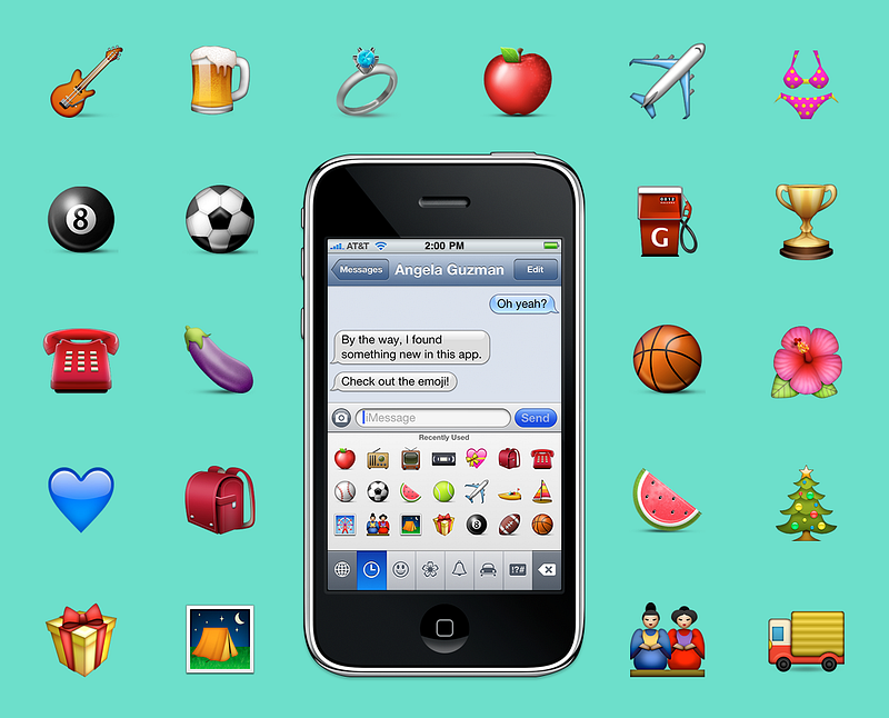
When
design leads to friendship, and that friendship leads back to design,
magic happens. This is the story of how an intern and her mentor
designed Apple’s original emoji set and together changed the way people
communicate around the world. It was also a project that led them to
become lifelong friends, a key ingredient in the success of these tiny
icons. In a nutshell, I was the intern and Raymond is my lifelong friend
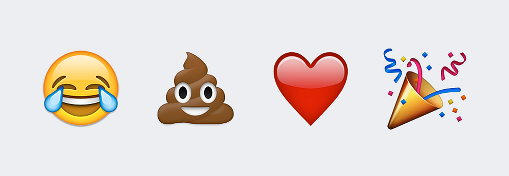
and mentor. In the course of three months, together we created some of
the most widely used emoji: face with tears of joy, pile of poo, red
heart, and party popper, plus around 460 additional ones. Later, as a
full time Apple employee, I even got to create a few more.
It
was the summer of 2008, and I was one year away from receiving my MFA
in Graphic Design from the Rhode Island School of Design (RISD). It was
the same summer I landed an internship at Apple on a team I was eager to
meet. The same design team responsible for the iPhone; a magical device
that launched the year prior at Macworld Expo in San Francisco. One
could only imagine the size of my butterflies as I flew to Cupertino and
arrived at 1 Infinite Loop. To add to the uncontrollable fluttering, I
had no idea what project I would be given, the size of the team, where I
would sit, or if I could really bike to work (I’m terrible on bikes).
Soon
after my arrival and meeting the team (oh and biking to work!) I was
handed my project. I was still trying to make sense of the assignment
I’d just received when someone asked if I knew what an emoji was. And
well, I didn’t, and at the time, neither did the majority of the English
speaking world. I answered ‘no’. This would all change, of course, as
the iPhone would soon popularize them globally by offering an emoji
keyboard. Moments later I learned what this Japanese word meant and that
I was to draw hundreds of them. Just as I was looking down the hallway
and internally processing, “This isn’t type or an exercise in layout,
these are luscious illustrations,” I was assigned my mentor.
For
the next three months Raymond and I would share an office and
illustrated an array of faces, places, flags, animals, food, clothing,
symbols, holidays, sports, and well, you probably know the rest. But
long before any of this was complete, I had to learn how to design
Apple-styled icons. We split the batch and the lesson in humility and
craftsmanship began.
Raymond
designed the face with tears of joy and pile of poo and I designed the
red heart and party popper. Emoji examples are from Emojipedia.
Raymond
taught me everything there was to know about icon design. Little did I
know that he, my humble mentor, was one of the best icon designers in
the world. In other words, I sat next to one of the best iconographers,
got to pick his brain until I could kick off my training wheels, all the
while exchanging stories of our time growing up in South Florida
including our trips to ‘Pollo Tropical’ in the search of amazing
plantains. Lesson in humility, check.
My
first emoji was the engagement ring, and I chose it because it had
challenging textures like metal and a faceted gem, tricky to render for a
beginner. The metal ring alone took me an entire day. Pretty soon,
however, I could do two a day, then three, and so forth. Regardless of
how fast I could crank one out, I constantly checked the details: the
direction of the woodgrain, how freckles appeared on apples and
eggplants, how leaf veins ran on a hibiscus, how leather was stitched on
a football, the details were neverending. I tried really hard to
capture all this in every pixel, zooming in and zooming out, because
every detail mattered. And for three months I stared at hundreds of
emoji on my screen. Somewhere in there we also had our first Steve Jobs
review, which had created a shared experience of suspense and success
when they were approved for launch. And if Steve said it was good to go,
I’d say lesson in craftsmanship, check.
Sometimes our emoji turned out more comical than intended and some have a backstory. For example, Raymond reused his happy poop swirl as the top of the ice cream cone. Now that you know, bet you’ll never forget. No one else who discovered this little detail did either.
Another
example is the order in which we drew them. We left the tough ones to
last, so the dancer with the red dress emerged towards the end of my
internship as it was the one that kept getting punted. You can thank her
ruffled dress for that and Raymond for the final output. The woman’s
turquoise dress with the brown waist band, on the other hand, was one I
drew earlier in the process. It was inspired by the color palette and
proportions of a dress that my sister had created in real life that same
year.
So
from funny backstories to realizing he and I attended high schools less
than 30 miles apart, our shared past and days drawing together
triggered unstoppable laughing spells with watery eyes and all, in other
words, with tears of joy. Ten years after my internship, Raymond and I
still fill a room with laughter and he continues to provide me with the
most flat out honest feedback to keep me in check, and vice versa. All
this is what I believe made the emoji successful, our friendship through
design.
When
I spotted the ever-changing rock found at Bernal Heights Park in San
Francisco, both Raymond and I had to pay tribute to the magical pile of
poo. Photo taken in 2016.
This
year will mark the tenth anniversary of Apple’s original emoji launch.
They were first released in Japan on November of 2008, shortly after my
internship at Apple concluded. I had no idea that within a few months of
completing such project, it would revolutionize our culture’s way of
communicating or how the emoji would physically appear everywhere. And I
mean everywhere: toys, apparel, stickers, candy, music videos, books,
jewelry, landmarks, movies, and whatever else you’ve seen.
It
should be noted that although Raymond and I, Angela Guzman, are the
original Apple emoji designers responsible for the initial batch of
close to 500 characters (and were awarded a US patent for them), there
are of course additional Apple designers. Amongst them, Ollie Wagner
created around a dozen of the original set after the conclusion of my
internship, and many more the following year. The set now totals
somewhere in the thousands — some are even animated!
Ten years ago Raymond and I worked on one of my favorite projects to date, one that led me to experience my own ikigai.
This Japanese term is defined as the place where one’s passion,
mission, vocation, and profession intersect; what some would say the
reason to get up in the morning — literally me in 2008. I would eagerly
wake up, and on the days I had to bike, I’d carry my bike down three
long flights of stairs and head to work with a smile on my face. Now
that’s magic!
Gift
from Raymond upon the conclusion of my internship, his version of real
life emoji. The orange, apple, and eggplant were part of a set that I
had created.
On
that note, I would suggest to any designer looking for their reason to
get up in the morning to find their humble mentor, or be one, and get on
the road to friendship. Because magic happens when design leads to
friendship, and that friendship leads back to design. For every emoji
made, I learned something new. For every emoji made, Raymond and I
became better friends. The better friends we became, the better designer
I became. In this case, friendship and design happened one emoji at a
time. And that’s a story worth sharing.
Sufficient
visual hierarchy is a foundation of a successful digital product. It
helps to organize UI elements in an effective way so that content would
be easy to comprehend and pleasant to see. The presentation of visual
elements has a great impact on user experience. If the components are
organized wisely, users navigate and interact with a product without
efforts and enjoy the process.
So,
what makes powerful visual hierarchy? Of course, different kinds of
products require different methods of building it still there are some
common solutions helpful for UI content organization. Today’s article
provides useful tips on creating the compelling visual hierarchy for web
and mobile products.
Keep business goals in mind
There
are often business goals standing behind a digital product. To achieve
them, creative team needs to work out which UI elements are more
important and prioritize them according to their roles. For example, all
the elements on e-commerce websites perform the tasks of various
levels. The item images are usually the main eye-catchers since they
have to encourage customers to consider it. A heading goes after the
image explaining what it is and the next important stage is a CTA button
calling people to buy an item. By considering business and marketing
goals set for the website or app, the creative team can effectively
prioritize visual content and make a product stand out the crowd.
In our previous articles,
we mentioned that before reading a web page people scan it to get a
sense of whether they are interested. Different studies, including the
ones by Nielsen Norman Group, have revealed several popular scanning patterns among which “F” and “Z”-shaped.
F-pattern appears mainly on digital pages or screens with the big amount of content such as blogs, news platforms etc.
Users’ eyes move in F-shape: first, they scan a horizontal line on the
top of the screen, then move down the page a bit and read across the
shorter horizontal line, finishing with the vertical line down on the
left side of the copy where people look for keywords in the paragraphs’
initial sentences.
Z-shaped
pattern takes place on the pages which are not so heavily concentrated
on copy or those which don’t require scrolling down. The pattern is the
following: people first scan across the head of the page starting from
the top left corner, searching for core information, and then go down to
the opposite corner at a diagonal, finishing with the horizontal line
at the bottom of the page from its left to right.
Knowing
these patterns designers organize content putting all the core UI
elements on the most scanned spots to draw users’ attention.
Functionality first
The
visual hierarchy may seem to be oriented only to the aesthetic aspects
but it’s not like that. First of all, by structuring and organizing
visual elements designers need to make sure a product is clear to use
and the navigation works right. The visual hierarchy which is built
exceptionally on aesthetics can’t work effectively. User interface with
the badly structured content leads to the bad UX. So, while building
visual hierarchy designers need to consider functions of UI elements and
a role they play in the navigation process.
White
space, or negative space, is not just an area between design elements,
it is actually a core component of each visual composition. It is a tool
able to make all the user interface elements noticeable to users’ eyes.
Designers can group or separate UI components so that they could create
the effective layout. Moreover, negative space helps to emphasize
particular elements which require deep attention from users. White space
is an effective instrument for creating visual hierarchy so designers
need to work on its balanced usage.
We devoted one of our latest articles to the golden ratio
applied in design. It is a mathematical proportion of the elements of
different sizes which is thought to be the most aesthetically pleasing
for human eyes. The proportion equals 1:1.618 and it is often
illustrated with seashell-shaped spirals which many of you could have
probably seen.
Designers
often apply golden ratio at the stage of wireframing. It helps to plan a
structure for the layout placing and sizing user interface elements in
the right proportion which will be pleasant for users.
A
grid is one of the key tools applied at the different stages of the
creative process and visual hierarchy is not an exception. A grid helps
to structure all the components and put them into the appropriate sizes
and proportion. What’s more, designers can effectively work with the
negative space since a grid shows if the elements are placed
proportionally and even.
Add some colors
Color
choice and combinations are essential for visual hierarchy as they help
users to distinguish the core elements. The thing is that colors have
their own hierarchy which is defined by the power of influence on users’
mind. There are bold colors such as red and orange as well as the weak
ones like white and cream. Bold colors are easy to notice so designers
often use them as the means of highlighting or setting contrast.
Moreover,
applying one color to the several elements you can show that they are
somehow connected. For example, you can choose a red color for purchase
buttons so that people could intuitively find them when they need.
Visual
hierarchy includes a core subsection called typographic hierarchy which
aims at modifying and combining fonts to build the contrast between the
most meaningful and prominent copy elements which should be noticed
first and ordinary text information. The fonts can be transformed by
regulating sizes, colors, and families as well as their alignment.
Different fonts can divide copy content into different levels so that
users could perceive the information gradually. However, designers are
recommended to keep the number of fonts within three since too many
fonts look messy and make the design inconsistent.
Three levels for web, two for mobile
As
we mentioned above, different fonts form typographic levels which
consist of such elements as headlines, subheaders, body copy,
call-to-action elements, and captions. There are three typographic
levels: primary, secondary, and tertiary. The first one includes the
biggest type and aims at drawing people’s attention to the core
information on the screen. The next level provides copy elements which
are easily scanned and help users navigate through the content. The
tertiary level usually applies body text and some additional data which
is presented via relatively small type.
In
many cases, web products include all three levels since they are more
likely to provide the big amount of content. On the other hand,
designers are recommended to keep the number of layers within two while
creating typography for mobile. The small screens don’t provide enough
space for three levels so the elements of a secondary level such as
subheaders have to step aside to make mobile UI look clean.
Effective
visual hierarchy is not only about aesthetics. It aims at providing
problem-solving navigation and interaction systems as well as friendly
user experience. To create a sufficient visual hierarchy, designers need
to organize all UI elements considering the functionality and business
goals.
In
this article, I’d like to talk about the “divide in technology” and how
you can become proficient at solving tech problems even if you have
never done it before.
The Gap
There
is a fundamental divide in how people deal with tech problems. It seems
that some people see computers, smartphones and other technical devices
as “black boxes”, most of the time doing what they want, but at times
showing frustrating errors or just plainly stopping to work.
Others
(with a winking eye referred to as “tech people”) see those devices as a
system of parts: hardware, software and things that run on the
internet. While errors and failures are certainly annoying, they are
merely symptoms that some part of the system is malfunctioning. And since it’s technology, the various components can be fixed.
The
difference between those groups is that the first group is intimidated
by technology — you might hear someone say “Oh, he (the computer)
doesn’t like me”, as if it’s a personal thing and the technological
system can be blamed. The other group doesn’t put the blame on the
system as a whole, vicious entity, but instead treat it as it is: a
collection of parts.
It’s
no shame to belong to group one, after all, technological education and
systems thinking is rarely taught and if you never had someone else
introduce you to the topic, you were likely never exposed to the ideas
behind it. However, I encourage you to read on and discover it’s quite
easy to understand and to switch over to the “tech” side in no time.
Why
should you do this? Because it gives you power and control over the
things you own. You are absolutely capable of fixing and repairing both
software and hardware problems, once you understand the basics. And each
time you succeed in fixing something, you will gain confidence and
experience. Plus, it’s actually pretty fun.
Everything is just a collection of parts
As
mentioned in the intro, every piece of technology is a quite elaborate
collection of parts, divided into hardware and software. The hardware is
the actual thing that you carry around, most of the times small boards
or chips that fulfill a certain function.
Two good things: those components are similar on almost all systems (I’m talking about computers, tablets and smartphones).
They
all have a processor unit (doing the computations), a permanent storage
(where all your photos are for instance) and a temporary storage
(supplying the files that are in use right at the moment to the
processor).
Those
three are absolutely necessary for the basic functions. Then, of
course, you have things that support everything else: batteries,
screens, sensors, input devices (keyboards, trackpads), wireless chips
and a series of boards connecting everything together.
The
second good thing is that you don’t need to understand how each of
those components work (or even how the system works at all) and you can
still fix the system as a whole.
On
top of this, there is software: an operating system and applications
running on this system. Again, you don’t need to understand how this all
works, just be aware of its existence.
Have you tried turning it off and on again?
It
seems like a tired old joke, but it’s quite true. More than half of all
errors on almost all systems can be “fixed” by turning off the system
and restarting it.
This allows the system to begin with a blank slate, it reloads the software and starts all calculations afresh.
It
is truly the one thing that a “tech person” will do first when trying
to fix a problem. Switch everything off (completely, ideally also
disconnect the power), then back on. You will be surprised how many
errors are never showing up again! This technique can be adapted to
resetting and reinstalling software, but we’ll get into that in a later
article.
Turn it off. Turn it back on. Fix most of your errors.
You can’t really break something
I find that most of the time, people are not trying to fix things because they are afraid to damage those things permanently.
Another
good thing (this article is full of positivity): you can’t really break
something as long as you don’t physically break part of the system.
Keeping your technology dry and reasonably clean is a good way to start.
It’s
also quite unlikely that you damage your software beyond repair. Rest
assured that there is almost always a way to completely reset
everything. Which brings us to the next point and then we will go into
the details.
Store your files securely
As
mentioned above, your files are stored on the permanent storage (hard
drive) of your device. Luckily, in the last decade it has gotten
incredibly easy to also store all your files in the “cloud”, meaning a
separate computer somewhere on the internet, owned by a company.
The
most famous of these services, like Dropbox, iCloud, GoogleDrive and
OneDrive are reliable and widely used, while alternative might be suited
to special needs.
I
won’t go into any detail on how to choose the best service, you should
be fine with typing “best cloud storage providers 2018” into Google.
The
point is: while I said you can’t break anything on your system, you
might lose your files, programs, settings and achievements if you don’t
save them on another device first.
Use
a cloud storage, external hard drive or another computer to move
important documents out of your system for the time of the repairs.
Things change, for better or for worse, it’s never just you
You
know the saying: never change a running system. Many software
developers don’t seem to heed this, they are constantly updating,
improving, iterating and changing.
Most
of these changes are benign, while sometimes they break the very thing
that you rely on for your work. It is annoying, it costs energy and
time.
Yet, we all have to accept it, sort of the price we pay for getting accelerated technological progress.
And
despite the myriads of different technological configurations,
operating systems, smartphones and programs there are, there is a high
chance that someone, somewhere has already had the same problem and
found a solution and shared it with the world.
Which brings us to…
The big secret
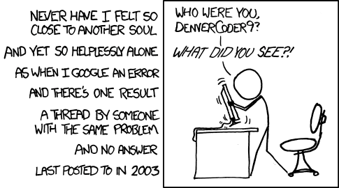
This is the big one. The secret you have been waiting for. How do “tech people” actually fix things?
The answer, of course, is a simple process.
They google the error and then follow whatever other people have tried.
Yes,
that’s all. That is how most of the errors get solved and how most
things get repaired and in fact, how most things are learned.
You
just google what you are trying to do and then spend some time going
through the answers. It might not be the first answer that helps you,
but chances are that somewhere in the first five answers, something
will.
The
art is within the right phrasing of the question. I’ll walk you through
an example: recently, my 3D software “Blender” started to display black
boxes instead of the usual interface. It was mildly annoying, so I
tried to fix it.
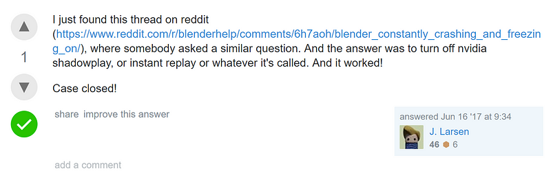
Here
is how you construct the google query: type the program name first,
then add a short and succinct description of what’s wrong. For instance:
“blender 3d displaying black user interface”. Here is what Google gives
me:
Click on the first answer.
And
I simply go to the first answer, which is a site called
stackexchange.com. It is a platform/ community where lots of tech
questions are answered and it is quite trustworthy. Reading the question
that someone else asked, I think that they have the same issue. And
behold, below there is an answer.
Turn off nVidia shadowplay, thanks J. Larsen!
I know that shadowplay is a program for my graphics card, so I turned it off.
It fixed the issue, no more black boxes.
If
I didn’t know how to turn it off, guess what: I’d google it (“turning
off nvidia shadowplay”). There are tutorials for everything online.
This principle works with any error message, too.
Just
don’t click it away angrily, look at it, read it and if you don’t
understand it, copy the exact words into Google, combined with the
software from which it came, for instance “windows 10 error 0x80200056”.
It looks like gibberish and I have no clue what it means, but other
people do!
Put it into Google, read the first answer (like seriously, read it like a really good recipe) and follow it.
Remember, you are quite unlikely to break anything, so just follow the steps.
Yes,
there is a chance that your problem is absolutely rare and unique. It
happens to all of us. We live with it. We reinstall the whole system. We
buy a new computer. But we can always say that we tried.
I’ll probably go into a little more depth on this next week, but for now, you have a basic understanding of your tech!
The more you fix and try and change, the more confident you will become.
Have you read Paid Applications Agreement, Schedule 2, Section 3.8(b)?
If
you’ve ever submitted an app to the App Store, you know the frustration
when Apple rejects your submission. Even more so when you thought you’d
followed all the rules. As it turns out, Apple can bury requirements
wherever they want, and it’s your burden to keep up.
About
a year ago, Apple started rejecting apps that didn’t comply with
Schedule 2, Section 3.8(b) of the Paid Applications Agreement, a verbose
list of self-evident truths about subscriptions. The Paid Applications
Agreement is a 37-page document that you had to agree to before you
could submit your app. It is only available via iTunes Connect in the
form of downloadable PDF.
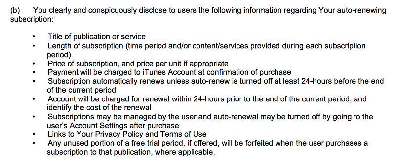
The actual contents of Schedule 2, Section 3.8(b):
I really like the part about privacy policies.
3.8(b)
requires that you “clearly and conspicuously disclose to users” all of
the above bullets. The first few items seem harmless enough but then we
start to get off into the weeds.
Apple
wants you to reproduce, “clearly and conspicuously”, all the details of
auto-renewing subscriptions. This information should be part of the
standard StoreKit subscription purchase flow. None of these bullets have
anything app specific to them. They are just boilerplate legalese.
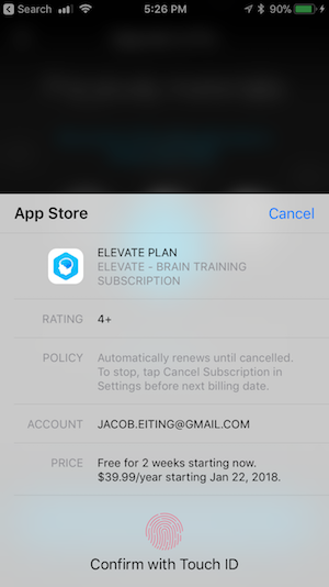
iOS’s purchase UI, more than enough information.
Apple
has an iOS level user interface flow for in-app purchases that is quite
good as of iOS 11. This view already covers most of the in-the-weeds
bullets, except telling users about the 24-hour renewal policy.
Requiring
every developer to implement their version of 3.8(b) is costly and
creates a fractured experience for the user. Apple should be putting it
in the standard sheet. But it’s Apple’s walled garden. When they say
jump, you say “fine, whatever.”
How to Comply With 3.8(b)
According
to recent rejections that I’ve seen (as of Jan. 8th, 2018), reviewers
are being more particular about what your purchase flow requires. From a
recent rejection:
Adding
the above information to the StoreKit modal alert is not sufficient;
the information must also be displayed within the app itself, and it
must be displayed clearly and conspicuously during the purchase flow
without requiring additional action from the user, such as opening a
link.
All
of the information in 3.8(b) must be “displayed clearly and
conspicuously during the purchase flow without requiring additional
action from the user, such as opening a link.” Your beautiful and
compact purchase flow must include in it, somewhere, nine bullets
written by a lawyer.
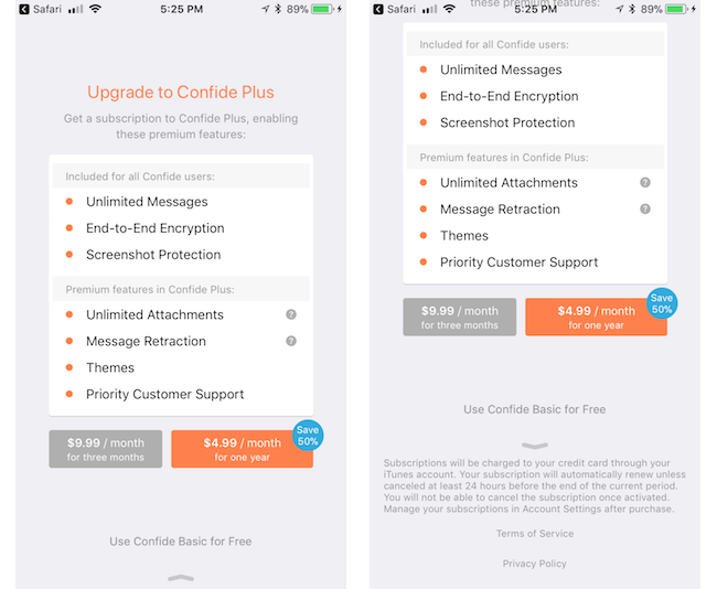
Confide, recently updated, achieved it with the following:
According to one reviewer, being below the fold with a leading arrow qualifies as “clearly and conspicuously.”
For another data point, I know of one recently rejected developer who had the same information, but in another view that was linked from the purchase flow with a button. This did not qualify (according to one reviewer).
A Template
Include a customized version of the following “clearly and conspicuously” in your purchase flow:
A
[purchase amount and period] purchase will be applied to your iTunes
account [at the end of the trial or intro| on confirmation].
Subscriptions
will automatically renew unless canceled within 24-hours before the end
of the current period. You can cancel anytime with your iTunes account
settings. Any unused portion of a free trial will be forfeited if you
purchase a subscription.
For more information, see our [link to ToS] and [link to Privacy Policy].
Put
it on the screen where you initiate the in-app purchase, below the fold
might be OK, but you might want to put something to lead users there.
UPDATE:
Readers are telling me it may also be required that you include it in
your app store description. It’s a much easier change to include so I
recommend you add it there to.
Why has Apple Taken a Legal Problem and made it Ours?
Apple
shouldn’t be burying submission requirements in the bodies of contracts
that nobody will read. If Apple wants developers to know something,
they should put it in the App Store Guidelines, HIG, or developer
documentation. The cost of making changes in a software project right at
the end can be astronomical. Dropping a bomb like this on developers at
submission shows a total lack of regard for our costs.
Why
didn’t they just update the iOS in-app purchase sheet? I speculate that
Apple discovered some legal exposure from in-app subscriptions and
fixed it with lawyers instead of designers. This problem could be
universally solved with an iOS update, but I think some side effect of
Apple being a vast, lumbering bureaucracy made forcing 3.8(b) onto
developers the more politically convenient path. Apple, if you are
reading this, please either update the iOS sheet or move the
requirements to the App Store guidelines, so fewer developers get caught
unawares.
RevenueCat
is the best way to implement subscriptions in your mobile app. We
handle all the complicated parts so you can get back to building.
Request an invite today at https://www.revenuecat.com/
MVP
is a great way for your app to find its early adopters, investors and
even customers. But, experience has shown that raw MVP without, at
least, tolerable UI and UX fails miserably. OK, but how much will MVP
app design cost me? Spoiler: not much. And you will be surprised with the result.
What
is the point of an MVP? To show off the core features of your app to a
target audience and investors before even starting the development. In
other words, to test the waters.
However, it doesn’t mean at all that you have to produce an ugly monster with absent UI. As one more crucial goal of MVP is to find your customers. Great UI in pair with convenient UX is your key to success.
But what is the cost of MVP app design? How much resources you have to spare on design purposes? Let’s find it out.
Preparations
To
get more or less decent design of your MVP you can’t just draw some
lines and boxes on a napkin and give it to a design company or
freelancers. Actually, you can do that, but it will cost you, and a lot.
We’ll talk about that further on. Now let’s get back to the point.
If you want to save time and, consequently, money it is a good idea to get prepared, prior meeting with a design agency. Wireframe and some mockups are pretty much everything you might need.
Moreover,
by presenting comprehensive app wireframe and mockups, you can be sure
that there won’t be any unpleasant surprises. As a hired freelancers or
guys from a contracted agency will know for sure what end-result they
are ought to provide.
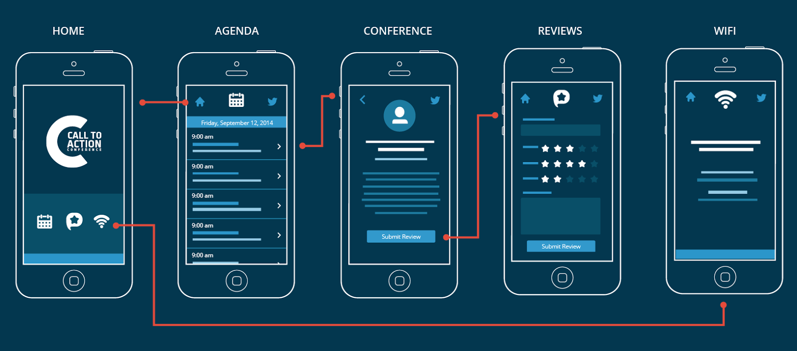
Wireframe of the app
A
skeleton of your app. That is a rough, or even drawn on a napkin
(yes-yes), layout of the navigation, screens and elements in your app.
It also outlines the core features of it. And the best thing is that you
finally have a, more or less, complete idea of your app.
Sure thing, making a wireframe is more than DIY-appropriate. Tools like Bootstrap may come in handy here. The coolest part is, that almost none programming skills are required. Only basic knowledge of HTML and CSS. And, probably, some video guides. :)
With
available templates, you’ll be capable of building a rough layout
within hours. Plus it is completely free. Unless you’ll require some
advanced templates. But you can always look out for those on the other
platforms.
Needless
to say, it will help a lot for the initial pitching session. Even if
you decide to entrust all this job to an agency — some minimum wireframe
would be very helpful prior approaching them.
On the average, wireframe might take 10–30 hours in development. It might cost you nothing if you’ll do it by yourself. But if you’re going to ask an agency — $500 — $3.000 would be a fair price, depending on the complexity of the app.
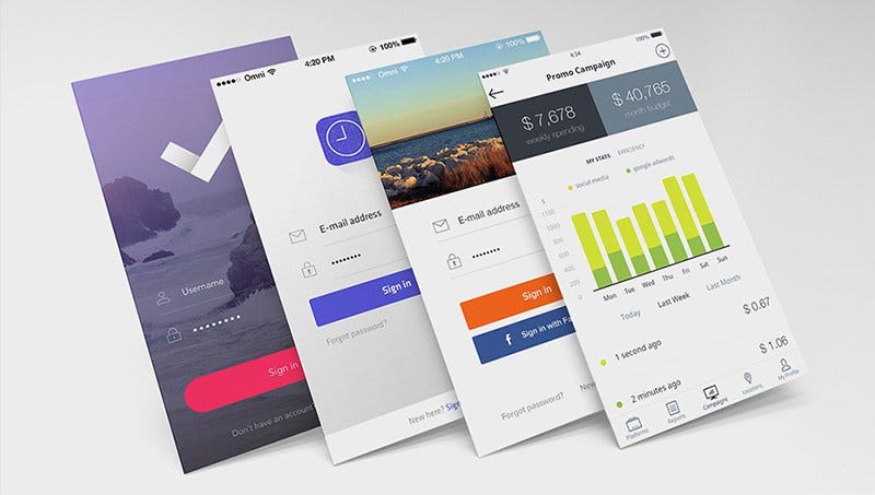
Mockup of the app
Mockup
is what your customers and investors will see. It can make them fall in
love with your app or drive them away. In a nutshell, that is an
approximate final look of your app.
There is a good rule for mockup estimation. Landing page will cost you around $500. And every additional screen will, usually, cost about $50–70.
Count the number of screens you are going to have. Simply add
everything to get the total price. That is the most common practice how
companies and freelancers usually charge for their services.
But what about DIY? Of course,if you are familiar with such great tools like Adobe Photoshop and Adobe Experience Design it
won’t be a problem for you to make a simple (or brilliant, depending on
your skills) mockup. Those are the most common and handy tools. And
while Photoshop will cost you $10-$20 (depending on the plan), Experience Design is completely free.
Interactive mockup
Speaking of simple mockups, there is a great way to improve those — interactivity.
Interactive mockup
— is a good chance for you to improve client engagement. Customers or
investors would better prefer interactive solution over a static image.
One more big plus — those are easy to spread over various devices.
Tools like Framer and inVision
are your best helpers here. They work pretty much like usual app
building platforms. Take your mockups, drag-and-drop different elements,
adjust navigation and features, et voila! Now you have it.
Interactive mockups cost just a slightly more than the usual
ones. You’ll just need your usual mockups and subscription for one of
those tools. Or you can give this job to the designers you’ve hired.
Anyway, additional expenses won’t exceed $100-$500. But potential profit may be a lot bigger.
Total price
Those blessed ones, who chose DIY way, might pay from complete nothing to a few hundred bucks (subscriptions, paid content, etc.).
And those who decide to hire somebody, might receive a bill on $1000-$10.000. Price varies drastically because of:
complexity of your app
desired features
region where you hire
One more good advice. Design agencies, usually, take fixed (and pretty high) price. Freelancers or outsource companies, on the other hand, often, charge onper hour basis.
So hiring few freelancers in India for $10/hour might be a good idea
for your wallet. But is it so when it comes to the quality?
Hardik Gandhi is Master of Computer science,blogger,developer,SEO provider,Motivator and writes a Gujarati and Programming books and Advicer of career and all type of guidance.