Programming & IT Tricks . Theme images by MichaelJay. Powered by Blogger.

Copyright

Facebook

Post Top Ad

Search This Blog

Post Top Ad

Responsive Ads Here

Archive

Post Top Ad

Contact


Editors Picks

Follow us

Post Top Ad

Fashion

Music

News

Sports

Food

Technology

Featured

Videos

Fashion

Technology

Fashion

Label

Translate

About

Translate

Sponsor

test

Weekly

Comments

Recent

Connect With us

Over 600,000+ Readers Get fresh content from FastBlog

About

Showing posts with label Technology. Show all posts

Sunday, January 28, 2018

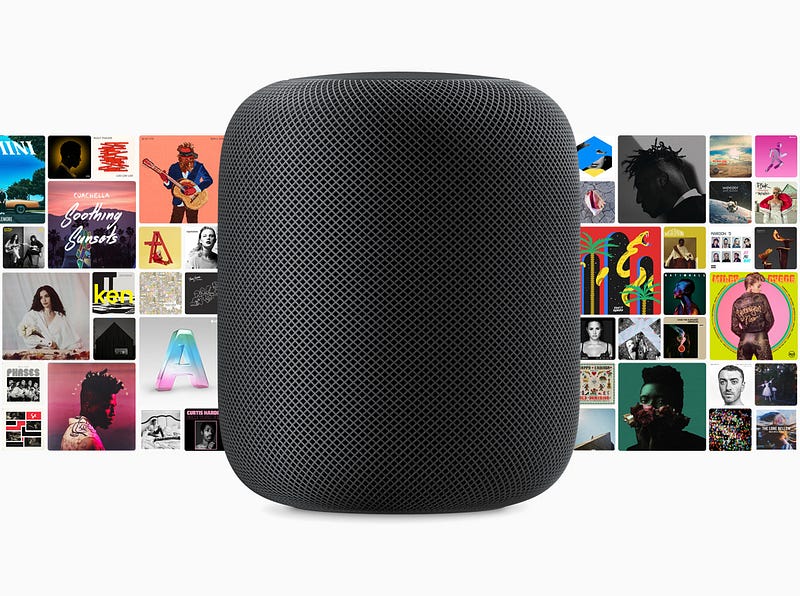
Up close with Apple HomePod, Siri’s expensive new home


Hello, HomePod. Image courtesy of Apple
If it were only a question of quality, Apple’s HomePod, which, after a months-long delay finally ships on February 9, should be an unqualified success. Its audio quality is excellent, especially considering its size.
Seven months ago, I sat is a small room and heard Apple’s 7-inch smart speaker play music for the first time. It sounded good, but the demonstration was short and lacking a key component of the smart speaker’s feature set: Siri integration.
Recently, though, I heard Apple’s HomePod again in a variety of scenarios and spaces. It sounded even better, especially when compared to larger Google Home Max and the aurally excellent Sonos One, the HomePod’s separation of sounds and fidelity to original instrumentation is astonishing.
This listening experience also added the smarts, or utility, that was missing back in June. Apple’s HomePod is, finally, a functioning Siri smart speaker.
Using the trigger phrase “Hey Siri,” HomePod responded to a variety of common Siri questions, activated HomeKit-enabled smart device tasks, and launched Siri-driven tasks, most revolving around Apple Music.
Put simply, Apple’s HomePod appears as good a smart speaker as most and a better audio device than many. However, it’s telling that Apple compares its first smart speaker to both the $399 Google Home Max and the $99.99 All New Amazon Echo. At $349, the HomePod is more expensive than virtually all of Amazon’s Echo line and most Google Home devices. The more comparably sized Google Home lists for $129.
This is a crucial moment for Siri, the voice assistant that now, according to Apple, has 500M monthly active devices. It lives in our iPhone, iPads and on our Apple Watches, but, until now, has never had a permanent place in the home. And it faces an uphill battle.
HomePod’s enters a crowded smart speaker market, one that Amazon owns, with a $350 product. This means Apple must work twice as hard to sell consumers on the HomePod’s ease-of-setup, standout audio qualities and its deep integration with the iOS, Siri and HomeKit ecosystem.
Does all that make it worth it? Let’s walk through some of the particulars and maybe you can decide.

Using the HomePod

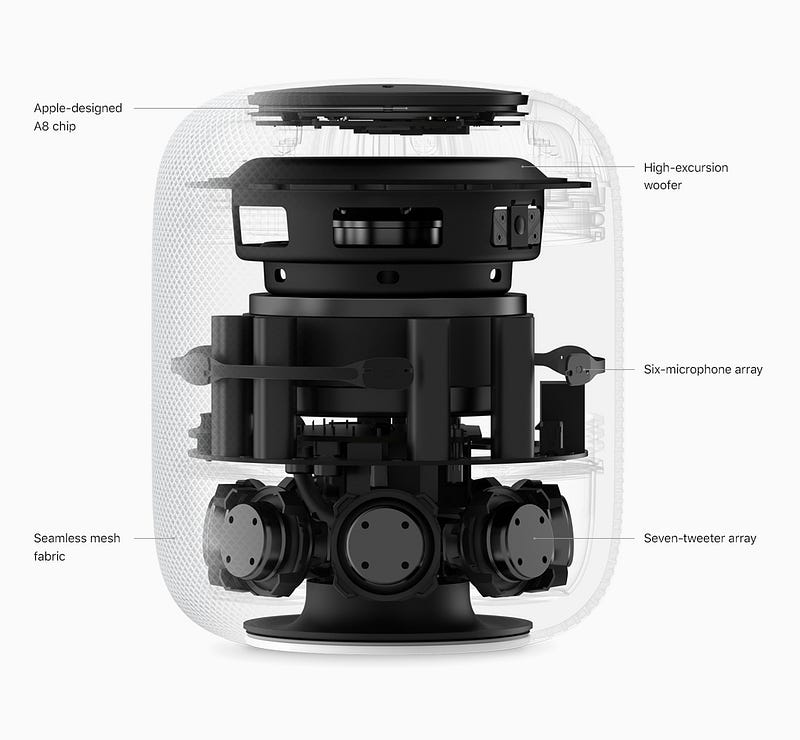
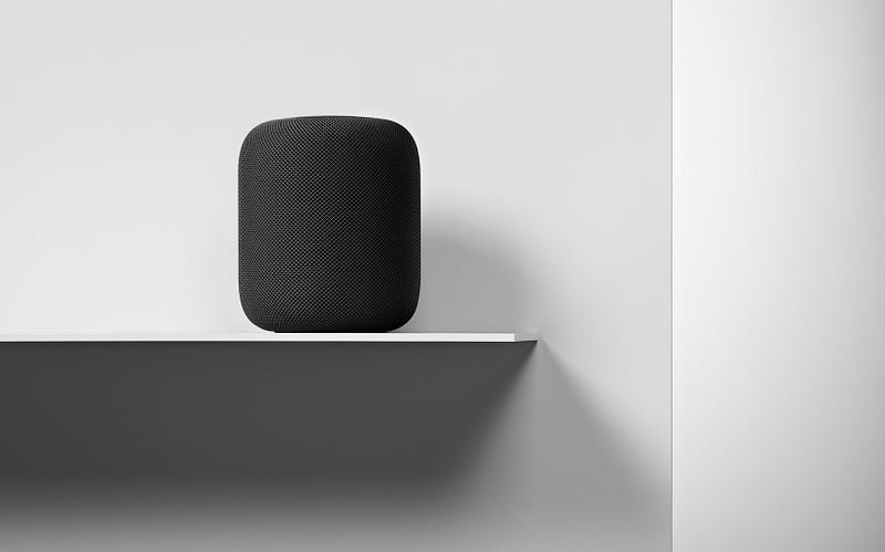
From the outside, the HomePod looks like a mesh-covered Mac Pro (it comes in white and space gray). Underneath, there’s a stacked array of audio technology, starting with seven horn-loaded tweeters at the base, a six-microphone array in the center and the sizeable woofer, with a claimed 22mm of travel, pointed straight up at the ceiling. Apple’s A8 chip handles the signal processing.
It is, in all an excellent hardware package that, unlike most of the other smart speakers, uses its own microphones to adjust audio for each listening environment.
The matrix of audio components is not inconsequential. In my listening party, songs like Ed Sheeran’s Shape of You picked apart the track, letting me hear both Sheeran’s guitar picking and the clarity of his voice. It was like he was playing in a small café for an audience of me. The bass notes on songs like Gregory Porter’s Holding On and Ariana Grande’s Side by Side were deep and resonant.
The HomePod setup process is as easy and fast as you would expect from an Apple device. With the latest version of iOS installed on your iPhone, 11.2.5, it will recognize the HomePod as soon as you put it near it. After that, the iPhone and HomePod steer you through a handful of settings including selecting the room where you’ll place the HomePod (it can get the list from the Home app, if you’re using it). It will also, with your permission, gather connections to your lists, reminders and will transfer all your iCloud and network settings so you don’t have to do things like manually enter user names, SSIDs and passwords. HomePod even grabs your Siri settings. Like a male voice? HomePod’s Siri will speak in that same male voice.
Then you get to the Apple Music portion of setup. Since Apple Music is the only natively supported music service, it’s pretty much your only option for streaming music, unless you use the HomePod as an AirPlay-connected speaker for your phone. At least every new HomePod comes with a three-month free subscription to Apple Music.
The combination of Siri and a smart speaker is quite compelling.
Since Apple Music has access to 45 million songs you can ask it pretty much any music question and get a good answer. From playing current hits, to finding a decent 80’s channel to playing various versions of the same song. The more you use Apple Music, the more it tailors responses to your preferences. I also noticed that, even with the volume at 90 percent, the HomePod could still hear when someone said, “Hey Siri, stop.”
Image courtesy of Apple
Apple updated Siri with a full-complement of Grammy-related responses, including playlists of the nominees and, after the Grammy Awards are announced, playlists of the winners. It’s a shame that the smart speaker doesn’t ship until after the awards show airs on January 28.

Siri house smarts

HomePod’s Siri integration works just as you would expect it to. You can ask Siri the latest news and it will launch a news brief from one of your favorite sources (CNN, Fox News, NPR). The white glowing spot on top of HomePod lets you know it’s listening. It has your weather update and can tell you if you need an umbrella. Siri has access to your reminders, so you can build a shopping list by talking to Siri.
It also lets you launch scenes with phrases like, “Hey Siri, Good Morning.” In the example I saw, that phrase triggered the raising of HomeKit-compatible blinds, turning on a coffee maker and raising the temperature through a smart thermostat. I like what I saw, but I don’t think the creation of Scenes in the Home app is as straightforward as it should be. I’m hoping Apple tears down and rebuilds the Home app, so it better integrates basic functions with automation and scene-building.
HomePod is also adept at sending messages to your contacts using only your voice and reading incoming messages back to you, as well. It also handles voice calls, but only as a speaker phone that accesses your WiFi-connected iPhone (you select the audio device on your phone). The Amazon Echo, can, by contrast, make calls to other Echos and those with the Alexa app without the need for smartphone.
Since Apple doesn’t sell information or let you buy products through the HomePod, it’s not interested in your personal information. They encrypt your queries and anonymize your personal data. Apple will even let you turn off “Hey Siri” listening, which means you must touch the device to launch a request (there’s also touch for volume control and mute).
Even with all these smart and home automation features. Apple believes most people use smart speakers like the HomePod for music, which is why it’s so surprising that it won’t ship with the ability to link up two HomePods as a stereo pair. Even after the February 9 ship date, you’ll have to wait for a software update to access that feature. If you do buy one or more HomePods, though, it’ll be worth the wait. Two HomePods playing just about anything is incredible.
What Apple has here is an ultra-high-quality speaker and the first physical instantiation of Siri without a screen. The fact that Apple is finally entering the smart speaker race is cause for muted celebration. It’s attractive, sounds amazing and is an excellent Siri ambassador. And it’s $349. Is better sound and solid iOS integration (plus the added cost of an Apple Music subscription) worth spending nearly four times as much as a decent sounding Echo?
Guess we’ll have our answer when the HomePod goes on pre-order this Friday.
Clarifications (1–26–2018): The HomePod does not support calendar. In addition, the iPhone call connection is over WiFi, not Bluetooth.

Saturday, January 27, 2018

How slums can inspire the micro-cities of the future


Using AI, pooled energy systems and blockchain membership, today’s deprived areas could become the innovation hubs of tomorrow. Image: Reuters/Danish Siddiqui

Soon, one third of humanity will live in a slum. Our cities are at breaking point. Over 90% of urbanisation this century will be due to the growth of slums. By the end of this century, the top megacities will no longer be London and Tokyo; they will almost all be in Asia and Africa, and they will be far bigger than the metropolises of today. Lagos is projected to have a population of 88 million. Dhaka: 76 million. Kinshasa: 63 million. The world is fundamentally restructuring itself.
What if there were a new type of city that is a better fit for this century? One that is more lightweight, light touch and adaptive than we’ve seen before. What if the future of our cities could come from the rethinking of slums?
Sustainable. Walkable. Livable. These terms are often used to paint visions of our preferred urban future. Yet the formal notion of a city is quite calcified; it’s heavy and clunky and inflexible. Cities today lack the flexibility to absorb emerging radical possibilities. What good are new solutions if the system can’t absorb them?
City leaders across Asia and Africa are looking for solutions for their cities. What if they found them in the most unlikely of places: their slums? The informality of slums creates a white space from which a new vision for urban living could emerge — and that’s where the concept of microcities can begin to take root.
Slums don’t have to be a glitch, or a problem. They can be an asset. By considering urban living at the human scale, and from a bird’s eye view, we can redesign slums as more liveable, lightweight and adaptive places. Places that are a better fit for the modern world; places in which a diverse group of citizens can not just survive, but thrive.

What is a microcity?

A microcity is a framework for urban reform. It has three core elements:
1) A microcity is a conversion of an existing slum.
2) It is a semi-autonomous, privately owned and operated Special Demonstration Zone (SDZ) for up to 100,000 inhabitants.
3) Each microcity is designed using integrated solutions. They are urban laboratories in emerging cities in Asia, Africa, and Latin America that will become testbeds for more agile approaches to healthcare, governance, education, energy provision and every other aspect of city life.
City governments will have three main roles to play. First, they can help identify the slum area to be converted. Secondly, they have to lay down the main arteries — the main roads into the area, along with the necessary infrastructure. Third, they pass a resolution establishing the microcity as an SDZ — a semi-autonomous area, similar to a Special Economic Zone, which becomes an innovation lab to test new forms of technology and governance.
Have you read?
Designing microcities involves several core principles. First, we’re using emergence theory — which looks at how simple rules and concepts give rise to complexity — to understand how slums and cities evolve, and we are developing algorithms to both analyse and design the microcity.
We’re placing humans at the centre of the design. Behavioural science can teach us a lot about how people best experience their cities. We start with the human’s experience in the microcity and then wrap the design of everything else around this.
Next, we are using modular, plugin solutions to the challenges of city living that can scale easily. What happens when energy production is integrated and can be exchanged between 100,000 people? What happens when private car ownership is banned and everyone shares podcars (small, automated vehicles)? What happens when creativity is unleashed through experiential education?
In designing microcities, we are also looking at how to reduce the friction generated by city living. One way is to automate; another way is to cluster. Imagine a single mother who needs to navigate work, parenthood and a social life each day. How can we make her life easier? Imagine if all her essentials were clustered in one area. And the design of every aspect of the microcity — its form and function, governance, energy and waste management, for example — will adhere to the circular economy model.
So what will a microcity look like — and what would it be like to live in one? A microcity will be a semi-autonomous area within its city, using a blockchain-based governance system that decentralises and automates much of its administration. It would feature a blockchain-based membership system, for example, that offers access to all key functions through member service hubs that become its inhabitants’ key point of contact for almost everything.
As well as connecting citizens, the microcity’s software would also work seamlessly together.
Imagine a healthcare system that takes care of 85% of people’s health needs through micro health clinics. Or a school system designed for the modern era, which focuses on project-based education. Or a food system that prioritises lab-grown food and industrial community kitchens, with a financial system that provides branchless banking. And, of course, free and fast wifi that connects everything and everyone.
The physical infrastructure would be designed with the same principle — connectedness — in mind. Energy systems that can run on their own solar microgrids, and which are integrated throughout the microcity. A transportation system that prioritises shared minibuses and podcars. A built environment that is largely prefabricated. Skinny streets that limit and slow traffic, giving the streets back to the people and enhancing a sense of community. The microcity will be strengthened by turning those who participate in it over time into shareholders. This will align inhabitants’ incentives to contribute to and improve their microcity.
Decentralising governance is another major building block. To help create a more light-touch city for this century, we’re exploring blockchain and artificial intelligence as tools to enable three things: (1) streamlined access to services (2) partially automated backend governance and (3) liquid democracy on many matters. Every microcity in the world will share the same systems, and will be able to interact with each other smoothly.

How will this benefit microcities’ inhabitants?

We see a pattern globally of slumdwellers being left out. Though they are contributing to their cities as the lifeblood of the services industry, they are seen as illegitimate, disconnected citizens. The microcity model is an attempt to change that. Where those living in slums were once undervalued non-citizens of their cities, they can now participate in creating the cities of the future.
So what’s next? We’re launching the first microcity in partnership with the city of Ulaanbaatar, the capital of Mongolia, and many of its leaders. We hope this joint venture will demonstrate to mayors around the world what they might do to repurpose their slums and, while doing so, create the future of urban living.
This will be the first in a global network of microcities. Our vision is to help establish 100 microcities that will be connected — through their economies, governance systems and identity — in emerging cities across Asia, Africa and Latin America.

Designing Atlis, the future of local search


How Rainfall approaches all clients as an extension of their team.
Atlis is the next generation of local search, a platform where its community can get real, personalized recommendations for almost any type of business simply by asking. In essence, Atlis has brought word of mouth recommendations to the digital space by rewarding quality interactions from its users with cash, status, and most importantly a trustworthiness score.
When Rainfall was first approached by Atlis in the Spring of 2015, that product vision had not yet been created, or in better words, discovered. The story of our partnership is a journey that includes the creation of a product, a brand, and a new behavior from scratch through constant iteration, testing, and deployment.
Our approach to the next generation of branding
At Rainfall, we call projects like Atlis “full brand expressions” because we have the ability to affect every visual element and touchpoint, not only defining the rules for how the brand is presented, but literally designing each and every component in company’s suite whether it’s printed, on the web, or in the product itself.
When developing any large system we design multiple pieces simultaneously in order to test ideas on a broad scale. Sometimes a particular approach will work well in one situation but not adequately characterize the overall language of the brand. Working holistically allows us to spot those situations and find effective solutions earlier in the creative process.
Creating a full expression involves understanding how the visual language works as part of the narrative fabric without interrupting the audience’s ability to engage. This is especially true in the digital space, as each platform serves a higher purpose than simply communicating the brand’s visual identity. Atlis’s interaction model and methods for information hierarchy are themselves components of the identity, so on the web and in the product those elements are of highest importance.
Here’s a look at what we created together with Atlis.

The Atlis Visual Identity

Atlis helps users make decisions

At the start of our engagement Atlis existed as a big idea and a product MVP. The working idea was that they could be the ultimate platform for users to get trusted recommendations for businesses through a network of their peers. At the time the mechanism for bringing that idea to live was not yet complete, but there was a strong enough narrative structure in place that we could strategically build a brand, a “favorite” between two options.
The Atlis logo, a heart between two dots, symbolizes the platform’s aim to help it’s users make informed decisions when given multiple options. It is quite simply the love that one shows for one business over another. This mark fits with the company’s aim to strike friendly relationships with both consumers and businesses in order to create a platform that is mutually beneficial.

The Badges

At this point Atlis had a visual presence but lacked the personality required to excite its audience and encourage them to engage. As part of a larger strategic exercise in gamification we developed a series of badges to reward users for their participation and become the face of the brand.
We considered all of the individuals that compose the fabric of an urban neighborhood to conceptually link each badge to a stage in one’s knowledge of the businesses nearby. Each badge memorializes the journey of discovery while also putting a face on Atlis.

The Atlis Product

Central to Atlis is its mobile product, the main platform on which community members ask for advice finding businesses or respond to others with their own recommendations. As a concept the experience design is simple. There is a flow to ask for advice, a flow to view and respond to other users’ asks, as well as the necessary user and business profiles.
What started as a simple task of designing each of these flows developed into an approach of constantly iterating to optimize interaction and effectively display large amounts of supporting information.
The Ask Flow
#AskAtlis was a term coined early in the project that embodied the ease by which users would seek information. Our job was to deliver on that promise of ease by making the Ask flow as effortless as possible.
In early versions an Ask was just one step. The user would define what type of business they were looking for, write a brief supporting question, and confirm the preferred location all at once. While this seemed easiest we found that breaking that process into three focused steps resulted in a greater number of Asks and better insight into specifically what users were looking for.
The Response Flow
With over 20,000 users, recommendations begin to roll in almost immediately. Asking is only half of Atlis’s equation, and our main concern when testing the concept was that no one would respond as those Asks came in. Our approach was to make responding just as easy as asking, but with the added support of contextual information. When users opt to provide a recommendation Atlis suggests businesses that they have previously recommended or visited aided with additional context clues such as time of day, current location, and how long ago their last visit was.
Enticement
We knew that making it easy for users to respond wasn’t going to be enough, so we wove gamification into the core of the product experience. Each interaction with Atlis is an opportunity to earn points, increasing one’s standing within the community and represented with the badges developed as part of the identity. For additional appeal, users are rewarded in cash when someone acts on their recommendation and visits a business.

Trust

With a platform for recommendations involving status and cash we soon found it necessary to develop a means by which users could evaluate the advice from others. Were users thoughtfully suggesting businesses or were they recommending a place that they figured the asker would visit for other reasons? We wanted to create a democratized system in which users held each other accountable for good advice and where trust is earned through positive engagement with the community.
A simple thumbs up and down system encourages users to give their opinion as to whether advice is relevant to the asker’s intent. Users who give thoughtful advice increase their trust score, those who try to game the system will see it decrease, simple as that.
Available anywhere
We need to cater to everybody, from longtime Atlis community members, to newcomers, to businesses owners claiming their profiles. This means that Atlis takes on many formats and exists in various contexts throughout the course of a single day or a single user’s journey.
A full application suite serves this purpose, including a responsive web product, mobile apps, marketing landing pages, and soon more. For the web, every element is fully responsive with content and interaction models that adapt to contextual information including location and time.
The result — a positive experience for businesses
Atlis is extraordinarily beneficial for its users because they can finally get real recommendations from locals and friends who know their neighborhoods. With the addition of more ubiquitous touchpoints and machine learning currently in development, the quality of information will continue to increase.
The value that Atlis is creating is just the first step in ensuring a more positive ecosystem for businesses. Businesses can make themselves discoverable to new clientele without average ratings and negativity, while leveraging satisfied customers to promote their businesses.
Rainfall’s close partnership with Atlis resulted in a consumer brand and product suite with wild initial success. It is a demonstration that our approach of honesty and mutual respect with clients leads to work that engages users and encapsulates the brand’s ideals.


Friday, January 26, 2018

Switching from iPhone 7 to Google’s Pixel 2 XL


The Google product lineup
I recently spoke to a friend who said he “didn’t care about what a phone looks like anymore — they’re all the same”. It’s true; pretty much every phone looks like the same cold, lifeless slab of glass and aluminium. Even Apple’s iPhones, once lauded for bringing hardware design to a higher level, have started to feel boring. It seems like the looks of a phone played a way larger role a few years ago. Now, we want a phone that works well and takes great photos.
Google’s announcement of the Pixel 2 phones, Google Homes, the creepy camera, the VR headset, their Pixel buds, speaker and laptop/tablet hybrid made me think of Dieter Rams’ work for Braun—although the great Teenage Engineering also popped up.
Rams has created or overseen the creation of numerous products for Braun. Most, if not all these products, have a certain elegance and timelessness, mostly due to their materials, the sparse use of colour and typography, and their ease of use.
Without lingering on it too much, I think this line of Google products is close to achieving the same thing. Their speakers and Home products look like furniture that will seamlessly blend into their surroundings. Their phones feel like—bear with me—a useful utility made for a human being, rather than a brick of computing power. From a product design point-of-view, the look of these products is an exciting development.
If you’re interested in reading more about Google’s hardware design, have a look at this article on Design Milk.

The Google Pixel 2 XL

On size and battery life

I’m not going back to 4.7”

One of my fears was that the phone would be too big. I’ve been an iPhone user since the iPhone 4 and have never chosen the larger model. After six weeks with the Pixel 2 XL, I don’t see myself going back to a small phone anytime soon.
While comparing the Pixel 2 XL to the smaller version, I noticed the difference in size between the two is minor. I’d say the Pixel 2 is more awkwardly sized than the XL version, and the XL gives you a lot more screen. It runs all the way to the edges, while the screen of the smaller version reveals larger bezels. Even if you have small hands, it might be worth holding both before deciding that a big phone is not for you. I worried it might slip out of my hands, but the Pixel 2 XL has an aluminium body and the matte coating provides more grip.
I’ve enjoyed the larger screen a lot so far. Reading articles on Instapaper’s black background is very immersive. The edges of the screen seem to disappear completely. With this phone I’ve done more reading in the Kindle app than I used to, and watching YouTube or Netflix in fullscreen is great.
Instapaper in fullscreen

One charge every two days

My iPhone 7 running iOS 11 was a shitshow when it comes to battery life. I had to charge it around 8pm every evening if I wanted to keep it on until bedtime.
The Google phone’s battery lasts me so long I can afford to forget charging it. On a full charge I can use it for at least a full day. That’s snapping photos and Instagram stories, sending messages on Telegram or Whatsapp, listening to podcasts for about an hour, a Headspace session, and reading an article or chapter of a book here and there. I’ll go to bed without having thought of charging the battery. When I wake up, it’s usually at 55%, lasting me another day before charging it the following evening.

From iOS to Android

Many friends mentioned being “locked into the Apple ecosystem”. For me, switching was as easy as or easier than switching from one iPhone to the other. The phone comes with a dongle you can plug into your iPhone. Within half an hour it has copied your contacts and whatever apps you’ve decided to keep, provided they are available for Android.
After switching I realised I’m more locked in to Google’s ecosystem than I am into Apple’s. I use Google Maps, Google Mail, and Google Photos, as Apple’s offering has sucked on those fronts for as long as I can remember. I only used iCloud to sync iA Writer documents between my phone and computer, but using Dropbox instead was a piece of cake.

Nifty details and customisation

I had a ton of duplicate contacts on my iPhone for whatever reason. Deleting them on iOS is a pain, so I never got around to it and accepted a contact list three times the size it should be. After importing all my contacts, the Google phone first asked if I wanted to merge all my duplicates in one tap. Aces! ✨
It’s details like those that make the Android OS a delight to work with. The control centre is customisable — I know, Apple also introduced that recently — and if the keyboard is not to your liking, you can choose a theme (light, dark, with or without button shapes) that better suits you. It listens to music playing around you and provides you with the song on your lock screen, which is scary and more convenient than I’d imagined. You can choose to set several widgets on your home screen; my calendar widget shows me my next upcoming appointment, if available.
If you feel like going all-in with customisation, you can tap the phone’s build number 10 times to enable developer mode. “You are now a developer!”, it’ll say, after which you can customise even more things, like the speed of animations. I won’t encourage messing too much with those, but the fact that the OS has numerous ways of customising it to your personal preference is a big plus.

Squeeze for help

The Google Assistant — which you can bring up by long pressing the home button or squeezing the phone — is a gazillion times better than Siri. I actually use it now and, occasional screw ups aside, it’s very accurate. Also, you can squeeze the phone to bring up the Assistant!
😏
At home I use a Chromecast Audio to stream music to my speakers. Pairing it with an iPhone was pretty OK, although it did force me to turn Spotify or wifi on/off on a regular basis. With the Google phone, connecting is instant and I haven’t had any problems. I wouldn’t expect otherwise from one Google product talking to the other, but it’s nice nonetheless.

Swiping and squeezing

Fingerprint sensor and NFC payments

The fingerprint sensor is on the back, conveniently placed for your index finger. Swiping down on the scanner brings down the notification/control centre. When the phone is on its back, you don’t have to pick it up to see your notifications. Double tap the screen to light up the lock screen and see if you have any. The way notifications are displayed on the lock screen minimises my urge to open apps, which is a plus.
Photo: Mark Wilson (Fast Co Design)
The phone has a built in NFC chip, so I can now use it to pay at PIN terminals. I had to install an app from my bank to enable it. After that I could hold it near a terminal once the cashier had entered the amount. It has proven to be quicker than pulling a card out of your wallet, and it has worked without fault almost every time.

Photos of my food have never looked better

The camera is great. I’ve taken some photos in low light and they come out very well. It has a Portrait Mode, which blurs the background and leaves you with a nice portrait. Much has been said about the difference between Google and Apple’s portrait mode (one being software-based while the other is created by hardware), but I don’t see or care much about the difference. I’m not going to use this phone for professional photography. I just want to take a nice picture of my girlfriend or a plate of food now and then, and it more than does the job for that.
A photo in low light and Portrait Mode used on a bowl of ramen

Google Lens

The camera has Google Lens integrated. Snap a photo, hit the Lens button and it will try to find whatever it sees in the photo. Again, this works very well and has been convenient for looking stuff up now and then. It’s also built into the Google Assistant, allowing you to open the camera and tap anything you’d like to find more information about. See below.
Google Lens integrated into Google Assistant ✨

A note on apps

The only apps I’ve missed so far are Darkroom, for editing photos, and Things, for my to-dos. Luckily, Things recently added a feature that allows you to email tasks to your to-do list, so that helps. It’s a bit of a bummer that I can’t look at my to-dos on my phone — and judging by Cultured Code’s development speed, an Android app might be scheduled for 2022 — but it’s not that big of a deal. For editing photos I’ve simply switched back to VSCO.
I used iMessage with my girlfriend and 6 other friends, and have switched to Telegram or Messenger with them. This might be a hassle if you’re all-in on iMessage, but it was hardly an issue for me.
Google’s apps are high quality and I enjoy using them. Some apps from third-party developers have proven to be a little less great than they are on iOS. Instagram’s compression on videos taken with an Android phone is lousy, for whatever reason. Instapaper crashes more often than I’m used to, and it expresses the time it takes to read an article in a range of dots instead of minutes. I have no idea why an Android user would prefer that. Goodreads is an absolute mess on Android, but that’s no surprise.
Watching videos on YouTube in fullscreen is glorious 👌
I’ve found a worthy replacement for the iOS Podcasts app in Pocket Casts. For email and my calendar I use Outlook — which is basically Sunrise, rest in peace—and I’ve been keeping my notes in the great Dropbox Paper more often. The Twitter app on Android is fine (as it is on iOS). Google’s Inbox is great for email too.
Overall, the Material Design language does make well-designed apps more fun and immersive to use. As Owen Williams put it:
Apps are full of color, playful animation and fun design flourishes. Where iOS has become flat, grey and uniform, Google went the opposite direction: bright colors, full-on fluid animations and much, much more.
Aside from this, apps are able to integrate more closely with the OS. A good example of this is that Spotify, Sonos or Pocket Casts can show on your lock screen persistently, allowing you to skip or pause playback. Overall, I’m finding the Google ecosystem to be much more pleasant to work with than Apple’s, and agree (again) with Owen that Google is eating Apple’s ecosystem for lunch.

TL;DR — I am very happy with this phone

The Google phone is here to stay. I’m not tempted to go back to iOS, as I haven’t missed it since I switched. If you’re considering making the switch, I’d fully recommend the Pixel 2 XL 🔁
I’m currently tempted to purchase a Google Home Mini and might even replace my Apple TV (which has mostly been an expensive disappointment) with a Chromecast. Slippery slope.
I look forward to see what Google will do on their next iteration!

Wednesday, January 24, 2018

No Cutting Corners on the iPhone X


When the iPhone X launched, a lot of designers were put off about the screen shape. Those complaints have mostly died down, but I haven’t seen much design-nerd talk about cool corner treatment details. Fortunately, deep nerd shit is my specialty.
iPhone X screen shape

What’s Your Angle?

When you’re starting a design like this, the obvious, and comically cheaper option is to make all corners square. Machines exist and/or are calibrated to make those screens, so keeping edges squared requires fewer manufacturing changes and less talent along the pathway to production.
Everyone knows how to make a right angle — designers don’t have to do math, engineers need fewer calculations, the people making the machine are clear on what to do.
And yet, let’s examine how crappy all-square corners would look:
I’m a pixelated bear cub. Rawr.
Once Apple knew they wanted to take advantage of new full-screen technology, that gave them the opportunity to alter screen shape because they would need to address the manufacturing process anyway. Presumably, the expense was mostly built in.
Still, there were lots of ugly ways to do this:
Meh.
This is where they landed:
That’s better.

Screen Corners

Here’s where the nerd part comes in, iPhone X rounded screen corners don’t use the classic rounding method where you move in a straight line and then arc using a single quadrant of a circle. Instead, the math is a bit more complicated. Commonly called a squircle, the slope starts sooner, but is more gentle.
The difference is real subtle, even in gif-form, but here we go:
Difference between common rounded rectangle maths and Apple maths.
Apple has been doing this to the corners of laptops and iMacs for years, but this type of rounding didn’t penetrate iOS until version 7. This shape has classically been difficult to achieve, because it wasn’t available in 2D design editors, though that’s starting to change. Read about it more detail here.

The Notch

Now let’s talk about the notch itself. The left and right sides have two rounded corners. Because of the curve falloff, one curve doesn’t complete before the next one starts — they blend seamlessly into each other. As a result, no tangent line on this edge actually hits a perfect vertical.
Ooo. Fancy.

Come Correct

iPhone X templates I’ve seen out there don’t 100 percent duplicate the official shape, probably because it was either too hard to make or they haven’t noticed. This is why it’s good practice to use official assets from Apple, found in the design resources section of the developer site for creating icons and mockups.
Future iterations of this design will surely alter these sizes, so it will be interesting to compare how hardware sensor evolution impacts design shifts.
Overall, these decisions seem minor, but from a design viewpoint they’re fairly opinionated. Even when designers are willing to spend social capital to push these ideas, most organizations won’t put resources behind them.

Rounding the Bend

One of the things I love about indie apps is their ability to be opinionated. It’s nearly impossible to ship strong viewpoints from larger companies where there are fifty people in a room examining angles. So it’s cool to see Apple still has the ability to take a strong stance in this way.
Sweating thousands of minor details is what separates Apple from other companies. Their ability to do that is hard-won, but damn it’s pretty to watch.

Tuesday, January 23, 2018

Simple App Ideas: How to Find the Next Big Thing


Originally published on http://www.appsterhq.com/
When it comes to building mobile apps, app makers tend to overcomplicate their ideas and strategies.
The app winds up becoming a clunky Swiss Army knife — one that offers too many features, is difficult to learn and use, and costly to maintain.
But when we think about successful apps, it’s often the simplest ones that come to mind — apps like Dropbox and Evernote that address a pressing pain point, yet are effortlessly easy to use.
As Steve Jobs famously said:
“Simple can be harder than complex: you have to work hard to get your thinking clean to make it simple. But it’s worth it in the end because once you get there, you can move mountains.”
Below, I’ll share about tried-and-tested strategies that I’ve used to help startups and entrepreneurs at Appster come up with simple app ideas effectively.

1. Train yourself to become an idea machine:

How do you get better at coming up with app ideas?
The answer, according to entrepreneur, best-selling author and podcaster James Altucher is to become an idea machine.
In Altucher’s words, it’s akin to being a superhero, where you’re never at a loss for ideas — regardless of whichever situation you’re in or whatever questions you’re thrown at.
If this sounds unrealistic, it isn’t — but it does require plenty of practice. Here’s a quick roundup of Altucher’s tips for becoming an idea machine:

How many ideas should you come up with each time?

10.

Why 10 ideas?

Most of us wouldn’t have much difficulty with conceiving a handful of ideas, even if it’s centered around topics that we don’t usually ponder about.
But after the fifth idea is just about when it gets challenging — where we find ourselves at a loss for ideas.
The point of the exercise is to break through this stage in order to build up your idea muscle.

How can you assess your ideas?

You can’t, and evaluating your app ideas isn’t the priority at this point in time. Says Altucher:
“You have to try multiple ideas and see which ones gets the excitement of customers, employees, and you can see that people are legitimately using it and excited by it.”

What are topics you can start brainstorming on?

The key here is to have fun with the ideation process, so don’t limit yourself to business-related ideas.
It helps to think out of the box, and conceptualize ideas around topics like “10 ridiculous mobile apps I would want”, “10 ways an app can solve a problem that I’m facing”, “10 mobile apps that I can reinvent” or “10 mobile apps I would improve”.

How long does it take to become an “idea machine”?

Altucher suggests doing this daily for at least six months.

2. Hone your problem-solving skills

How can app makers go about finding the right idea for their startup?
Daniel Kempe, founder of hand-curated content suggestion platform Quuu elaborates in a Forbes article:
“It’s not about the search for ideas, it’s identifying problems or gaps with existing products or services. Ideas are tough to come by, at least good ones are. But problems, they’re everywhere! Almost every product or service you use on a daily basis was created to solve a problem.”
Here four strategies you can use to hone your problem-solving abilities:

2.1. Review problems you face on a day-to-day basis

The first place to start is by identifying problems that you encounter on a day-to-day basis.
It can be difficult to come up with ideas in a brainstorming session, so start by observing any moments of frustration you have throughout the day — whether it’s an interruption or delay that occurred at work or a problem that crops up in your personal life.
At first glance, these issues may appear to be minute or mundane — but resolving a personal problem has been the launching point for apps like Dropbox and Summly.
The idea for Dropbox arose out of co-founder Drew Houston’s frustration with the absence of a seamless storage solution for his files, while Summly was conceived when founder Nick D’Aloisio found it inefficient to click through Google search results while preparing for his exams.

2.2. Pay attention to everyday conversations

Everyday conversations and seemingly banal complains can become a source of inspiration.
Try carving out a block of time — say five days to a week — where you pay close attention to and note down problems that crop up in conversations all around you. “I wish this could be better”, “I hate this…”, “Why does this keep happening…” are some phrases you’d want to prick your ears up for.

2.3. Tap on social media

Social media platforms are a great way to find out about larger scale problems encountered by individuals and communities all around the world.
There are different ways of conducting a search via social media: you may create hashtags around the problems you’ve picked up on through the above methods, or come up with a list of hashtags around topics or problems that you’re concerned about.

2.4. Go to where your potential users are at

Blog articles, blog comments, forums, discussion boards, Quora — apart from being a useful source of information, these sites are also a great way to interact with potential users or target audience.
Take note of common problems and issues that are being discussed, and don’t hesitate to post comments or start a new thread around any questions you might have — this could spark off conversations that will shed light on problems that you weren’t previously aware of.

3. Keep a close watch on your competitors

A competitive analysis should be carried out at several stages over the lifetime of a mobile app: during the ideation process, before significant changes are made to your app or business strategy, and at regular intervals to keep up with changes in the competitive landscape.
Below, I’ll be focusing on competitive analysis conducted at the ideation stage.

Pay attention to user feedback and comments

User feedback and comments are a treasure trove of information. Start poring through reviews and ratings left by users of your competitors’ apps — from app store reviews to social media comments and forum posts — to obtain a clearer idea of features and strategies that resonate with your potential users.
If you’re in the midst of sounding out your ideas with friends and family or testing your MVP, keep an eye out for remarks like “I’ve tried out the ABC app, but didn’t like a particular feature they had” or “This feature reminds me of XYZ app” — you’ll know that these are competitors to keep track of.

Dig deep into your competitors’ strategies

By delving deep into the strategies implemented by your competitors, you can then break these down into simpler elements, and reverse engineer the processes to replicate their success.
The objective here isn’t to imitate what your competitors are doing, but to combine their strategies with your existing ideas to create concepts and features that work for your app.
Here’s a checklist of questions to help you get started on your research process:
  • Which strategies have produced the best results for your competitors?
  • What were unsuccessful strategies implemented?
  • How can you improve on strategies your competitors implemented?
  • How can you adapt these strategies to make it work for your mobile app?
  • Don’t forget about indirect competitors
While your indirect competitors may not have launched a mobile app, they are still targeting a similar set of users — so it helps to pay attention to how they’re attracting your potential users with their products or services.
Here are key questions to guide you in your analysis of indirect competitors:
  • In what areas are their products or services similar to yours?
  • What are successful strategies and ideas that have helped them target and retain their users?
  • How can these strategies be improved on?
  • Can you adapt these ideas or concepts to make it work for your mobile app?

4. Stay on top of the latest trends

The ever-changing mobile landscape is a challenging space to navigate.
App makers are up against the intense competition — a 2017 Statista study indicated that Android users were able to choose between 2.8 million apps, while the number of apps on the App Store totaled at 2.2 million.
In addition, the emergence of trends like augmented reality, virtual reality and chatbots are revolutionizing the way users engage with mobile apps.
Strategies and features that are effective now may easily be rendered irrelevant in a matter of months. Generating ideas that resonate with today’s users requires a constant pursuit of keeping up with the trends.
Here are a few tools and websites you can use to stay on top of the latest developments:
  • Google Trends
  • Google Alerts
  • App Annie: App market data and insights company producing consumer and competitive information on downloads, revenue, ratings, usage, search terms and more. App Annie’s Insights Blog and webinars are also great resources for app makers.
  • Priori Data: App Store intelligence company providing market data and competitive benchmarking information on the global app economy.
  • Forrester Research: Market research firm providing advice on existing and potential impacts of technology.
  • Trendwatching: Independent trend firm scanning the global market for promising consumer trends and insights.
  • Springwise: Provides information on innovation intelligence. Springwise sources for the latest innovation, startup, and business ideas from around the world.
  • Trends and mobile apps outside of your industry
Too often, startups and businesses fall into the trap of living within the industry bubble. In adopting a myopic focus on industry trends, benchmarking and best practices, companies eventually wind up providing run-of-the-mill experiences that fail to stand out.
This can be prevented by studying and introducing ideas and concepts from industries, businesses or mobile apps that differ from your own.
Here are key takeaways you can gain from studying mobile apps across different industries:
  • Zappos: Zappos is known for delivering stellar customer experiences, and its mobile app is no different. App makers can learn about providing top-notch experiences through studying features like Ask Zappos, a feature that helps users find any product with just a tap of their camera, and Handover, which enables users to shop seamlessly between their Apple devices.
  • JetBlue: Pesky push notifications are a bane for smartphone users. Learn from JetBlue’s timely and thoughtful communication, which includes providing flight check-in reminders 24 hours before a flight is scheduled to take off, as well as notifications to let passengers review flight entertainment options in advance.
  • Venmo: App makers can learn from the convenience and efficiency that mobile payment apps like Venmo provides — from the way user information is saved for easy access, to how a complex process like sending out money or making purchases can be completed in a few quick taps.

Interested for our works and services?
Get more of our update !