Programming & IT Tricks . Theme images by MichaelJay. Powered by Blogger.

Copyright

Facebook

Post Top Ad

Search This Blog

Post Top Ad

Responsive Ads Here

Archive

Post Top Ad

Contact


Editors Picks

Follow us

Post Top Ad

Fashion

Music

News

Sports

Food

Technology

Featured

Videos

Fashion

Technology

Fashion

Label

Translate

About

Translate

Sponsor

test

Weekly

Comments

Recent

Connect With us

Over 600,000+ Readers Get fresh content from FastBlog

About

Showing posts with label Development. Show all posts

Tuesday, January 16, 2018

5 App Monetization Trends To Watch In 2018


Which trends will shape app monetization in 2018? As the world becomes better adapted for mobile, developers will benefit from greater revenue than ever before. However to do this they must balance the needs of the user with app monetization practices.
We’ll look at five trends that will influence the way that app monetization will work in 2018.

App experience will become more important for developers relying on ads to generate revenue.

In-app ads remain a popular method of app monetization for developers. Despite them having obvious drawbacks when applied poorly.
In 2018 app advertising will be all about the user experience. developers must strike a balance between the number of ads, where they appear and how the user interacts with them. This will be pivotal to app monetization success. App owners will also have to consider how these changes will affect their users in 2018. Too many ads will negatively affect the user experience. But that doesn’t mean that it’s impossible to provide value whilst delivering in-app ads.
Mobile app advertising is maturing quickly. Make sure you look for a network that uses safe brands, smart ad targeting, and provides support for interactive ads.
When integrating an app advertising strategy you may find a trade-off between ease of integration and spamminess of ads. In 2018 it might be worth taking the time to focus on putting user experience first.
Don’t expect revenue from app ads to jump to new heights anytime soon. If anything expect app ad revenue to decrease as more apps adopt in-app advertising. Perhaps 2018 could be the year to supplement your app revenue with another method.

More apps will adopt a freemium model as more users are becoming used to an app being free at the point of use.

Freemium is allowing app owners to increase session length and generate engaged users. This is a great place from which to convert users into healthy revenue. After a positive app experience app users are more likely to opt-in for premium features. Having the chance to nurture and educate your users before this has a positive effect on your app monetization strategy.
Try not to appear like you are cheating your users. Make it clear that your app is a freemium app from the very beginning. They won’t want to invest a lot of time in a game or app to realise that they have to pay to use some features.
It seems that freemium is here to stay. With users finding it standard practice to not pay for an app at the point of purchase. Because of this, developers are finding it harder to justify an upfront fee. The freemium app monetization model is a great opportunity to engage and nurture audiences for app monetization.

Users will become dissatisfied if they have to commit huge amounts of time or money to unlock all app features.

In-app purchases as a method of app monetization is still experiencing healthy growth. This may be slightly overstated due to the inclusion of ‘services’ as purchases (think Uber etc).
One of the main trends well see in 2018 is that app developers will need to focus more on engagement rather than only increasing app monetization.
Once a user has purchased in-app content then they are more likely come back and spend more time in the app. This translates to better engagement and retention and in turn better monetization.
No category has benefited from in-app purchases more than the gaming category. Here, developers are benefiting by placing engagement first. The user now has the option to pay to advance through the game quicker or access powerups and features.
Developers need to make sure they are getting this balance right. In-app purchases are effective because a few users spend a lot. There will always be users who only want to play your game for free. True these users don’t generate revenue, but they are still important for your app to exist.
Whilst not being a mobile app, developers can still learn a lot from the EA debacle in the new Battlefront game. Users quickly noticed that to unlock some of the features they would have to play the game for 1000 hours. Alternatively, they could pay to unlock them. This seemed rather unfair, especially when they had purchased the game upfront.
To keep users happy, developers will need to strike the right balance between monetization and experience.
In 2018 more and more users will become aware of how apps monetize their users. That’s why app monetization methods must be clear and fair, in the long term it will benefit you.

A conversation will need to be had with users about monetization of data and opt-out methods.

Users are more aware than ever of the need for developers to monetize their app audience. The conversation around app monetization is shifting to help users understand why apps are free.
In 2018 consumer personalization will be a high priority for brands. They will achieve this by using consumer data to help provide an improved user experience.
Mobile app owners are sitting on a lot of behavioural data around their users. This is of value to those who wish to improve personlization for their users.
Data monetization is secure, private and becoming more popular amongst developers. Users are more likely to understand that this data will help to generate improved personlization. By communicating the benefits and education users about opt-in developers can monetize their app in this way.
A benefit of app data monetization is that the user experience remains intact. There are no intrusive adverts or the need for the user to pay anything upfront. This means that the user will spend more time in the app and engage with the app’s features. The app monetization strategy can be adopted alongside other methods of monetization.
Data monetization allows developers to monetize a much higher percentage of users. The users don’t need to be engaged for it to work. The revenue that you generate from each user will also be higher. This means you don’t have to worry about monetization in relation to platform. It’s the same regardless of the device.
Expect revenue from data monetization to increase from a high starting point with better technology. 2018 will see the consumer become more aware of the power of big data and better educated on how it affects them.

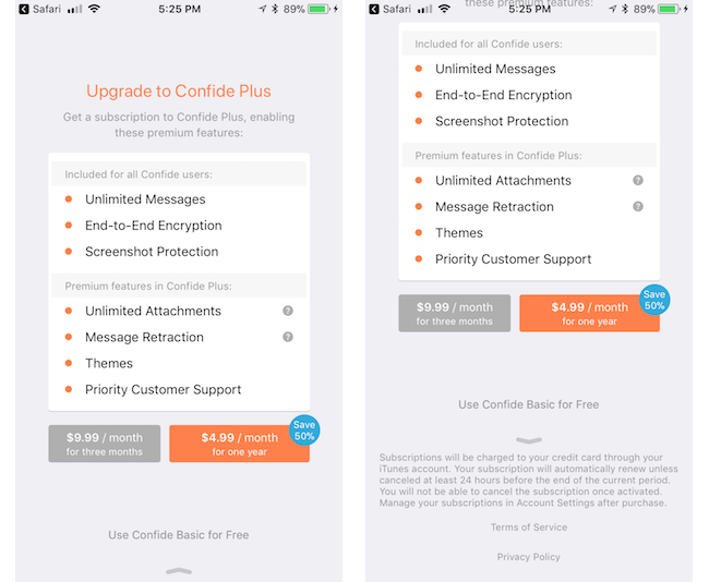
App subscription models will more closely resemble SAAS subscriptions.

The subscription model is one that looks to remain popular in 2018. Again, users are used to trialling an app and its features before parting with any cash
Subscription models are becoming more complex than a simple buy or don’t buy. In fact, many pricing structures now more closely resemble a SAAS model. It’s common to see several pricing tiers with many different features.
This allows app developers to persuade users who would previously not part with any cash to subscribe to a lower tier of membership. This method of app monetization is still the best fit for service apps.
A side effect of this is that developers will need to clearly help users understand the benefits of upgrading. More tiers and features mean a better explanation is needed.
Closing thoughts for 2018
Developers will continue to benefit from the app economy with revenue from app monetization set to grow throughout 2018. Free apps will become the new normal, compared to previously where single pay purchases were the most popular. This will allow developers to generate more revenue over a longer period of time.
Developers will need to place more emphasis on the monetization experience. This means that the developers are more likely to miss out on revenue from app monetization if the app experience is not up to scratch. Due to the free to download culture, more emphasis on experience and education is needed. This will help to persuade users to enter into premium models and subscriptions or to engage with in-app purchases.
More and more developers will need to adopt hybrid monetization strategies. Developers should
not rely on a single method of app monetization. Instead, spreading monetization across multiple strategies will provide stability. Especially in a market that can change quickly. The preference of app users is volatile. The changing platform rules around app monetization may also affect developers in 2018. It’s important to stay one step ahead!

Monday, January 15, 2018

The big secret about “tech people”, fixing things and how to control your technology


Hint: it’s neither hard nor dangerous

In this article, I’d like to talk about the “divide in technology” and how you can become proficient at solving tech problems even if you have never done it before.

The Gap

There is a fundamental divide in how people deal with tech problems. It seems that some people see computers, smartphones and other technical devices as “black boxes”, most of the time doing what they want, but at times showing frustrating errors or just plainly stopping to work.
Others (with a winking eye referred to as “tech people”) see those devices as a system of parts: hardware, software and things that run on the internet. While errors and failures are certainly annoying, they are merely symptoms that some part of the system is malfunctioning. And since it’s technology, the various components can be fixed.
The difference between those groups is that the first group is intimidated by technology — you might hear someone say “Oh, he (the computer) doesn’t like me”, as if it’s a personal thing and the technological system can be blamed. The other group doesn’t put the blame on the system as a whole, vicious entity, but instead treat it as it is: a collection of parts.
It’s no shame to belong to group one, after all, technological education and systems thinking is rarely taught and if you never had someone else introduce you to the topic, you were likely never exposed to the ideas behind it. However, I encourage you to read on and discover it’s quite easy to understand and to switch over to the “tech” side in no time.
Why should you do this? Because it gives you power and control over the things you own. You are absolutely capable of fixing and repairing both software and hardware problems, once you understand the basics. And each time you succeed in fixing something, you will gain confidence and experience. Plus, it’s actually pretty fun.

Everything is just a collection of parts

As mentioned in the intro, every piece of technology is a quite elaborate collection of parts, divided into hardware and software. The hardware is the actual thing that you carry around, most of the times small boards or chips that fulfill a certain function.
Two good things: those components are similar on almost all systems (I’m talking about computers, tablets and smartphones).
They all have a processor unit (doing the computations), a permanent storage (where all your photos are for instance) and a temporary storage (supplying the files that are in use right at the moment to the processor).
Those three are absolutely necessary for the basic functions. Then, of course, you have things that support everything else: batteries, screens, sensors, input devices (keyboards, trackpads), wireless chips and a series of boards connecting everything together.
The second good thing is that you don’t need to understand how each of those components work (or even how the system works at all) and you can still fix the system as a whole.
On top of this, there is software: an operating system and applications running on this system. Again, you don’t need to understand how this all works, just be aware of its existence.

Have you tried turning it off and on again?

It seems like a tired old joke, but it’s quite true. More than half of all errors on almost all systems can be “fixed” by turning off the system and restarting it.
This allows the system to begin with a blank slate, it reloads the software and starts all calculations afresh.
It is truly the one thing that a “tech person” will do first when trying to fix a problem. Switch everything off (completely, ideally also disconnect the power), then back on. You will be surprised how many errors are never showing up again! This technique can be adapted to resetting and reinstalling software, but we’ll get into that in a later article.
Turn it off. Turn it back on. Fix most of your errors.

You can’t really break something

I find that most of the time, people are not trying to fix things because they are afraid to damage those things permanently.
Another good thing (this article is full of positivity): you can’t really break something as long as you don’t physically break part of the system. Keeping your technology dry and reasonably clean is a good way to start.
It’s also quite unlikely that you damage your software beyond repair. Rest assured that there is almost always a way to completely reset everything. Which brings us to the next point and then we will go into the details.

Store your files securely

As mentioned above, your files are stored on the permanent storage (hard drive) of your device. Luckily, in the last decade it has gotten incredibly easy to also store all your files in the “cloud”, meaning a separate computer somewhere on the internet, owned by a company.
The most famous of these services, like Dropbox, iCloud, GoogleDrive and OneDrive are reliable and widely used, while alternative might be suited to special needs.
I won’t go into any detail on how to choose the best service, you should be fine with typing “best cloud storage providers 2018” into Google.
The point is: while I said you can’t break anything on your system, you might lose your files, programs, settings and achievements if you don’t save them on another device first.
Use a cloud storage, external hard drive or another computer to move important documents out of your system for the time of the repairs.

Things change, for better or for worse, it’s never just you

You know the saying: never change a running system. Many software developers don’t seem to heed this, they are constantly updating, improving, iterating and changing.
Most of these changes are benign, while sometimes they break the very thing that you rely on for your work. It is annoying, it costs energy and time.
Yet, we all have to accept it, sort of the price we pay for getting accelerated technological progress.
And despite the myriads of different technological configurations, operating systems, smartphones and programs there are, there is a high chance that someone, somewhere has already had the same problem and found a solution and shared it with the world.
Which brings us to…

The big secret

This is the big one. The secret you have been waiting for. How do “tech people” actually fix things?
The answer, of course, is a simple process.
They google the error and then follow whatever other people have tried.
Yes, that’s all. That is how most of the errors get solved and how most things get repaired and in fact, how most things are learned.
You just google what you are trying to do and then spend some time going through the answers. It might not be the first answer that helps you, but chances are that somewhere in the first five answers, something will.
The art is within the right phrasing of the question. I’ll walk you through an example: recently, my 3D software “Blender” started to display black boxes instead of the usual interface. It was mildly annoying, so I tried to fix it.
Here is how you construct the google query: type the program name first, then add a short and succinct description of what’s wrong. For instance: “blender 3d displaying black user interface”. Here is what Google gives me:
Click on the first answer.
And I simply go to the first answer, which is a site called stackexchange.com. It is a platform/ community where lots of tech questions are answered and it is quite trustworthy. Reading the question that someone else asked, I think that they have the same issue. And behold, below there is an answer.
Turn off nVidia shadowplay, thanks J. Larsen!
I know that shadowplay is a program for my graphics card, so I turned it off.
It fixed the issue, no more black boxes.
If I didn’t know how to turn it off, guess what: I’d google it (“turning off nvidia shadowplay”). There are tutorials for everything online.
This principle works with any error message, too.
Just don’t click it away angrily, look at it, read it and if you don’t understand it, copy the exact words into Google, combined with the software from which it came, for instance “windows 10 error 0x80200056”. It looks like gibberish and I have no clue what it means, but other people do!
Put it into Google, read the first answer (like seriously, read it like a really good recipe) and follow it.
Remember, you are quite unlikely to break anything, so just follow the steps.
And then there is this case:
https://imgs.xkcd.com/comics/wisdom_of_the_ancients.png
Yes, there is a chance that your problem is absolutely rare and unique. It happens to all of us. We live with it. We reinstall the whole system. We buy a new computer. But we can always say that we tried.
I’ll probably go into a little more depth on this next week, but for now, you have a basic understanding of your tech!
The more you fix and try and change, the more confident you will become.
Soon, you will be one of the “tech people”.

Apple Will Reject Your Subscription App if You Don’t Include This Disclosure


Have you read Paid Applications Agreement, Schedule 2, Section 3.8(b)?

If you’ve ever submitted an app to the App Store, you know the frustration when Apple rejects your submission. Even more so when you thought you’d followed all the rules. As it turns out, Apple can bury requirements wherever they want, and it’s your burden to keep up.
About a year ago, Apple started rejecting apps that didn’t comply with Schedule 2, Section 3.8(b) of the Paid Applications Agreement, a verbose list of self-evident truths about subscriptions. The Paid Applications Agreement is a 37-page document that you had to agree to before you could submit your app. It is only available via iTunes Connect in the form of downloadable PDF.
The actual contents of Schedule 2, Section 3.8(b):
I really like the part about privacy policies.
3.8(b) requires that you “clearly and conspicuously disclose to users” all of the above bullets. The first few items seem harmless enough but then we start to get off into the weeds.
Apple wants you to reproduce, “clearly and conspicuously”, all the details of auto-renewing subscriptions. This information should be part of the standard StoreKit subscription purchase flow. None of these bullets have anything app specific to them. They are just boilerplate legalese.
iOS’s purchase UI, more than enough information.
Apple has an iOS level user interface flow for in-app purchases that is quite good as of iOS 11. This view already covers most of the in-the-weeds bullets, except telling users about the 24-hour renewal policy.
Requiring every developer to implement their version of 3.8(b) is costly and creates a fractured experience for the user. Apple should be putting it in the standard sheet. But it’s Apple’s walled garden. When they say jump, you say “fine, whatever.”

How to Comply With 3.8(b)

According to recent rejections that I’ve seen (as of Jan. 8th, 2018), reviewers are being more particular about what your purchase flow requires. From a recent rejection:
Adding the above information to the StoreKit modal alert is not sufficient; the information must also be displayed within the app itself, and it must be displayed clearly and conspicuously during the purchase flow without requiring additional action from the user, such as opening a link.
All of the information in 3.8(b) must be “displayed clearly and conspicuously during the purchase flow without requiring additional action from the user, such as opening a link.” Your beautiful and compact purchase flow must include in it, somewhere, nine bullets written by a lawyer.
Confide, recently updated, achieved it with the following:
According to one reviewer, being below the fold with a leading arrow qualifies as “clearly and conspicuously.”
For another data point, I know of one recently rejected developer who had the same information, but in another view that was linked from the purchase flow with a button. This did not qualify (according to one reviewer).

A Template

Include a customized version of the following “clearly and conspicuously” in your purchase flow:
A [purchase amount and period] purchase will be applied to your iTunes account [at the end of the trial or intro| on confirmation].
Subscriptions will automatically renew unless canceled within 24-hours before the end of the current period. You can cancel anytime with your iTunes account settings. Any unused portion of a free trial will be forfeited if you purchase a subscription.
For more information, see our [link to ToS] and [link to Privacy Policy].
Put it on the screen where you initiate the in-app purchase, below the fold might be OK, but you might want to put something to lead users there.
UPDATE: Readers are telling me it may also be required that you include it in your app store description. It’s a much easier change to include so I recommend you add it there to.

Why has Apple Taken a Legal Problem and made it Ours?

Apple shouldn’t be burying submission requirements in the bodies of contracts that nobody will read. If Apple wants developers to know something, they should put it in the App Store Guidelines, HIG, or developer documentation. The cost of making changes in a software project right at the end can be astronomical. Dropping a bomb like this on developers at submission shows a total lack of regard for our costs.
Why didn’t they just update the iOS in-app purchase sheet? I speculate that Apple discovered some legal exposure from in-app subscriptions and fixed it with lawyers instead of designers. This problem could be universally solved with an iOS update, but I think some side effect of Apple being a vast, lumbering bureaucracy made forcing 3.8(b) onto developers the more politically convenient path. Apple, if you are reading this, please either update the iOS sheet or move the requirements to the App Store guidelines, so fewer developers get caught unawares.
RevenueCat is the best way to implement subscriptions in your mobile app. We handle all the complicated parts so you can get back to building. Request an invite today at https://www.revenuecat.com/

Friday, January 12, 2018

How much will MVP app design cost in 2018


MVP is a great way for your app to find its early adopters, investors and even customers. But, experience has shown that raw MVP without, at least, tolerable UI and UX fails miserably. OK, but how much will MVP app design cost me? Spoiler: not much. And you will be surprised with the result.
What is the point of an MVP? To show off the core features of your app to a target audience and investors before even starting the development. In other words, to test the waters.
However, it doesn’t mean at all that you have to produce an ugly monster with absent UI. As one more crucial goal of MVP is to find your customers. Great UI in pair with convenient UX is your key to success.
But what is the cost of MVP app design? How much resources you have to spare on design purposes? Let’s find it out.

Preparations

To get more or less decent design of your MVP you can’t just draw some lines and boxes on a napkin and give it to a design company or freelancers. Actually, you can do that, but it will cost you, and a lot. We’ll talk about that further on. Now let’s get back to the point.
If you want to save time and, consequently, money it is a good idea to get prepared, prior meeting with a design agency. Wireframe and some mockups are pretty much everything you might need.
Moreover, by presenting comprehensive app wireframe and mockups, you can be sure that there won’t be any unpleasant surprises. As a hired freelancers or guys from a contracted agency will know for sure what end-result they are ought to provide.

Wireframe of the app

A skeleton of your app. That is a rough, or even drawn on a napkin (yes-yes), layout of the navigation, screens and elements in your app. It also outlines the core features of it. And the best thing is that you finally have a, more or less, complete idea of your app.
Sure thing, making a wireframe is more than DIY-appropriate. Tools like Bootstrap may come in handy here. The coolest part is, that almost none programming skills are required. Only basic knowledge of HTML and CSS. And, probably, some video guides. :)
With available templates, you’ll be capable of building a rough layout within hours. Plus it is completely free. Unless you’ll require some advanced templates. But you can always look out for those on the other platforms.
Needless to say, it will help a lot for the initial pitching session. Even if you decide to entrust all this job to an agency — some minimum wireframe would be very helpful prior approaching them.
On the average, wireframe might take 10–30 hours in development. It might cost you nothing if you’ll do it by yourself. But if you’re going to ask an agency — $500 — $3.000 would be a fair price, depending on the complexity of the app.

Mockup of the app

Mockup is what your customers and investors will see. It can make them fall in love with your app or drive them away. In a nutshell, that is an approximate final look of your app.
There is a good rule for mockup estimation. Landing page will cost you around $500. And every additional screen will, usually, cost about $50–70. Count the number of screens you are going to have. Simply add everything to get the total price. That is the most common practice how companies and freelancers usually charge for their services.
But what about DIY? Of course, if you are familiar with such great tools like Adobe Photoshop and Adobe Experience Design it won’t be a problem for you to make a simple (or brilliant, depending on your skills) mockup. Those are the most common and handy tools. And while Photoshop will cost you $10-$20 (depending on the plan), Experience Design is completely free.

Interactive mockup

Speaking of simple mockups, there is a great way to improve those — interactivity.
Interactive mockup  — is a good chance for you to improve client engagement. Customers or investors would better prefer interactive solution over a static image. One more big plus — those are easy to spread over various devices.
Tools like Framer and inVision are your best helpers here. They work pretty much like usual app building platforms. Take your mockups, drag-and-drop different elements, adjust navigation and features, et voila! Now you have it.
Interactive mockups cost just a slightly more than the usual ones. You’ll just need your usual mockups and subscription for one of those tools. Or you can give this job to the designers you’ve hired. Anyway, additional expenses won’t exceed $100-$500. But potential profit may be a lot bigger.

Total price

Those blessed ones, who chose DIY way, might pay from complete nothing to a few hundred bucks (subscriptions, paid content, etc.).
And those who decide to hire somebody, might receive a bill on $1000-$10.000. Price varies drastically because of:
  • complexity of your app
  • desired features
  • region where you hire
One more good advice. Design agencies, usually, take fixed (and pretty high) price. Freelancers or outsource companies, on the other hand, often, charge on per hour basis. So hiring few freelancers in India for $10/hour might be a good idea for your wallet. But is it so when it comes to the quality?

Learn mobile app development with these 10 online courses


Top 10 online courses to help your learn mobile app development plus some advice from the experts on why app prototyping makes all the difference!

Thinking about becoming a Mobile App Developer? You’re in luck! There’s never been a better time to learn mobile app development. Take a look:
For budding developers, it’s time to hop aboard the gravy train. But what’s the first step in learning mobile app development? What courses should you sign up for? Should you teach yourself app development? We’ve got you covered.
And yes, the first step is learning how to prototype a mobile app. Learn why here — plus get our top 10 online courses on mobile app development to get you started right away, no matter where you are!

10 free and paid online courses to help you learn mobile app development

Here are our top 10 online courses to help you learn mobile app development:

1 — Android Development Tips Weekly series on Lynda

Teach yourself app development with this series of Android development tips by David Gassner.
Each week, David shares techniques to help you speed up your coding, improve app functionality or make your apps more reliable and refined.
The tutorials cover developing the app’s user interface, backend processing and open source libraries, to get your coding knowledge off the ground even quicker.
  • Level: Beginner — Intermediate
  • Commitment: approximately 3h per video
  • Price-point: 30-day free trial, from $19.99 thereafter

2 — Mobile App Development for Beginners on Udemy

Dee Aliyu Odumosu’s mobile app development course is ideal if you’re looking to break into iOS.
Learn how to create and customize 10+ iPhone apps (using Swift 3 and Xcode 8) with easy step-by-step instructions. The course begins with implementation of basic elements — UILabel, UIButton, UITextField etc. — Auto Layout and multiple-sized icons, with more advanced classes covering memory issues, storyboarding and displaying rich local notifications.
Note that this course requires you to own and already be familiar with Mac.
  • Level: Beginner
  • Commitment: approximately 33 hours
  • Price-point: $10.99 (New Year discount, was $50.00)

3 — iOS App Development with Swift Specialization on Coursera

This is the ultimate Swift for iOS development course, brought to you by Parham Aarabi and the University of Toronto.
Using XCode, Parham will teach you how to design elegant interactions and create fully functioning iOS apps, such as the photo editing app for iPhone, iPad, and Apple Watch. The course also includes best practices to help you become proficient in functional Swift concepts.
Note that this course requires you to own and already be familiar with Mac.
  • Level: Intermediate (some previous experience required)
  • Commitment: 6 weeks
  • Price-point: 7-day free trial, $49 per month thereafter

4 — Introduction to Mobile Application Development using Android on edX

Learn mobile app development and the basics of Android Studio in Jogesh K Muppala’s introduction to the Android platform.
In this 5-week course, you’ll explore the basics of Android application components as well as Activities and their lifecycle, some UI design principles, Multimedia, 2D graphics and networking support for Android.
  • Level: Beginner
  • Commitment: 6 weeks
  • Price-point: free

5 — Full Stack Web and Multiplatform Mobile App Development Specialization on Coursera

If you’re learning mobile application development for Android and found the above course useful, try this course out next.
Here you’ll have the chance to build complete web and hybrid mobile solutions, as well as master front-end web, hybrid mobile app and server-side development.
  • Level: Intermediate (some previous experience required)
  • Commitment: approximately 20 weeks
  • Price-point: 7-day free trial, $39 per month thereafter

6 — iOS 9 and Swift 2: From Beginner to Paid Professional on Skillshare

Mark Price’s online course for iOS Swift is everything you need to know about iOS 9 development.
This is another great set of classes for novice iOS coders. Build 15+ apps for iOS 9, learn swift 2.0 and publish apps to the App Store. Warmups, class projects and exercises will help you keep on top of the workload.
  • Level: Beginner
  • Commitment: approximately 37 hours
  • Price-point: from $15 a month

7 — The iOS Development Course That Gets You Hired on Career Foundry

Jeffrey Camealy presents the iOS Development course to get your hired.
1-on-1 mentorship from industry experts and real-world projects complement a set of 6 structured modules. The course covers the very basic principles of iOS development and takes you right to the point of submitting an app to the App Store.
  • Level: Beginner
  • Commitment: 6 months
  • Price-point: $4000 (payment plans available)

8 — Get Started With React Native on TutsPlus

Markus Mühlberger’s course for React Native is perfect for anyone who wants to code for multiple mobile platforms.
Learn how to create and customize UI elements, build user interaction, and integrate third-party components into apps for both iOS and Android. Upon completion, you’ll be able to write mobile apps in React Native.
  • Level: Intermediate
  • Commitment: 1.2 hours
  • Price-point: $29 a month

9 — Build a Simple Android App with Java on Treehouse

Ben Deitch’s course will help you build simple mobile apps for Android with Java, without any prior knowledge.
Best-suited to budding Android developers, this course will explore programming in Android and some very basic concepts of the Android SDK. By the end of the course, you’ll have a working knowledge of how a basic app works.
  • Level: Beginner
  • Commitment: 1.5 hours
  • Price-point: from $25 a month

10 — Try iOS on Code School

Gregg Pollack’s tutorials on iOS app development from the ground up and requires only basic coding experience.
Write your first iPhone app code and learn about different UI elements, such as buttons, labels, tabs and images. Upon completion, you’ll be able to connect to the internet to fetch data, build out table views and navigate between different areas of your app.
  • Level: Beginner
  • Commitment: 6–8 hours
  • Price-point: $29 a month
It’s an exciting time for mobile app developers. And as you can see, there are plenty of resources out there to help get your career off the ground. But don’t forget to look at the big picture.
Prototyping is an integral part of the mobile app life cycle. Download Justinmind now and explore a prototyping tool that’s made with the entire product team in mind.

Thursday, January 11, 2018

How to Lead High-Impact, Cross-Functional Projects


Even When You’re Not the Boss

This past summer I managed the largest acquisition campaign in my company’s history. I work at HubSpot, a marketing software company that popularized lead-gen campaigns and the whole idea of “inbound marketing,” so this is no small feat (we’ve run massive campaigns over the years).
The campaign, Four Days of Facebook, drove 10x the number of average leads of a typical acquisition campaign and 6x the lifetime value of projected customers.
But I didn’t do it alone. This campaign involved 11 teams and 33 people who directly contributed to the work.
Cross-functional campaigns like this can be big, complicated, and challenging which is why they so often take a boss or recognized leader to make them happen. So I wanted to share my experience as a “non-boss.” I hope it encourages other individual contributors out there to get their co-workers in other departments excited about working on high-impact, cross-functional projects.

Pre-planning: create alignment

You won’t have all the answers on day one, but make sure every conversation you’re having at this stage focuses on one thing: impact. You’ll be asking a lot of people to work hard on something outside of their normal day-to-day, make it clear that your asks will translate into business results.
  • Meet with senior leaders of each team before you ask for their employees commitment on helping. Again, make it clear that you won’t be wasting anyone’s time, you’re out to generate big results.
  • Have a kickoff meeting with the team who will be responsible for delivering the work. At a high-level, you want to let everyone know that you have senior leadership buy-in and the project will be worth their time. On a more tactical level, you’ll also want to get people up-to-speed on the tools you’ll be using to manage the project.
  • Go the extra mile to develop a team culture for your team. You know how developers name their projects crazy-sounding names? It’s surprisingly effective! Give your temporary team a name that makes people feel like they’re a part of something, set up an email alias, and create a Slack channel. Get people excited!
Throughout the pre-planning stage, keep your vision front and center. For Four Days of Facebook we were partnering with Facebook, a fact I repeated constantly.
If people are excited and engaged with your vision, they’ll put up with the inevitable bumps as you achieve lift-off.

During: maintain momentum

The Progress Principle is the idea that humans love the satisfaction of wins, even if they’re small. It’s your best friend as you seek to keep multiple teams and dozens of people aligned and moving in the right direction–constantly show (and celebrate) forward progress.
  • Display it: I put together a registration goal waterfall chart that was updated everyday to show progress. It’s motivating to close-in on and cross that goal line.
  • Never shut up about it: I linked to information about this campaign in my email signature, Slack rooms, wherever I had the attention of my co-workers. And that information was short, sweet, and up-to-date.
  • Be a good partner: You’re not technically the manager of the people on a cross-functional team, but you should implement some management best practices: give people autonomy, figure out how they like to work and what kind of support they need from you.
  • Ask for feedback: I asked questions constantly– Is this system or process working for you? Can I set up these reports in an easier way? At one point during this campaign I asked the senior manager of a few folks working on the project if she had thoughts on how I could run it better, she told me she would love to see weekly updates sent to her and other senior managers. I was avoiding this as I didn’t want to clutter inboxes, but it ended up being one of my best tools for building internal momentum around the campaign.
Don’t overlook the fundamentals of good project management. A framework like DARCI makes roles & responsibilities super easy so you the project lead can just say, “This meeting is for people who are Responsible and Accountable only, we’ll be covering deadlines for next week”, or “This meeting is for people that need to be Informed, it’ll be a milestone check-in.”
Find a project management framework, and stick to it.

Wrapping up: close-the-loop

I run 4–5 acquisition campaigns at HubSpot every quarter and running a campaign of this size and impact was a complete rush and I can’t wait to do it again. But before jumping into the next big project, it’s important to do a clean wrap-up, I want people to be excited to work with me and my team again in the future.
  • Say thank you: Do it publicly via a company announcement or email, and privately. I wrote handwritten notes to every person who contributed to this campaign.
  • Share results soon: Share the quantitative results, but don’t miss Twitter comments from attendees, feedback from partners, or the accolades of your co-workers. This is your chance to make it clear that you promised impact and delivered it.
  • Look for improvement opportunities: Because no matter how successful your campaign was, there are opportunities to do better — Were any deadlines missed? Why? Did any team members not work well together? Can this be addressed?
It’s easy to get stuck in a rut of executing one marketing campaign after the next, and it’s scary to think about leading a big cross-functional project that could potentially fail publicly.
But so often the answer to higher impact is better collaboration. Learning how to lead across teams 10x’ed the impact I was having at my company, I hope it does the same for you.

Tuesday, January 9, 2018

The Video Game Experience


Independent

Best: Rumu

Rumu is a very unique game, and of all the games on this list, I think it’s the one that has the most unique UI. This is most likely due to the fact that Rumu has pioneered the ‘Sentient Vaccuum Cleaner’ genre, and there’s simply no game similar enough to pull inspiration from. Because of this, I’ll briefly summarise the elements I liked the most, so you have an idea of what I’m talking about.
It’s fitting, then, that Rumu’s UI pulls from a number of different genres and also remains quite unique. Rumu (The titular vacuum cleaner himself) has a radial menu to manage it’s quest log and inventory. That’s about where the traditional UI ends, and you start to see some bespoke elements.
Tutorial tips for controls appear outside the environments. This is a nice detail, as it serves not only to communicate the key bind but also as a hint of what you’re supposed to do in any given space.
A similar method is used for doorways or vent spaces — each is earmarked with text or iconography to indicate whether the player can pass through. The difference is actually really important, because it serves to split how the player treats information throughout the game — if the information is inside the room, it’s something to be learned. If it exists outside of the game space, it’s something that little Rumu already knows.
There’s a ‘Datavision’ function that allows Rumu to see how the various smart devices and intractable objects connect. It’s a great way to declutter the environments when the player is being task oriented, and it also often hides hidden easter eggs or gadgets.
One of the smartest UX features of Rumu is how it uses it’s palette and art style to generate emotion. A clean, white kitchen feels calm and simple, while crawling through vents on a sinister dark background gives the game a sense of urgency and danger.
Rumu is beautiful, functional, unique, and incredibly evocative. It’s UX blends perfectly with the narrative of the game, and aids in the storytelling.
Conclusion:
Independent developers are constantly coming up with new, interesting ways to interact with their games. There’s even a few on this list: Hand of Fate 2 and Tooth of Tail both innovate in a well-trodden genre.

Rumu’s a little different, because the robot vacuum cleaner genre isn’t quite as mature as, say, first person shooters. Despite this, the interactions in Rumu feel natural; the spacial and diagetic elements are what I’d expect a robo-vacuum to see in the world, and the meta UI tips help move the player along without breaking the (sometimes literal) fourth wall.

I look forward to seeing the robot vacuum cleaner genre evolve.

Worst: Stationeers

Picking this game sparked an internal debate in my mind over having a ‘Worst’ section at all, but in the end I decided it’s always better to get your feelings out than internalise them.
I really enjoyed Stationeers; I played almost six hours straight in my first run through. It’s an incredibly complex space space station construction game. Most of it’s UI is inoffensive: a simple HUD with your vitals and atmosphere stats, and a slot-based inventory system.
It all falls apart for me in the item management. Rather than go into specifics, I’ll give you an example: I need to take the empty battery out of my welding torch, and replace it with a full one.
I have to press 5 to open my tool belt, use the scroll wheel to highlight the torch, press F to put it in my hand, press R to open the torch’s inventory, press E to change hands, press F to move the batter into my free hand.
Now I press 2 to open my suit inventory, scroll wheel to an empty slot, press F to place the flat batter in there. Scroll wheel to the full battery, press F to place it in my off hand. Press E to change hands. Press R to open the torch inventory. Press E to change hands. Press F to place the battery in.
That’s…15 key presses. I can see what they were going for with this system, but there’s got to be a better way.

Virtual Reality

Best: Lone Echo

If UX as a practice is still in it’s infancy, UX for VR is a single-celled organism attempting mitosis for the first time. Nobody really has any idea what’s going to work and what’s not going to work, and so many games have great executions with a poor UX.
Lone Echo feels like someone looking at what VR will be doing five years from now, and dragged it screaming back into 2017. I don’t think it’s hyperbole to say that Lone Echo’s UX will help define the future of virtual and augmented reality interfaces.
There’s no HUD in Lone Echo, instead opting to have your UI displayed from various arm-mounted gadgetry. Jack, the player character, has a number of controls and panels along his suit, each of which the player can interact with to reveal various elements interfaces.
This actually annoyed me at first — I wasn’t sure why a robot need any sort of interface at all. However, the interactions available are just so neat and genuinely enjoyable, it becomes a very small nitpick. You will also witness other characters in the game use the same interface, which gives some internal consistency to the game.
Talking to someone, for example, is a matter of simply looking at them and tapping a button the controller. This spawns a list of dialogue options that you select with your finger. It’s a simple thing, but being able to quickly interact with the object your looking at feels great.
Any panels you summon are intractable with your hand. You can scroll and tap like you would on an iPad. It feels completely natural to work with, and there were very few times after the opening minutes where I had trouble with this interaction style.
Similarly, Jack’s wrist holds a number of functions and features that are activated using your opposite hand. Slide across your forearm to open your objectives. Tap the top of your wrist for your scanner, or the side of your wrist for your welder. The interactions are so second-nature after having used them a few times that I found myself not even looking at my hands as I did these simple tasks.
Most of what you see in Lone Echo comes from somewhere. The locomotion, the dialogues, the tool interactions, are all borrowed from games that have come before it. Lone Echo proves that these interactions are unequivocally the right way to do them, and if done right, can be so immersive and intuitive that the player doesn’t have to remember them, they just become the way things are done.
Just like the brilliant writing and slick graphics, Lone Echo’s UX is the reason it’s such a successful game. It keeps the player completely immersed in everything they’re doing, no matter how complex the task. At it’s best, the interactions in Lone Echo are actually fun to use. Menus that are fun! If that’s not a revolution, I don’t know what is.
Conclusion:
The most immersive experience I’ve ever had in a video game. Lone Echo bends over backwards to put you in the moment with objects that behave like the user expects they should, and an environment that is consistently interactive.

Lone Echo isn’t held back by trying to fit it’s UI into it’s narrative — it’s built it’s entire user experience around the narrative, instead. Lone Echo sets the standard for VR UX to come.

Worst: None

It’s a cop out, I know. Truth be told, I haven’t played a VR game that released in 2017 that had any truly awful UX. There’s plenty of games that make some missteps, or the occasional obvious error, but this is going to happen with a still-growing genre like virtual reality. For now, VR gets a pass.
If you got this far, thanks for reading! Hopefully you found something interesting in my choices. Please feel free to comment with your opinions, especially if there’s something great that I missed.
I’m

Interested for our works and services?
Get more of our update !