Make me think!
the design of complexity
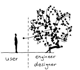
Until
recently everyday objects were shaped by their technology. The design
of a telephone was basically a hull around a machine. The task of the designers was to make technology look pretty.
It was up to the engineers to define the interfaces of those objects. Their main concern was the function of the machine, not its ease of use. We — the “users” — had to figure out how they worked.
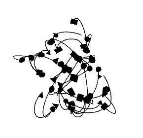
With every technological innovation our everyday objects became richer and increasingly complex. Designers and engineers simply burdened the users with this increase in complexity. I am still having nightmares trying to get a train ticket from the old BART vending machines in San Francisco.
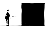
From complicated to simple
Fortunately,
UX (User eXperience) designers have found ways to design beautiful
interfaces that are easy to use. Their process can resemble a
philosophical enquiry, where they constantly asks questions such as: What is this really about? How do we perceive this? What is our mental model?
Today, as a result of their efforts, we interact with wonderfully designed interfaces. Designers have been taming complexity for us. They make extremely sophisticated technology appear simple and easy to use.

From simple to too simple
And easy sells well. Thus more and more products are based on the promise to make our lives easier by using increasingly complex technologies with ever simpler interfaces.
Just
tell your phone what you want and things will appear
magically — whether it is the information on a screen or a package
delivered to your doorstep. A gigantic amount of technologies and infrastructure is domesticated by brave designers and engineers who make all this work.

But we don’t see — let alone understand — what is going on behind the scenes, behind the simple appearance. We are kept in the dark.
You
should see me whining like a spoiled brat when a video call is not
working as smoothly as expected — all those interruptions and the bad
sound quality! An experience which would have appeared nothing short of a
miracle to
people just 50 years ago and which requires the operation of a colossal
infrastructure has become an expected normality for me.
We fail to appreciate and to empathise because we don’t understand what is going on.
So
does technology makes us dumb? This question isn’t really new. Famously
Plato warned us about the detrimental effects of writing — which we
know of because he wrote them down.
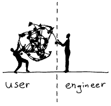
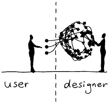
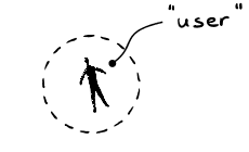
The problem with “user centered” design
In his excellent book “Living with complexity” Donald Norman offers numerous strategies for how designers can harness the design of complexity to improve the user experience.
And there lies a problem.
I am increasingly wary of the term “user centered design”. The word “user” has a second meaning — “consumer of drugs”— which implies dependance, short-sighted gratification and a reliable source of income for the “dealer”. The word “centered” excludes pretty much everyone and everything else.
A holistic approach to complexity
As an alternative we should widen our perspective and ask questions such as:
Empowerment: Who’s having the fun?
Maybe being able to speak a foreign language is more fun than using a translation software.
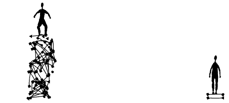
Whenever
we are about to substitute a laborious activity such as learning a
language, cooking a meal, or tending to plants with
a — deceptively — simple solution, we might always ask ourselves: Should the technology grow — or the person using it?
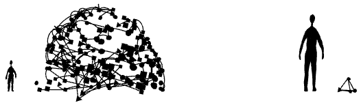
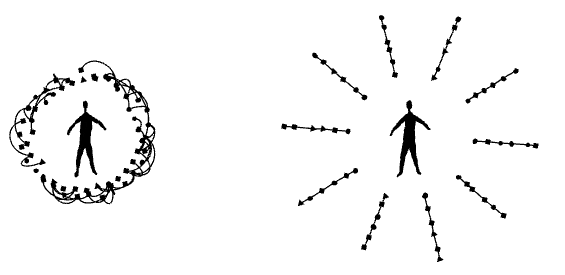
Resilience: Does it make us more vulnerable?
Highly sophisticated systems work flawlessly, as long as things go as expected.
When a problem occurs which hasn’t been anticipated by the designers, those systems are prone to fail. The more complex the systems are, the higher are the chances that things go wrong. They are less resilient.
A
chronic dependance on a combination of electronics, artificial
intelligence and a high speed internet connection for the simplest tasks
is a recipe for disaster. It makes our lives more complicated,
especially when we don’t understand what is going on behind the
deceptively simple interface.
Empathy: What is the impact of simplification on others?
Our decisions have consequences for ourselves and others. A simplified appearance can make us blind to those consequences.
Our
decision what smart phone to buy or what to have for dinner has a huge
impact on other living beings. Knowing about the complexity behind such a
decision can be of tremendous value. We need to know things better if we want to be better.
Embracing complexity
Simplification
is a powerful design strategy. Naturally the button to make an
emergency call should be as simple as possible. And yet, we also need
further design strategies that help us accept, understand, and interact
with complex situations in our lives.