Programming & IT Tricks . Theme images by MichaelJay. Powered by Blogger.

Copyright

Facebook

Post Top Ad

Search This Blog

Post Top Ad

Responsive Ads Here

Archive

Post Top Ad

Contact


Editors Picks

Follow us

Post Top Ad

Fashion

Music

News

Sports

Food

Technology

Featured

Videos

Fashion

Technology

Fashion

Label

Translate

About

Translate

Sponsor

test

Weekly

Comments

Recent

Connect With us

Over 600,000+ Readers Get fresh content from FastBlog

About

Showing posts with label UX. Show all posts

Wednesday, January 17, 2018

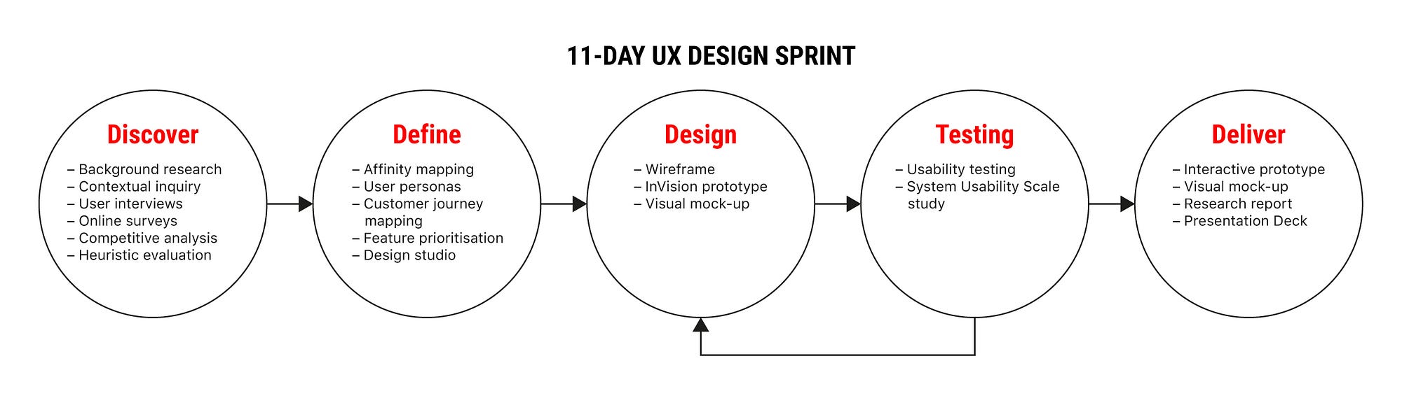
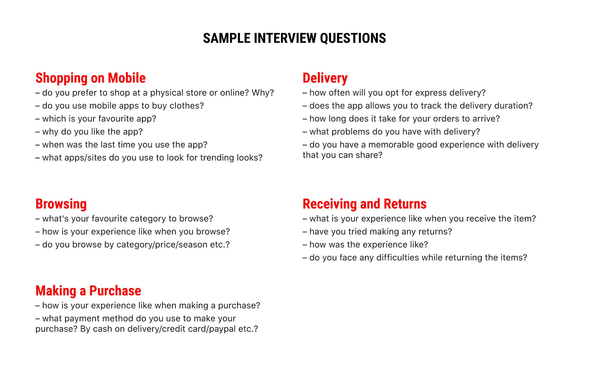
The Things Junior UX Designers Should Do More Of (Not Just Design)


As a designer starting out in the beginning of your career, you may not know what to expect during your first job. You could be given lots of work and because you are the new designer on team, you do things without question. You might think you are expected to know everything because nobody said you should seek out the things you need to help you.
Having worked in the design industry almost every summer in college, I’ve learned a thing or two about how a new designer, such as myself, can navigate through challenges and learn in environments based on implied messages of what we should or shouldn’t do. Knowing the basic tools and techniques of good design is essential, but it’s the small details surrounding how we work which can help us progress and open doors. Here are a few tips that growing designers should take into consideration during their first year on the job to accelerate career growth.

Asking for Help Doesn't Make You Stupid

It’s okay to ask for help, but the issue that some designers may allude to when they say asking for help is a big no-no is the phrasing. Instead of directly asking for help, ask for feedback and advice. If you need help with doing research, join a research session. If you need help with moving forward in a project, ask designers to join you in prioritizing ideas. This will provide you with direction. Instead of receiving a hard-cut answer, you receive validation and perspective, things that will help you develop your own point of view. Designers don’t receive answers, they problem solve to get there.

Saying “No” is better than saying “Yes” all the time*

Note the asterisk. You are in control of what you want to do. You can decide when you reply to that e-mail or if you want to go that meeting. We are often given so many things to do that we can’t do all of them, yet we think we have to. Many designers, especially in the beginning of their career, do everything they are told to do, and this distracts them from the work they need to do the most. Decide on what is most important to help get your work done and prioritize.
Don’t say yes for the things that get in the way of producing quality work.
Delegating tasks and prioritizing is hard, but if you can do that, you will get so much done (and more). It’s okay to say no for valid reasons because it tells people that you know what’s important.

Speak up

During a critique, we are excepted to provide feedback for our peers, but not everyone does it because they might be self concious of their thoughts, or they don’t make the effort to help. Don’t be selfish with ideas. Ideas are meant to be expressed and help our fellow designers design for the people. Feedback is a gift. Feedback is what results in more iterations and better experiences.

Take Breaks

I used to work hard constantly, whether it was at home, with friends and family…You name it. But then I realized, without fault, I will be working for the rest of my life and work isn’t ever really “done”. I was taking the time to work on something fleeting, when I could have been spending time with the people I loved and the things I loved to do outside of work. Also, too much work can increase stress which can increase burnout. It makes sense to do as much work as you can to get to a certain job or rank, but that takes time. Just do what you can and relax when you feel overworked or exausted. In the end, health is more important than work because without health, we can’t work.

Be Present

As tempting as it is to work from home, especially for people who have the privilege of doing so all the time, it is crucial to be present. Even if the quality of work has not been affected, as designers, collaboration is such an important aspect of the way we do things. Being present in the office can make all the difference, especially when working with the people on your team. It’s not a team if everyone isn’t present.

If you have any questions about design, message me on LinkedIn and I’ll write about it!

Links to some other cool reads:

Tuesday, January 16, 2018

9 Effective Tips on Visual Hierarchy


Sufficient visual hierarchy is a foundation of a successful digital product. It helps to organize UI elements in an effective way so that content would be easy to comprehend and pleasant to see. The presentation of visual elements has a great impact on user experience. If the components are organized wisely, users navigate and interact with a product without efforts and enjoy the process.
So, what makes powerful visual hierarchy? Of course, different kinds of products require different methods of building it still there are some common solutions helpful for UI content organization. Today’s article provides useful tips on creating the compelling visual hierarchy for web and mobile products.

Keep business goals in mind

There are often business goals standing behind a digital product. To achieve them, creative team needs to work out which UI elements are more important and prioritize them according to their roles. For example, all the elements on e-commerce websites perform the tasks of various levels. The item images are usually the main eye-catchers since they have to encourage customers to consider it. A heading goes after the image explaining what it is and the next important stage is a CTA button calling people to buy an item. By considering business and marketing goals set for the website or app, the creative team can effectively prioritize visual content and make a product stand out the crowd.
Design Agency Landing Page

Consider scanning patterns

In our previous articles, we mentioned that before reading a web page people scan it to get a sense of whether they are interested. Different studies, including the ones by Nielsen Norman Group, have revealed several popular scanning patterns among which “F” and “Z”-shaped.
F-pattern appears mainly on digital pages or screens with the big amount of content such as blogs, news platforms etc. Users’ eyes move in F-shape: first, they scan a horizontal line on the top of the screen, then move down the page a bit and read across the shorter horizontal line, finishing with the vertical line down on the left side of the copy where people look for keywords in the paragraphs’ initial sentences.
Z-shaped pattern takes place on the pages which are not so heavily concentrated on copy or those which don’t require scrolling down. The pattern is the following: people first scan across the head of the page starting from the top left corner, searching for core information, and then go down to the opposite corner at a diagonal, finishing with the horizontal line at the bottom of the page from its left to right.
Knowing these patterns designers organize content putting all the core UI elements on the most scanned spots to draw users’ attention.

Functionality first

The visual hierarchy may seem to be oriented only to the aesthetic aspects but it’s not like that. First of all, by structuring and organizing visual elements designers need to make sure a product is clear to use and the navigation works right. The visual hierarchy which is built exceptionally on aesthetics can’t work effectively. User interface with the badly structured content leads to the bad UX. So, while building visual hierarchy designers need to consider functions of UI elements and a role they play in the navigation process.
Seafood Recipes Landing Page

White space is a visual element

White space, or negative space, is not just an area between design elements, it is actually a core component of each visual composition. It is a tool able to make all the user interface elements noticeable to users’ eyes. Designers can group or separate UI components so that they could create the effective layout. Moreover, negative space helps to emphasize particular elements which require deep attention from users. White space is an effective instrument for creating visual hierarchy so designers need to work on its balanced usage.
Colony Landing Page

Apply the golden ratio

We devoted one of our latest articles to the golden ratio applied in design. It is a mathematical proportion of the elements of different sizes which is thought to be the most aesthetically pleasing for human eyes. The proportion equals 1:1.618 and it is often illustrated with seashell-shaped spirals which many of you could have probably seen.
Designers often apply golden ratio at the stage of wireframing. It helps to plan a structure for the layout placing and sizing user interface elements in the right proportion which will be pleasant for users.
Tracking Widget

Use a grid

A grid is one of the key tools applied at the different stages of the creative process and visual hierarchy is not an exception. A grid helps to structure all the components and put them into the appropriate sizes and proportion. What’s more, designers can effectively work with the negative space since a grid shows if the elements are placed proportionally and even.

Add some colors

Color choice and combinations are essential for visual hierarchy as they help users to distinguish the core elements. The thing is that colors have their own hierarchy which is defined by the power of influence on users’ mind. There are bold colors such as red and orange as well as the weak ones like white and cream. Bold colors are easy to notice so designers often use them as the means of highlighting or setting contrast.
Moreover, applying one color to the several elements you can show that they are somehow connected. For example, you can choose a red color for purchase buttons so that people could intuitively find them when they need.
Financial Service Website

Pay attention to the fonts

Visual hierarchy includes a core subsection called typographic hierarchy which aims at modifying and combining fonts to build the contrast between the most meaningful and prominent copy elements which should be noticed first and ordinary text information. The fonts can be transformed by regulating sizes, colors, and families as well as their alignment. Different fonts can divide copy content into different levels so that users could perceive the information gradually. However, designers are recommended to keep the number of fonts within three since too many fonts look messy and make the design inconsistent.

Three levels for web, two for mobile

As we mentioned above, different fonts form typographic levels which consist of such elements as headlines, subheaders, body copy, call-to-action elements, and captions. There are three typographic levels: primary, secondary, and tertiary. The first one includes the biggest type and aims at drawing people’s attention to the core information on the screen. The next level provides copy elements which are easily scanned and help users navigate through the content. The tertiary level usually applies body text and some additional data which is presented via relatively small type.
In many cases, web products include all three levels since they are more likely to provide the big amount of content. On the other hand, designers are recommended to keep the number of layers within two while creating typography for mobile. The small screens don’t provide enough space for three levels so the elements of a secondary level such as subheaders have to step aside to make mobile UI look clean.
WineYard App
Effective visual hierarchy is not only about aesthetics. It aims at providing problem-solving navigation and interaction systems as well as friendly user experience. To create a sufficient visual hierarchy, designers need to organize all UI elements considering the functionality and business goals.

Monday, January 8, 2018

UI/UX Case Study: Mobile Self-Checkout App Design Concept


Fashion Retail and E-Commerce App Redesign

The UI/UX case study documents the processes involved in a redesign of a fashion retail and e-commerce app. The app includes a product scan feature for customers to perform a self-checkout at a physical store. This design sprint took 11-days to complete and is submitted to the UXDI course at General Assembly, Singapore.

Project Brief

Work in a team to identify problems and/or opportunities with an existing mobile application and utilise your knowledge to design a solution.
For this project, my team selected the Uniqlo, Singapore app to redesign. For this documentation, the brand name will not be mentioned again below. The ideas below apply to most fashion retailers with an e-commerce presence.

Overview

The 11-days group project (3 members) includes the following processes and methodologies:
#1 Discover
  • Background research
  • Contextual inquiry
  • User Interviews
  • Online surveys
  • Competitive analysis
  • Heuristic evaluation
#2 Define
  • Affinity mapping
  • User personas
  • Customer journey mapping
  • Feature prioritisation
  • Design studio
#3 Design
  • Wireframe
  • InVision prototype
  • Visual mock-up
#4 Testing
  • Usability testing
  • System Usability Scale study
#5 Deliver
  • Interactive prototype
  • Visual mock-up
  • Research report
  • Presentation

The Context — Competitive Retail Scene & Mobile Payment in Singapore

News clippings from The Straits Times and Channel NewsAsia
It is increasingly difficult for retail businesses to remain competitive in Singapore. This is due to the high rental fees to maintain a physical store and the difficulty in hiring lower-skilled sales assistants.
In addition, consumers are increasingly shopping online on platforms such as Taobao, ASOS, ZALORA for their fashion fix.
In the recent Singapore National Day Rally Speech (Aug 17), the prime minister pushes for consumers and retailers to adopt mobile payments. This will be done through initiatives such as ‘PayNow’ and a common national QR code.
Based on this setting, my team picked a retail outlet with a physical and online (mobile app) presence as our project.

Heuristic Evaluation

Screen grab from heuristic evaluation report–Consistency and Standards
First, we started by analysing the existing app to identify key problems and issues. This was compared to online reviews on Google Play and the App Store.
App reviews on Google Play and Apple App Store
The main issues discovered was the app is a hybrid app, i.e. it is pulling information from a web page. This creates potential issues:
  1. Slow loading as most of the information is downloaded only when needed.
  2. The experience is not catered to mobile. Fonts, buttons, and images appear too small on the mobile phone.
  3. Navigation is inconsistent throughout the app.

Competitive Analysis

Competitive Analysis–Comparing features on the Home screen
Next, we compared the app to the competitors’ apps. The competitors are determined by these 4 points:
  1. Fashion retailers with a physical store in Singapore;
  2. Has an e-commerce mobile app;
  3. Similar price range and demographics;
  4. Fast-fashion retailer.

Key findings identified were:

  1. Most shoppers do not know of or use the apps;
  2. No in-store signages were found to encourage its usage;
  3. Competitors have a barcode scanner to provide additional product information. This feature integrates the in-store and mobile experience;
  4. Competitors have a significantly better app presentation as it feels less cluttered;
  5. App approaches may be different — one is more editorial, while the other is focused on e-commerce.

The Big Questions — How Might We…

At the start of the project, we had three main questions in mind.
How might we…
  1. adapt the physical store experience into a mobile experience?
  2. use a mobile app to further enhance the physical store experience?
  3. adopt mobile payment or a mobile self-checkout at a physical store?

Defining the In-store Experience

First, we define the unique experience at the physical store to adapt it to the mobile app.
  • Greeted with ‘Welcome to (the store)’ every time you enter the shop;
  • Same familiar shop layout at every outlet;
  • Wide open aisle, bright lights, neatly stacked shelves;
  • Sales and promotions throughout the year for different products each week;
  • Easy to find the right sizes without help from a sales assistant;
  • Strong visual branding from clothes tag to signages.

Contextual Inquiry/Field Study

Contextual inquiry at the physical store
We conducted a field study at an outlet by speaking to customers and shop assistants. Also, we showed the product scan feature found on our competitor’s mobile app.

What we noticed and found out:

  1. Shoppers do not know of the app even though they frequently shop at the store.
  2. The current app is for e-commerce only.
  3. Shoppers will consider shopping online after knowing of the app.
  4. Shoppers are wowed by the product scan feature as the technology is fascinating. The same technology is already available at a kiosk at the flagship store (in the city). Other smaller outlets (in the neighbourhoods) did not have this kiosk, probably due to space constraints.
  5. The same product might be cheaper in the app as there are mobile exclusive discounts. This, although they may incur additional delivery fees ($6 for spendings < $30).
  6. Various products are available only at the flagship store or on the mobile app.
  7. Long queues were observed at the store during peak hours.

User Interviews

Sample interview questions grouped by topics
We interviewed 7 users to find out what they think of the current app. The questions we asked were centred on various touch points common to fashion e-commerce apps. For example, we asked questions related to:
  1. browsing for clothes,
  2. making a purchase,
  3. waiting for the delivery,
  4. receiving the items,
  5. and making returns.

Key findings from the interviews:

  1. The app is easy to browse, hence there are no major issues with the navigation. The only issue is with ‘dresses’ being classified under ‘tops’.
  2. Frustration comes from the lack of filtering and a complicated check-out process.
  3. The app lacks clarity in the delivery options and fees.
  4. The app presentation is messy.

Affinity Mapping

Existing App User
Shopper–Potential App User
After conducting user interviews and contextual inquiry, the next step we did was to organise the insights into groups in an Affinity Map. With this map, we could identify common habits, problems, and pain points. The map also helped us to identify 2 key personas (elaborated below) where the same coloured post-its are usually grouped together. Eg. Red and pale blue posts-its are existing users.

User Personas and Customer Journey Map

Based on the patterns identified in the affinity map, we came out with 2 personas — an existing user of the app, and a current shopper who is a potential user of the app. These personas describe a typical user/potential user, their habits, problems, pain points, and other details about him/her.
Persona 1 — Existing user of the app
User Persona–Existing user of the app
Customer Journey Map–Shopping on the App
Katie prefers to shop online and is an existing user of the app. She wants quick access to all the discounts and finds it difficult to find the size and availability of the items she wants. While she is familiar and comfortable using the app, she hopes the user experience can be improved.
Persona 2 — Existing shopper and potential user of the app
User Persona–Shopper at physical store/Potential user of app
Customer Journey Map–Shopping at a physical store
Natalie shops at the physical store and is not aware of the existing app. While she enjoys shopping at the store, there are often long queues at the payment counter. She may be a potential user of the app since she uses other e-commerce apps to shop for clothes.

Potential project approaches:

  1. The redesign should not affect current users of the app. Navigation should be kept similar to the existing app and website.
  2. New features can be added to the app for current shoppers to use it in-store.
  3. Users should be able to access ‘Promotions’ quickly since it is a major feature of the brand.
  4. Increase awareness of the app through in-store posters and other marketing efforts.

Feature Prioritisation Matrix

Feature Prioritisation Matrix–User Needs vs Business Needs
57% of users surveyed rated a 4 or more, that is important to have a self-checkout counter in-store
Through a design studio process, we came up with various new features we intend to include in the new app. To come out with a Minimal Viable Product (MVP, or Minimal Lovable Product, MLP) we conducted an online survey to find out what users want on the app. We looked at the features from the business perspective and organised them according to our user and business needs. Features at the top right corner (the box in red) are the ones that should be included in the new version of the app.

Storyboards

The new features are illustrated in storyboards, detailing the environment, scenario, and context where the app may be used.
Storyboard by Parul–Receiving a push-notification when user is near the store
Storyboard by Parul–Using the barcode scan and self-checkout function

Mid-Fi Prototype & First Usability Test

Mid-Fidelity Prototype by Parul
Since my team comprises two visual designers (myself included), we skipped to a mid-fidelity prototype after doing quick sketches. Visuals of the clothing may be important in helping users visualise the actual app.
The version was used for testing with actual customers on our second trip to the store. The purpose of the test is to determine if customers are receptive to the new scanning and self-checkout feature.
Key findings from the usability test:
  1. Customers are able to identify the scan feature and its uses.
  2. Most customers are able to expect what will appear after scanning the product.
  3. However, they questioned the need to know more product information when they have the physical item on hand.
  4. Customers will use the self-checkout ‘only when there is a queue’. This is to be expected since most Singaporeans are more comfortable making payment by cash at a counter.
  5. However, most highlighted there they are slowly accepting mobile payments and self-checkout systems as part of the future retail experience.
  6. The wishlist feature was removed subsequently as users do not require the function.

Hi-Fi Prototype

From the usability test, we iterated a high fidelity prototype. The branding was also enhanced in the design by using the right fonts and colours. The interactive prototype can be viewed on InVision.

Feature Demonstration

Scan Feature

We created a video to show the new scan feature on the app since it was impossible to prototype the actual feature.
App Scan Feature Prototype Demo

Delivery Target Bar

Another feature on the app is an animated target bar for free delivery. This will encourage users to spend more to meet the target while providing greater clarity to the users.
Animated delivery target bar

Geo-Fencing Push Notification

Users will receive a mobile coupon through push notification when their GPS indicates that they are near a store outlet. This will encourage them to use the app for self-checkout.
Receiving a mobile voucher through push notification when user is near an outlet

Usability Testing

Tasks assigned for usability tests
Participants were given 4 tasks to complete. Task 1 was conducted on both the existing app and the new app. The clicks for 3 of the tasks were illustrated below.
Where did the users click?
Time taken by user to find a dress on the current and new app
To collect quantitative data, we timed users on how fast they took to complete the task on the existing app and new app. The new design allows the user to complete the task more efficiently.
Quantitative Data from System Usability Scale(SUS)
In addition, we conducted a post-test survey to collect feedback from the participants on their views of the new app. This was done with the System Usability Scale(SUS) test. The results were tabulated and calculated based on the method specified by the standardised test.

Results from system usability scale test:

  • Users rated 69/100 (marginal) on their opinion of the new app.
  • Although this is below the acceptable score (>70), it was not a bad score.
  • The marginal score was due to the difficulty in performing task 4 (i.e. performing a self-checkout).
  • Designing a self-checkout is a challenging task due to the lack of existing models to follow. Users need time to learn and accept self-checkout methods.

Design Iteration — Improving the User Flow

After the usability test, we discovered that users were confused by the product detail page after scanning the barcode. They assumed that the item was already added to the cart after the scan.

Scanning Products

Revising the user flow to provide more feedback
Providing feedback to guide users in completing their task
We made the process more informative for users by providing feedback on what is happening. First, we prompt users if they want to add the item to the bag after scanning the barcode. Next, we gave them the option to continue scanning or proceed to the shopping bag. This provides more clarity to the user as they are provided with options to proceed to the next step.

Self-Checkout

Revising the self-checkout user flow to provide more instructions
This is a case where a simpler user flow, may actually cause greater confusion to the user. With more steps inserted, users are more confident in performing tasks.
Providing instructions on what to do after self-checkout payment
The revised self-checkout user flow may seem a lot more complicated, but provides greater clarity to users. This is because instructions are given to them to proceed to the Express Packing Counter to get their items packed, and the security tags removed. Without these instructions, users were unsure what to do after making a payment.

Promoting the App Usage

Through our app redesign, we created opportunities where users can use the app within the physical store. Hence, to encourage the usage, this should be accompanied by various promotional materials around the stores.
Clothes Tag and InStore Posters
For example, the clothes tag can include a line to inform users that they can scan and perform a self-checkout with the app. This can also be included in the signages found throughout the store.
Express Packing Counter for self-checkout users
As users have to get their items packed and security sensors removed, we propose setting up an Express Packing Counter lanes that will be quicker in serving these customers. This will help to bring about a greater awareness of the app.

Future Steps

In the short term:
  1. We propose to include features that will help users to find what they need. For example, we can include an image search feature so that users can find a similar style.
  2. Personalised feed for signed in users based on gender and body size to suggest the right style and promotions.
In the long term:
  1. Align the current website with the new app after collecting user feedback for the new app.
  2. Rearrange products in the navigation based on knowledge of future product inventory.

Points to Note

The design of the app in the InVision prototype does not follow the guidelines listed in the iOS Human Interface Guidelines. This was due to my unfamiliarity with iPhone app design. After studying the guide, I redesigned the app to match the style specified for iPhone 7.
The main difference is in the system font choice (SF Pro Display) and in the navigation labels. This is to ensure consistency throughout the iPhone.
Revising the navigation to match Apple iOS Human Interface Guidelines

Special thanks to:

Team mates, Parul Shukla & Cheryl Lee,
Instructor, Nie Zhen Zhi,
and Teaching Assistant, Wilson Chew

Interested for our works and services?
Get more of our update !