How we designed our bank account: NuConta — Part I
In
October, Nubank announced our boldest product release since our
revolutionary credit card: NuConta, a single account that allows people
to save, invest and transfer money in real-time. NuConta is a complete
redefinition of how banking accounts should work, and here’s how our
design team arrived at this new concept.
Start with why
Nubank’s core mission is to remove complexity and empower people.
The credit card, our first product, has achieved viral growth among our
customers by doing exactly this, but it’s a product accessible only to a
select population due to credit analysis requirements. In fact, we have
received over 13 million requests to get a Nubank card, but had to say
no to a considerable percentage of those people. Our customer base,
which is nearing 3 million accounts, is already representative — we’re
currently Brazil’s no.5 credit card issuer — but still limited when
compared to a market of 120 million Brazilians who are unbanked or have
to deal with expensive and abusive banking services that dominate the
market.
The
next logical step in bringing our mission and user experience to a
broader population, regardless of their income, credit scores or other
barriers, was to build a product anyone could have access to: our
version of a banking account, NuConta.
The team
Designing,
building and launching NuConta in 12 months was only possible because
of how the team was structured and governed. The squad,
as we call teams here, was composed from the very beginning of product,
financial, engineering and design talent, none of whom had built
something like this before. It was a group of unbelievably bright, but
most of all humble people, who were completely open to learning and having their opinions challenged.
This
was, of course, a fascinating and unique project to be working on, so
people couldn’t avoid coming in with their premature views and
expectations for what the final product should be. The role of design
was as much about facilitating alignment between these expectations,
bringing clarity to compromises and decisions, and replacing our biased
opinions with real people’s pains and needs, as it was about designing
UI flows, copy, or making prototypes.
Design in an Agile Team
As
much as we designers like to structure and visualize our process, what
happens in our reality is more complex and asynchronous than the
diagrams we’ve grown accustomed to.
Doing
solid foundational research before starting anything else can surely
de-risk product placement, but inevitably delays engineering and thus
time-to-MVP.
What we did then, was to work in parallel threads:
- The Design team working to figure out how to shape the product to answer the customers’ needs.
- The Engineering team working at full-speed to put the banking infrastructure together.
- The Intel and Legal team powering through the sea of legislation, third-party interactions and contracts.
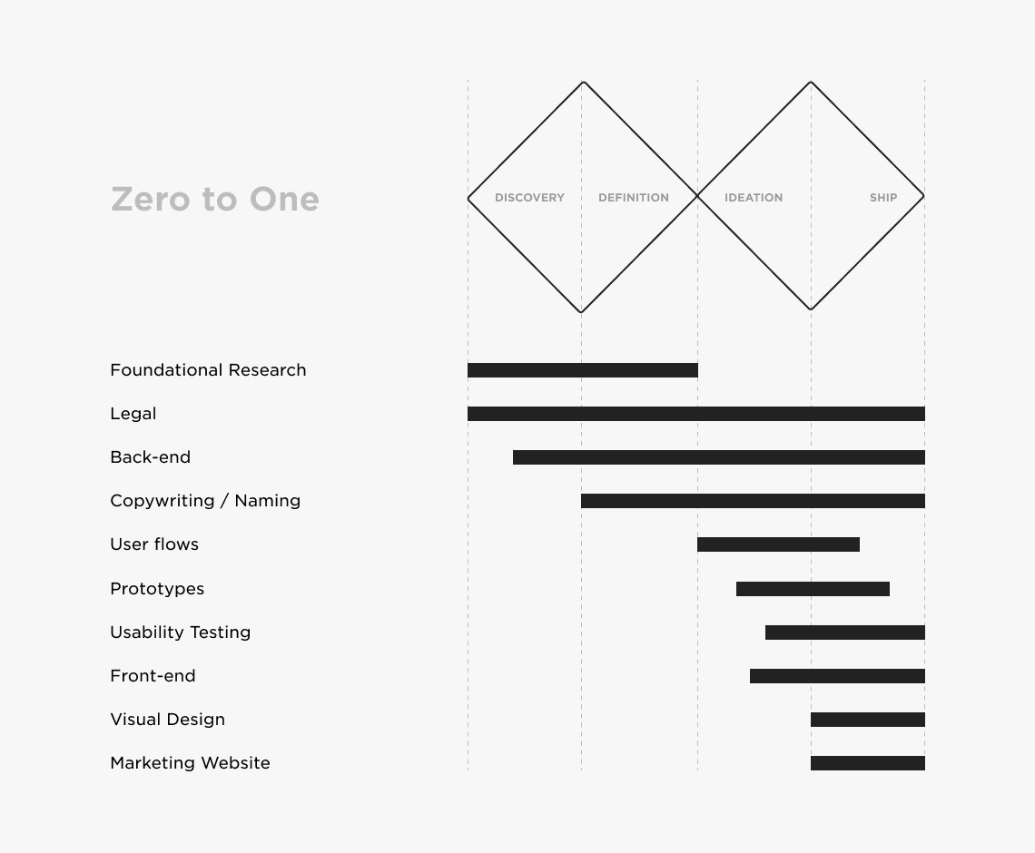
Each
of these threads constantly fed each other with their learnings and
advancements, and we adjusted the product accordingly up to the last
moment before shipping.
“Go do the best research you can, come back to tell us what you’ve learned, and we’ll adjust as we go. We’re not afraid of throwing our code away.” — The best thing a UX person could hear from their dev team.
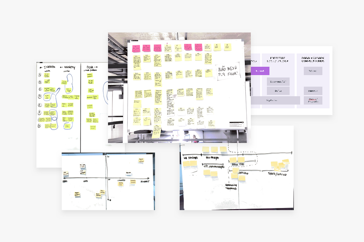
Foundational Research
We
were committed to challenging our most basic assumptions about how
people understand and use banking services, so our initial conversations
were purposefully broad and naive. We started with a simple list of
questions, but we adjusted frequently along the way.
- How do people currently manage their money?
- What do they think about the different account types? Do they even understand them?
- Do people save money? Why? Where?
- Are people aware of product options in the market?
- How do they feel about the products on the market? What attracts them? What scares them?
- How complicated is the current landscape for a person with no financial background?
- If people want to start saving money now, what would be their first step?
The
fastest way for us to start asking (and testing) these questions was to
sneak them into studies already being conducted by other product teams
(namely, credit card and Nubank Rewards). We learned a lot very quickly
by “stealing” a few minutes of our colleagues’ interviewing time, but
their target audience could be skewed to non-target segments.
To
balance that out, we got out of the building to do intercept interviews
in places like public universities and spaces, where we could reach a
wider variety of people who were not already Nubank customers.
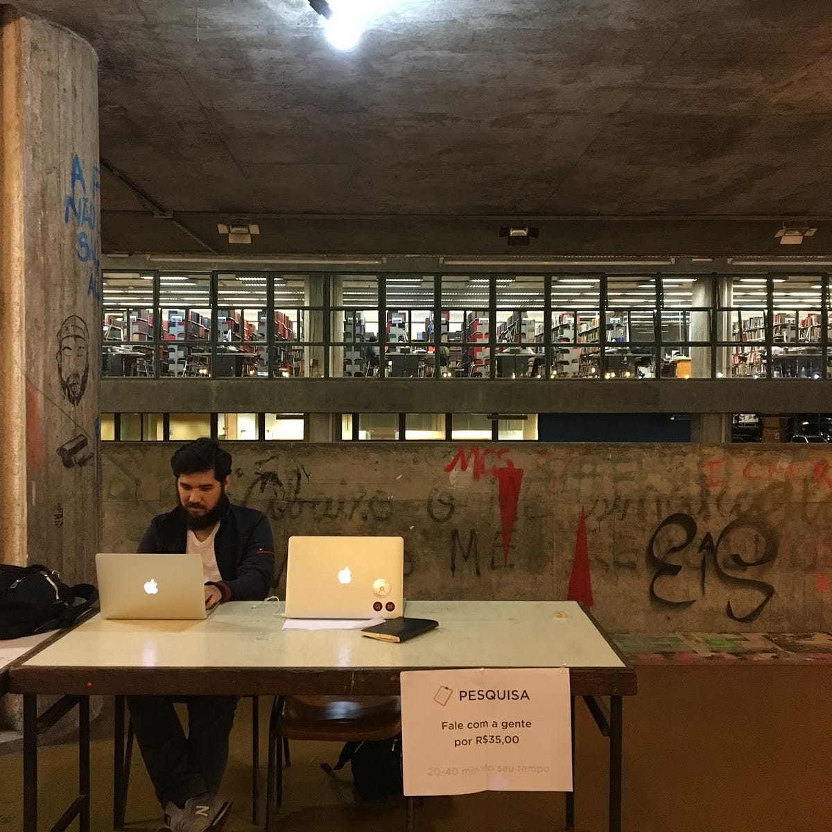
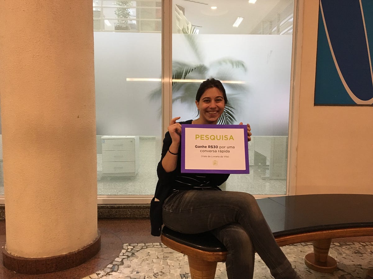
These
in-depth early interviews took 40–90 minutes each. We sat down and very
informally let people talk about their financial lives, how they felt
about saving, investing, transferring, and spending their money. We also
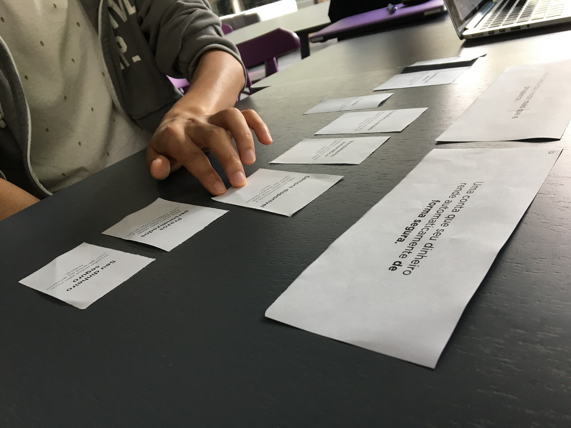
experimented with some visual aids such as card-sorting and very cheap
prototypes, but honestly our best feedback tools were our competitor's
websites and products. We learned an incredible amount just by having
people experiment with things other companies have already built.
Personas
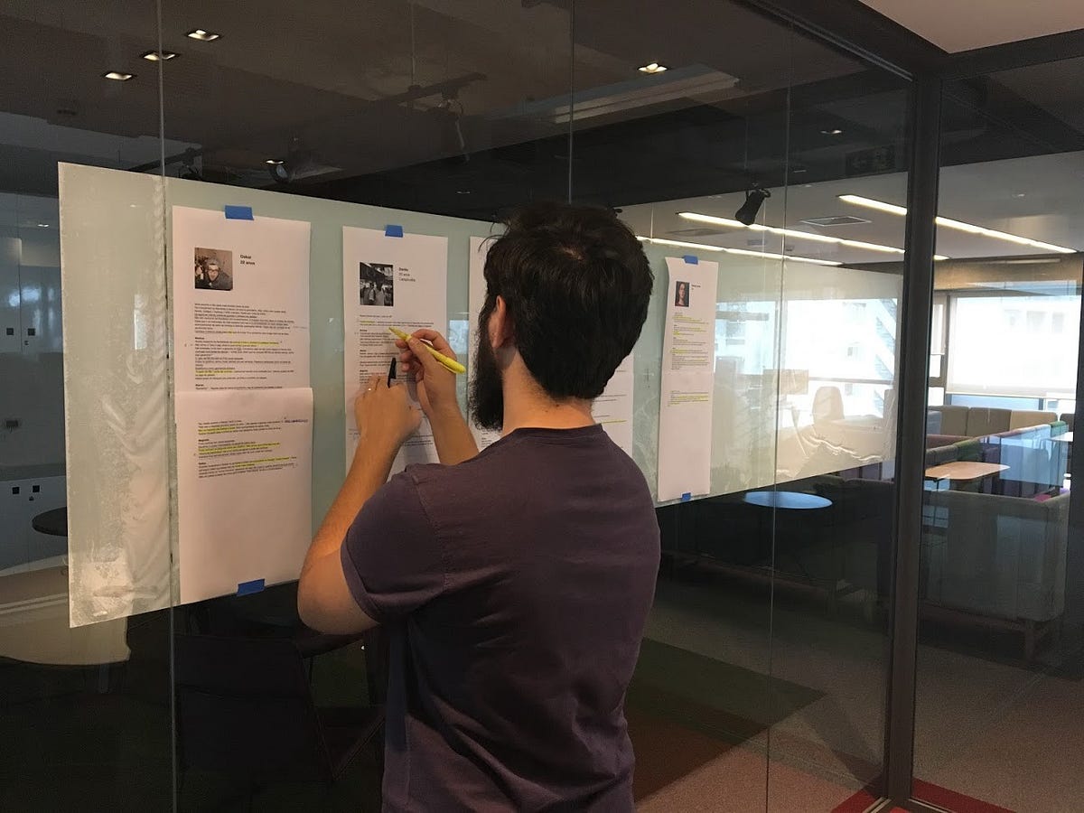
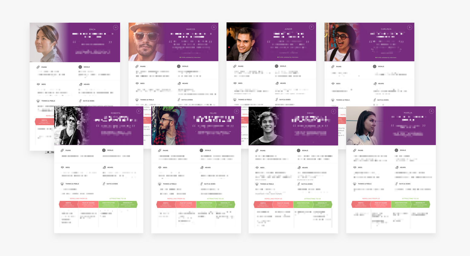
By
combining the data from these interviews with others conducted in our
lab, and also talking to a lot of our own employees about their
finances, we were able to come up with eight personas that represent a
gradient of behavior and demographic patterns.
Personas
can yield mix results, but we’re confident they were essential in this
case. Here’s some of the value personas brought to our process:
- The team learned that people represent a gradient of experience and behaviors.
- What we thought would add the most value, was often biased as it was based on our financially savvy perspective.
- The team learned that it would be impossible to design a product for every type of person, and that we had to choose some group to focus on.
- Our discussions evolved from being biased by personal opinions to being based on our chosen target’s jobs-to-be-done, pains and needs.
- Everyone in the team now remembers who Diego (one of our personas) is, what he struggles with, and that our efforts should be focused on making his financial life less complicated and more empowered, instead of our own.
Problem definition
With
well-defined personas, we now had a lens through which we could look at
the problem. Our initial mission, which was very broad, could now be
better expressed in sentences that the whole team could agree on:
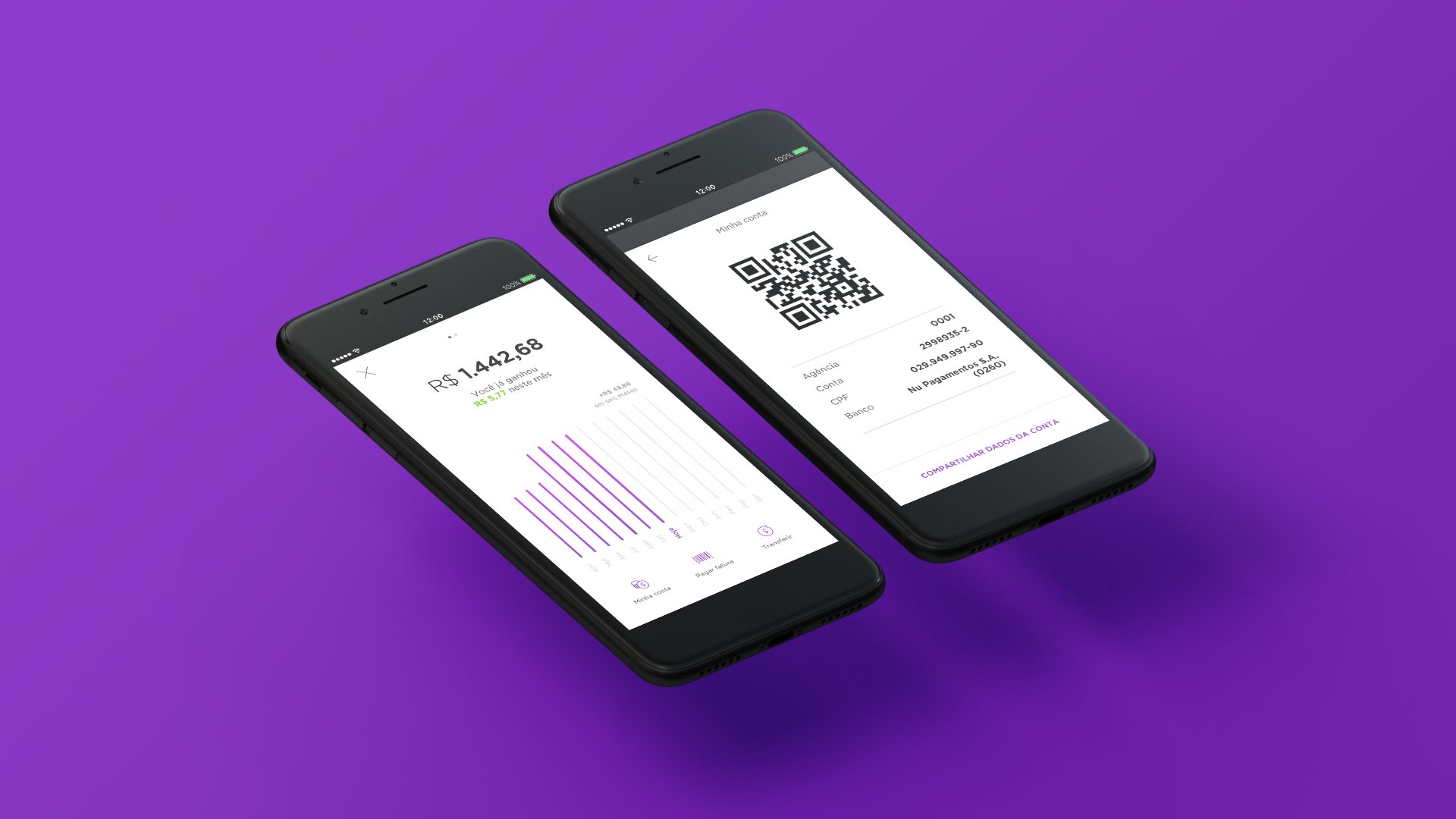
What NuConta is / does
NuConta is an evolution of your current and savings accounts, designed for people looking for a more accessible and easy-to-use bank account. It’s free of complexity, doesn’t charge abusive fees, and makes your money grow at a fair interest rate. Differently from big banks and other fintech pre-paid products, NuConta has zero bureaucracy, less friction to adopt and a superior user experience.
Likewise, defining what NuConta was not supposed to do, at least for launch, was equally helpful in creating vision alignment and prioritization:
What NuConta is not / doesn't
NuConta doesn’t serve people looking for advanced investments, home brokerage, paid wealth management advice. It tries to be accessible and self-explanatory, but without becoming an educational product. At its early stage, it also will not support goals or any other kind of gaming mechanics.
We
learned from this process that defining a problem is sometimes harder
than sitting down to solve it. After dozens of long work days, heated
meetings, lots of head-scratching, word-smithing, and sense-making about
the material collected during research, the team was finally committed
to a unified vision of the product that reflected our customer’s pains
and needs instead of our own. We were now ready to deep dive into
exploring solutions that would eventually become NuConta.
Part
II of this post will tell how the next steps played out: product
ideation, UI explorations, concept & usability testing, onboarding
design, copywriting, and implementation.
Hit Subscribe to be notified when Part II comes out!