Programming & IT Tricks . Theme images by MichaelJay. Powered by Blogger.

Copyright

Facebook

Post Top Ad

Search This Blog

Post Top Ad

Responsive Ads Here

Archive

Post Top Ad

Contact


Editors Picks

Follow us

Post Top Ad

Fashion

Music

News

Sports

Food

Technology

Featured

Videos

Fashion

Technology

Fashion

Label

Translate

About

Translate

Sponsor

test

Weekly

Comments

Recent

Connect With us

Over 600,000+ Readers Get fresh content from FastBlog

About

Friday, February 2, 2018

Voxels (VOX) — Future of Virtual Reality


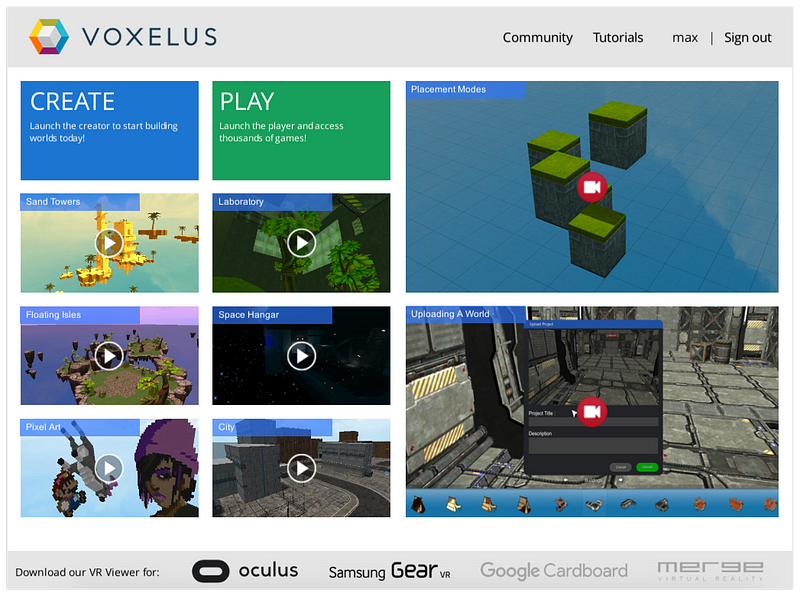
Imagine if you could capitalize on the explosive growth of cryptocurrencies and the power of virtual reality in one investment. Would that be something you’d be interested in? I sure am. That’s why I am buying up all the Voxels I can get, which is currently trading at $.23. Believe me when I say that Voxel will be the OFFICIAL currency of virtual reality. This cryptocurrency has been created by Voxelus, a leading virtual reality world builder and marketplace, AND it’s compatible with Oculus Rift and Samsung Gear VR. As of today, Voxelus is the world’s largest source of virtual reality content, with more than 500 unique assets, 50 working games, and 7,000 additional pieces of content through their partnerships. I can confidently say that in 2020 Voxels could be trading at $1.50 a coin because the team is lead by legendary entrepreneur Halsey Minor, have strategic partnerships, an upcoming release of their first standalone game, and several other drivers of growth that I will outline below.

Basics:

  1. Voxelus is a platform that allows anyone, anywhere to create and play VR games without needing to write a single line of code
  2. The platform consists of the Voxelus Creator, a 3D design app for PC and Mac; Voxelus Viewer, which works on desktop PCs, Oculus Rift, and Samsung VR devices; Voxelus Marketplace, which allows creators to sell and user to buy VR content and games for the Voxelus ecosystem
  3. The only form of payment within this ecosystem is Voxel, the in-game cryptocurrency
  4. Ticker: VOX
    Price: $.23
    Ranking by Market Cap: 70
    Market Capitalization: $47,036,640
    Circulating Supply: 210,000,000 VOX
    Max Supply: 210,000,000 VOX
    Average Trading Volume: $8,316,144
    Consensus: PoW

Team:

  1. The Voxels team is lead by no other legendary entrepreneur than Halsey Minor. Mr. Minor was the founder of CNET, co-founder of Google Voice, Salesforce.com, OpenDNS, Uphold, and Rhapsody.
  2. The development team is led by Argentinean software industry veteran Martin Repetto. Mr. Repetto previously created, Atmosphir, a video game creation tool that was the runner up on the TechCrunch 50 in 2008. He was also the CEO of Minor Studios.
  3. The business development and marketing teams are based in Los Angeles. The development and operations teams are located in Rosario, close to Buenos Aires, Argentina
  4. As of 2016, the Voxels team has 10 individuals working on this project full time

Drivers of Growth:

  1. Simply put, the team. Mr. Minor is arguably the most impressive and seasoned leader I have ever come across in the cryptocurrency space. He will squeeze every ounce of value out of this project
  2. The Voxels team is on the verge of launching their first standalone game, Xtraction Royale. The game will be compatible with Oculus Rift, HTC Vive, and Steam VR. These are all large VR platforms with a good portion of the total VR market share
  3. Voxels has engaged in a recent partnership with Flatpyramid.com, which will give Voxels users access to 7,000 digital assets like animated characters and environments
  4. The team established the Voxel Foundation to help expand Voxel’s ecosystem to a variety of network games, VR platforms, and various entertainment outlets. The team has dedicated $5 Million Voxel towards this effort, with the option to add an additional $10 million
  5. The team is currently undergoing a rebranding effort that should help boost their market exposure and increase public awareness. They have also alluded to introducing a newly formed partnership once the rebranding has been completed
  6. Voxel has multi-platform wallets for MAC, PC, and Linux
  7. It has been estimated that the market value for VR in 2020 will exceed $40 billion and Voxels will be at the epicenter of that explosive growth. Current market value for VR is about $6 billion

Headwinds:

  1. Both VR and cryptocurrency are very young, evolving types of technology, so there will be lots of growing pains as a result. However, this team is lead by arguably the best leader which will help them navigate through the turbulent times
  2. Since regulation will always trail innovation, the digital currency space can be subject to new regulations in the future
  3. As of now, Voxels’s growth has happened purely through word of mouth. There has currently been no marketing dollars spent on this project

Summary:

Since this project is so unique we will have to do a little math and make some assumptions to get our price target. The current market value for VR is about $6 billion and the price of Voxels is:
  1. Price: $.23
    Ranking by Market Cap: 70
    Market Capitalization: $47,036,640
    Circulating Supply: 210,000,000 VOX
As I previously mentioned, it is estimated that the market value for VR will reach $40 billion by 2020. So, if you apply the same growth rate to Voxel’s current price, it would be valued at about $1.50 a coin in 2020. However, this is assuming that Voxels market share stays the same into 2020, but I will promise you it will only grow from here.
Voxels Team… Let’s change the world!!


Source:Hacker Noon

Thursday, February 1, 2018

The Apple Battery Cover-Up: Triumph of Management, Failure of Leadership


This is a difficult post for me to write. It’s a post about Apple — yet it’s not the same Apple where I spent 22 years of my career. It’s also a post about competent management — and, the utter failure of leadership.starti

You’ve probably seen the headlines by now. Apple recently rolled out an update that slows down older phones, ostensibly in an effort to preserve the life of aging batteries.
The thing is, Apple didn’t tell anyone that this was happening; a lot of iPhone users upgraded to newer models, when they could have simply bought new batteries — a much smaller financial investment — and continued to use their old phones.
It’s been a public relations nightmare, with multiple class action suits already filed. And Apple’s solution to the problem has been to apologize — rather feebly, and only after the whole thing was uncovered by a Reddit user — and knock down the battery replacement cost to $29. (It normally runs about $79.)

This is unbelievable to me.

When I was at Apple in the early 2000s, I ran into a somewhat similar problem, albeit on a much smaller scale. About 800 iBooks (yes there was actual hardware called an iBook), all of them in university settings, started exhibiting problems with their CD trays.

We acted quickly, and replaced every single one of those 800 units, no questions asked.

I know for a fact that we lost a couple of customers to Microsoft over this. I also know that we did the right thing. We were proud to have done the right thing. And most of our customers appreciated it.
Even with this slight inconvenience, they felt good about how we were treating them. Our response to the hardware malfunction enhanced our brand and our reputation.

Again: The Apple you’re reading about today is not the same company I worked for all those 22 years.

I can think of so many better ways they could have handled this:

1. The best solution would have been to just be upfront with customers in the first place. Say, “Hey, we’re glad you enjoy your old-school iPhone, but you’re going to be left behind; in order to download the latest iOS updates, you need to upgrade to a newer device.”
This kind of thing is, of course, totally normal in the tech world; you can’t run the latest macOS on an older MacBook any more than you can run the latest version of Windows on a 1980s PC. Tech changes, and eventually goes obsolete.
2. Another solution? In response to the aging battery issue, offer a coupon to those old-school iPhone users, giving them 50 percent off an iPhone 8. This is a feel-good solution — a new phone for a fraction of the price! Plus, it gets people into the Apple Store, and makes them actually happy.
3. Apple could even have offered to replace those old batteries in the store, free of charge — an inconvenient and cumbersome solution, but at least it would have shown some real customer service initiative. And again, it would generate traffic to the Apple Store and an opportunity to upgrade. Has everyone forgotten about the traffic conversion factor?
Any of those solutions would have been preferable to Apple’s secretive software upgrade — which, again, we only know about through social media users, not because Apple was forthcoming about it — to say nothing of its lame apology and its trifling $29 battery offer.
Here I might note that, according to some of my sources on the inside, the actual cost of a battery is in the single digits — so the fact that Apple is still making people pay $29 for a new one, in the face of a major PR scandal and with $200 billion in the reserves, is absolutely stunning.

Sure: In the short term, Apple’s saving a few bucks. That’s because the company is managing this problem well.

Managing a problem means getting through it with minimum trouble to the company. It involves a focus on numbers and accounting, but a short-sightedness when it comes to relationships and customer goodwill.
Instead of managing the problem, Apple should be leading it — not doing the bare minimum to save its neck, but doing the right thing, taking pride in doing the right thing, and trusting that customers will appreciate it. That’s what leadership means.
In other words, Apple should be thinking a few steps ahead, and realizing that a few bucks for free battery replacements (or discounted iPhone upgrades) mean nothing compared to the loss of goodwill the company now faces.

Goodwill (or relationships, when you get right down to it) is the most precious commodity it or any other company has. And Apple is squandering it.

And that’s to say nothing of the lack of communication here — as if Apple’s executives don’t know the old political adage, that the cover-up is always worse than the deed.
This whole episode may be seen as a turning point for Apple — its real transition from Steve’s company into Tim’s. Tim Cook is a great manager, and he’s certainly managing this situation ably.

But Steve would have done something better: He would have shown leadership.

3 Product Design Predictions for 2018


Text & illustration: Andrew Wilshere
For better or worse, we begin 2018 in the wake of some historically significant political shifts. Across the U.S., Europe and beyond, establishment thinking and received wisdom failed to predict the electoral upheavals of 2016. In this piece, we explore some upheavals in the tech world that might also come sooner rather than later, manifesting a similar reaction against products and corporations that are increasingly perceived as both too powerful and too self-serving.

1. Apple will enter a full-blown identity crisis

Some might have thought that the corporate drama of Apple Computer would have ended after the Steve Jobs era — but the controversies that have come to characterize Tim Cook’s tenure have turned out to be just as enthralling.
The company Cook inherited in 2011 was very different from the one that Jobs found when he rejoined Apple in 1997. Jobs was brought in because the company had declined into near-irrelevance by the mid-90s; in contrast, Cook took over one of the largest and most successful companies in the world, boasting a highly desirable range of products and one of the most loyal customer bases around.
So, why this prediction — that 2018 is going to herald an identity crisis for Apple?
Well, things have been brewing for a while. First, there are the dumb design decisions that have characterised Cook’s tenure. Don’t get us wrong — Apple have always had a sideline in eccentric, overpriced, and failed products. Remember the 20th Anniversary Mac? Yeah, I thought not. One of the reasons I can’t forget it is that I think of it every time they show that episode of The Simpsons where Homer designs a car.
The 20th Anniversary Mac vs Homer Simpson’s car design
The doomed “hockey puck” — cute, but useless
Even in the Jobs era, there were some product design howlers, including the notoriously unusable “hockey puck” Apple Mouse that was released in 1998. Then, of course, there were the first-generation plastic MacBooks that first discoloured and then (literally) fell to pieces, earning themselves the nickname of “Crackbooks” in the process.
The top-case fiasco became a familiar sight for owners of the 2006 MacBook.
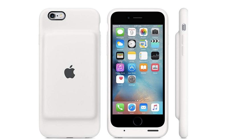
Dumb decisions in the Cook era have included a mouse that you have to turn upside-down to charge, and a battery pack for your iPhone that looks like a parody product, as well as making your phone look pregnant.
The official Apple Smart Battery Case for iPhone 6. Hmmm.
The 2015 Apple Magic Mouse 2. More hmmm.
Until recently, it was possible to take these eccentricities in good humor, largely because they were not that important. But things have been getting more serious in the past year.
For a start, Apple has embraced its market position and begun to systematically position its products as exclusive, premium alternatives to its run-of-the-mill competitors. This has included significant price hikes for its flagship products. A top-of-the-range MacBook Pro will set you back well over $4,000 with a 2TB hard drive, and the iPhone X begins at $999.
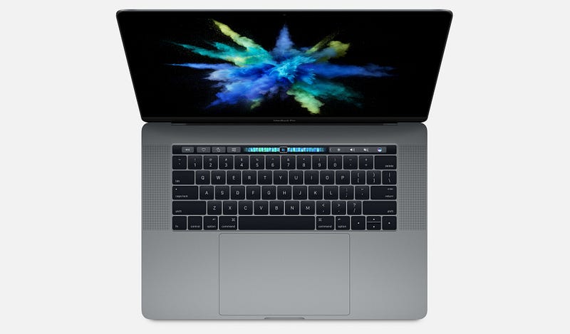
As a strategy, this might have been fine, had it not coincided with a series of increasingly embarrassing product design blunders. The 2016 and 2017 MacBook Pro have widely-reported problems with creaking or cracking screen hinges, and failing keyboards. Add to that some bizarre design decisions — such as adding a largely useless Touch Bar and a comically oversized trackpad — and you start to wonder what is going on.
The late 2016 MacBook Pro — beautiful but botched
The most widely remarked-upon oddity of the iPhone X is the “notch”, though I doubt that’s going to be an enduring objection to the product; it may indeed prove to be a very useful piece of branding at a time when other “all-screen” smartphones are pretty much indistinguishable from one another.
More likely to hit the iPhone X’s reputation are emerging security problems with FaceID, which, combined with the product’s exceptionally high price, may go some way to explaining the reportedly slow sales of the handset and its rumoured discontinuation.
The iPhone X from 2017
In short, Apple has set itself up as being better than the rest, but has got into a bad habit of releasing products — both hardware and software — that can’t really support that claim, especially given that the quality of PC and Android products have increased markedly over the past 5 years.
In just the past few weeks, this mismatch between the company’s positioning, and what it is tending to deliver, was painfully evident in the disastrous flaws that MacOS High Sierra shipped with. One bug even allowed anyone to log in to any Mac as an administrator without a password, which led Apple to issue an emergency fix and a grovelling apology. Such a basic error would be inexcusable in a bargain-basement product; that it happened in a major release of MacOS is astonishing from a company that has set itself up as a paragon of virtue in its industry.
Which leads us to our prediction. It’s within Apple’s power to turn things around this year, but it’s going to be difficult. Some of these issues are probably evidence of failing processes within the company — for example, inadequate pre-release quality control and software testing — while the loss of genuinely “pro” features in the MacBook Pro in favor of expensive adapters and gimmicks like the Touch Bar show a lack of connection with user needs.
In 2018, if Apple wants to preserve its prime industry position and justify its price tags, it needs to return to real user-centered product design and re-focus on truly exceptional product execution. What’s more likely to happen, we fear, is that we will see another couple of botched product releases and embarrassing security problems, precipitating an identity crisis and maybe even some high-level departures from the company following 4 years of flat-lining revenue growth.

2. First-wave social media will start to decline

For the purposes of this article, we’re defining “first-wave” social media as Facebook and Twitter — though of course before that, there was the social media vanguard of MySpace, Bebo, and FriendsReunited.
If, like me, you have spent (too) much of the past decade reluctantly but compulsively attached to social media, you might find it hard to believe that Facebook or Twitter will ever die. But, of course, nothing lasts forever, and there are signs that these services are past their prime.
They were most popular amongst millennials, who hit adulthood in the mid-2000s and were excited by the prospect of an easy way to keep in touch with their nascent networks of friends and professional contacts. Facebook also offered an important, accessible way for older people to connect with friends and family far away.
A younger generation of post-millennials, though, have largely failed to see the attraction in these platforms, which offer the user very little granularity in how they relate to and share with different people. Generation Z have turned in their droves to Snapchat and encrypted services like WhatsApp for more secure and granular social networking — which can more faithfully mirror offline social relationships — and to Instagram for a more narrowly defined public sharing experience. Post-millennials have only ever known a data-driven, digital world, and easily see through “meaningless” Facebook friendships.
Facebook has made attempts to recapture the teenage and young adult market with apps like 2014’s Lifestage. This, however, was shut down last year following a lack of user uptake. They have also tried to bring in younger users by acquiring Instagram and other services that the demographic already use. More recently, Facebook acquired tbh, an anonymous compliments app for teens that was reportedly feared to be a potential commercial threat.
On top of this, we have a growing and diverse chorus of voices warning of the dangers of highly engineered social media services. These concerns have emerged partly in response to the alleged propagation of fake and planted news stories through social platforms during the 2016 US election. However, it runs deeper than that.
More importantly, critics draw attention to the fact that it is a core part of the design of first-wave social media platforms to create cognitive overload, psychological addiction, and compulsive sharing. It’s become common knowledge that many high-profile figures in the tech world limit their kids’ screen time or even send them to screen-free schools, perhaps to combat the expansion of tech into every realm of life.
At the Davos international trade summit a few days ago, billionaire George Soros had this to say:
“Mining and oil companies exploit the physical environment; social media companies exploit the social environment. This is particularly nefarious because social media companies influence how people think and behave without them even being aware of it. This has far-reaching adverse consequences on the functioning of democracy, particularly on the integrity of elections.”
Similarly, at the end of last year, Chamath Palihapitiya, a former Facebook executive for growth until he left in 2011, expressed regret at his role in the company’s expansion:
“the short-term, dopamine-driven feedback loops that we have created are destroying how society works. No civil discourse, no cooperation, misinformation, mistruth. […] This is not about Russian ads. This is a global problem. It is eroding the core foundations of how people behave by and between each other.”
And that’s not to mention the huge amounts of compromising personal data that users give over, unpaid, to multi-billion dollar companies to feed a lucrative advertising machine. Even The Economist — generally far from being a radical voice — is asking whether users should be paid for the data they currently freely surrender.
Our prediction is that 2018 will be a tipping point, as users become more aware of how corrosive first-wave social media platforms have become. To maintain their market position, Facebook and Twitter will need to go back to UX design basics and figure out afresh what 2018’s users actually want and need from a social app.
In the year ahead we are likely, at least, to see pushback against first-wave social media’s exhibitionist tendency. User preferences will shift towards more lo-fi, quasi-SMS interactions that require active participation rather than passive scrolling. Particularly in a world with an increasingly mobile workforce, business platforms such as Slack could provide a model for the future of social networking.
Slack’s desktop messaging interface
One important change in the decade since these platforms emerged is that users are now much more willing to pay for apps; paid subscriptions to Spotify and Netflix, which would once have been scandalous to the average web user, are now entirely normal.
User bases, even huge ones, can be fickle: once the time comes, or perhaps more importantly once the right new platform comes, we could see a brutal, mass exodus of regular users within a few years, towards paid platforms that deliver a more user-centered product.

3. Privacy and security will become more important user goals

Which leads us to our final prediction: in 2018, privacy and security will ratchet up the hierarchy of goals for many users. In the year ahead, experts deem it likely that there will be further international cyber-attacks in the wake of the WannaCry ransomware attack, which affected National Health Service (NHS) computer systems in the UK, leading to the closure of some services and diversion of ambulances. In turn, one of the reasons the ransomware propagated quickly was a failure to apply existing Windows 7 security patches that closed the EternalBlue exploit of a Windows vulnerability.
In a press release last year, David Dufour, vice president of engineering and cybersecurity at Webroot, stated that
“This past year was unlike anything we’ve ever seen. Attacks such as NotPetya and WannaCry were hijacking computers worldwide and spreading new infections through tried-and-true methods. This list is further evidence that cybercriminals will continue to exploit the same vulnerabilities in increasingly malicious ways. Although headlines have helped educate users on the devastating effects of ransomware, businesses and consumers need to follow basic cybersecurity standards to protect themselves.”
Individual users are beginning to wise up to the steps they can take to secure their privacy, security and identity, and will soon start to demand more of these controls from the devices and apps they use. To meet this demand, companies are likely to step up their efforts in these areas, perhaps accelerating programs to replace password systems or make 2-step verification mandatory.
After all, there is a long way to go: less than 10% of Google users currently use 2-step verification. By the end of the year, we will see lots more screens like this one from Slack, as more major sites and services beginning to retire passwords completely in favour of other verification systems.
Growing awareness of security and privacy risks may also accelerate the decline of first-wave social media platforms, which are notoriously opaque when it comes to how they use personal data, and the steps that users can take to get it deleted.
In part, this has been a failure of national and international governance and regulation. Particularly with the introduction of significant legal measures such as the EU Data Protection Regulation, we will also see legislators adopting a less hands-off approach to tech companies’ use of data; in the year ahead legislative bodies around the world are likely to pass new laws demanding more rigorous data standards and greater user control.

Wednesday, January 31, 2018

Submit to Design + Sketch Publication


Design + Sketch is a large collection of articles, tips, tutorials, and stories on designing and prototyping with Sketch and beyond. Below you’ll find a guideline, useful tips and info about the publication process to keep in mind.

How does it work?

  • Send a link of your published article or draft via email to contact@sketchappsources.com
  • Note: Medium only allows articles to be published to one publication at a time. So if your article has already been published with a different publication, you’ll have to make a decision what publication you’d like to publish it under
  • We will contact you once we’ve reviewed your email and your article 📬(within 24 hours)
  • If your story has been successful, we’ll invite you to join as an official writer to the publication 👏
  • At this point, you’ll be able to submit your story. Medium has written a handy post on how to submit your work
  • Once you submit, your article will be added to our publishing queue and it will be added promptly
  • Once your article is published, you’ll see it as part of Design + Sketch 🎉

What the Design + Sketch community loves?

The community loves genuine design and development opinions, tips, lists, tutorials, plugins, and case studies on Sketch, User Experience Design, User Interface Design, Usability, Interaction Design, Prototyping, Product Design, and any other topic that relates to designing and building plugins or digital products with Sketch and beyond.
Make sure your article has a clear value to our readers so they can take something away that will impact their productivity and improve their design process. You can review current stories for inspiration 😃

What you could improve on before submitting?

If you’re trying to sell or promote something, don’t forget that what matters most is the value that you’re creating for others. Write about the “Why?” and your experience, instead of pushing products, books, courses, or other tools with slimy sales tactics.
In order to keep the quality, we maintain the privilege to decline articles that don’t align with what the community desires.

We look forward to reading your story! Thank you for choosing Design + Sketch as the home for your work 🦄
With love,

An introduction to Progressive Web Apps


Progressive Web Apps (PWA) are the latest trend in mobile application development using web technologies. At the time of writing (early 2018), they’re only applicable to Android devices.
PWAs are coming to iOS 11.3 and macOS 10.13.4, very soon.
WebKit, the tech underlying Safari and Mobile Safari, has recently (Aug 2017) declared that they’ve started working on introducing Service Workers into the browser. This means that soon they will land in iOS devices as well. So the Progressive Web Apps concept will likely be applicable to iPhones and iPads, if Apple decides to encourage this approach.
It’s not a groundbreaking new technology, but rather a new term that identifies a bundle of techniques that have the goal of creating a better experience for web-based apps.

What is a Progressive Web App

A Progressive Web App is an app that can provide additional features based on what the device supports, providing offline capability, push notifications, an almost native app look and speed, and local caching of resources.
This technique was originally introduced by Google in 2015, and proves to bring many advantages to both the developer and the users.
Developers have access to building almost-first-class applications using a web stack. This is always considerably easier and cheaper than building native applications, especially when considering the implications of building and maintaining cross-platform apps.
Devs can benefit from a reduced installation friction, and at a time when having an app in the store does not actually bring anything in terms of discoverability for 99,99% of the apps, Google search can provide the same benefits if not more.
A Progressive Web App is a website which is developed with certain technologies that make the mobile experience much more pleasant than a normal mobile-optimized website. It almost feels like working on a native app, as it offers the following features:
  • Offline support
  • Loads fast
  • Is secure
  • Is capable of emitting push notifications
  • Has an immersive, full-screen user experience without the URL bar
Mobile platforms (Android at the time of writing, but it’s not technically limited to that) offer increasing support for Progressive Web Apps. They even ask the user to add the app to the home screen when that user visits such a site.
But first, a little clarification on the name. Progressive Web App can be a confusing term, and a good definition is: web apps that take advantage of modern browsers features (like web workers and the web app manifest) to let their mobile devices “upgrade” the app to the role of a first-class citizen app.

Progressive Web Apps alternatives

How does a PWA stand compared to the alternatives when it comes to building a mobile experience?
Let’s focus on the pros and cons of each, and let’s see where PWAs are a good fit.

Native Mobile Apps

Native mobile apps are the most obvious way to build a mobile app. Objective-C or Swift on iOS, Java /Kotlin on Android and C# on Windows Phone.
Each platform has its own UI and UX conventions, and the native widgets provide the experience that the user expects. They can be deployed and distributed through the platform App Store.
The main pain point with native apps is that cross-platform development requires learning, mastering and keeping up to date with many different methodologies and best practices. If, for example, you have a small team or you’re a solo developer building an app on 3 platforms, you need to spend a lot of time learning the technology and environment. You’ll also spend a lot of time managing different libraries and using different workflows (for example, iCloud only works on iOS devices — there’s no Android version).

Hybrid Apps

Hybrid applications are built using Web Technologies, but are deployed to the App Store. In the middle sits a framework or some way to package the application so it’s possible to send it for review to the traditional App Store.
Some of the most common platforms are Phonegap and Ionic Framework, among many others, and usually what you see on the page is a WebView that essentially loads a local website.
I initially included Xamarin in the list, but Carlos Eduardo Pérez correctly pointed out that Xamaring generates native code.
The key aspect of Hybrid Apps is the write once, run anywhere concept. The different platform code is generated at build time, and you’re building apps using JavaScript, HTML and CSS, which is amazing. The device capabilities (microphone, camera, network, gps…) are exposed through JavaScript APIs.
The bad part of building hybrid apps is that, unless you do a great job, you might settle on providing a common denominator. This effectively creates an app that’s sub-optimal on all platforms because the app is ignoring the platform-specific human-computer interaction guidelines.
Also, performance for complex views might suffer.

Apps built with React Native

React Native exposes the native controls of the mobile device through a JavaScript API, but you’re effectively creating a native application, not embedding a website inside a WebView.
Their motto, to distinguish this approach from hybrid apps, is learn once, write anywhere. This means that the approach is the same across platforms, but you’re going to create completely separate apps in order to provide a great experience on each platform.
Performance is comparable to native apps, since what you build is essentially a native app which is distributed through the App Store.

Progressive Web Apps features

In the last section, you saw the main competitors of Progressive Web Apps. So how do PWAs stand compared to them, and what are their main features?
Remember — currently, Progressive Web Apps are for Android devices only.

Features

Progressive Web Apps have one thing that separates them completely from the above approaches: they are not deployed to the app store.
This is a key advantage. The app store is beneficial if you have the reach and luck to be featured, which can make your app go viral. But unless you’re in the top 0.001% you’re not going to get much benefit from having your little place on the App Store.
Progressive Web Apps are discoverable using Search Engines, and when a user gets to your site that has PWAs capabilities, the browser in combination with the device asks the user if they want to install the app to the home screen. This is huge, because regular SEO can apply to your PWA, leading to much less reliance on paid acquisition.
Not being in the App Store means you don’t need Apple’s or Google’s approval to be in the users pockets. You can release updates when you want, without having to go through the standard approval process which is typical of iOS apps.
PWAs are basically HTML5 applications/responsive websites on steroids, with some key technologies that were recently introduced to make some of the key features possible. If you remember, the original iPhone came without the option to develop native apps. Developers were told to develop HTML5 mobile apps that could be installed to the home screen, but the tech back then was not ready for this.
Progressive Web Apps run offline.
The use of service workers allow the app to always have fresh content, which can be downloaded in the background, and to provide support for push notifications, which offer greater re-engagement opportunities.
Also, sharability makes for a much nicer experience for users that want to share your app, as they just need a URL.

Benefits

So why should users and developers care about Progressive Web Apps?
  1. PWA are lighter. Native Apps can weigh 200MB or more, while a PWA could be in the range of the KBs.
  2. There’s no native platform code
  3. The cost of acquisition is lower (it’s much more difficult to convince a user to install an app than to visit a website to get the first-time experience)
  4. Significantly less effort is needed to build and release updates
  5. They have much more support for deep links than regular app-store apps

Core concepts

  • Responsive: the UI adapts to the device screen size
  • App-like feel: it doesn’t feel like a website but rather like an app (as much as possible)
  • Offline support: it will use the device storage to provide an offline experience
  • Installable: the device browser prompts the user to install your app
  • Re-engaging: push notifications help users re-discover your app once installed
  • Discoverable: search engines and SEO optimization can provide a lot more users than the app store
  • Fresh: the app updates itself and the content once it’s online
  • Safe: it uses HTTPS
  • Progressive: it will work on any device, even older one, even if it has fewer features (e.g. just as a website, not installable)
  • Linkable: it’s easy to point to it using URLs

Service Workers

Part of the Progressive Web App definition is that it must work offline.
Since the thing that allows the web app to work offline is the Service Worker, this implies that Service Workers are a mandatory part of a Progressive Web App.
WARNING: Service Workers are currently only supported by Chrome (Desktop and Android), Firefox, and Opera. See http://caniuse.com/#feat=serviceworkers for updated data on the support.
TIP: Don’t confuse Service Workers with Web Workers. They are a completely different thing.
A Service Worker is a JavaScript file that acts as a middleman between the web app and the network. Because of this it can provide cache services, speed the app rendering, and improve the user experience.
For security reasons, only HTTPS sites can make use of Service Workers, and this is part of the reason why a Progressive Web App must be served through HTTPS.
Service Workers are not available on the device the first time the user visits the app. On the first visit the web worker is installed, and then on subsequent visits to separate pages of the site, this Service Worker will be called.
Check out the complete guide to Service Workers at https://www.writesoftware.org/topic/service-workers

The App Manifest

The App Manifest is a JSON file that you can use to provide the device information about your Progressive Web App.
You add a link to the manifest in every header on each page of your web site:
<link rel="manifest" href="/manifest.json">
This file will tell the device how to set:
  • The name and short name of the app
  • The icons’ locations, in various sizes
  • The starting URL, relative to the domain
  • The default orientation
  • The splash screen

Example

{ 
  "name": "The Weather App", 
  "short_name": "Weather", 
  "description": "Progressive Web App Example", 
  "icons": [{
    "src": "images/icons/icon-128x128.png",
    "sizes": "128x128",
    "type": "image/png" 
  }, { 
    "src": "images/icons/icon-144x144.png",
    "sizes": "144x144", 
    "type": "image/png" 
  }, { 
    "src": "images/icons/icon-152x152.png",
    "sizes": "152x152", 
    "type": "image/png" 
  }, { 
    "src": "images/icons/icon-192x192.png",
    "sizes": "192x192", 
    "type": "image/png" 
  }, { 
    "src": "images/icons/icon-256x256.png", 
    "sizes": "256x256", 
    "type": "image/png" 
  }], 
  "start_url": "/index.html?utm_source=app_manifest", 
  "orientation": "portrait", 
  "display": "standalone", 
  "background_color": "#3E4EB8",
  "theme_color": "#2F3BA2" 
}
The App Manifest is a W3C Working Draft, reachable at https://www.w3.org/TR/appmanifest/

The App Shell

The App Shell is not a technology but rather a design concept. It’s aimed at loading and rendering the web app container first, and the actual content shortly after, to give the user a nice app-like impression.
Take, for example, Apple’s Human Interface Guidelines’ suggestion to use a splash screen that resembles the user interface. This provides a psychological hint that was found to lower the perception that the app was taking a long time to load.

Caching

The App Shell is cached separately from the contents, and it’s setup so that retrieving the shell building blocks from the cache takes very little time.

Thanks for reading through this tutorial. There’s a lot to learn about this topic and the new browser APIs. I publish a lot of related content on my blog about frontend development, don’t miss it! 😀

Tuesday, January 30, 2018

Designing beautiful mobile apps from scratch


I started learning graphic design when I was 13. I learned to design websites from online courses and used to play around with Photoshop and Affinity Designer all day. That experience taught me how to think like a designer.
I’ve been designing and developing apps for almost a year now. I attended a program at MIT where I worked with a team to develop Universeaty. Two months ago, I started working on a new app, Crypto Price Tracker, which I launched recently on 28th January.
In this post, I’ll share the step-by-step design process I follow along with examples of the app I worked on. This should help anyone who wants to learn or improve upon their digital design skills. Design is not all about knowing how to use design software, and this post won’t teach you how to use it. There’s hundreds of good quality tutorials online to learn. Design is also about understanding your product inside out, its features and functionality, and designing while keeping the end-user in mind. That’s what this post is meant to teach.
Design Process:
  1. Create a user-flow diagram for each screen.
  2. Create/draw wireframes.
  3. Choose design patterns and colour palettes.
  4. Create mock-ups.
  5. Create an animated app prototype and ask people to test it and provide feedback.
  6. Give final touch ups to the mock-ups to have the final screens all ready to begin coding.
Let’s start!

User-Flow Diagram

The first step is to figure out the features you want in your app. Once you’ve got your ideas, design a user-flow diagram. A user-flow diagram is a very high level representation of a user’s journey through your app/website.
Usually, a user flow diagram is made up of 3 types of shapes.
  • Rectangles are used to represent screens.
  • Diamonds are used to represent decisions (For example, tapping the login button, swiping to the left, zooming in).
  • Arrows link up screens and decisions together.
User-flow diagrams are super helpful because they give a good logical idea of how the app would function.
Here’s a user-flow diagram I drew when I started out working on the design of my app.
User-flow diagram for the Main Interface.

Wireframes

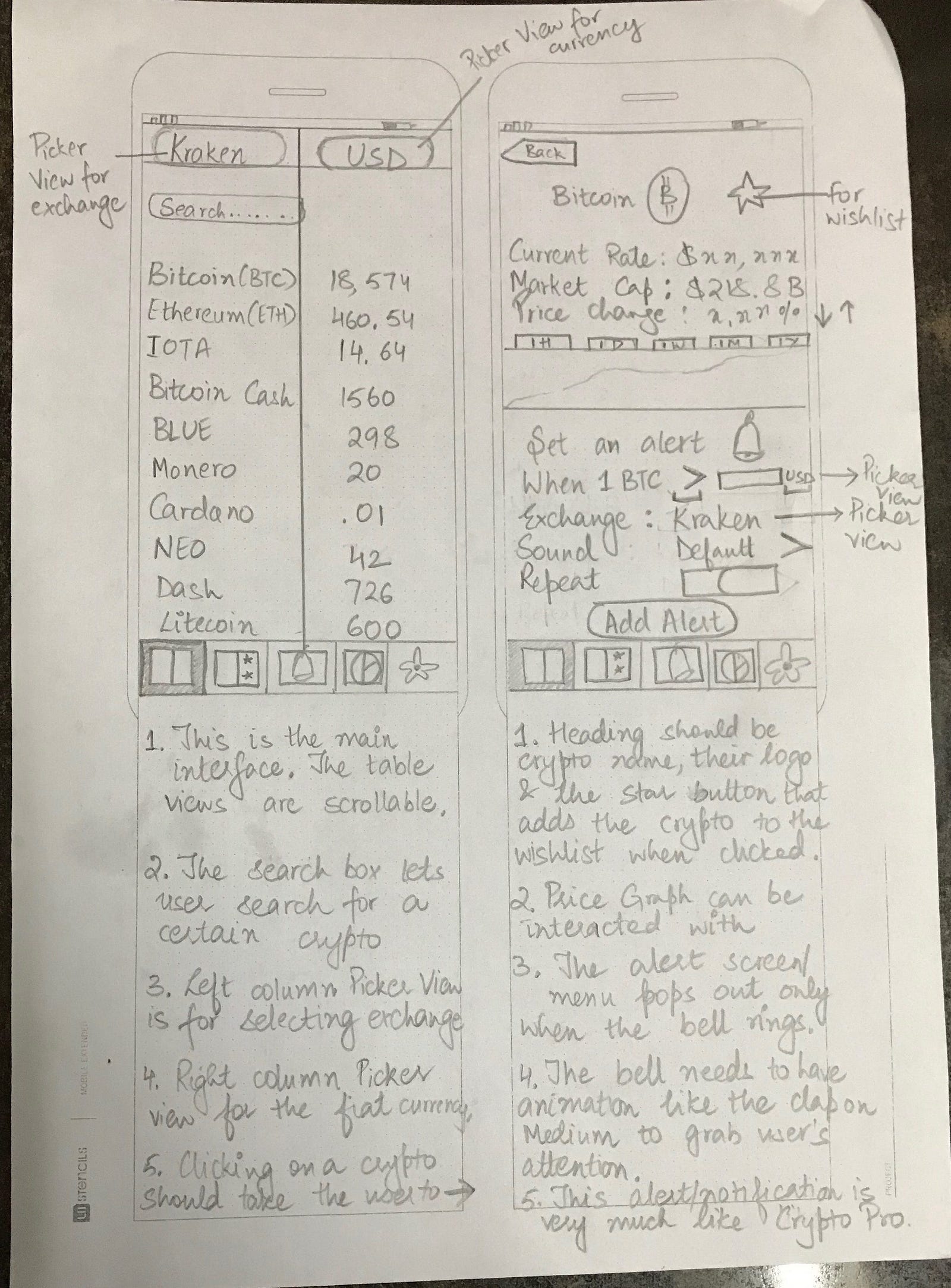
Once you’ve completed the user-flow diagrams for each screen and designed user journeys, you’ll begin working on wireframing all the screens. Wireframes are essentially low-fidelity representations of how your app will look. Essentially a sketch or an outline of where images, labels, buttons, and stuff will go, with their layout and positioning. A rough sketch of how your app will work.
I use printed templates from UI Stencils for drawing the wireframes. It saves time and gives a nice canvas to draw on and make notes.
Here’s an example wireframe.
Wireframe for the Main Interface.
After sketching the wireframes, you can use an app called Pop and take a pic of all your drawings using the app and have a prototype by linking up all the screens through buttons.

Design Patterns and Colour Palettes

This is my favourite part. It’s like window-shopping. Lots of design patterns and colour palettes to choose from. I go about picking the ones I like and experimenting with them.
The best platforms to find design patterns are Mobile Patterns and Pttrns. And to find good colour palettes, go to Color Hunt.

Mock-ups

This is when you finally move on to using design software. A mock-up in the design sense is a high-fidelity representation of your design. It’s almost like you went into this app in the future and you took some screenshots from it. It should look realistic and pretty much like the real thing.
There are design software and tools for creating mock-ups. I use Affinity designer. The most commonly used tool for iOS design is Sketch.
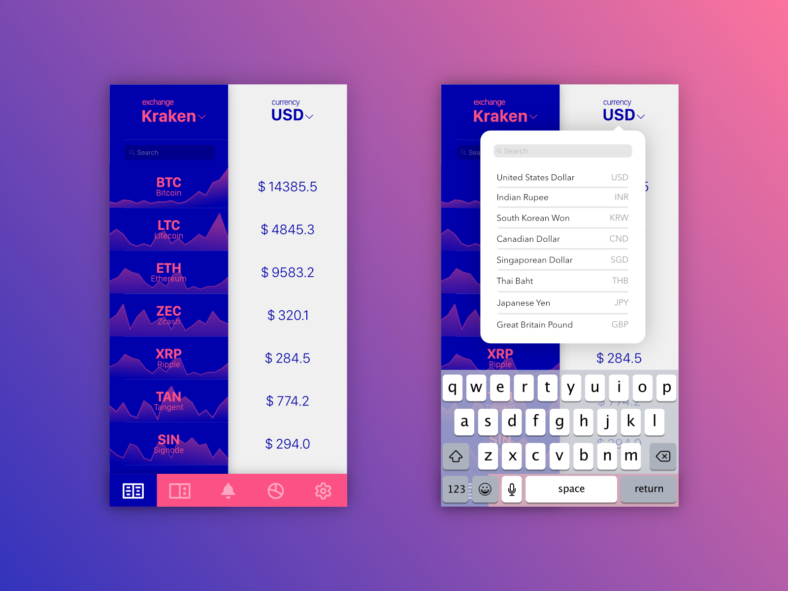
Here’s an example of some of the early designs of my app.
Bringing the pencil drawing to pixels!
I experimented more with various colour palettes.
I shared the initial mockups with my friends for their feedback. A lot of people seemed to like the gold gradient and black scheme.
Be willing to take feedback and experiment with new suggestions! You’ll find amazing ideas come from your users when you talk to them, not when you frantically scroll through Dribbble or Behance.
So I redesigned the mock-up and removed the background graphs because generating them was a technically time-consuming process and they reduced readability. This is what the redesigned mock-up looked like.
Gold gradient with black surprisingly looks good!
I was pretty satisfied with the colour scheme, icons on the tab bar, and overall layout. I went ahead and designed the rest of the screens following the same design guidelines. It was a long, but surely fun process!
Once all of my screens were ready, I put together a prototype in Adobe XD and asked a few friends to experiment and give feedback.
After final touches and such, this is what my final design looks like.
The Main Interface!
After all the screens were completed, I imported them into Xcode and began coding the app.
That’s it! I hope this post will help you get started with app design or help you become a better designer. And if you like my app, you can download it here.
I’m ending the post with one of my favourite quotes about design.
“Design is not just what it looks like and feels like. Design is how it works”
-Steve Jobs

Interested for our works and services?
Get more of our update !